Affiliate links on Android Authority may earn us a commission. Learn more.
Samsung One UI 2.0 review: A subtle Android 10 update for Galaxy phones

Samsung says the primary aim of One UI 2.0 is to help Galaxy smartphone owners “focus on what matters.” One UI, which is what Samsung calls its Android user interface skin, replaced the Samsung Experience and TouchWiz on Samsung’s smartphones starting with Android 9 Pie in early 2019. It’s the core experience on the Galaxy S10 and Galaxy Note 10 series, though some older phone series have access to it as well.
This second-generation One UI, available on many Samsung devices, is streamlined in order to further reduce on-screen clutter and confusion. Samsung approached this primarily by toning down notifications. Other improvements include tweaks to dark mode, digital wellbeing, and the lock screen. Let’s take a look.
Less intrusive notifications
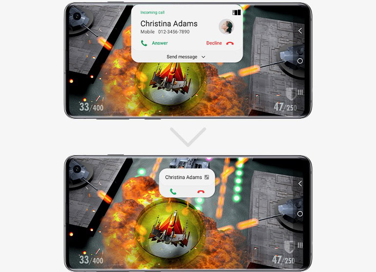
You know the drill. You’re in the middle of binging your latest Netflix series when an incoming phone call takes over your screen. If the call doesn’t completely obliterate your activity, it at least mars it with a pop-over or other intruding box. In One UI 2.0, these pop-overs and action boxes are dramatically smaller.
For example, rather than display the caller’s photo, number, quick message, and other options, now only the name appears with buttons for accepting or rejecting the call. Smartly, there’s a small toggle (maybe too small) in the corner that when tapped will expand this notification to show all the details.

System alerts are similarly reduced. When adjusting the volume, the control bar that shows you the volume level is noticeably thinner and positioned higher up on the screen. It, too, has a toggle that expands the volume controller so users can adjust media playback or alarm volume.
These are small touches, but the have the effect of creating more breathing room on the screen when performing certain actions and/or receiving notifications.
See also: Tame your Android notifications with these tips and tricks
The dark, it spreads
Samsung altered the way dark mode works a bit in One UI 2.0, though not by too, too much. The most significant factor here is that dark mode is available in more apps and to more aspects of the user interface.
For example, in the two screenshots below, you can see how the Google News widget in One UI 1.o has a white background, while the same widget has a black background in One UI 2.0. It is full of little changes like this.
One UI 2.0 is also a bit more aggressive about toning down screen brightness in darker settings. Samsung claims this should also help battery life some, but given the beta nature of the software we cannot validate that claim.
Another black-and-white change built into One UI 2.0 is a true helper. We’re talking wallpaper.
How many times have you pored over various wallpapers to select a good one, only to get burned on the lock screen? What I mean is, many wallpapers have really bright content in the upper half of the screen. Most often, phones use white text for the lock screen clock, date, and notifications widget. This often makes the clock invisible (white text on a white/bright background), particularly when outdoors. On Samsung One UI 2.o, the software is smart enough to change the color of the text. In the sample below, you can see how the clock is white in the One UI 1.0 lock screen and dark gray in the One UI 2.0 lock screen. The latter is far more visible outdoors.
Again, little touches that go a long way.
See also: The best Android wallpapers
Being well digitally
If there’s one app in One UI 2.0 that’s been overhauled in a significant way, it is Digital Wellbeing.
To start, the landing screen is wholly different. It drops the airy pie chart graphic for a thick timeline graphic with bold numbers. This cosmetic change isn’t as important as the addition of Focus Mode and Parental Controls.
Focus Mode, which we’ve seen from other phone makers such as OnePlus, allows you to control which apps are allowed to run or bother you at any given moment. Two options, Work Time and Me Time, are suggested for helping people mute notifications so they can work, or manage other preferences for a mental health break. Naturally, people can create their own, custom modes for different scenarios and avoiding distractions.
New to One UI 2.0 is a console for parents. Parental Controls are located inside the Digital Wellbeing app and are meant to help parents set limits for their kids. The one hitch here is that Google’s Family Link is required. Family Link is Google’s online dashboard for managing kid devices. Samsung’s take simple builds on the bones provided by Google.
Your device needs some love, too, and that’s why the Device Care app has been redesigned. Its landing screen now mirrors that of the Digital Wellbeing app. It provides the same large numbers and timeline view of usage so you can quickly glean the details you need and perform a tune-up if warranted.
Elsewhere
I did a screen-by-screen comparison of One UI 1.0 and One UI 2.0. Other than what we’ve mentioned above, very little is different. That means the appearance and performance of the home screen panels, app drawer, quick settings shade, and main settings menus are more or less carried over from One UI 1.0. Even core Samsung apps, such as the phone, browser, PenUp, SmartThings, and Bixby are essentially unchanged.
Performance of the Samsung One UI 2.0 beta did not negatively impact our Galaxy Note 10 device over the course of several days testing it. That doesn’t mean the beta is free of bugs, it simply means we haven’t found them yet.
The beta is free for US residents to test now, and can be installed on the Samsung Galaxy S10, S10 Plus, Note 10, and Note 10 Plus. Samsung hasn’t said exactly when the update will reach these devices in final form, but I would not expect to see it before January.
See also: Here’s how to get Samsung One UI 2.0 on your Samsung Galaxy S10
Thank you for being part of our community. Read our Comment Policy before posting.