Affiliate links on Android Authority may earn us a commission. Learn more.
Android 9 Pie review: Closing the gap
The Android 9 Pie release is the proof in the proverbial pudding that Android as an operating system has hit its stride. Lacking neither underlying features or surface polish, Android 9 Pie is the most complete, comprehensive and consistent version of Android yet. It delivers on many of the promises of Android versions past, bringing us a new navigation system and app overview, better notification handling and resource management, and more embedded AI than you can poke a stick at. And yet, for all that, it can’t help but feel a little out of sync with its roots, perhaps trending a little too far in Apple’s direction. This is the Android 9 Pie review.
For Google, there are three main themes to Pie: intelligence, simplicity and digital wellbeing. The third won’t be available until the fall, but it is accessible to Pixel owners now through a public beta (more on this at the very end). The intelligence in Android Pie largely boils down to AI-based automation, learning from your usage habits to adjust everything from battery usage to display brightness. Simplicity is embodied in what you see and how you use it. Let’s start there.

Android 9 Pie review: Visual changes
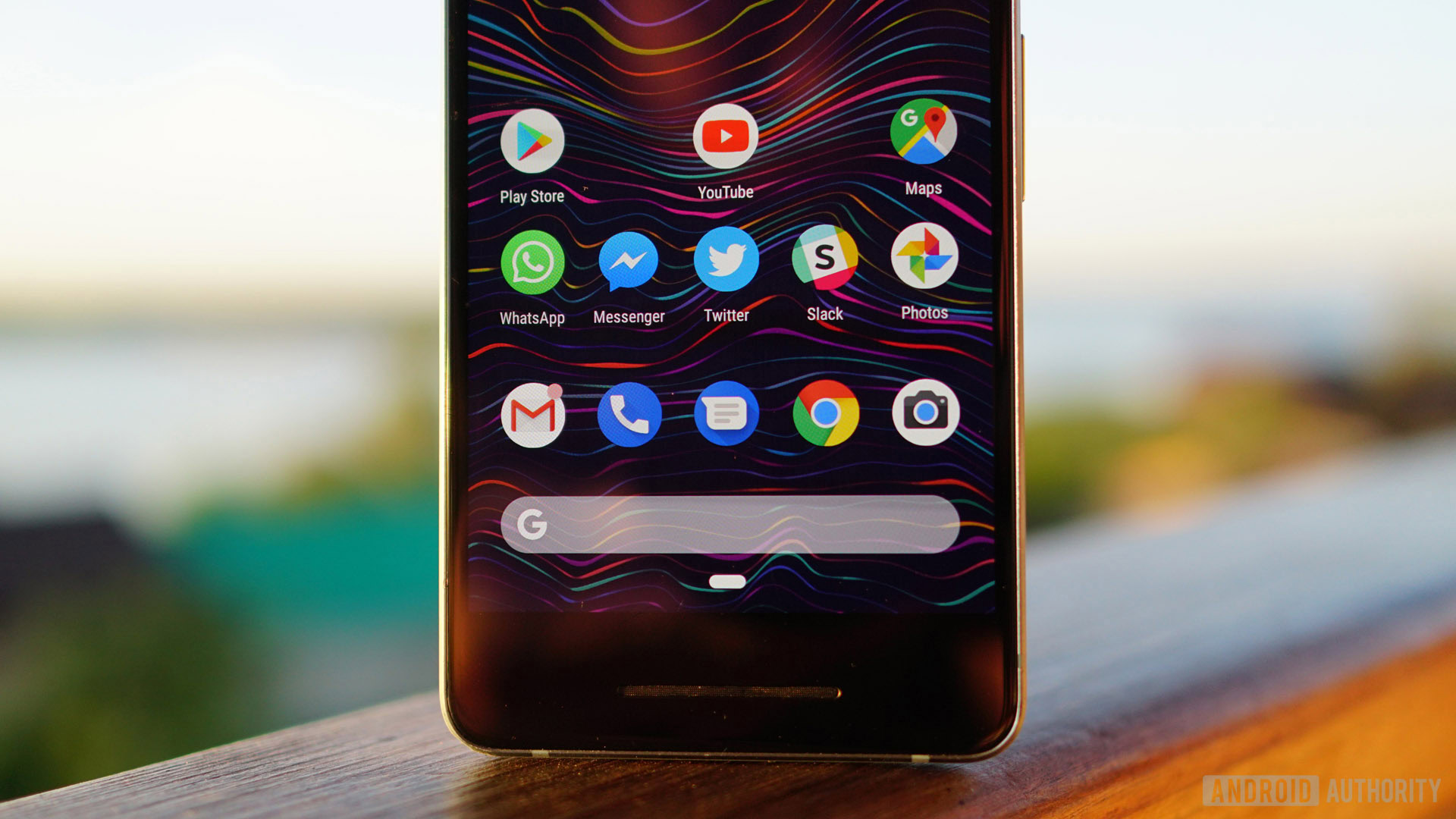
The first thing you’ll notice about Android 9 is that its design language, known as Material Design, has received a visual refresh. The primary changes relate to rounded corners, colored icons, and lots more white space. It’s also flatter than ever, with even fewer drop shadows than before.
Android 9 navigation
Android 9 Pie introduces a new single-button gesture navigation system. It can be toggled on and off in the Display settings under Gestures > Swipe up on home button. These are the Android Pie gesture controls:
- Tap for home
- Long press for Google Assistant
- Swipe right and release for most recent app
- Swipe right and hold to scroll through recent apps
- Swipe up to show recent apps menu and suggested apps
- Swipe further up to open app drawer (or swipe up again from app overview)
Note: Android 9 gesture navigation is not going to remain limited to Pixel and Android One devices. Google has said that the Pixel 3 will use it by default and it will be made available to any manufacturers that want it.
These gestures are available in any screen, so you can swipe up any time to access the app drawer without going back to the home screen. A back arrow will appear to the left of the navigation button when necessary. I’m not entirely sure why swiping left to go back wasn’t implemented, as the back arrow’s presence seems slightly inconsistent with the otherwise very minimalistic navigation solution.
I’m not sure what the learning curve will be like for less technically-inclined users given the lack of visual cues, but I assume that’s why traditional on-screen buttons are still a thing. There are first-day popups to guide you but nothing persistent and obvious like Android’s traditional nav buttons.
Depending on where you are in the interface, other temporary buttons occasionally appear beside the navigation button. These include the keyboard picker and a smart rotation button. Smart rotation means that even if you have your auto-rotation toggle off, the Android OS will recognize apps in which you might want to override that setting (like YouTube for example), saving you a trip to the Quick Settings when you want to watch a video in full screen.
On-screen gesture navigation is nothing new, with the iPhone X and several Android devices using it already. Some Android manufacturers had previously toyed with gesture navigation based around a capacitive fingerprint scanner, but that solution had several problems including quick app switching and accessing split-screen mode. In Android Pie, you just need to tap the app icon in the overview screen and choose split-screen from the menu (app pinning will also appear here if you enable it in Settings > Security & location > Advanced > Screen pinning). Fun fact: HUAWEI already introduced a single on-screen navigation button with last year’s Mate 10 Pro, although it was not as comprehensive as Google’s Pixel Pie solution. It should be noted for fans of capacitive buttons that the gesture nav button takes up the same amount of space as the old on-screen buttons.
Android Pie's gesture navigation system is surprisingly natural once you know what does what, but it does take a little getting used to.
Using the Pie navigation system is surprisingly natural once you know what does what. It does take a little getting used to if you haven’t used gesture nav in the past, but once you do it just feels “right” (at least to me). My only qualm during this Android 9 Pie review was that to launch the app drawer you need to swipe past the halfway point of your screen. This isn’t so bad on my Pixel 2, but I can imagine it being a little clumsy on larger-screened devices. If anyone at Google is reading this, an option somewhere in the settings that allows you to move the tipping point for launching the app drawer down a bit would be a great addition.
App overview
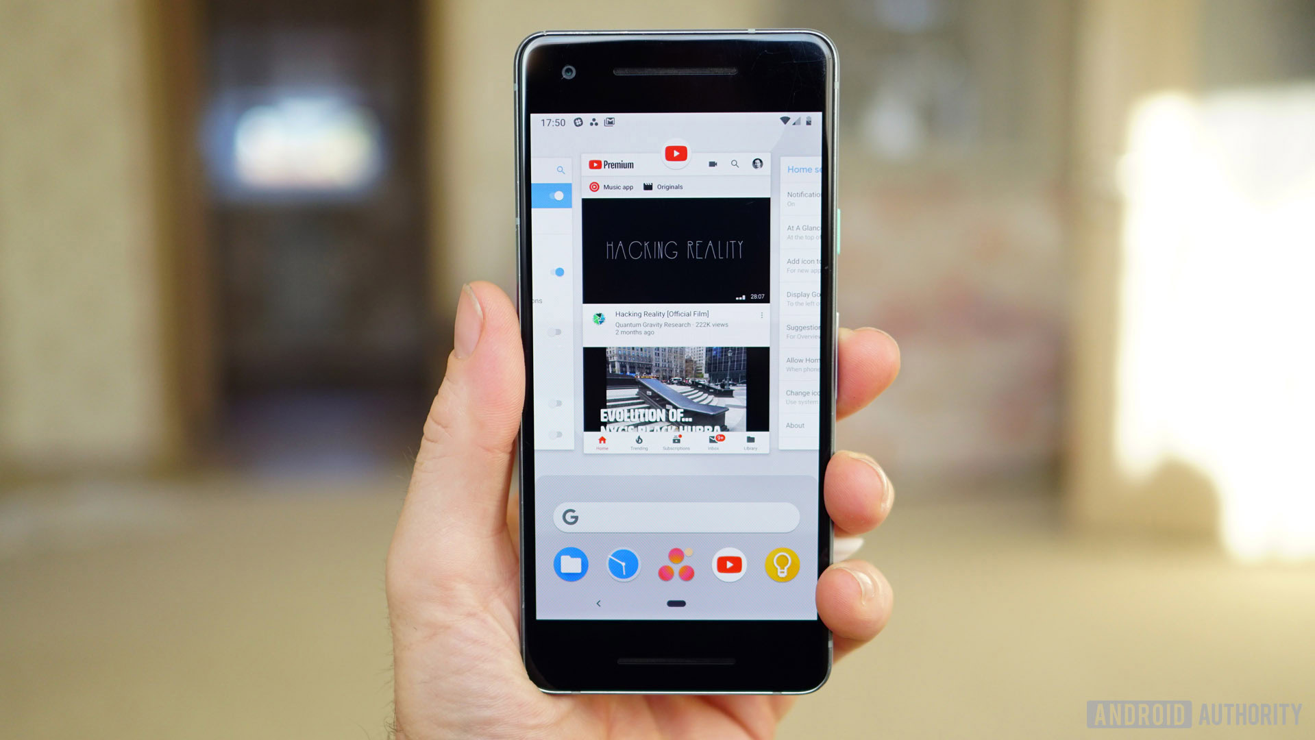
There are now two versions of the app overview screen (if you have gesture nav enabled): one with the Google search bar and AI-suggested apps at the bottom and another with full-screen app preview cards. The first is passive, simply presenting a horizontal row of preview cards you can swipe your way through. To remove an app, simply swipe it upwards. To enter an app, either swipe it down or tap on its card. Swipe all the way to the right and you’ll see a Clear All option. Tap the app’s icon at the top of the preview card and you’ll get additional options for App Info, app pinning and Split-Screen.
If you have gesture navigation enabled, there are now two versions of the app overview screen, each with its own benefits.
The second app overview screen is much cooler. Activated by swiping (and holding) the navigation button to the far right, it launches an active scroll through your most recent apps. Simply keep your finger on the navigation button to keep scrolling and release to launch whichever app is currently on screen. You can reverse direction by moving the nav button to the left and the speed with which the cards scroll by matches the speed of your finger’s movement along the scrubber bar.
Rather than swiping and holding, if you swipe and release the navigation button to the right you’ll instantly load the most recently used app. This makes switching between your two most recent apps even more convenient than double tapping the old recent apps button. It works on the home screen as well as in an app, but the result is the same.
The larger app preview screens make it easier to see where you were at and you can even copy and paste text right from the preview cards. Depending on what you’re highlighting, Pie will also suggest an app (Maps for an address, Chrome for a URL, Contacts or Messages for a phone number, and so on). Some have actions attached to the app suggestion, like calling a number you’ve just highlighted and so on. For general text, your options are copy, search and share, and for images, it’s just share.
You can even copy and paste text right from the preview cards via a new feature called Overview Selection.
Overview selection can be turned off in your home screen settings under Suggestions. In this same menu, you can also disable the AI-suggested apps that appear in the app overview and at the top of your app drawer if you’re not a fan. I must say that, more so than any other “AI” or habit-based suggestions I’ve ever encountered on other phones, Google gets it right a lot more frequently than most.
I personally love the new recent apps screens. Some may feel having two is redundant, but I like having the option of an active and a passive scroll. The first lets me steadily scroll through my recent apps when I’m looking for an app I know I used fairly recently. The second lets me quickly flick all the way back to the last app in memory or scroll at my own pace.
Quick Settings
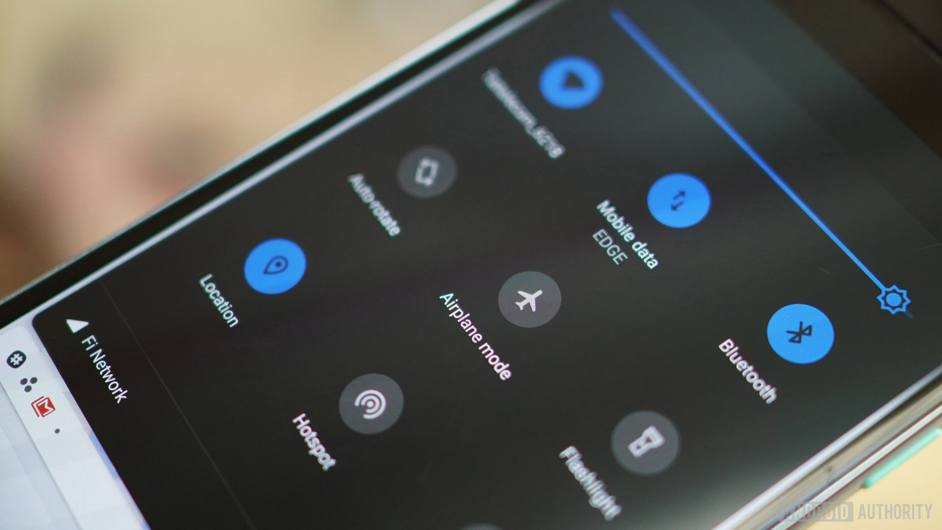
The Quick Settings area represents perhaps the most obvious visual change to the OS, even if the changes are pretty minimal. The monochrome and some would say dull Oreo toggles are now placed in colored circles. Depending on your wallpaper (Pie adapts automatically, but you can choose manually), you’ll either get a white or very dark gray ground with blue circles to denote active toggles and greyed out ones for those that are off.
Like Oreo, in the minimal Quick Settings pane at the top of the notification shade you’ll simply get six toggles. It’s mildly annoying that you can’t quickly access the settings menu from this view anymore, but you’ll learn to live with it. As always, tapping the toggles here flips them on or off, and holding down on one takes you to the relevant area in settings.
Android Pie adds a few splashes of color back into the OS, but most of it is only skin deep.
In the expanded Quick Settings view you’ll get nine toggles on screen, with a second page to the right if you need it. While the overall layout is the same as Oreo (barring the colored circles), it’s worth noting that Google has removed two things in Android 9 Pie. There are no longer any drop down carats for settings like Bluetooth or Wi-Fi and the mini-menus they used to take you to are now gone. The only option in Pie is to long-press the toggle to go to the full section in settings. It may feel less convenient to some folks – having to leave the Quick Settings area just to switch Wi-Fi networks for example – but it does make the whole area feel less cluttered.

Which brings me to one of the most inconsistent parts of this new version of Android.
On the home screen, you’ll find the Wi-Fi, cellular network and battery icons at the right of the status bar. Swipe the notifications shade down and things rejig a little. The battery icon changes shape and shifts to the left to make way for a battery-remaining percentage (which shows up whether you have the percentage enabled permanently via the Battery settings menu or not). The Wi-Fi and cellular icons move into the right-hand corner of the Quick Settings mini-view and the date appears to the left under the time, which makes sense. But swipe down into the full Quick Settings view and things reshuffle again. The date and Wi-Fi and mobile data icons vanish and instead, you find your Wi-Fi network named under the toggle while your carrier info appears at the very bottom of the card next to the moved-again cellular icon. On the lock screen, your carrier info appears in the top left corner.
This all just feels sloppy and unnecessary. For example, why show the Wi-Fi icon in the notification shade when the toggle already shows the same information? Why change the mobile data icon so it no longer shows cellular strength? Why move the cellular network icon three times rather than just leave it in the status bar? Do that and Google could have simply displayed your carrier info right underneath as it did with the date underneath the time. As boring as it may have been, Oreo’s consistent handling of these issues was far better, making the changes in Pie stick out as bad design.
Thankfully, the time, which now appears on the left of the status bar, never moves. Expect to instinctually look in the wrong place for a while after you get the Android 9 update.
Easter egg
Sorry folks, nothing new to see here (for now). Going to Settings > System > About phone > Android version and tapping the Android version number repeatedly in the card that pops up will still take you to the psychedelic peppermint P screen rather than a new Easter Egg. Perhaps in Android 9.1…
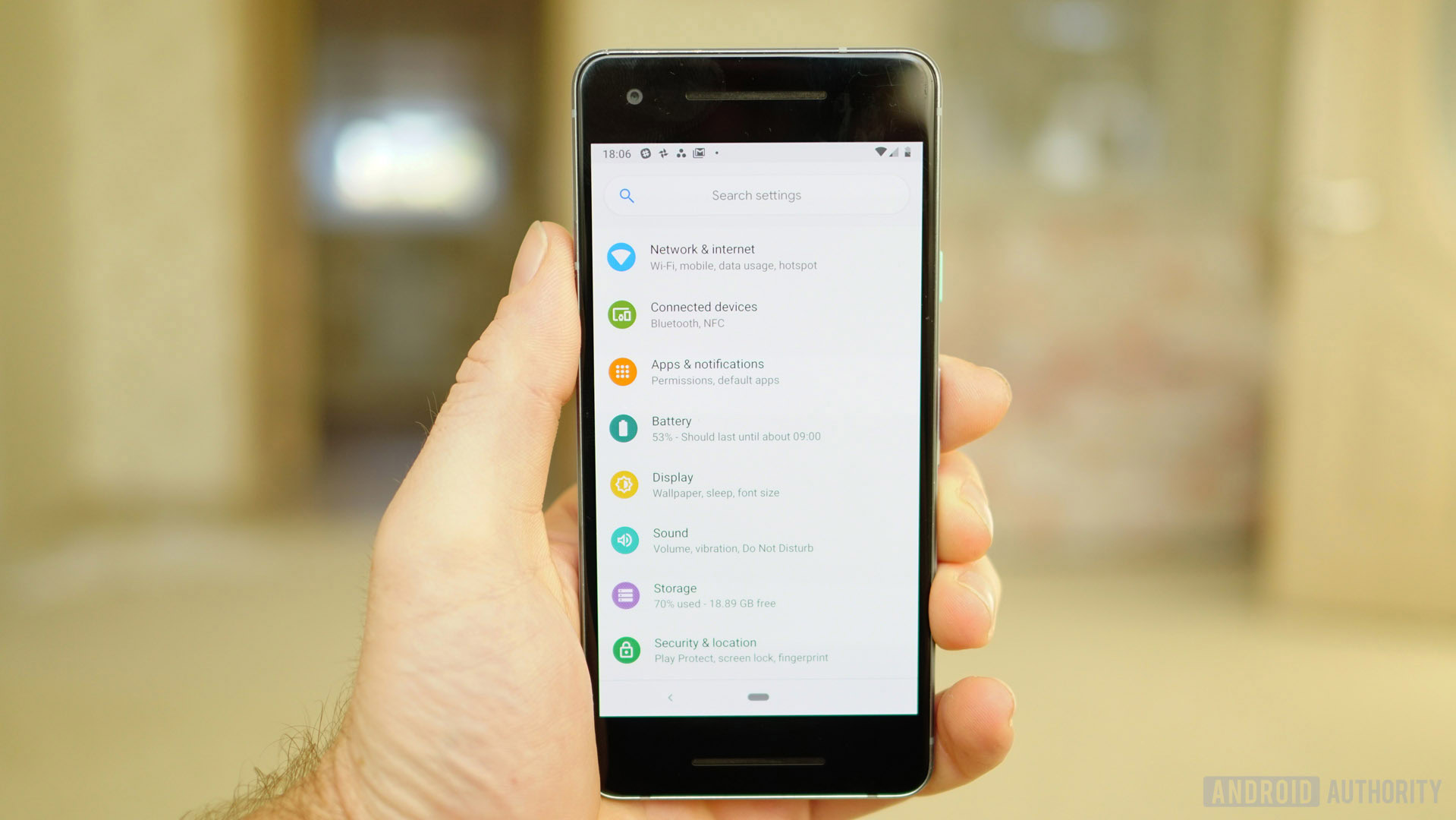
Settings
For once, the settings menu largely avoids what I typically refer to as Google DOCTRIN (Department of Change That Really Isn’t Necessary) and just gets a splash of color rather than a complete reshuffle. In keeping with other changes, the search bar at the very top of the Settings is now in a pill shape.
The colored icons in Android Pie’s settings menu is only skin deep though. As soon as you enter a sub-menu things generally revert back to the familiar black text on white ground with blue highlights (at least on the Pixel 2).
Android Pie doesn't quite get a system-wide dark mode, but it does have a dark theme for Quick Settings and the app drawer.
Dark theme (sort of)
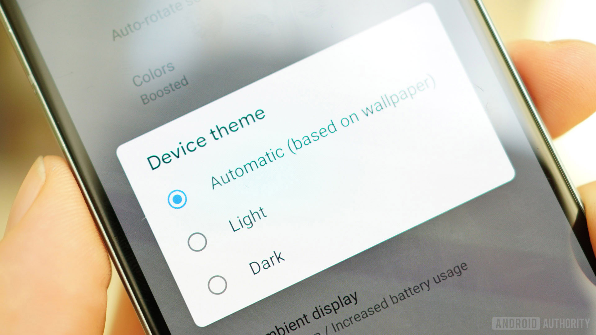
The Android team has long wanted to add a dark theme to the OS which is why we continually see it in various forms in developer previews. Unfortunately, every year it seems to fail Google’s internal testing for battery life and performance and so it is removed in the final version. Not so this year. While it’s not exactly a system-wide dark mode (the settings menu being the obvious exception), you can now choose whether you want a dark or light theme in your Display settings under Device theme. If you prefer the adaptive theme based on your wallpaper, you can also leave it as is.
Other visual changes
With Material Design’s new even-more-rounded corners, you’ll see a lot more of them in Pie and in Google’s apps in the months to come. Notification cards are no longer full-width as they are in Oreo, but are much more noticeably cards, complete with rounded corners. This is true both on the lock screen and in the notification shade.
There are new transition animations throughout Android 9 and new heads up notification animations as well. If you like animations you’ll enjoy them, but my standard advice is to enable developer options and turn Window animation scale and Transition animation scale to off. It won’t really make your phone any faster, but removing animations does make it feel snappier.
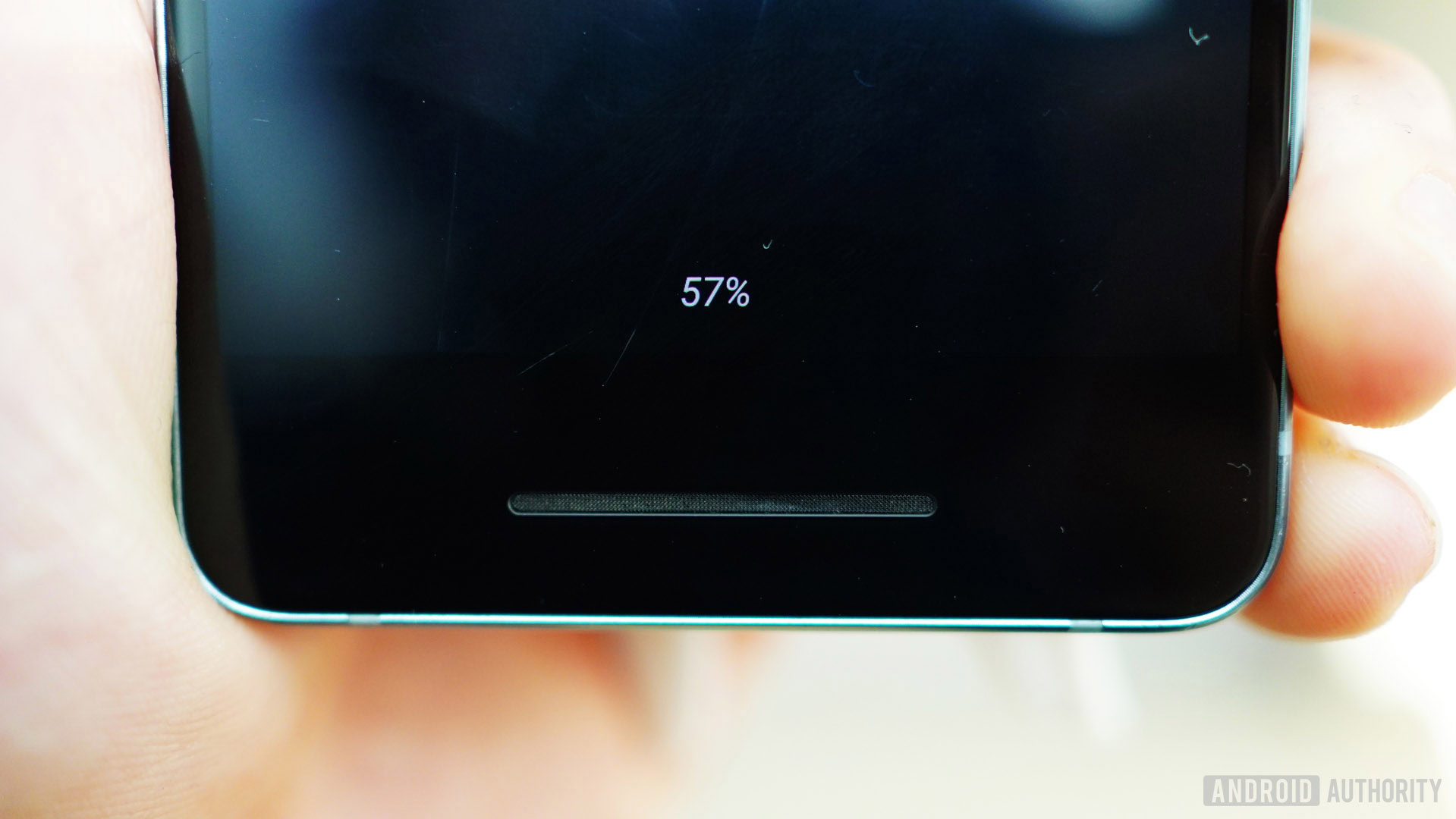
There’s now a battery percentage indicator at the bottom of the screen in Ambient Display, meaning you don’t have to waste battery by waking your phone to find out how much battery life you have remaining. You also get the weather displayed on Pie’s Ambient Display and centered notifications.
As you couldn’t possibly have missed unless you have been living under an internet-free rock these last few months, there’s new Android 9 Pie emoji. Fun fact: the Clock app icon actually shows the current time rather than being a static icon.
Android 9 Pie review: Functional changes
Volume
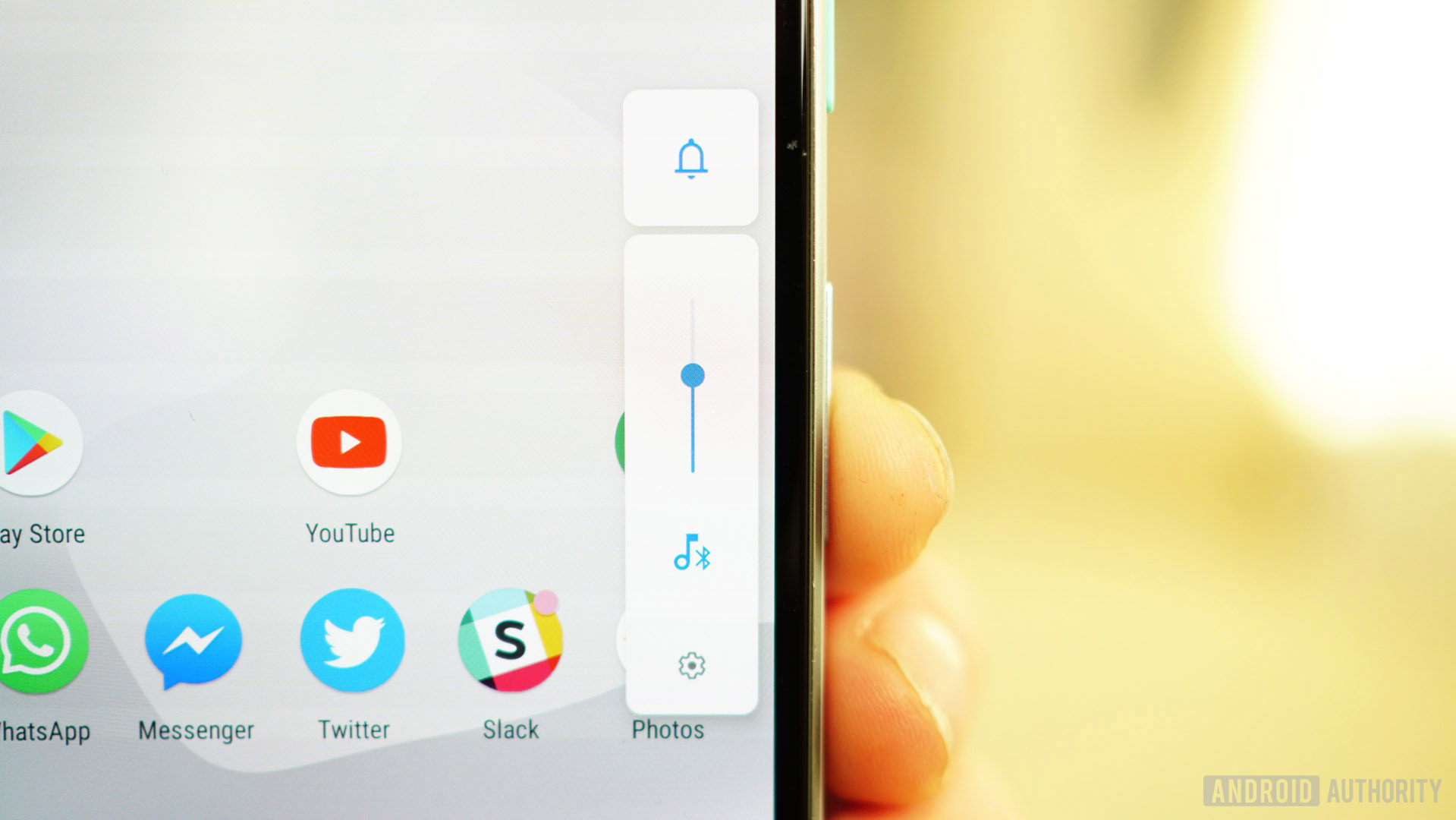
In Oreo, Google moved the power menu over near the physical power button. In Pie, it does the same to volume, putting it next to the volume button (except if you’ve got home screen rotation enabled, in which case it just appears on the right-hand side of the screen). By default, the volume buttons now adjust media volume rather than ringer volume.
There are two parts to the new look. The vertical slider is your media volume. It can be toggled on or off by tapping the musical note below it or adjusted by sliding or tapping the bar. It’ll switch to Bluetooth volume when you have wireless headphones connected and when you’re in a call the volume rocker changes in-call audio.
Pie moves the volume slider over near the volume buttons and adds shortcuts for vibrate, mute and sound.
The little box at the top is your ring volume. Tapping it cycles through on, vibrate only and off. You can also press volume up and power at the same time to instantly switch to vibrate only. If you hit your Sound settings you can change the button shortcut to mute (or disable it entirely). If you want to change the actual volume level rather than just toggle it, you’ll have to go to your sound settings via the cog icon at the very bottom. You can also adjust alarm and in-call volume here. The toggle for the optional charging sound when you plug your phone in is also found here.
Text selection magnifier
As in iOS, when you drag the text selection brackets left or right you’ll get a magnifier popup to better show you where you’re at in the text. I kind of wish it was a little less sensitive, as getting the right stopping point still doesn’t feel ideal. The popup is also not much of a magnification, essentially just getting the text out from under your finger rather than making it significantly larger. It’s a nice start but I think it could use further refinement. On a related note, if you, like me, were a big fan of the ability to add custom navigation bar buttons like move-one-space left or right, it’s still possible in Pie using an app called Custom Navigation Bar.
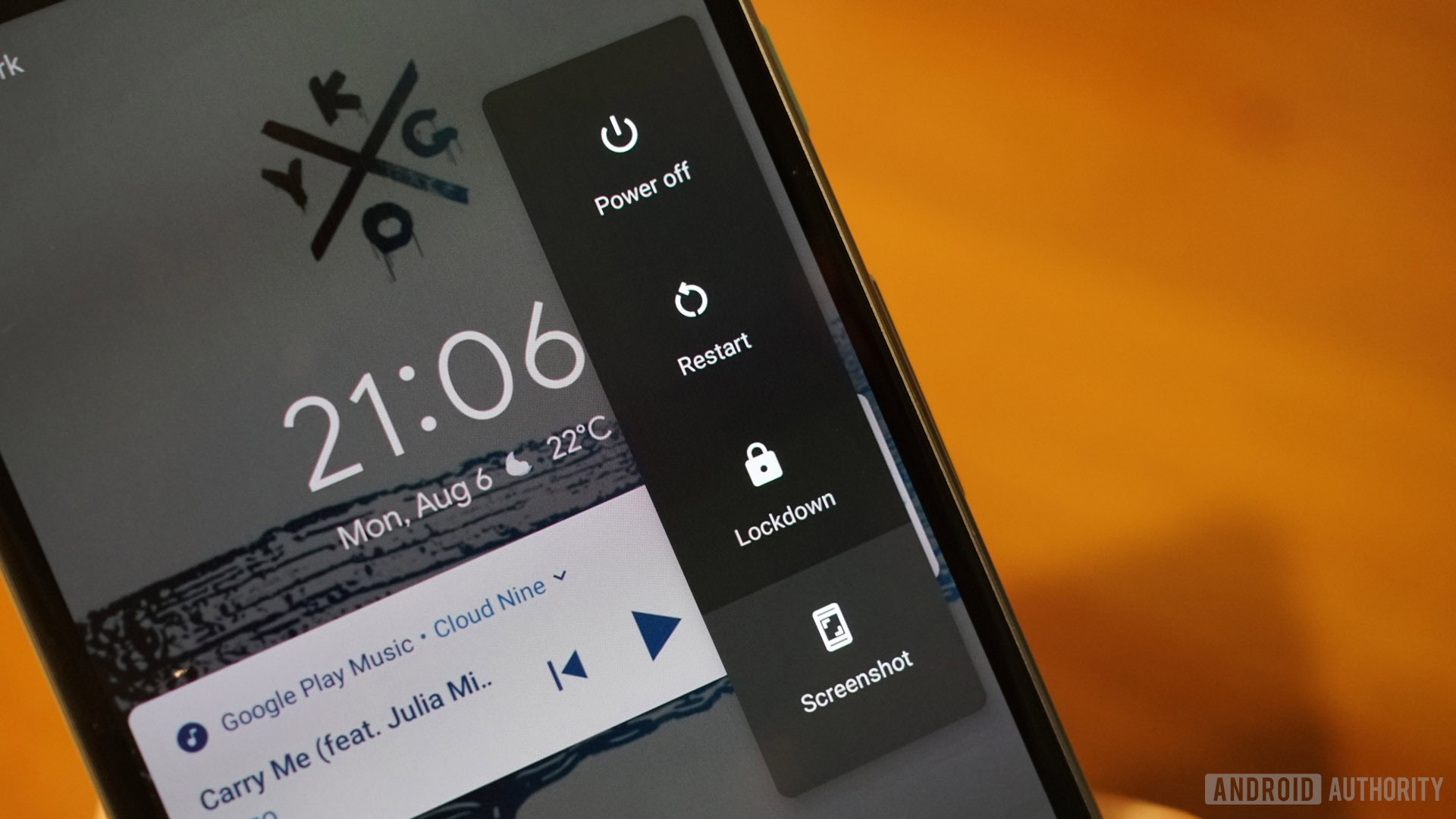
The power menu adds a screenshot button at long last and a new feature called Lockdown, which does what it sounds like.
Power menu
The power menu now has a screenshot option (the old power and volume down method still works though). It’s also worth noting there’s a new Lockdown option you can add to the power menu which will hide all notifications, block Smart Lock and disable the fingerprint scanner. You can find the toggle in your lock screen settings, but once enabled it’ll appear in the main UI as well. Side note: if your screen dims on its way to timeout, you can now bring it back to life simply by touching the fingerprint scanner.
Better security
For security reasons, idle apps in Pie can no longer access your camera, sensors or mic. If a background app does make a request you’ll see a notification alerting you to the fact. If it’s something you don’t approve of, you can deny access from the notification. MAC addresses are now randomized too, meaning it won’t be quite so easy to track your device across public access Wi-Fi.
Better screenshots
Sometimes the simplest changes make the most impact. In Android 9 Pie you can now edit a screenshot via the notifications shade, meaning if all you want to do is crop, circle something or highlight a section, you can now do so without requiring a third-party editing app.
Adaptive brightness
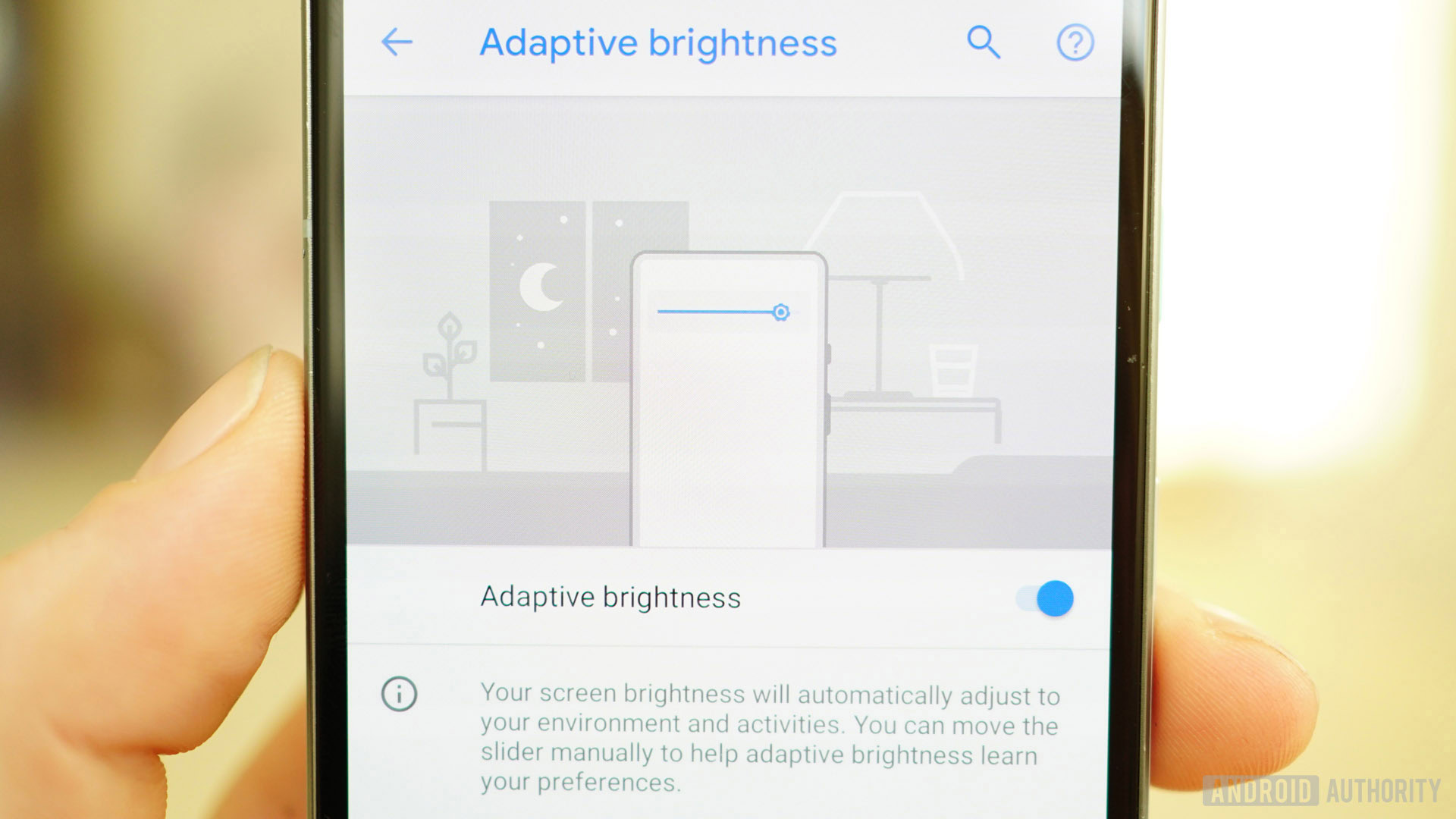
Android Pie introduces Adaptive Brightness, which shouldn’t be confused with the old adaptive brightness because now it’s got AI. Once enabled, Adaptive Brightness will automatically adjust to the ambiance of your situation as it always has, but it will also learn how you modify brightness in those conditions. So if you always tend to drop your screen brightness a bit further when you turn off the lights, Pie will soon learn that behavior and do it for you.
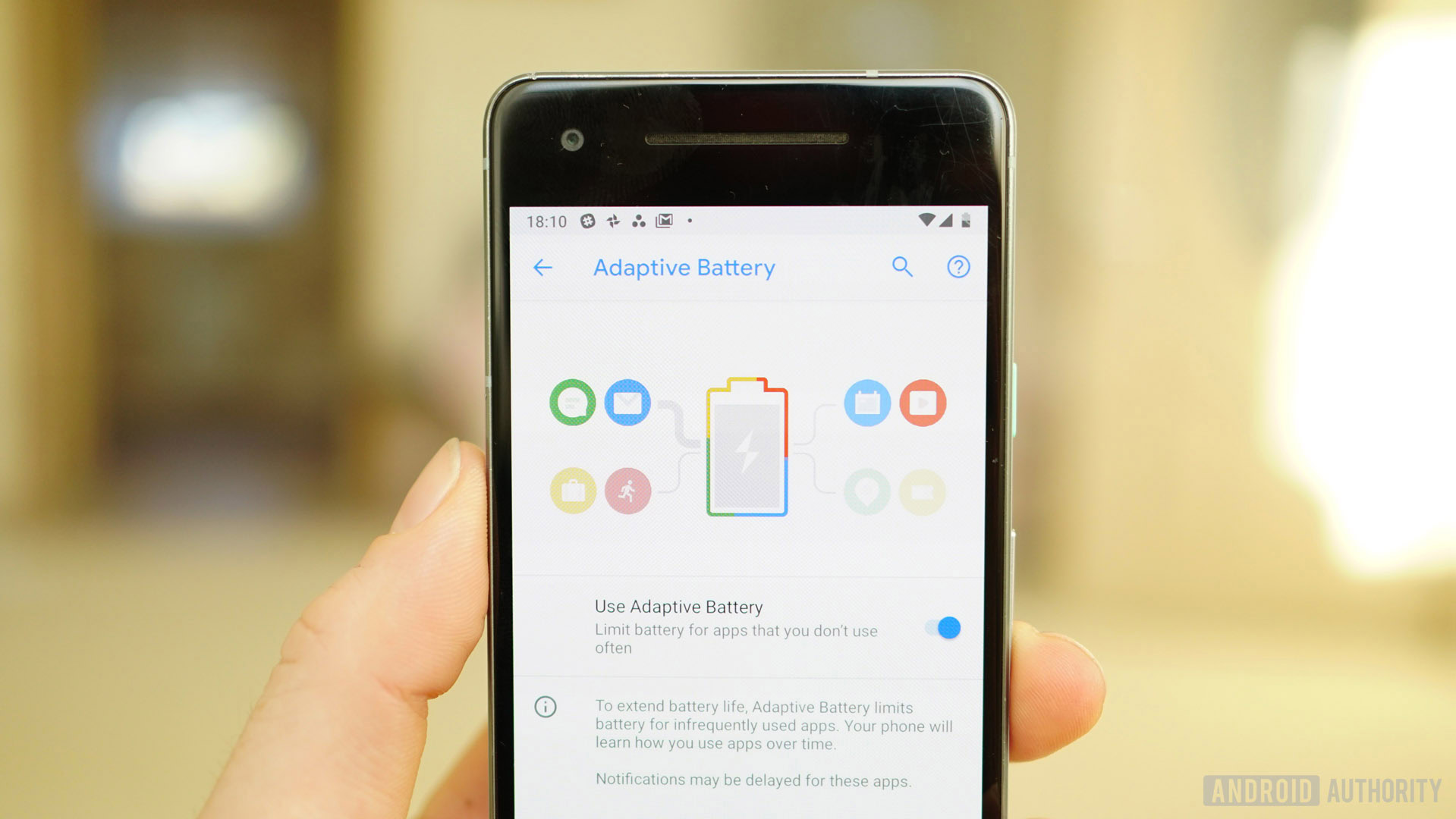
AI takes center stage in both battery and brightness, learning how you use your device and adapting to your preferences.
Adaptive battery
AI also enters the battery arena, prioritizing battery power for the apps and services you use most. Apps and services you use infrequently will have their resources limited to extend your phone’s battery life. It should be noted that this may result in delayed notifications from those apps, so be warned.
App Actions
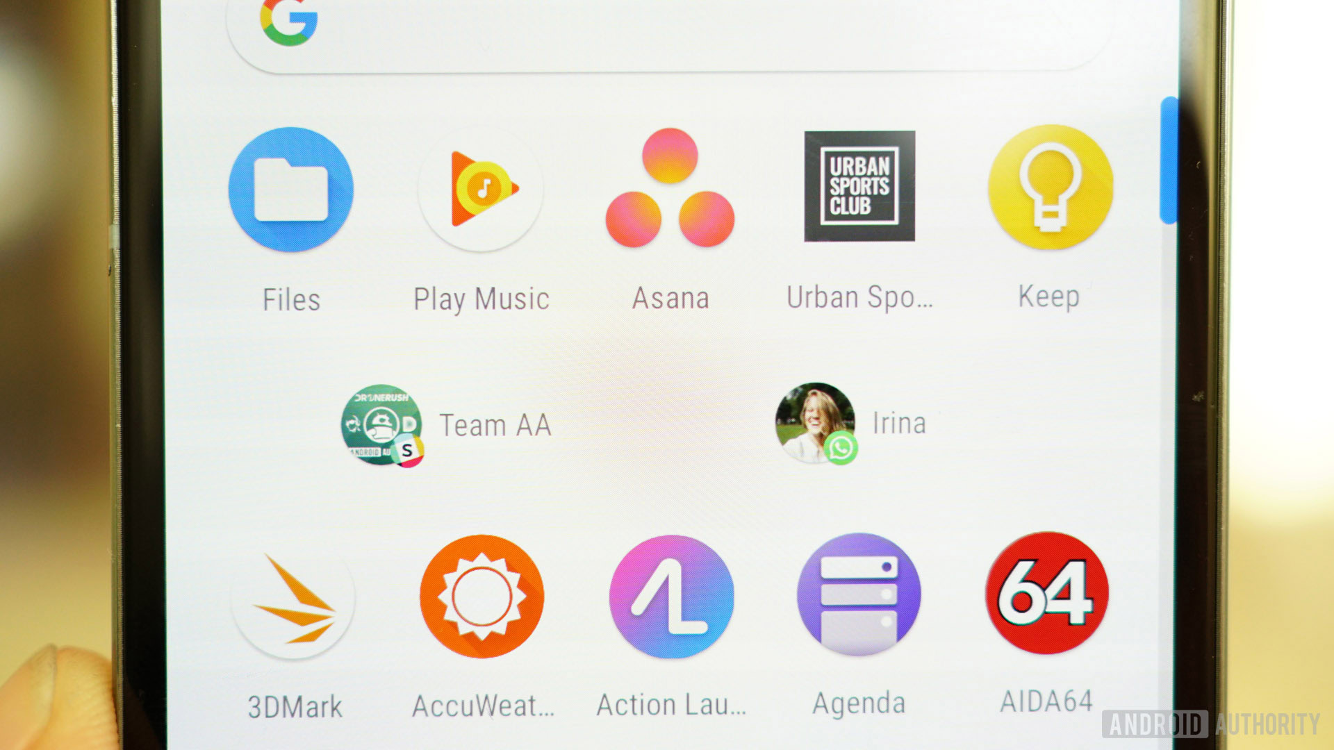
Following on with this year’s impulse to AI all the things, Android 9 uses AI to pre-empt what it thinks you’re likely to do in an app – depending on the time of day, where you are, what you’re doing and what you ate for breakfast – and highlight it in the app drawer just underneath the AI-curated app suggestions. For me, I’m primarily recommended to message the Android Authority team in Slack or my wife in WhatsApp, two things I basically do every second I’m awake. So far so good, robots.
App Actions suggest the things Google's AI thinks you'll want to do - and it's not bad.
App Actions are actually pretty cool: if you call your kids every day after school it’ll prompt the call at the right time; when you connect a pair of headphones it’ll switch to actions within your music player app of choice; get in the car and it’ll suggest navigation via Maps, and so on. App Actions also play into smart text selection, so if you highlight a band’s name, you’ll see listening options for your music apps as well as the usual options like copy and share.
If you don’t like the idea of AI learning all about your habits, you can disable Actions in the Home screen settings menu under Suggestions > Actions. If you do choose to use them, Actions can be dragged and dropped onto the home screen and will also appear in Google Assistant.
App Slices
App Slices aren’t ready for prime time yet, meaning they’ll likely debut on the Pixel 3. Slices are basically snippets of app UIs that developers can hand over to Google to have surfaced in places like search. The classic example is if you type Lyft into search, Pie will surface information and shortcuts from within the app like hailing a driver for a particular destination or showing how far away the nearest car is.
Search is only the first stage of Slices’ life, with Google Assistant integration coming eventually too. Like rich snippets on the web, Google is essentially prioritizing the user experience here at the cost of time-on-site or time-in-app. For example, if a cinema app allows Slices access to live screening times there might not be any need to launch the app at all. While some developers might want to avoid Slices for this reason, there’s no denying the feature will play an increasingly large part in Pie and future OS versions.
Anyone that took the time to learn Do Not Disturb's three-part system will feel restricted by Pie's default setup.
Do Not Disturb
Do Not Disturb mode has been modified in Android 9. The fairly complicated three-part system (total silence, alarms only and priority mode) has been condensed into a single Do Not Disturb mode in Pie. It is customizable though, so you can add exceptions, adjust notification handling, remove visual disturbances when the screen is off and so on. For a mainstream user it’ll be easier and more coherent, but for anyone that took the time to get to know the old three-part system it will no doubt seem restrictive.
Notifications
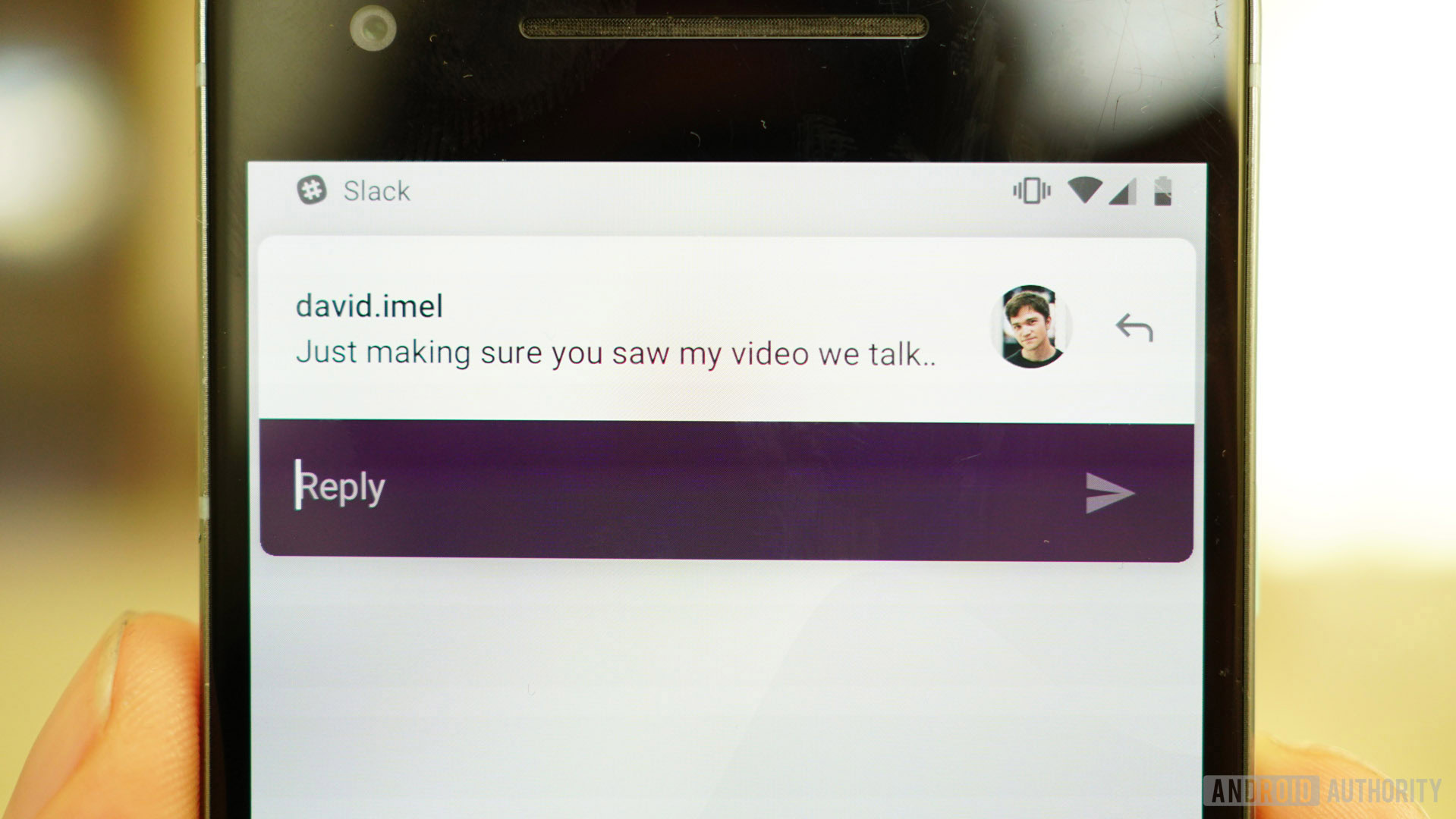
Notifications have received some slight changes in Android 9. There’s a new Manage notifications shortcut at the bottom of the cards in the notification shade, and if you constantly swipe away a particular type of notification Pie will ask if you want to stop showing them. If you tend to get a little swipe happy and forget what notification you blindly dismissed, or suffer from spammy notifications you want to block, Pie has your back. You can now see a user-facing list of recent notification activity at the bottom of your Notifications settings. If it’s something annoying you can flip the toggle right there to disable them in future.
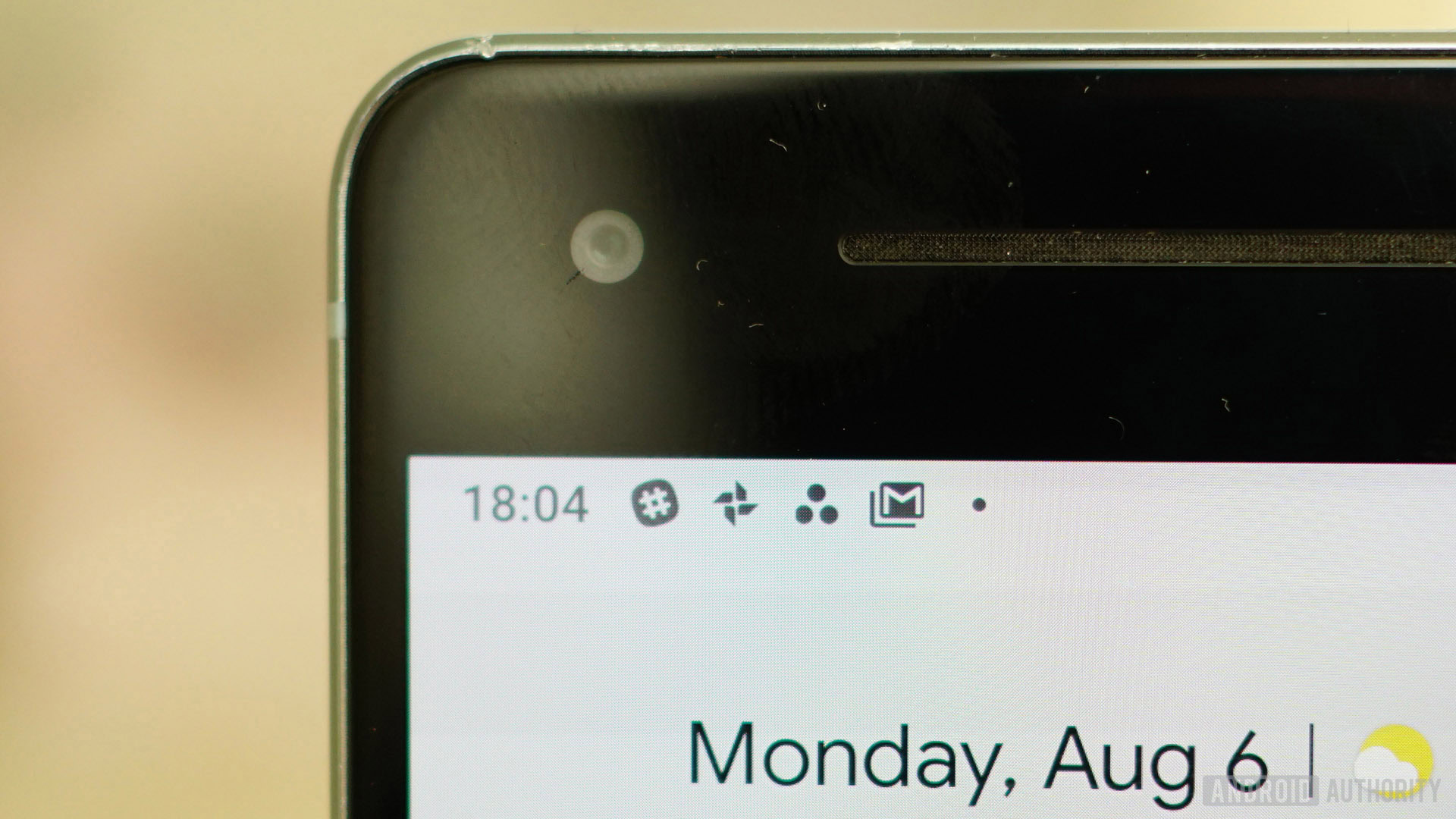
Thanks to the accursed notch, you’ll only see four notification icons in the status bar before the list is truncated with a dot to indicate more unseen icons. As much as I suffer from notification anxiety, I still preferred being able to see which apps my notifications are from without having to commit to engaging with them by swiping down the shade. Accommodating a non-existent notch on the home screen in landscape mode is also ridonculous. Android should be smart enough to know if the device on which it is being used has a notch, or whether the screen has been rotated.
Persistent Android System and System UI notifications can now be disabled in their respective notification channels. Before you take the nuclear option and disable all of these just take a moment to think why you’re being shown them in the first place. They may be annoying when they clog up your notification shade but they are kind of important.
Other functional changes
Bottom nav is coming, including both bottom navigation in your favorite Google apps or bottom app bar menus. The rise of the notch and larger phones overall have meant that in-app navigation bars and app bar menus have migrated south, closer to your thumbs. It’ll take a while, but sooner or later most essential items in apps are going to be sitting just above the navigation button.
Battery Saver mode no longer turns your phone that horrendous shade of orange, simply providing a notification that the mode is enabled and a discrete + symbol inside the battery icon in the status bar. If Battery Saver is turned on and you only partially charge your phone, it will remain on if the battery percentage when you unplug your phone is still below the Battery Saver threshold you set in your battery settings. Side note: If you forget to turn your hotspot off, Android Pie will automatically disable it after a while if no devices are connected.
The text selection menu has been improved in Pie, taking web search and translate out of the overflow menu and onto the main menu. When App Actions appear in the menu, you’ll still have to deal with the overflow menu, but at least it won’t be every time you want to know what a Flügelspiegel is.
Android Pie’s Location settings have also been streamlined, but, like the simplification of Do Not Disturb mode, not necessarily in ways that you’ll like. Case in point: there is no longer a setting for battery saving mode in the location settings. Your options are now quite limited, either allow everything, disable location entirely or turn off Improve location accuracy, which means instead of using cellular, Wi-Fi and sensors you’ll only be using GPS, which will drain your battery very quickly. Opting in to any of these will grant Google permission to periodically collect your location data.
Digital Wellbeing
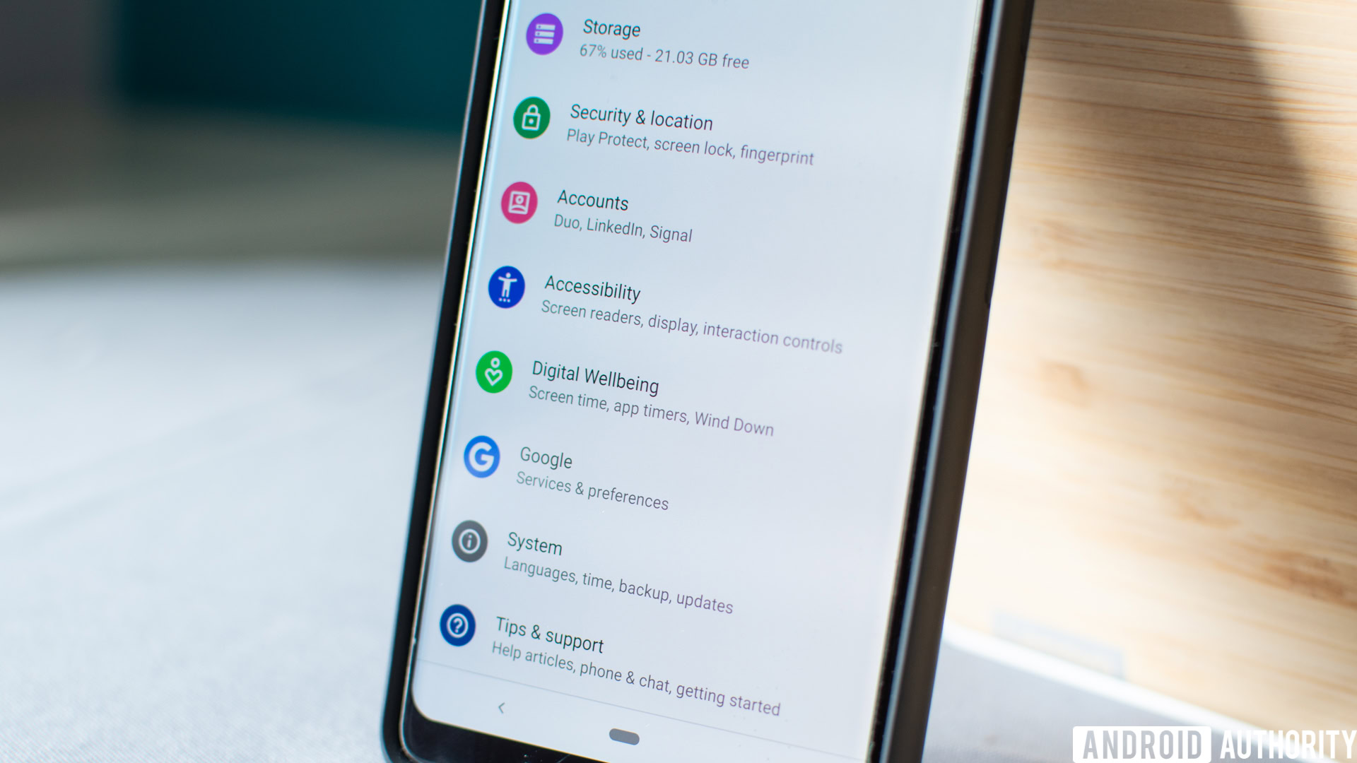
Google, like Apple, is making a big deal right now about helping you manage your screen time. While Google wants and needs you on your phone as much as possible to keep those ad dollars rolling in, introducing something that helps you wean yourself off it is admirable. Skeptics might assume it’s a decision made to avoid looking bad when Apple does it, but whatevs. According to its research, Google claims 70 percent of respondents admitted they’d like help using their phones less.
Digital Wellbeing is now available for Pixel 3 phones with Android Pie and is also available on all Android One-based phones with the Pie update installed.
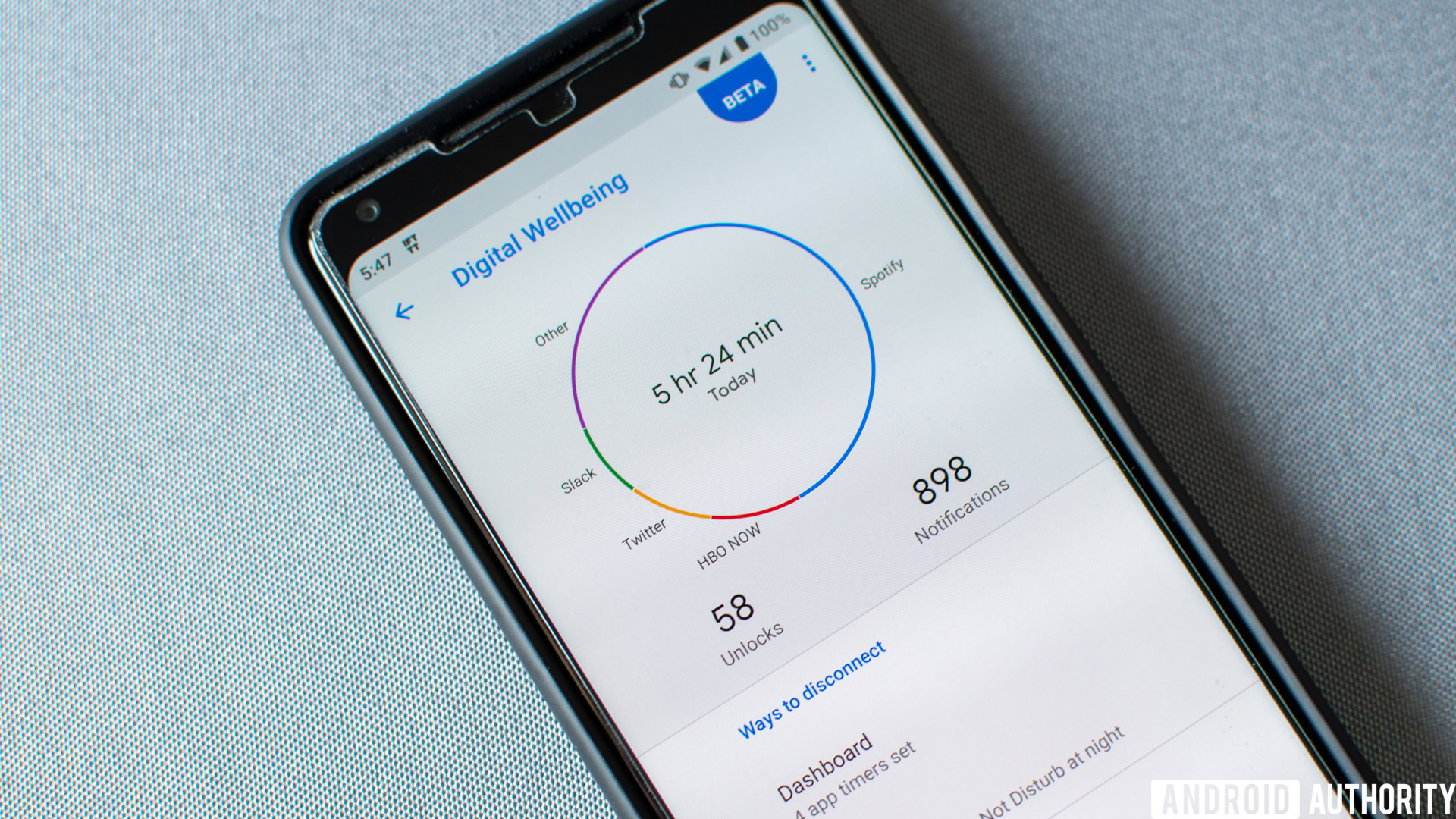
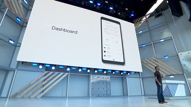
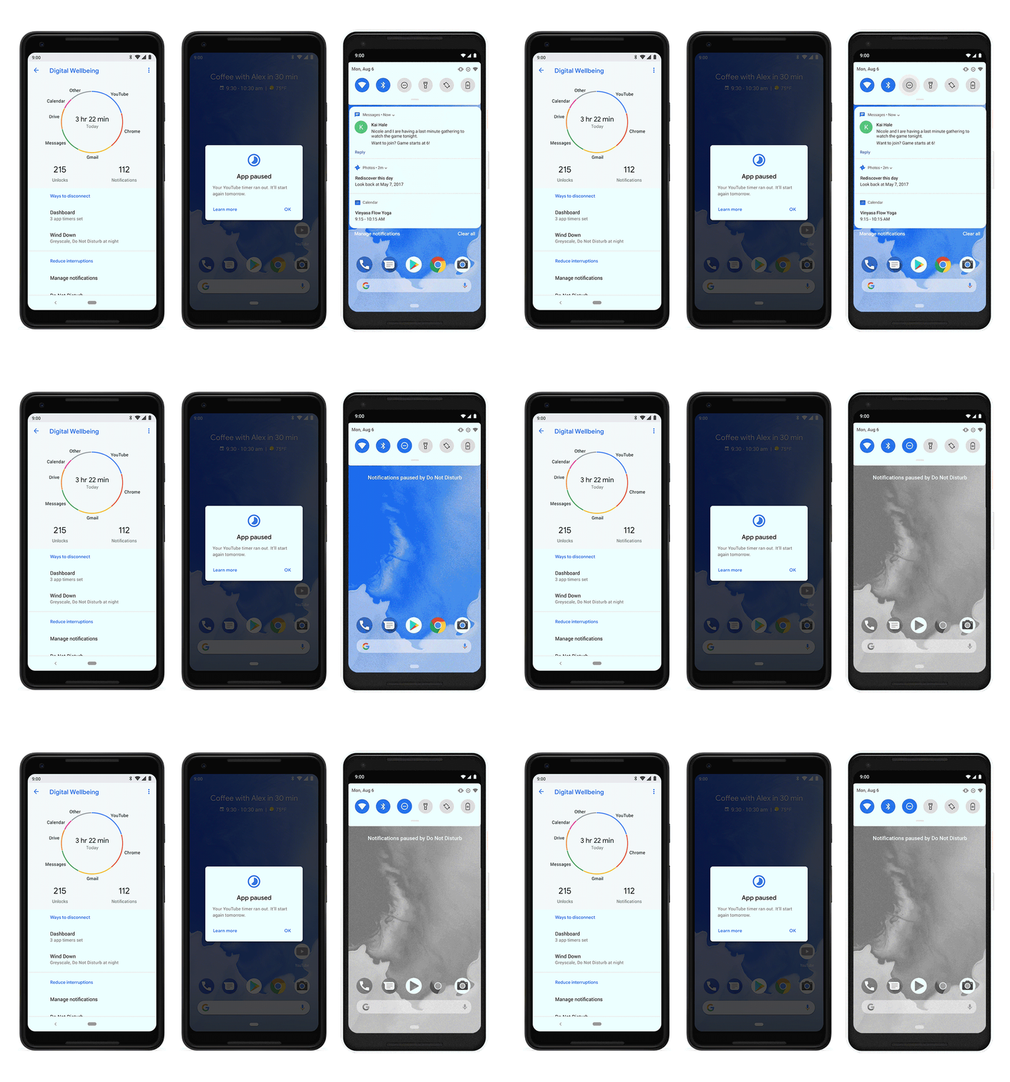
The primary functions of Digital Wellbeing are a Dashboard which gives you an overview of your device usage: how many notifications you’ve received, how often you’ve unlocked your device and how much time you’ve spent in various apps.
The Digital Wellbeing Dashboard shows you how many notifications you've received, how often you've unlocked your device and how much time you've spent in various apps.
Following that, App Timer lets you set time limits for particularly addictive apps, with the app icon being grayed out once your time is up. If you know you have an unhealthy addiction to Instagram, Android Pie can help keep your impulses in check, assuming you opt in of course. As with most things, the first step to recovery is admitting you need help.
A new mode called Wind Down will slowly limit your device’s activity according to a schedule you set. So as you get closer bedtime it’ll turn on night mode, limit interruptions via Do Not Disturb and eventually fade the screen to grayscale to remind you it’s time to hit the hay.
While these additions are certainly positive, it’ll be interesting to see how many folks actually volunteer to limit their phone usage and how many stick with it over time. I can absolutely see a lot of us turning things off in irritation when we’re in the midst of a 2am YouTube binge and our screen suddenly turns monochrome.
Wrap up
Android Pie continues the push first made abundantly clear in Oreo: Google has taken Android mainstream. Where Oreo put a clean table cloth on the Android foundation we all know and love, Pie is starting to clear away some of the clutter. In a few places, Pie even starts down the slippery slope of removing choice in favor of a single “simple” solution. Whether it’s handing the reins to AI or simply accepting the settings Google thinks is best, Pie feels the least “Androidy” of all recent releases.
For the majority of mainstream users – the next billion Google is obviously courting – a less complex Android will likely be seen as a good thing. Android has a reputation for being the tech savvy person’s OS, something that scares off a lot of the smartphone buying public. First Oreo and now Pie have been designed to rehabilitate that reputation. Pie makes the Pixel line every bit as approachable as the iPhone, even if Google’s primary focus is propagating its software and services rather than shipping hardware. But to those that have long loved Android’s exhaustive customization and freedom, Android 9 might feel a little hollow, at least in the form Google has released it. For those feeling a little disillusioned, other Android manufacturers will become an increasingly important factor in giving Android Pie enough spice to give it the flavor they crave.
Android is becoming more user-friendly, more intelligent, more clean and simple, and increasingly melting into the background.
Philosophical qualms aside, there is a lot of great stuff going on in Android 9 Pie, and I have to say I feel slightly guilty for enjoying it as much as I do while starting to realize what’s being lost along the way. As Android becomes more user-friendly, more intelligent, more clean and simple, it’ll increasingly melt into the background and become something that “just works.”
AI and machine learning will continue to make more and more decisions for us, but even if they’re totally accurate and appropriate, it’ll be hard to shake the feeling that something central to Android’s history has fallen by the wayside. As Android 9 Pie closes the gap and brings us one step closer to a seamless, polished, intuitive and fully automatic future, just know that if that thought fills you with equal parts excitement and longing for the good old days, you’re not alone.
In the meantime, our podcast team sat down for a quick overview of the update. Here’s what they think.
Let us know when you expect to get Android Pie in the comments and what you think of what you’ve seen so far.
Thank you for being part of our community. Read our Comment Policy before posting.