Affiliate links on Android Authority may earn us a commission. Learn more.
Hands-on: HMD Global's mid-range finds something for everyone
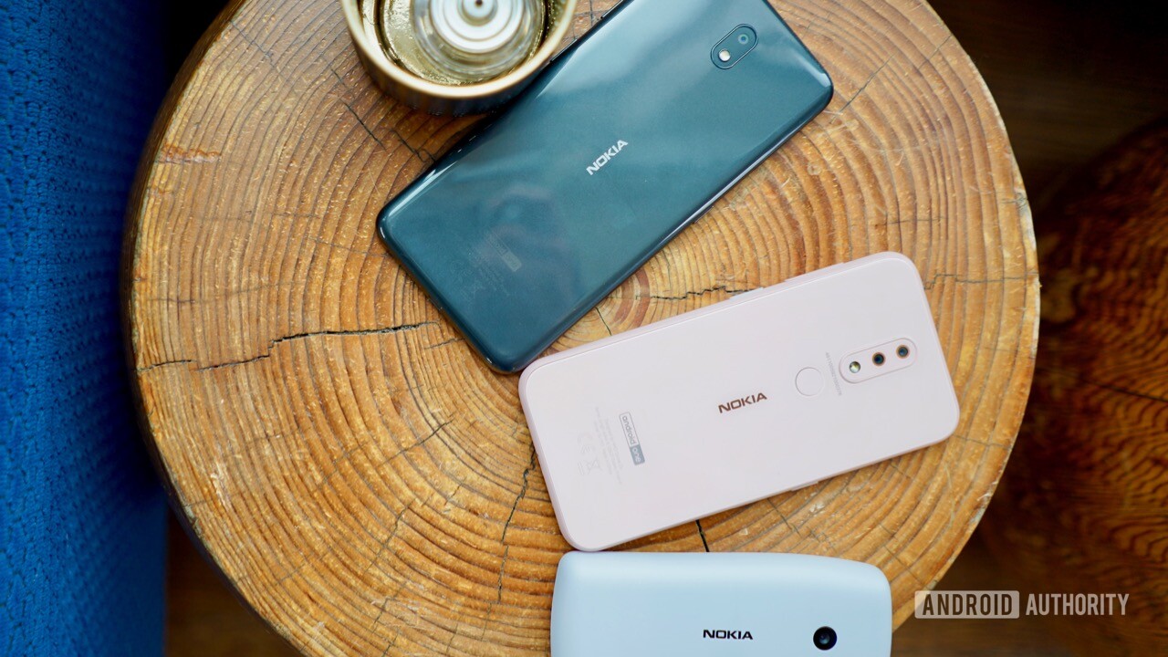
In addition to the attractive Nokia 9 flagship, HMD Global today announced four other phones — the Nokia 4.2, Nokia 3.2, Nokia 1 Plus, and Nokia 210. These span price points from 30 euros (~$34) to 169 euros (~$190) and are meant to fill out HMD Global’s mid-range and entry-level portfolios. Let’s take a look in our Nokia hands-on article.
Nokia 4.2, Nokia 3.2, Nokia 1 Plus, and Nokia 210 – Everything you need to know
Nokia 4.2 and 3.2
HMD developed these phones as a pair, even though they are wholly different. The phones have unique hardware, but they share some core features.
For starters, both the Nokia 4.2 and Nokia 3.2 have dedicated buttons for Google Assistant. More than a simple push button, the key can handle three distinct operations. A single click opens Google Assistant, a double click opens Google Assistant with the owner’s news feed, and press-and-hold keeps Assistant in an active listening mode so owners can hold an ongoing, interactive conversation.
Moreover, Google Translate is built in with support for 30 languages across 80 countries. HMD hopes this will help facilitate conversations between those who might not ordinarily be able to communicate.
Last of the shared features includes an AI-assisted face unlock feature. It is protected from spoofing, says HMD Global, and all the processing is done on the device. That means faster operation. All good stuff.
HMD Global calls the Nokia 4.2 an “affordable flagship” device. The 4.2’s aim is to do everything a flagship can do at a much lower price point. It’s a new series for HMD Global.
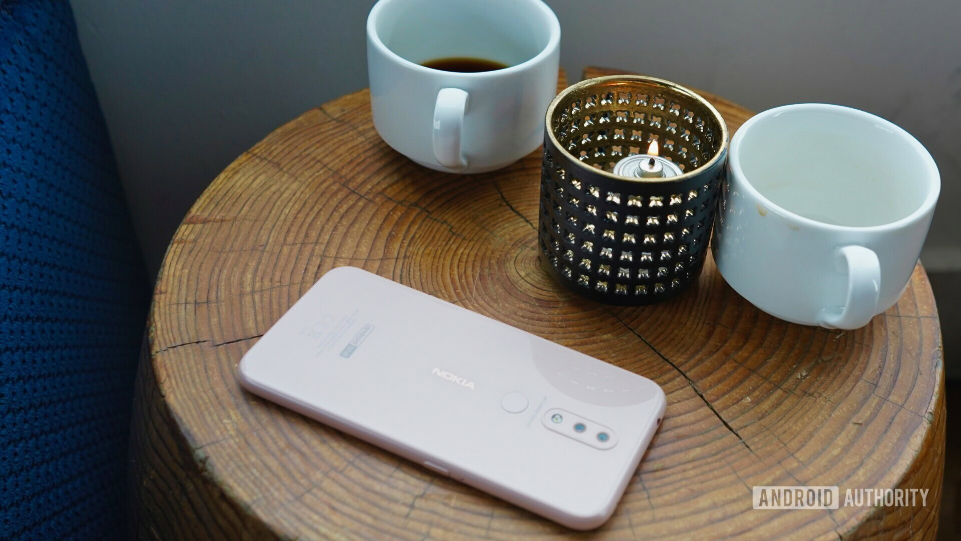
The 4.2 has a polycarbonate frame. It’s rounded and strong. HMD says 2.5D glass is on front and back. The result is a smooth device with a seamless feel. There are no hard edges to catch or pinch your skin. The materials are impressive. I noticed some uneven aspects to the fit-and-finish, but HMD says the devices we saw were early prototypes and not necessarily representative of what consumers will see when the Nokia 4.2 goes on sale later this month. It’ll come in pink sand or black.
The phone has a 5.71-inch HD+ display with a teardrop notch. It’s an IPS LCD screen and has an 18:9 aspect ratio like most other modern phones. I thought the display looked pretty good in the few minutes we spent with it. Glare was pretty bad when I took it outside for a few moments, and it’s possible there is no oleophobic coating.
Thanks in part to the screen size, the phone’s footprint is really manageable. The Nokia 4.2 fit comfortably in my hands. The screen is a bit small for my tastes, but it may be perfect for others. I barely noticed the teardrop notch at the top of the screen.
A fairly standard set of buttons are built into the polycarbonate frame. The screen lock button and volume toggle are on the right edge. The buttons were a little mushy. You’ll also find a USB-C port and a 3.5mm headphone jack. It’s the little things, right?
The rear glass panel surprised me a bit for a phone at this price point. I expected it to be plastic. It has a really nice sheen and gives the phone a much-needed boost in sex appeal. I’m glad to see a fingerprint reader on the back. This is a must-have feature at any price point as far as I am concerned.
The Nokia 4.2 features a two-camera array, positioned above the fingerprint reader. The main sensor captures 13MP images in full color, while the secondary sensor captures 2MP depth and contrast images. The Nokia 4.2 supports bokeh, a depth editor, and color pop. The user-facing camera rates 8MP. HMD didn’t call out any particularly interesting photo features for the selfie camera. I’m glad to see the two-camera bokeh set up on this accruable phone. This may not be a must-have feature, but it is a nice-to-have feature.
The phone runs Android 9 Pie. It is powered by a Snapdragon 439 processor and comes in two configurations: 2GB memory and 16GB storage, or 3GB memory and 32GB storage. A 3,000mAh battery is embedded in the chassis, as is NFC.
The Nokia 4.2 will cost 169 euros (~$169) when it goes on sale. The phone delivers a lot of value for the dollar.
The Nokia 3.2 is bigger and cheaper refresh to last year’s phone. It carries over many of the Nokia 4.2’s basic internal features, though the design is noticeably its own. The 3.2 has a 2.5D glass front, a rounded polycarbonate frame, and a high-gloss polished polycarbonate rear panel. It looks like glass, but is actually plastic. This isn’t the worst thing. The phone feels crazy strong, which I dig. It doesn’t convey the same feel of luxury that glass phones often do, but the result is a phone that likely won’t break when dropped.
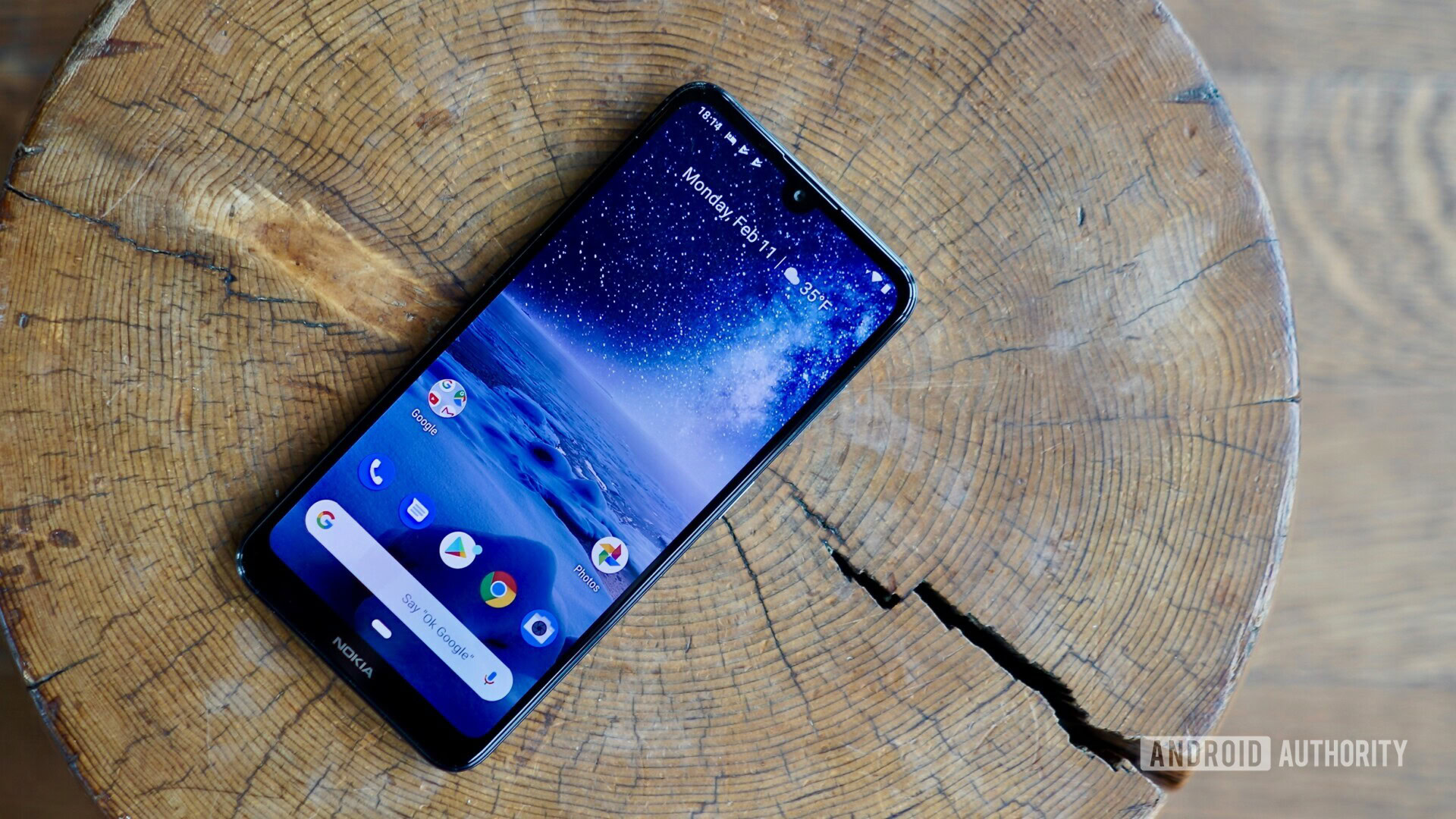
The Nokia 3.2 has a 6.26-inch HD+ display with the 18:9 aspect ratio. Like the smaller Nokia 4.2, it has a teardrop notch in the display that I didn’t find intrusive. (HMD Global calls it a “selfie notch.”) The display looked pretty good, but it didn’t knock my socks off. Like the Nokia 4.2, it is an LCD panel, rather than OLED. The colors looked accurate, though the viewing angles weren’t great. There’s no fingerprint reader on the back, but the Nokia 3.2 supports face unlock.
My favorite feature of this phone is the notification light. Notification lights are most frequently located in the upper corner on the front a phone. If you place the phone face down, you can’t see the notification light. HMD had a stroke of genius and put the notification light in the power button on the side. This means you can see the notifications blink-blink-blink no matter how the phone is positioned on a flat surface. Innovation!
The rear panel is rather barren. It’s made of nondescript polycarbonate with a small camera module near the top. The main camera has a 13MP sensor and the front camera has a 5MP sensor. HMD didn’t call out any interesting camera features and the camera app looked fairly basic.
The Nokia 3.2 is powered by a Snapdragon 429 processor, which is a slight step down from the Nokia 4.2’s Snapdragon 439. The 3.2 comes in two configurations: 2GB memory and 16GB storage, and 3GB memory and 32GB of storage. The phone has a 4,000mAh battery — 33 percent larger than the Nokia 9 PureView flagship! — and boasts two-day battery life. Multi-day use is one thing HMD Global targeted when developing this phone.
The Nokia 3.2 will come in a steely gray or black for 129 euros (~$145). Availability timing and markets have yet to be provided.
Nokia 1 Plus
Google’s Android Go platform is important, particularly for emerging markets where phones are sometimes a luxury. Last year, HMD Global showed off the Nokia 1, a simple Android Go phone for emerging markets. This year, it improved upon the original in many ways.
The Nokia 1 Plus has a brand new exterior. The phone was designed with durability, flexibility, and color firmly in mind . The outer shell, which covers the rear panel and side edges of the phone, has a 3D nano-texture that feels a bit like fabric. HMD Global insists the material is polycarbonate and yet you could mistake it for tweed. The shell will come in red, blue, and black. HMD said the back covers are swappable, but it stopped short of saying it will create any sort of ecosystem of interchangeable shells for the Nokia 1 Plus. I definitely like the texture.
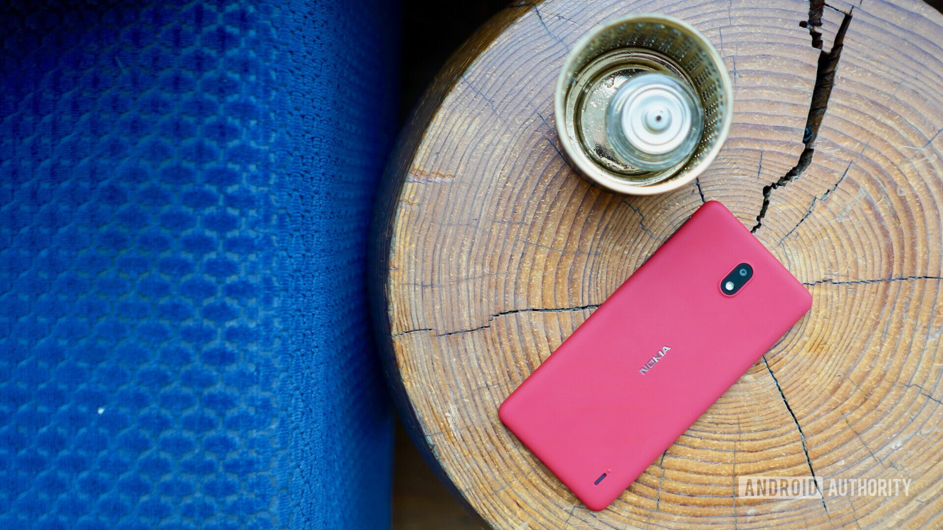
A 5.45-inch display, which is 0.95 inches bigger than last year’s Nokia 1, adorns the front. The screen has an FWVGA+ resolution and an 18:9 aspect ratio for that modern look. Again, we’re talking an LCD screen here, but the display impressed me for a phone at this price (despite the fingerprints). The smaller screen means the entire footprint of the phone is manageable. It’s really compact compared to many of today’s giganto-phones. There are many reasons to appreciate the tight profile (it’s only 8.55mm thick, according to HMD Global). The Nokia 1 Plus is an ideal size for many.
As with all the other phones in HMD’s MWC portfolio, the screen lock button and volume toggle are on the right edge. Both are easy to find and reach. I had no trouble using them. I like how the glossy finish of the buttons counters the rough texture of the shell itself. This helps the buttons stand out when searching by feel. Annoyingly, the Nokia 1 Plus sticks with Micro-USB rather than USB-C. At least a 3.5mm headphone jack is on top.
The rear is fairly plain. The phone has a slightly blocky shape to it and the only feature that appears on the rear panel is the camera module. There’s an 8MP camera on the back with an LED flash, and a 5MP camera on front. HMD says the Nokia 1 supports “portrait selfies” but we’re not entirely sure what that means in this context. The camera app is nearly identical to those of the Nokia 3.2 and 4.2.
Looking at the rest of the specs, the Nokia 1 Plus is definitely a low-cost phone. You’ve got a MediaTek MT6739 processor with 1GB of memory and either 8GB or 16GB of storage. A 2,500mAh battery provides at least a day of battery life, said HMD. Those low numbers are to be expected for an Android Go phone, where cost is the primary feature.
Speaking of which, the phone runs Android 9 Pie Go Edition with Android Go apps. HMD insists the apps have been crunched down to the smallest possible size and take up far less storage on the phone than the full size versions.
Pricing is 89 euros (~$100) for the 1GB version an 99 euros (~$111) for the 2GB version. The Nokia 1 Plus will mainly target emerging markets and prepaid carriers.
Nokia 210
We can’t talk Nokia without talking candy bar-style feature phones. This year, HMD is offering up the Nokia 210, a super affordable bar-style phone for emerging markets and the world’s youngest phone users.
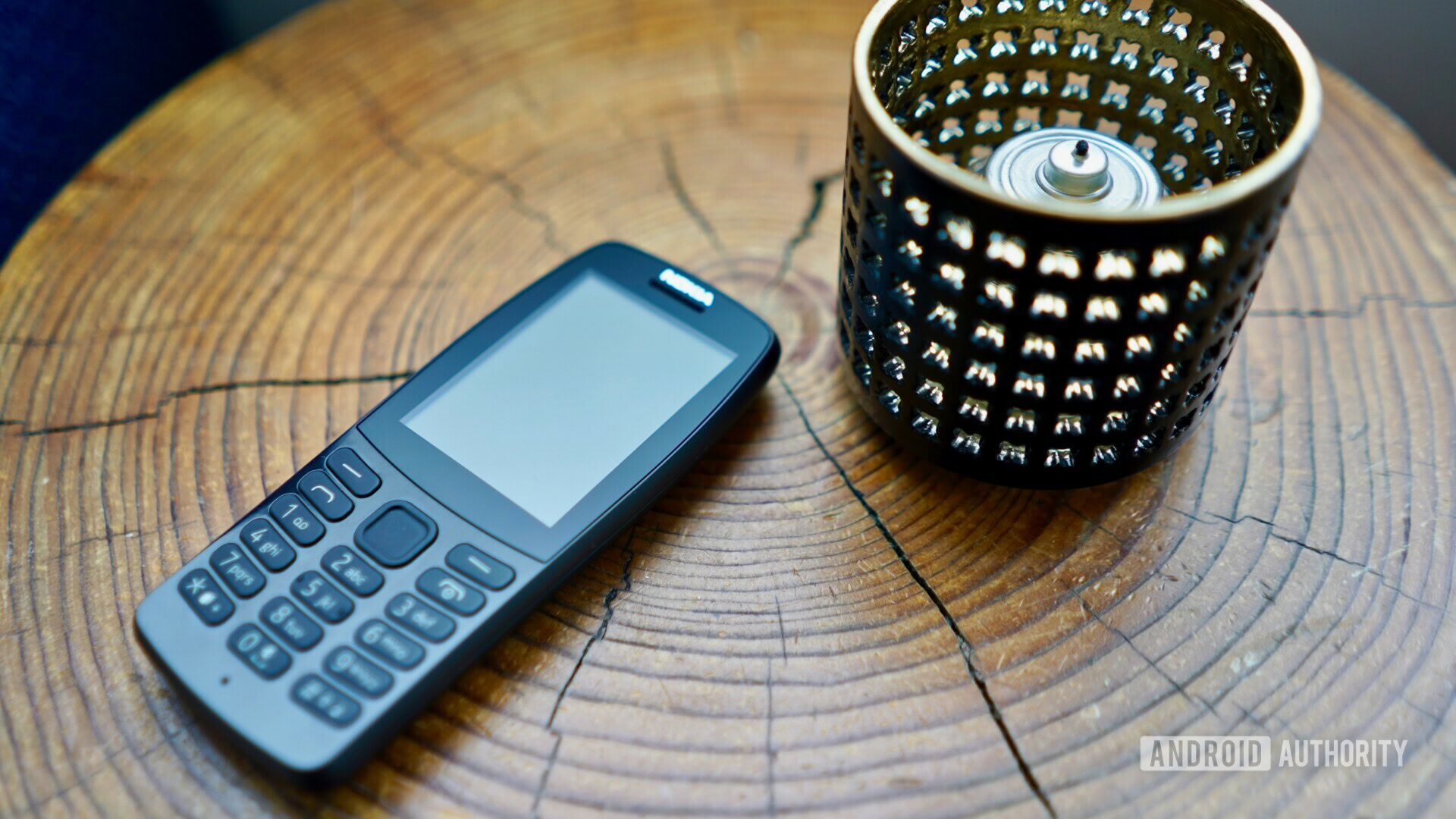
The 210 has a 2.4-inch display, a VGA camera, and numeric dialpad. The whole thing is made of toughened plastic. It feels like a tank. Seriously, you could make a slapshot from your local hockey rink and score some sick goals with this rugged little killer. I’m glad it is lightweight. I had no trouble finding and using the dialpad. You’ve got a T9 setup as far as the numbers are concerned. After spending the last decade tapping on glass, getting use to physical buttons almost feel like a novelty. A d-pad just below the screen lets you move the cursor around on the display, and you’ve got some dedicated function buttons, and send/end buttons to either side. Quality is solid, though there’s no masking that this is a really low-cost device.
The Nokia 210 runs a proprietary operating system based on Java. HMD says it includes access to a browser via Opera Mini, and social networks via Facebook and Twitter apps. Content beyond games from Gameloft and wallpapers will be somewhat limited. Yes, Snake is on board.
The Nokia 210 has a 1,020mAh battery, an FM radio, 16GB of storage, and runs on 2G networks only. It will cost 30 euros (~$34).
Thoughts on these new phones from Nokia?
Thank you for being part of our community. Read our Comment Policy before posting.