Affiliate links on Android Authority may earn us a commission. Learn more.
Material 3 Expressive vs One UI 8: Which Android flavor is better?
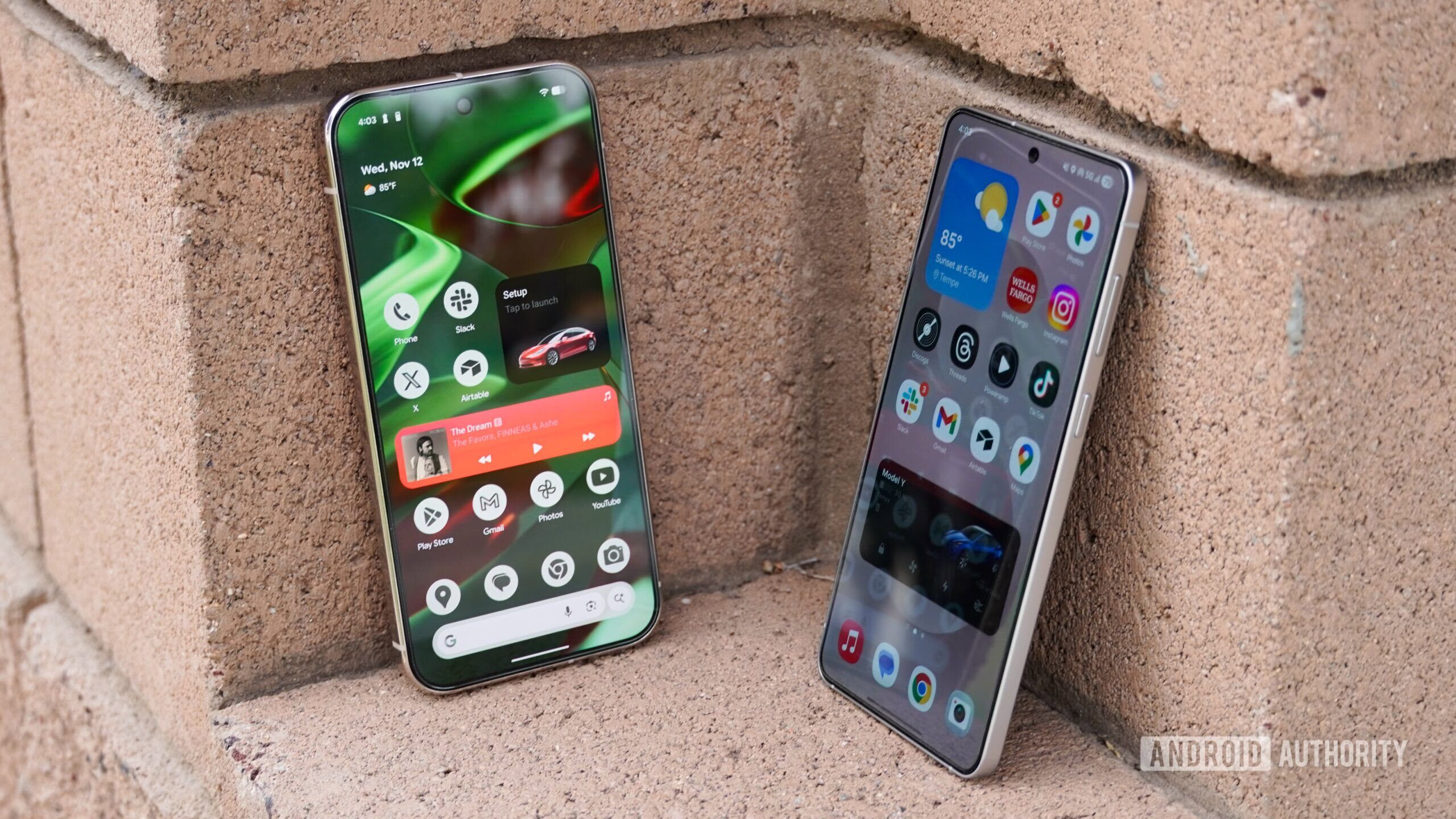
Android operating systems in 2025 are what individual phone brands make of them. Android 16 is publicly available as part of the Android Open Source Project, but it’s barebones, and brands like Google and Samsung put their own twists and styling atop it — that’s how we end up with Pixel UI, One UI, OxygenOS, and other variants. The two biggest flavors, Google’s Material 3 Expressive and One UI 8, couldn’t be more different.
Samsung overhauled its operating system with One UI 7, opting for a subtle and iOS-like appearance that extends into One UI 8. Meanwhile, Google doubled down on Material You, releasing Material 3 Expressive as part of Android 16 for Pixel phones, tablets, and watches. One is minimalist, the other maximalist. One has a muted color palette while the other’s is bold and vibrant.
But which one is best? I compared these polarizing design languages to find the most appealing one on a daily basis. This is purely a design and user-interface comparison, so I’m focusing on the appearance and ease of use of these Android skins.
Material 3 Expressive or One UI 8? Choose one.
Samsung’s Now Brief narrowly beats Google’s At a Glance
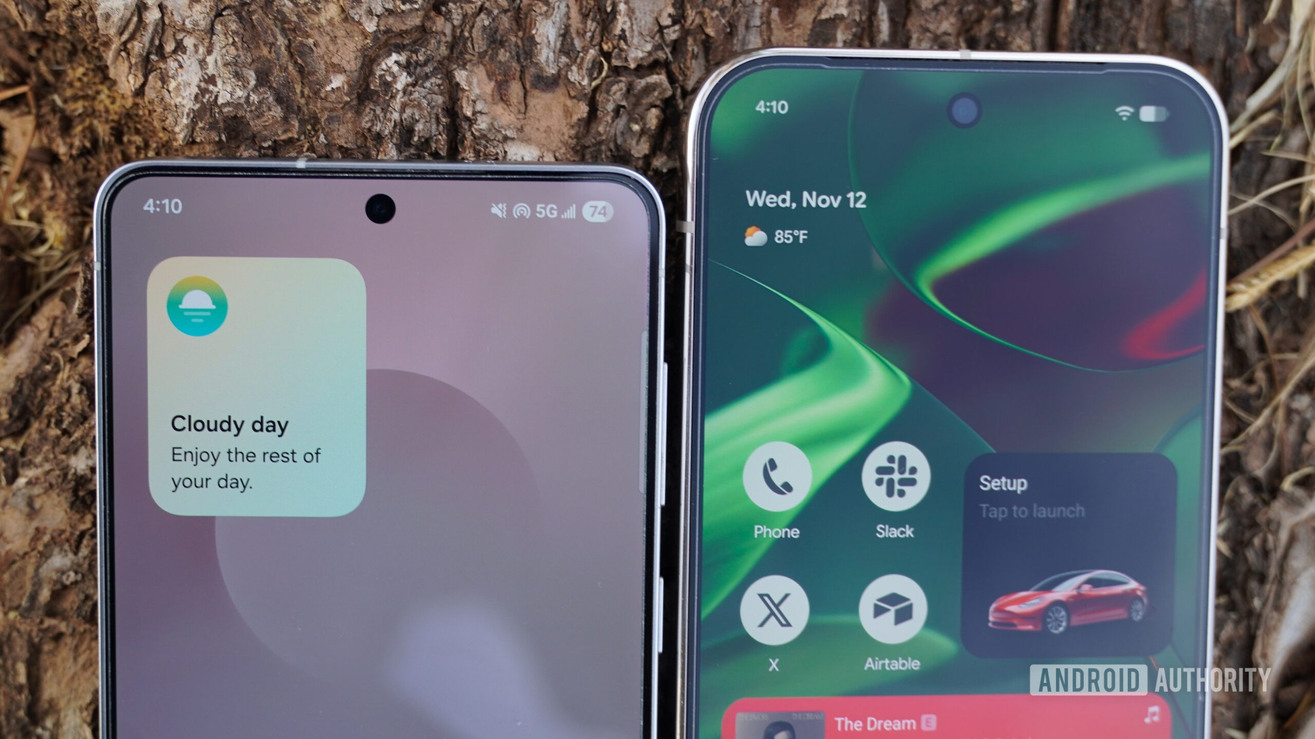
Despite the visual differences, Material 3 Expressive and One UI 8 have quite a bit in common. They both go all-in on AI summaries in the form of Now Brief on Galaxy phones and At a Glance on Pixels (RIP Daily Hub). Samsung’s Now Brief works in tandem with the Now Bar, a pill-shaped data field that can appear on the One UI 8 status bar or lock screen. The Now Bar and Brief try to learn your habits and adjust dynamically based on the situation.
It all sounds like At a Glance, a pinnacle Pixel feature that is a fixture of the Material 3 Expressive home screen. Google’s daily helper blends in better with the Pixel home screen and can successfully surface more information than the Now Bar and Brief. Samsung’s offering is a glorified widget, while At a Glance feels like it was built to be the centerpiece of Pixel UI. I’ve only ever had the Now Brief tell me the weather and to “enjoy the rest of my day,” but At a Glance can be genuinely useful at times, finding calendar events and reminders to display.
At a Glance crushes Now Brief in utility, but bringing in Samsung’s Now Bar makes this a different ballgame. The latter is a true alternative to Apple’s Dynamic Island on iOS. It can show live sports scores, now playing media, timers, and other urgent updates. Controls are only a tap away — they would’ve been stashed in the notification shade previously. The Now Bar and Brief are even more colorful, helping One UI 8 beat Material 3 Expressive at its own game.
Material 3 Expressive’s stock app designs shine better
Material 3 Expressive brought system-wide visual and typography changes, like 15 new “emphasized” styles with higher font weights. It also coincided with major Google app redesigns for defaults, including Weather, Clock, and Calendar. One UI 8, for the most part, defaults to first-party Samsung apps. While some Samsung apps have their own character, Material 3 Expressive’s stock apps appear more thoughtful and cohesive.
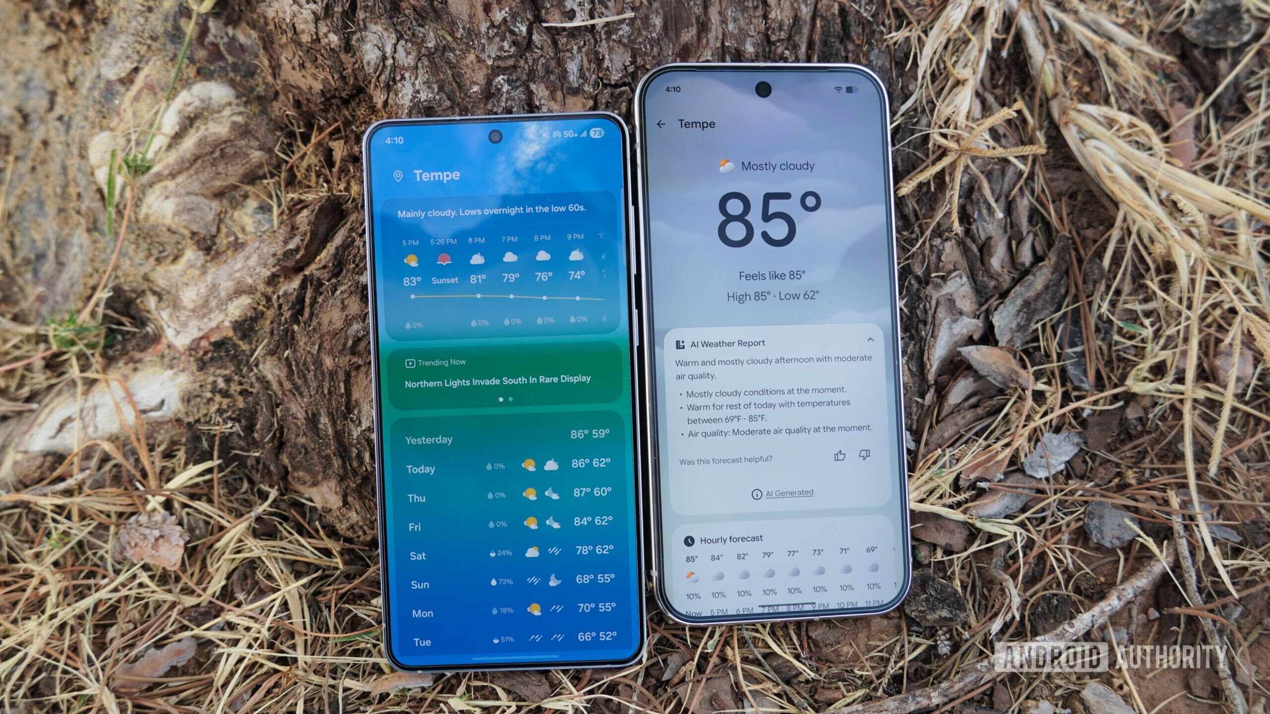
Case in point, the Samsung Weather app’s potential seems squandered by unnecessary visual elements. The actual temperature and weather conditions seem to come second compared to the cartoon of a person looking at their phone. Aside from that strange animation, the One UI 8 Weather app is more information-dense than the Material 3 Expressive version.
The Pixel Weather app might be the best example of Material 3 Expressive design characteristics in action. The top of each Weather card is fairly basic, with pills for AI weather reports and forecasts. Things get interesting when you scroll down to the Pixel Weather app’s tiles. They seemingly use every Material 3 Expressive design element, from a large navigation arrow showing wind direction, to colorful gauges for pressure and pollen levels, to squiggles and dots for UV index and visibility.
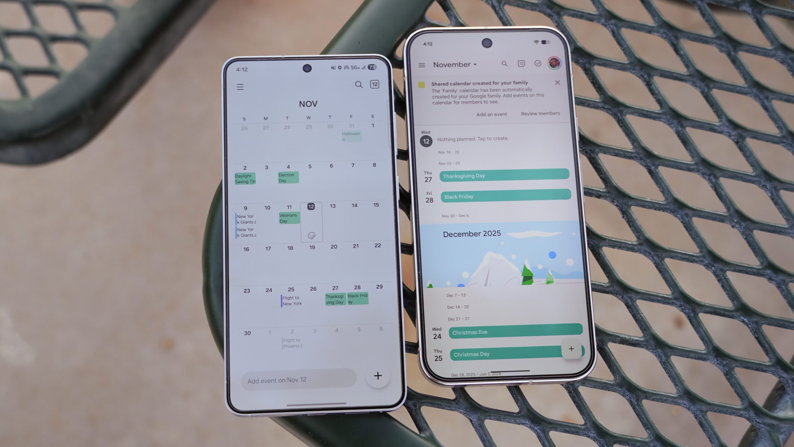
Google’s Material 3 Expressive apps come off as inviting, whereas the bland look of One UI 8 defaults might make using them feel like a chore.
For example, Samsung’s Calendar and Clock apps are mostly black and white, with only a few accent colors. Google’s equivalents are filled with color. When you turn on an alarm in the Clock app, all the text becomes bolded as the background fills with color shading. Flipping the same toggle on One UI 8 merely colors the text with your pre-set color theme. It’s so subtle that you may miss it, while Material 3 Expressive is loud and unmistakable.
Theming and customization are more wins for Google
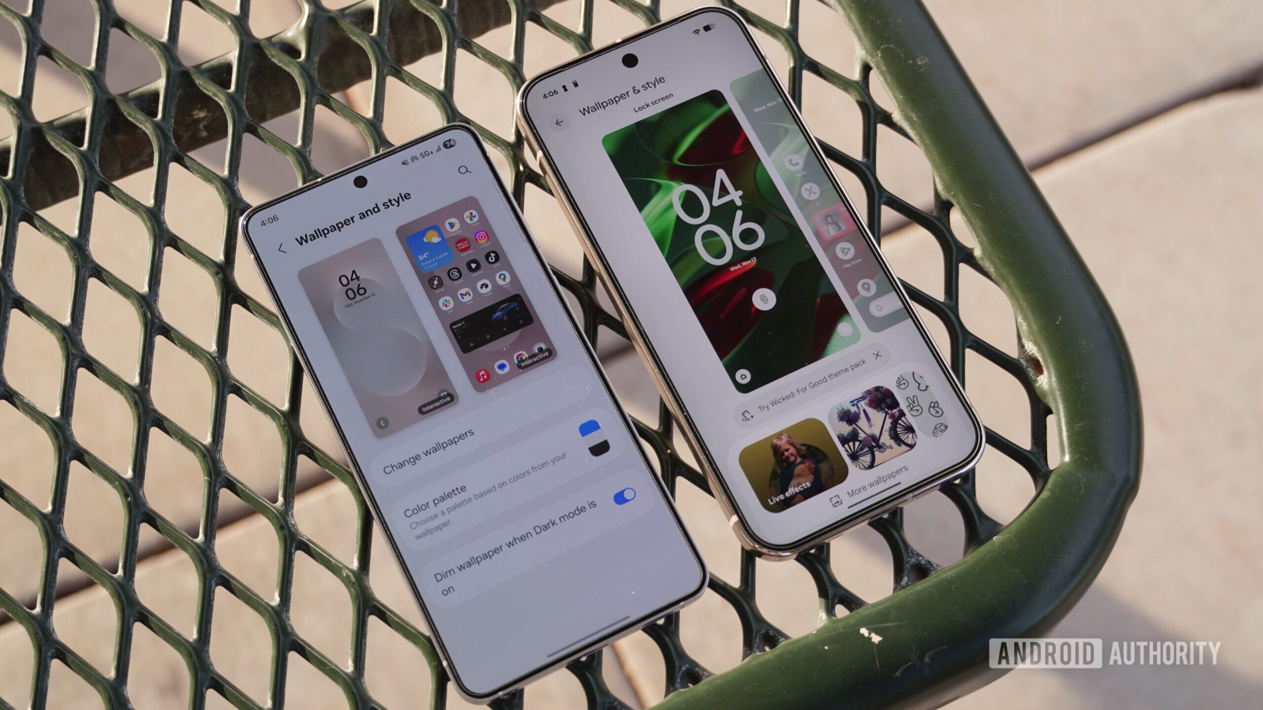
Regardless of whether you love or hate Material 3 Expressive design, it’s clear that Google nailed theming and customization. iOS 26’s Liquid Glass did one thing right — it forced all apps to conform to its design language. Google is doing the exact same with Material 3 Expressive, which applies your chosen theme and color palette across the system. There are even new theme packs that set a custom wallpaper, color palette, and app icons for you.
These elements permeate throughout Android 16 on Pixel phones, and they’re more noticeable due to Material 3 Expressive’s abundance of color. While One UI 8 has similar functionality, it doesn’t do enough. There are color palettes, but choices are limited, and they don’t extend to all app icons.
Galaxy Themes are another issue. In a way, they’re better than Pixel theme packs — there are far more Galaxy Themes available, and make no mistake, Google’s implementation is little more than a brand deal at the moment. On the other hand, the entire Galaxy Themes page in Settings feels like bloatware to me. It’s filled with overpriced “themes” that mostly change just the wallpaper and device sounds. Meanwhile, Pixel theme packs at least feel intentional, and make their way beyond wallpapers and system sounds to places like icons and GIFs. They’re also completely free, unlike the vast majority of Galaxy Themes.
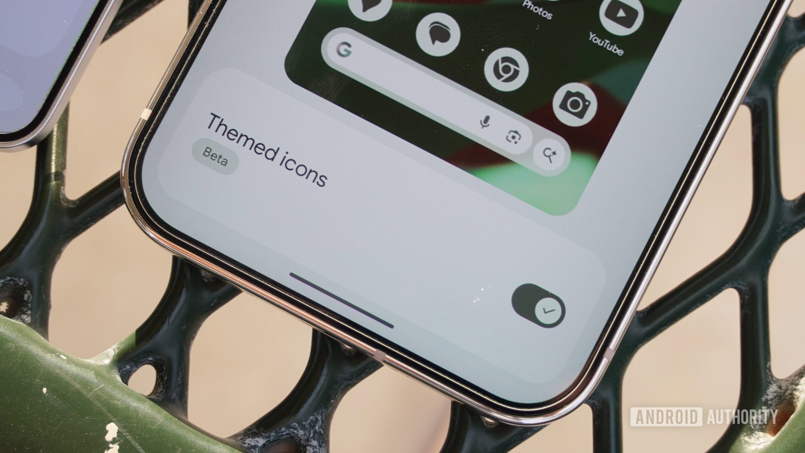
Google’s Themed icons toggle in Android 16’s latest betas is a game-changer for Material 3 Expressive that finally lets users force all apps to comply with system color theming. Until Samsung adds a similar feature to One UI 8, it can’t compete in theming and customization. The default options simply aren’t enough, and users shouldn’t have to download separate add-ons like Good Lock and Home Up to get more. They’re clunky, and the average user won’t bother with them — if they’re aware of them at all.
The notification shade and control panel are up for grabs
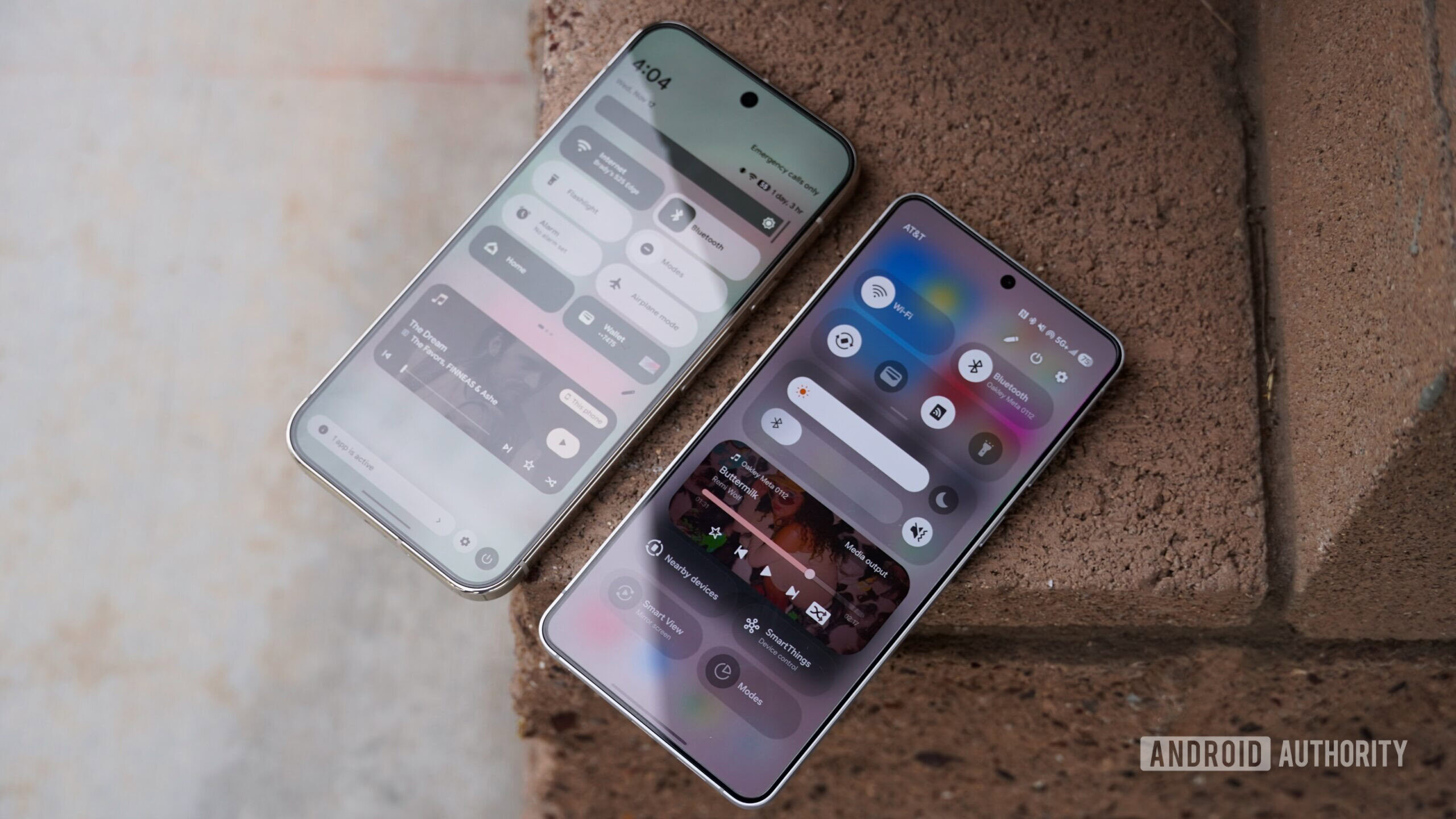
The split notification shade is controversial among Android fans. Samsung and Google drew lines in the sand, with the former going for the split shade by default and the latter sticking with the unified shade. Both sport pill-shaped notification bubbles and control toggles, and have a background blur that lets your open apps remain slightly visible. It’s clearer in One UI 8, while Material 3 Expressive’s blur is more aggressive, improving visibility.
Samsung gives One UI 8 users light haptic feedback when they clear a notification or tap a button. Material 3 Expressive’s behavior is more noticeable, giving users the feeling of notification cards snapping out of place when cleared, and there’s a visual animation to match. Quick Settings are revamped to allow for custom sizing, with unique elements like a squiggly progress bar for now-playing media.
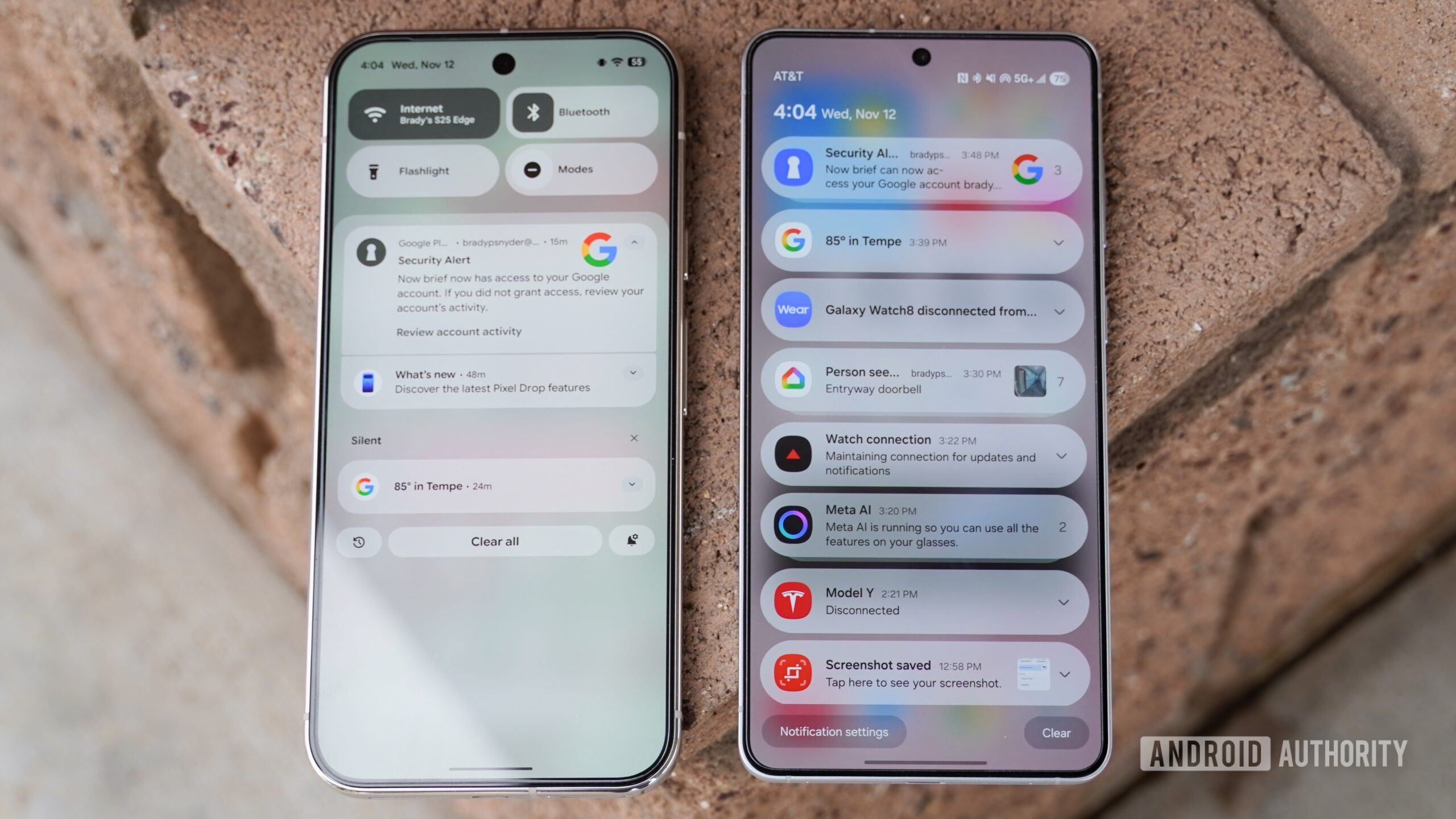
One UI 8 does manage to squeeze more toggles into the control panel, and that isn’t surprising — the entire Android 16 skin seems to prioritize function over form.
Google and Samsung both made the right choice
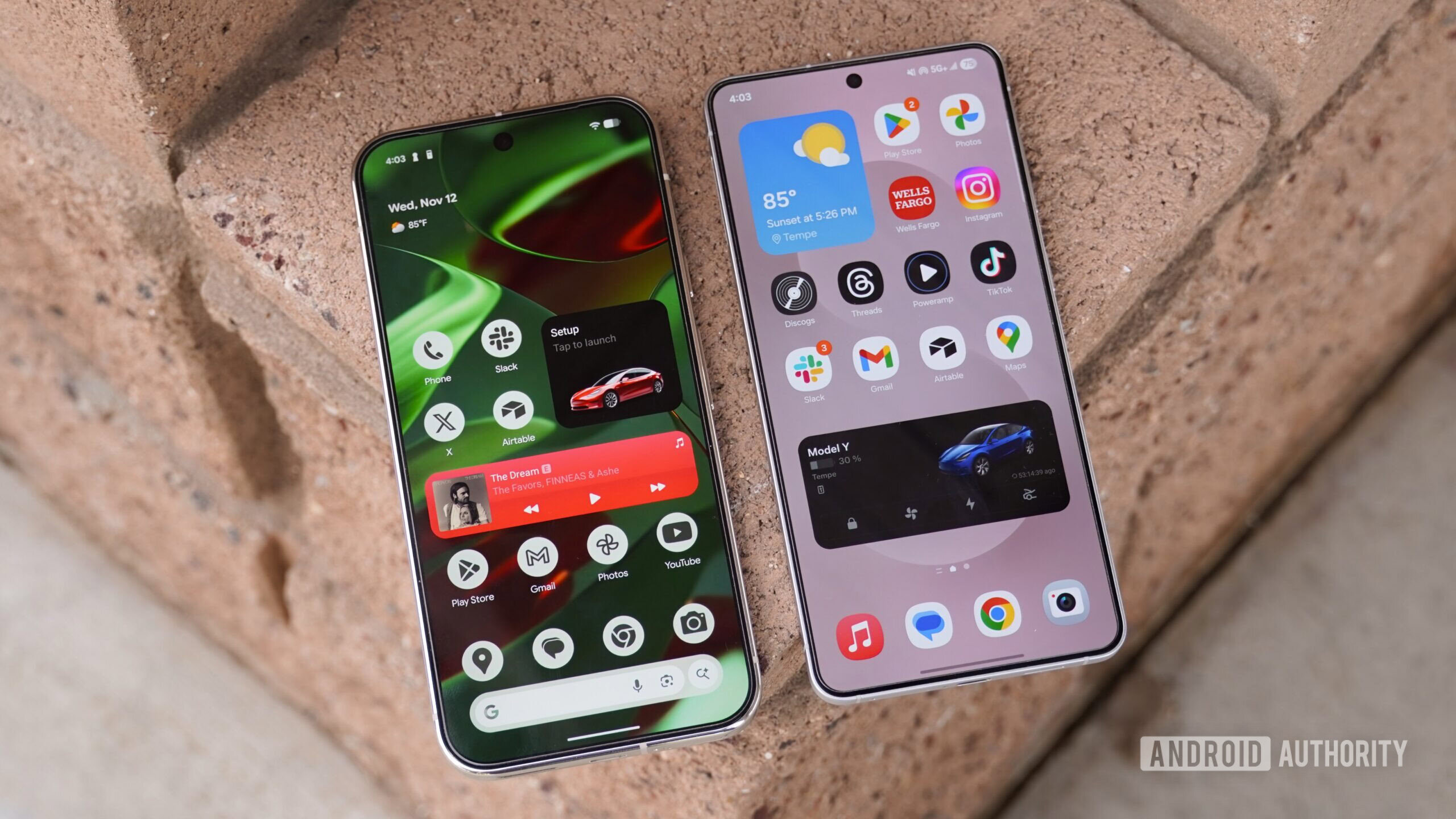
Samsung didn’t take major risks with One UI 8. The operating system leans into the status quo, applying a minimalist design language that often prioritizes transparency over color. Material 3 Expressive does the opposite, putting color and loud design at the forefront of Pixel UI. Neither approach is perfect. One UI 8’s Now Bar and notification shade are basic but useful in the best way. On the other hand, Material 3 Expressive’s theming, consistency, and customization are unmatched.
Google deserves credit for developing something truly original with Material 3 Expressive. Even if it isn’t my favorite design language, it also isn’t an iOS carbon copy like so many Android skins. Samsung didn’t do a bad job either, as the utilitarian elements of One UI 8 seem to match the industrial yet practical design of Galaxy phones.
Don’t want to miss the best from Android Authority?
- Set us as a favorite source in Google Discover to never miss our latest exclusive reports, expert analysis, and much more.
- You can also set us as a preferred source in Google Search by clicking the button below.
Thank you for being part of our community. Read our Comment Policy before posting.

