Affiliate links on Android Authority may earn us a commission. Learn more.
Material You's unicolor themes are doomed to fail

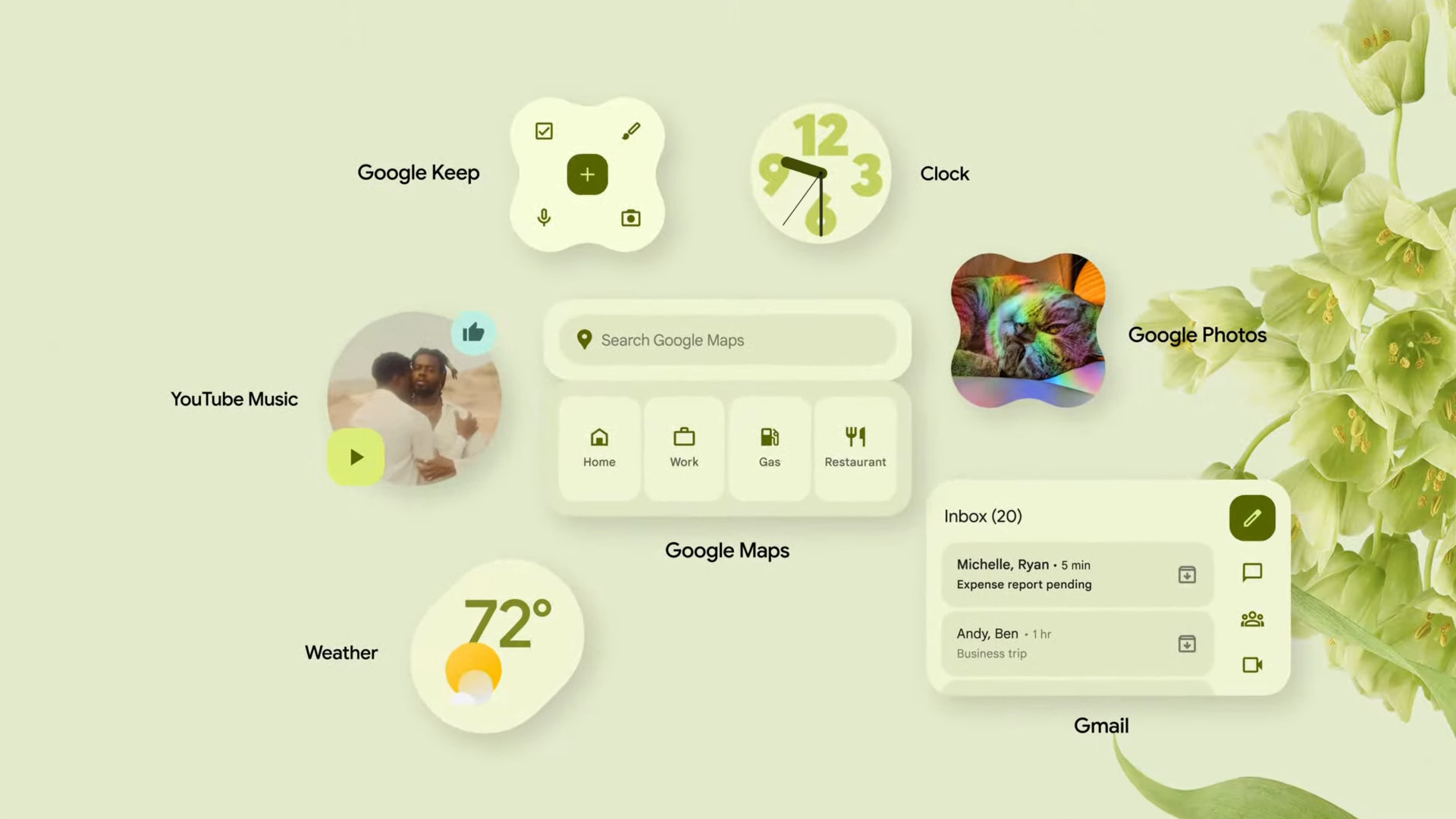
Google is doubling down on Material You, its reboot of Material Design. In an announcement made earlier this month, the company said it plans on expanding the Pixel-exclusive dynamic theming to other brands. Samsung, OnePlus, OPPO, Xiaomi, and other smartphone makers will be able to tap into Google’s APIs to allow apps, icons, and widgets to adapt their colors to your chosen wallpaper.
While this is a necessary step in Google’s strategy for a more cohesive Android experience, it doesn’t solve Material You’s biggest problem: It’s just wishful thinking. Material You is exciting as long as developers are willing to jump on board, but very few have and I don’t see that changing anytime soon.
Brand identity versus Google’s wishes

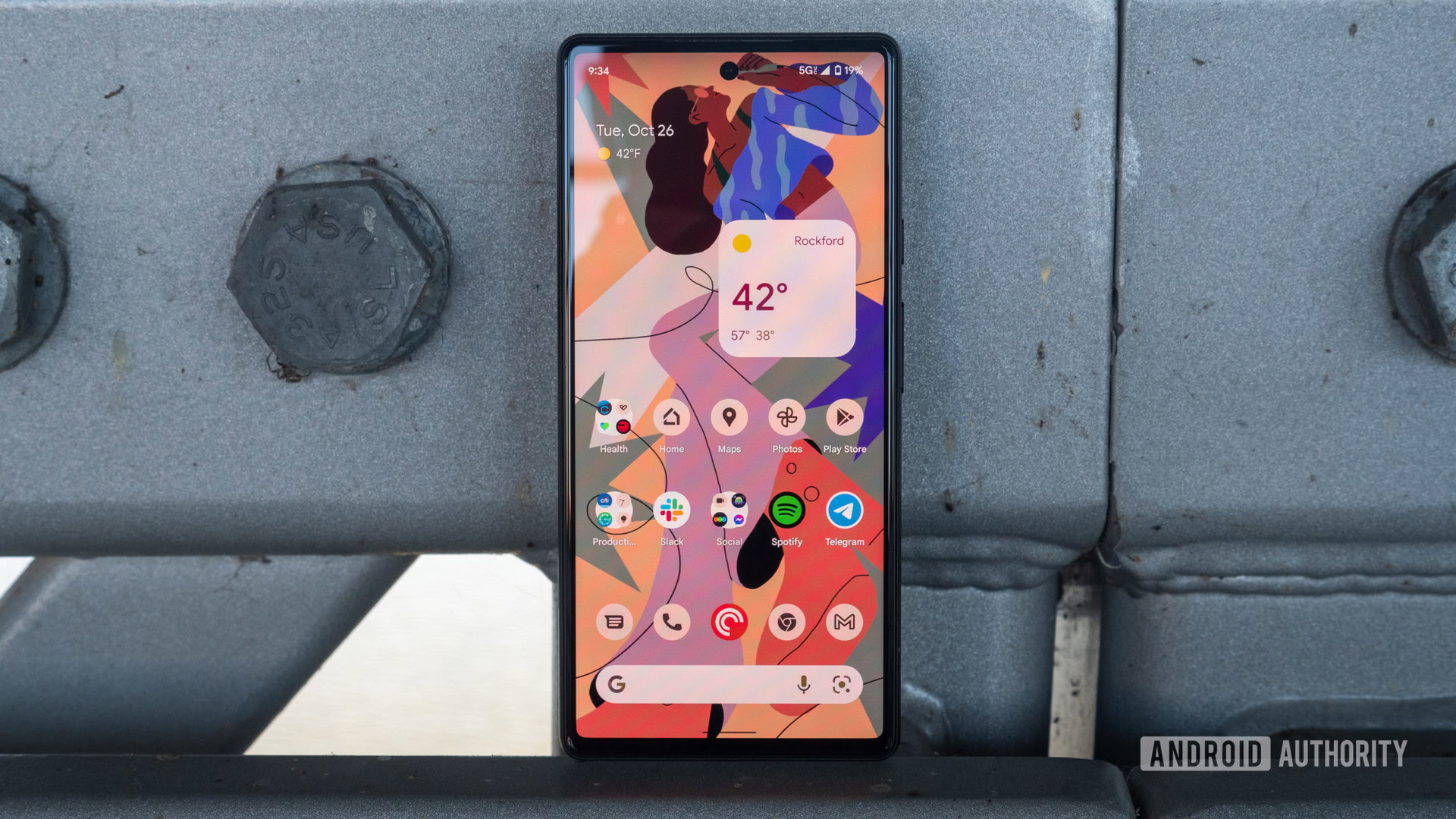
Material You was introduced last year as a core feature of Android 12 and the Pixel 6. Pick a new wallpaper and your phone changes the accent color of everything from the Quick Settings toggles to your home screen widgets, settings, keyboard, and even most Google apps to match this wallpaper.
As a concept, Material You sounds great. A consolidated look connects all the apps and services you’re using together. It also keeps your phone feeling ‘fresh’. All it takes is a new wallpaper to get an entirely new color palette on your device.
Brush up: The Android 12 redesign is the biggest revamp in years
Google’s wishful thinking hits the wall, though, when you bring brand identity into the equation. It’s easy to imagine Samsung, OnePlus, OPPO, Xiaomi, and other Android makers adapting their entire skins to different colors (as a matter of fact, many of them already offer theming options), but it’s a gigantic leap to imagine this with app developers too. Especially for established services.
Facebook won’t offer you a green icon, widget, or app accent theme just because Google wants that. Nor will Spotify go purple, Twitter paint itself in yellow, Amazon try red, or Uber switch to maroon. Companies spend millions of dollars to market their uniqueness and distinguish themselves from competitors. This includes logo emblems and color identities. A monochromatic look that makes WhatsApp appear like Telegram, or Netflix like Amazon Prime Video goes against every brand specialist’s instincts.
Facebook won't offer you a green icon, widget, or app accent theme just because Google really wants that.
This isn’t just speculation. Many of these established services have a history of not following Android’s API and design guidance. They’ve adopted their own design language that sits somewhere in the middle between Google’s and Apple’s, to create a cohesive experience for their own brand across platforms. Cohesion with other apps on either of these platforms is the last thing on their mind. And every time Google has introduced new features or APIs, these services have taken forever and a day to add them to their app. Just remember how long many apps took to adopt notification channels on Android because they go against every company’s instinct to bombard you with hundreds of daily pings.
So third-party developers of popular services with widely-recognized colors aren’t going to bend to Google’s will and throw away everything that makes them unique. Only smaller developers with generic apps — some of your RSS readers, money trackers, file managers, local photo galleries, and so on — will likely adopt Material You. And they’ll be very happy to feel right at home next to themed Gmail, Chrome, and YouTube.
But that leaves Material You in an incomplete state. Google can generate as many home screen renders full of themed icons and widgets as it wants, we all know my home screen and yours will be an unappealing mix of properly themed icons/widgets and unchanged ones. We know some apps will follow the dynamic theme throughout their interface but others won’t. And I don’t see any Google incentive changing that.
Material You themes and half-baked customization

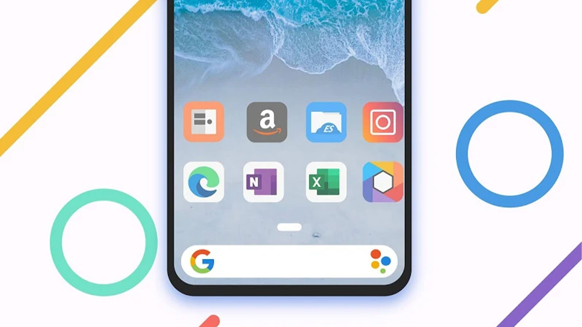
Users interested in proper customization have long ago gravitated toward third-party launchers, icon packs, and KGWT widgets (or similar). When you’re that far down the rabbit hole of home screen modding, you know that the only solution is to manually apply icons to apps that aren’t supported by default. Your local bank or supermarket don’t have icons that fit with the rest? Just use generic banking and grocery icons. You can’t find a weather or calendar widget that fits your design? Build them yourself.
Either app developers implement Material You or not. Users can't manually force any icon or widget to follow along.
Google’s Material You implementation is slowly improving, but it’s still far behind this level of customization. With Android 12, third-party apps could only adopt the dynamic theme colors across the main interface and widget. With Android 13, they can also theme their icon, and there’s a rumor suggesting users would be able to pick between four different color tones for each wallpaper. But clearly, you don’t have a lot of control — yet. Either app developers implement it themselves or not. You can’t manually force any icon or widget to follow along.
That puts Material You in a weird in-between position. Hardcore aficionados who care about a perfectly harmonized home screen will still have to build it themselves from scratch. And those who prefer distinct apps and widgets will likely disable some of Material You’s features. So who’s going to adopt it and like it? Only those users who care enough about a cohesive experience to enable it, but not enough to be annoyed by the unthemed Netflix or Uber icon. That’s a very narrow target for Google to aim at.
Check out: Best Material You apps to try on Android
Is a unified look all that appealing?

All of that brings me to what I’ve been pondering since Material You was introduced. Is a unified look all that appealing?
On the surface, the answer seems obvious. There was a time back in the early 2010s when I spent hours every week setting up a new home screen look with icons, widgets, and wallpapers that matched each other to perfection. But with time, I realized that the similarities that made these setups eye-pleasing also made them more difficult to use. It was taking me a lot longer to find and open an app because its icon looked just like the others. It was also taking me more time to distinguish between widgets and wallpapers because they were using the same color hues.
The similarities that made these monochrome setups eye-pleasing also made them more difficult to use.
Monochromatic tones might work well for a living room or a website, but not for a series of tiny icons that all do different things. Design should be at the service of usability, and when we get to a point where it’s hindering it instead, we have to ask ourselves some difficult questions. What’s more important? A pretty harmonious home screen or one where there’s enough contrast and difference that you can easily find what you’re looking for? To me, now, the answer is pretty clear. I’d much rather see unique icons (perhaps in one shape for a bit of uniformity) than a set where everything looks nearly identical.
And to me, that is the final pitfall of Material You, as Google has envisioned it so far. It privileges design ahead of usability, it won’t answer the demands of diehard modders, and most importantly, it won’t be widely adopted by big brands. So how could it take off?