Affiliate links on Android Authority may earn us a commission. Learn more.
Android 12 review: It really is all about you
Google made Android 12 available in final form on October 19, 2021 — the same day it announced the Google Pixel 6 and Pixel 6 Pro — after nearly six months of betas. The mobile operating system received a dramatic visual overhaul, the biggest since adopting Material Design way back in 2014. The company also made sure to introduce a wide range of new user-facing features and less-obvious-but-still-important changes that make the release a significant upgrade compared to previous generations. While we’ve had a chance to peek at these features over the course of the beta program, now we have the stable version. This is Android Authority‘s Android 12 review.
For the moment, Android 12 is only available to Google Pixel phones. The 2018-era Pixel 3 and Pixel 3 XL are the oldest devices compatible with Android 12. If you own a Pixel 3a, Pixel 3a XL, Pixel 4, Pixel 4 XL, Pixel 4a 5G, Pixel 5, or Pixel 5a you can download the new version. Android 12 also ships preinstalled on the Pixel 6 devices. While some phones from manufacturers including ASUS, OnePlus, and Samsung participated in the beta program, it’s not yet clear exactly when those devices will receive Android 12 from their respective OEMs.
For the most part, Android 12 should run well on your device with no major issues.
Android Authority has provided extensive coverage of Android 12 since it was first announced. You can find more information and resources in the following articles:
Material You: Google’s you-focused design
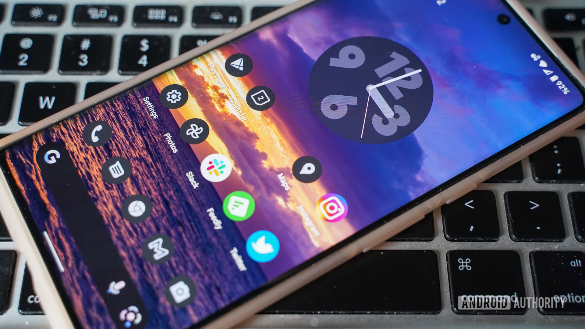
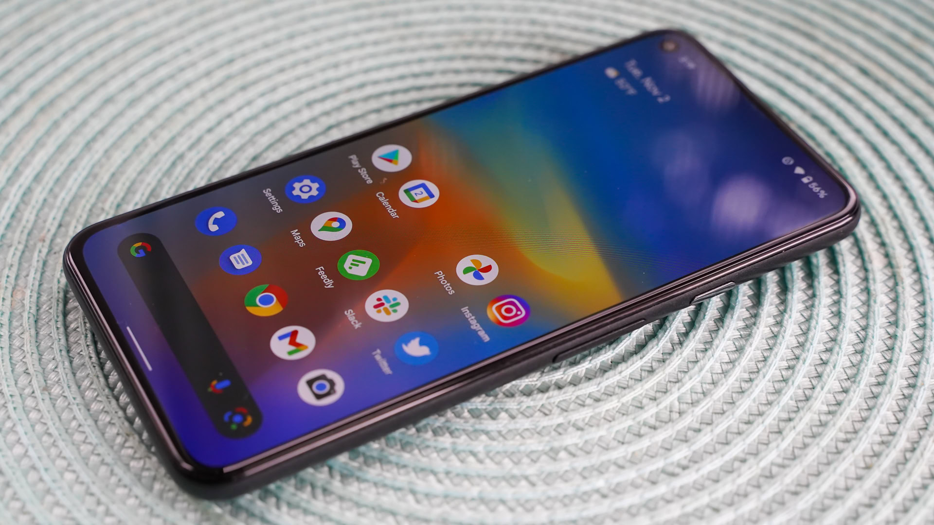
Material You is Google’s brand-new-for-2021 design language. The company rethought the whole user interface, representing perhaps the biggest visual overhaul Android has ever received. Google says Android 12 is its “most personal OS ever.” The platform now includes dynamic, shifting colors and new animations when touched. Google retooled many of the widgets with a focus on people, and was also sure to include more accessibility tools to help those with low vision.
Related: Read our Google Pixel 6 Pro review
Likely the first thing you’ll notice is the change in color. Google has stepped away from the bold primary colors that have defined Android in the past. It has replaced them with softer, often semi-transparent pastels. The real trick, though, was to automatically match the system-level colors (widgets, drop-down menus, animations, buttons, notifications, etc.) to the color of whatever wallpaper you choose. In theory, this is a good idea because (ostensibly) you actually like the colors in the wallpaper you’ve chosen. What’s the reality like?
You have more control than you might think. Once you’ve selected a wallpaper, there are several choices for the color schemes that end up on your phone under the Wallpaper & Style menu. The system automatically generates three or four sets of matched colors that will be interspersed across the UI as well as single, bolder shades that can appear instead. I like the flexibility and choice, and the combinations of colors are nearly endless if not always appealing.
This auto-theming feature is limited to Pixel phones and won’t be available from other manufacturers.
Is this the greatest design revolution to ever reach smartphones? Not necessarily. But it does open up new ways to personalize the look and feel of your phone. That can be empowering to some people. Moreover, the UI colors will change every time you shift your wallpaper and that can keep things fresh. On the flip side, some users may find the new color schemes dull or otherwise not to their liking. Further, not all apps will adopt the auto-themed color feature. For example, you can set the app icons to adopt the general color of the rest of the UI. Third-party apps that don’t enable this feature will retain their original color and design, thereby defeating the homogenous look.
Material You's color changes open up new ways to personalize the look and feel of your phone.
New shapes bring another noticeable visual change to Android 12. They’re hard to miss. The toggles in the Quick Settings menu, for example, have new profiles and sizes. They are downright enormous now, which makes them easier to tap in a hurry, though this comes at the expense of how many fit per screen. As always you can edit which toggles are positioned where in the drop-down shade. I like that more info can be displayed within each toggle.
The widget picker has been completely overhauled and is now much easier to use. I like how the picker reveals how many widgets and/or shortcuts are available for each app. Swiping through to select the one you want is a breeze. Not every app has a new Android 12-themed widget just yet. Google itself is still updating its own over time and only some third-party apps have been quick to adapt their offerings. Whether or not you actually care for these new widgets is another story entirely. Some are better than others. For example, I’m not sold on the new wavy analog clock or the oddly bulbous weather designs.
Looking back: The history of Android — the evolution of the biggest mobile OS in the world
There is one new system widget that some are sure to like: Conversations. This tool lets you see the most recent communications with any given contact, whether that be a message, call, or status update. It can be a quick-and-easy way to keep tabs on your communiques with that one person right from your home screen.
Beyond colors and shapes, Google says Android 12 includes a smoother and more responsive UI. The company worked on system performance to make sure everything always feels snappy, and at the same time generated a whole new range of animations that unfold when you interact with the OS. For example, swiping away notifications now looks more fluid, and turning off the screen produces a new animation that darkens the display around the power button last. These small touches add up to a silky experience. Again, not necessarily earth-shattering stuff, but still a pleasant improvement.
The small UI touches, such as new animations, add up to a silky experience.
Next in the design space is accessibility. Google focused on two small areas here to help those with poor vision better use their Android device. The first is a new window magnifier. It allows the user to zoom in on any part of the screen without losing their place on the rest of the screen. You’ll need to enable it in the Accessibility settings menu. The other new tool allows you to crank the screen brightness down to the lowest possible setting. This “extra dim” feature is meant for night-time scrolling when you don’t want to disturb a partner or for times/places when even the screen’s usual lowest setting is still too bright. Both of these features work well.
Last, your eyes might have locked onto the revised Settings menu. Google boosted the visibility of the top-level sections with larger headers while continuing to include a short list of the options contained within. I think this particular change is more effective visually when using light mode as opposed to dark mode, but that may be just me.
Check out: Google Pixel 6 review
From my perspective, all these changes are welcome. Android 11 and earlier builds were beginning to look a bit stale in their sameness. The refreshed look may not be to everyone’s tastes but it offers more personality and plenty of room for customization and personalization. The result? Few Android 12 phones will look the same.
Android 12 privacy: More control than ever
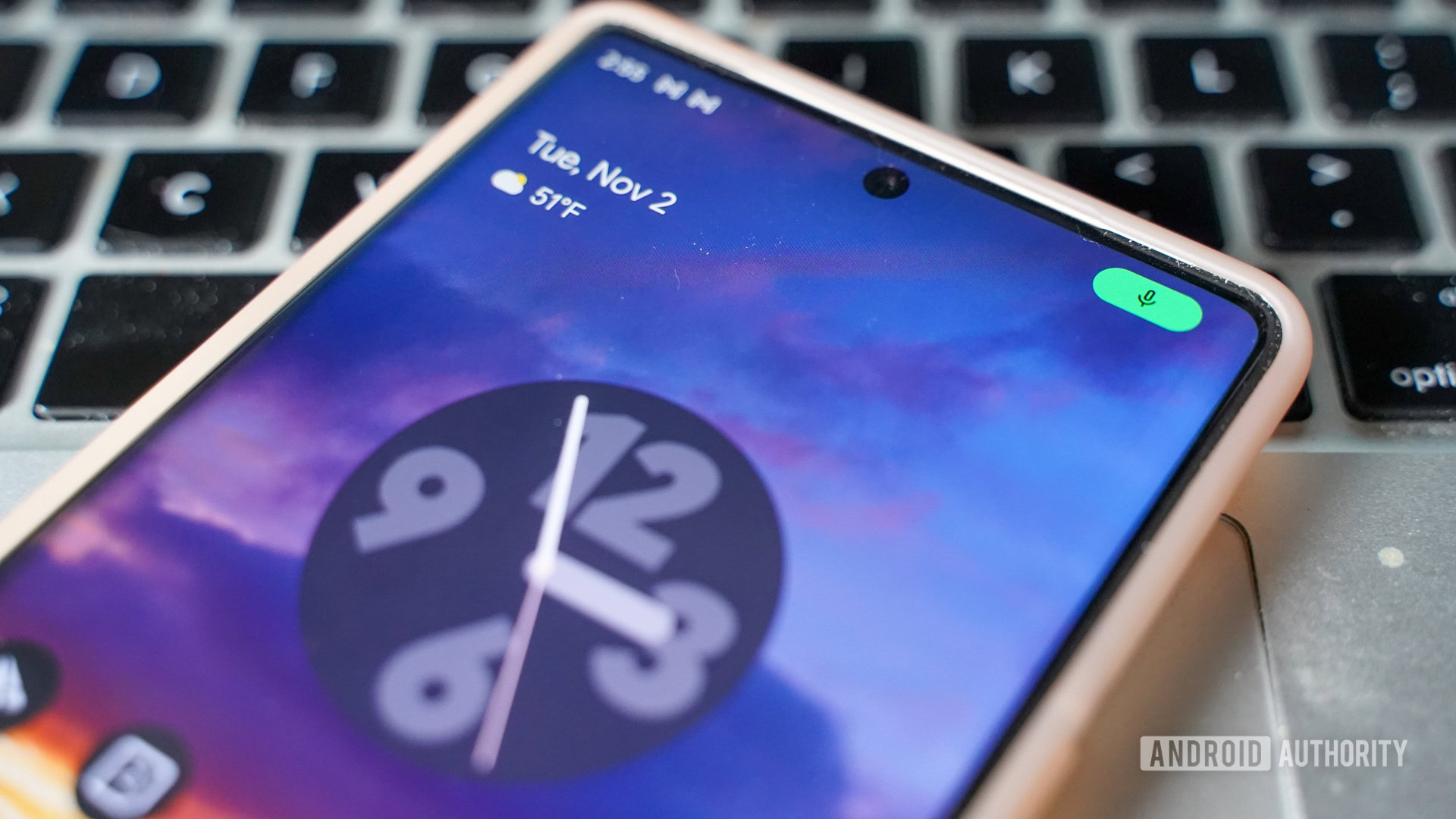
Google says it designed Android 12 around the idea of user safety. It overhauled the way apps and users interact with vital privacy features, providing you with more control over your data and device than ever before.
Android 12 makes it much simpler to determine when an app is using the microphone or the camera thanks to new indicators that pop up in the status bar. They are bright green, you can’t miss them, though they only show up for a moment and then shrink to small dots that are harder to see. I’d prefer the larger icons to remain visible.
If you want to revoke an app’s access to the mic or camera, or simply want to turn them off, you can do so thanks to new toggles in Quick Settings. These controls are preloaded on the new Pixel 6 phones but you’ll have to manually add them to older Pixels. This functionality can give you quick peace of mind if you’re worried about apps spying on you.
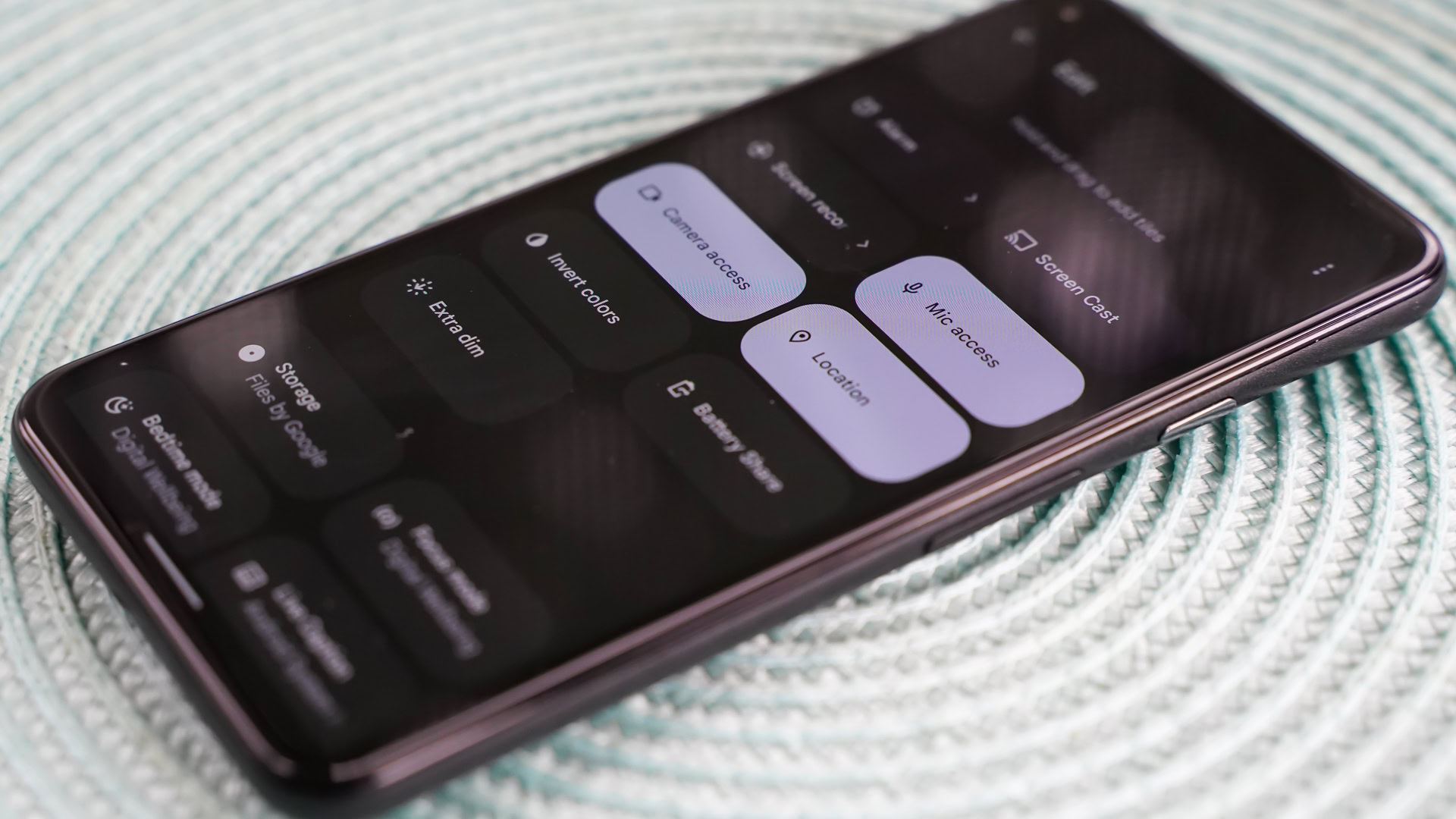
Location sharing has gained a useful feature. Android 12 allows you to permit apps access to your precise location or your approximate location. The former is often needed for select tasks such as turn-by-turn navigation. It’s a breeze to give that permission to Google Maps for this sort of activity. Much of the time, however, the latter is good enough.
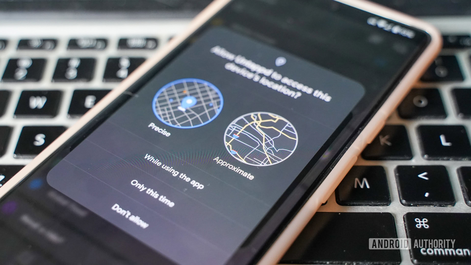
For example, weather apps don’t need to know what street you’re on. Giving such apps access to your approximate location means you’ll still get the local neighborhood weather without revealing your exact whereabouts. The first time you launch an app that requires location, a prompt will let you choose between precise and approximate locations. Alternatively, you can dive into the settings menu to make the switch proactively. Since location can be a sensitive subject, this option is a welcome one. Google has not, however, made clear just how “approximate” approximate really is. Moreover, third-party apps have to build in support for this functionality for it to work properly. For example, if you select approximate location sharing for an app that doesn’t yet support the feature, it will think you’ve denied location permission entirely, forcing you to switch to the precise setting or forego sharing your location with the app.
One new privacy feature I like is that you can revoke location access from your Bluetooth headphones’ app (should you have it installed). No need for the app to know where you are. Again, however, this is something the app developer will need to address from their end.
Since location can be a sensitive subject, this new measure of control is a welcome one.
Need to assess which apps have been using your mic, camera, or location at a glance? The new Privacy dashboard built into Android 12 provides you with exactly that information. The dashboard lets you view a 24-hour timeline of which apps accessed those hardware features and when they did it. While the dashboard prioritizes the mic, camera, and location, you can drill down deeper to see what other apps are up to.
For example, it’s simple to see when apps have accessed your calendar, call log, contacts, files, messages, and more. What I like about this tool is that it makes it incredibly easy to fine-tune app access to your data. Everything is laid out plainly and the controls are just a tap away. One thing that might make it better? A widget. Right now there isn’t one for the dashboard. Get on that, Google!
Check out: Every Android Easter egg and how to find it
Perhaps the most useful aspect of this functionality is that Android 12 will automatically reset the permissions of apps that go unused. You can also choose to do this manually on a per-app basis or for every app in one fell swoop. It’s an effective way to start over with app permissions should you wish.
Let’s talk nerdy for a minute. One of the new privacy features built into Android 12 isn’t as user-facing as the elements discussed above and that’s the Private Compute Core. It’s a safe mobile space on your phone that’s isolated from the rest of the system and most installed apps. It’s meant to be a secure place where certain machine learning tasks can be performed on-device instead of in the cloud. For now, it handles three things — Live Caption, Now Playing, and Smart Replies — which require access to sensitive data such as recordings from the microphone.
The general idea is to keep as much of your data as possible from leaving the phone while still including machine learning features.
For example, the Live Caption feature listens to the audio from your device. The Private Compute Core gives Live Caption a place to do that where other apps cannot. The general idea is to keep as much of your data as possible from leaving the phone while still giving it the machine learning-powered features we’ve come to rely on in our daily lives. The Private Compute Core may not be sexy, but it’s a helpful addition to Android 12. What’s more, Google made it an updatable app in the Google Play Store so it can add more machine learning functionality over time.
See also: How on-device machine learning has changed the way we use our phones
Taken together, these changes make Android 12 the most private Android release yet. There’s certainly still work to be done, and yet Google has given its users a better way to manage their data and device.
Everything else: Effortless? Not exactly
One of the big pushes Google made in Android 12 was to simplify things for end-users. The fresh coat of paint and the hidden coat of armor that clothe and protect Android 12 contain a multitude of smaller features that contribute to the whole. Here are some that stand out and make Android 12 just that much more impactful.
Sharing Wi-Fi
It’s fairly straightforward to share your Wi-Fi credentials with a friend or colleague by using the existing QR code tool. But that method requires you to bring the two phones together and this is cumbersome if you have to share the credentials more than a couple of times. Using the Nearby Share feature, you can now push the Wi-Fi credentials from your Android 12 phone directly to one or more other users at the same time when you’re in the same space. It works well.
Scrolling screenshots
A handful of Android device makers have added scrolling screenshots to their own phones but the functionality is now built directly into Android 12. Take a screenshot as normal and you’ll then be given the opportunity to expand the shot to the entire page/app you were viewing. It’s dead simple to use and the markup features are a bonus.
Improved gaming
Google has long worked to reduce the friction between choosing a game in the Play Store and getting you to actually play that game. Now, Android 12 lets users start gameplay before the game has even finished downloading from the Play Store. This could be handy with games that are bigger than 1GB or 2GB and might otherwise take a while to download. Google hasn’t publicized any titles that take advantage of this feature yet and it’s not clear how wide adoption will be.
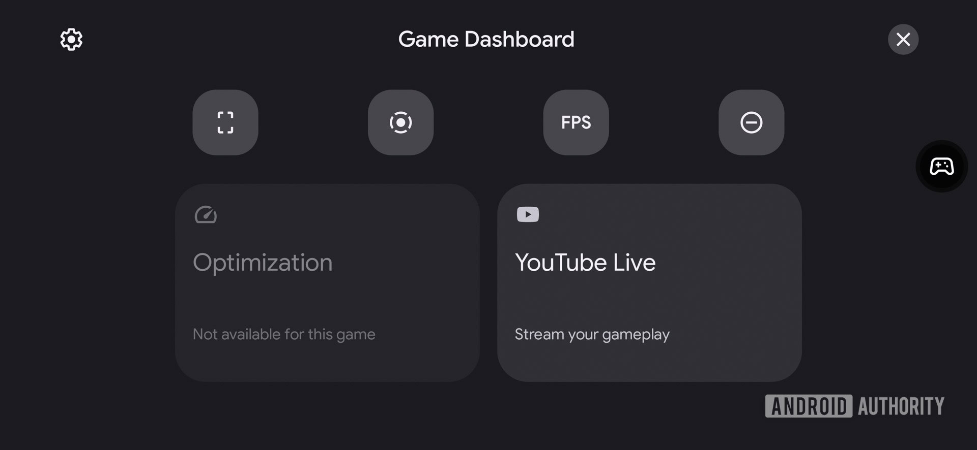
Games can also tap into your phone’s haptic motor to enhance gameplay. Think vibrating explosions and the like, similar to that of a game controller (or a dedicated gaming phone, such as the ASUS ROG Phone). Android 12 users will eventually have more ways to tweak power management and performance on their phone to boost gaming. Neither of these features appeared in any of the games I sampled.
When it comes to gaming, Android 12 certainly has more potential than any previous version. Importantly, however, game developers need to adopt the right tools from Google in order for the fresh features to work properly. At this point not enough (any?) have, though we expect that to improve over time.
AppSearch
Google debuted a functionality in Android 12 called AppSearch. It’s meant to let you search not only for apps, but for any local data — even the content within apps. Type your query in the app drawer’s search bar and it will automatically bring up contacts, apps, settings, and other relevant items. In my testing, it didn’t turn up the deep results I was expecting.
For example, searching for “home” AppSearch was able to find the Google Home app as well as my home address and settings for the phone’s home screen. I searched for a few contacts, however, and they turned up within some apps but not others. The crux of this feature is that it is API driven and developers need to adopt it for it to work properly. In other words, widespread support is not yet a thing.
Switching devices
The last major user-facing feature that Google highlights in Android 12 is “switching made easy.” Google has long sought to make switching from one phone to another as painless as possible, but it has achieved only middling success over the years. Sometimes it works and sometimes it doesn’t. What’s different this year is that Google is making it possible to switch from an iPhone to an Android 12 phone directly. Of course, we had to test this for ourselves.
Using a Pixel 4 XL, I first updated the device to Android 12 and then performed a factory reset. Then, using the on-screen prompts, I plugged the Pixel directly into an iPhone 13 Pro Max running iOS 15.1 and followed the directions for transferring data from the iPhone to the Pixel. It sort of worked. For example, all my contacts, call logs, and messages moved from the iPhone to the Pixel. That’s great. Most of my personal photos made it from one device to the other, but my videos did not. That’s okay, but could be better. And Android 12 was only able to install about half of the iPhone’s apps onto the Pixel (allowing for Apple-branded stuff that simply isn’t available to Android devices.) I was left with a phone that felt mostly set up, but still needed some attention.
All my contacts, call logs, and messages moved from the iPhone to the Pixel. That's great.
Things that didn’t transfer over? Usernames and passwords. You’d better know those or have them written down somewhere. For example, the Pixel may have copied the Twitter app over from the iPhone (well, technically, it downloaded Twitter from the Google Play Store) but it certainly didn’t bring my login along with it. It’s worth mentioning quickly that both Android and iOS do support saved logins within their own ecosystems (e.g., when switching from one Android to another), but there’s no cross-pollination between them when it comes to stuff like that.
More reading: Best password manager apps for Android
By the way, this whole process of half-cloning an iPhone onto a Pixel took close to 90 minutes despite the direct wired connection between the two phones. It’s definitely not a perfect tool and you’re going to lose some things along the way. But the absolute basics, such as all your messages, are covered.
There are many, many, many more features built into Android 12. We encourage you to explore them all in our extensive round-up of everything.
Android 12 review: The verdict
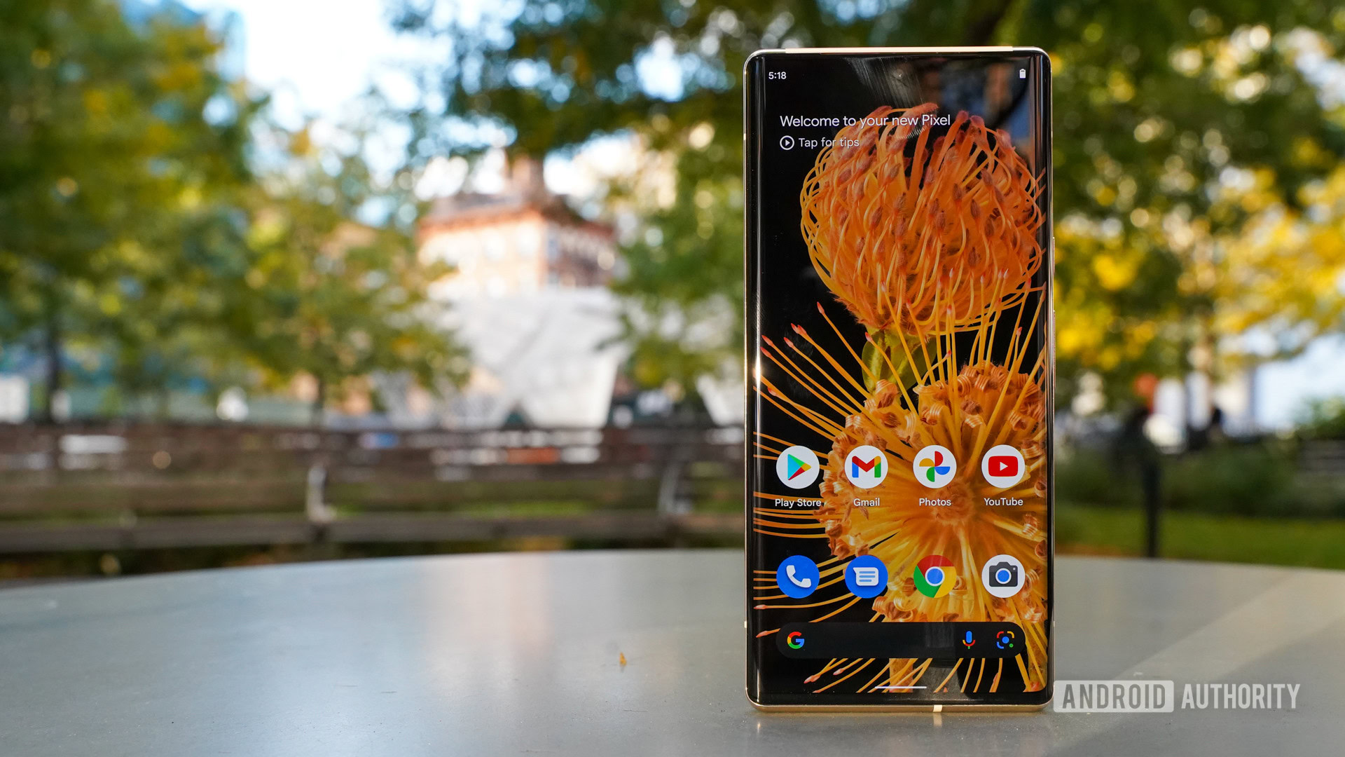
Android 12 is surely an exhilarating breath of fresh air. The Material You design, with its revised focus on colors, shapes, and experiences, represents a huge shift in the look and feel of Google’s mobile operating system. I welcome the visual changes with open arms, though it is easy to understand why the new design may not appeal to everyone. What’s perhaps more important than the actual appearance is the improved usability that accompanies some features such as the larger Quick Settings toggles or new widgets.
The stricter privacy parameters matter, too. As people around the world truly begin to question who is using their data when and where, it’s critical that we gain more control over that data. Simple things such as buttons for turning the mic and camera off may not seem like James Bond-level security features, but it’s the little things that often matter most. Making it easier to manage which apps have access to various functions of the phone can go a long way in providing peace of mind — and actual privacy.
Android 12: Hot or not?
As for the smaller updates, improvements, and additions that make up the bulk of Android 12’s feature list, those we tested ranged from highly usable to nearly useless. It’s a joy to see basics such as scrolling screenshots become a reality in such a clean way, while it’s frustrating to see supposed advanced tools such as AppSearch stumble out of the gate. Such is the nature of major operating system updates. It will take a while for developers and their apps to catch up with broad support for the numerous new functions.
Relatively few devices will experience this exact version of Android.
What perhaps is most important to note is that relatively few devices will experience this exact version of Android. Remember, we tested Android 12 on two Pixel phones, meaning we got the “stock” software directly from Google. As we’ve seen on some of the Android 12-based betas, third-party companies such as OnePlus and Samsung won’t necessarily bring all the features over unchanged. In other words, if you want a different Android 12 experience on your phone it will likely be available before too long.
Android 12 marks a milestone for Google. It demonstrates the company’s commitment to evolving the operating system in ways that actually benefit regular people and not just tech geeks. It may fall just short of being a major revolutionary jump, but it’s a big enough evolutionary step and we’re willing to walk in stride with Google.