Affiliate links on Android Authority may earn us a commission. Learn more.
Oxygen OS 12 beta hands-on: Color OS by any other name
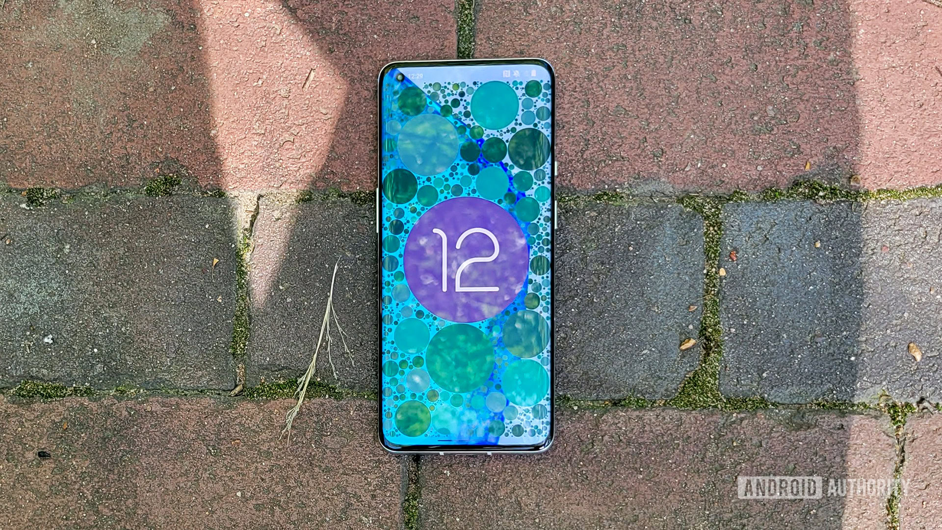
At the end of September, OnePlus dropped a huge bomb on smartphone fans: starting with Oxygen OS 12 based on Android 12, the company would be combining its Oxygen OS Android skin with the skin of its sister brand, OPPO. This new “unified OS” doesn’t have a definitive name yet. All we knew then was that OnePlus’ ambition was to take the best of each Android skin to make something new and better.
With the very first Oxygen OS 12 beta available now, we finally have a semblance of an idea of what the unified OS could be like, at least as far as OnePlus phones go. Although we’re going to save our commentary for the end of this article, we can summarize it quite succinctly for you: it’s Oppo’s Color OS, but pared down a bit.
Let’s dive in and check out the first beta of Oxygen OS 12 and see what’s going on. Please note, though, that this is the first beta of this software. Any of the things we cover here could change before the stable launch, so don’t take any of this as gospel quite yet.
If you want to find out how to down
Oxygen OS 12 UI overhaul
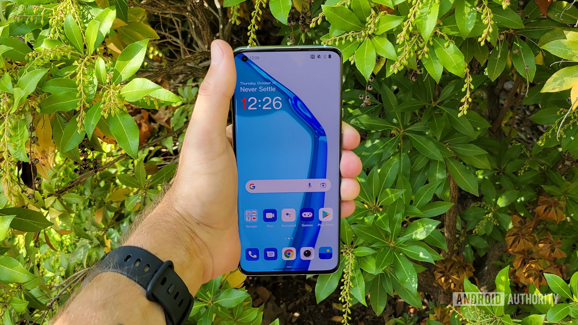
When you first boot into Oxygen OS 12, you get a very familiar setup process as on Oxygen OS 11. However, once you land on your home screen, die-hard fans of OnePlus’ skin will notice immediately that something is amiss.
The biggest change here is the icons. By default, they are now shaped like rounded squares instead of the circles OnePlus fans have become used to. The good news is that if you don’t like this, you can easily customize them. You can stick with basic formats, or even use “ART+” to fully customize the shape and look of the icons. Color OS fans will be very familiar with this since it’s basically the same system that appears on OPPO phones. Get ready, because we’re going to be saying that a lot throughout this article.
If you long-press an empty spot on the home screen, you can find the new personalization editor. In the screenshot above, note that the “Wallpapers” icon in the bottom left isn’t formatted properly. This is probably because I’m using OnePlus Sans as the font throughout (you are given a choice between this or Roboto when you set up the phone). This will probably be fixed in the stable version. Anyway, after you long press you can change all sorts of things about the home screen. This new system is, once again, borrowed directly from Color OS.
Throughout the entire phone, UI elements are either unchanged from stock Android or replicated from Color OS. OnePlus fans will likely need some time to get used to this.
New dark mode tweaks
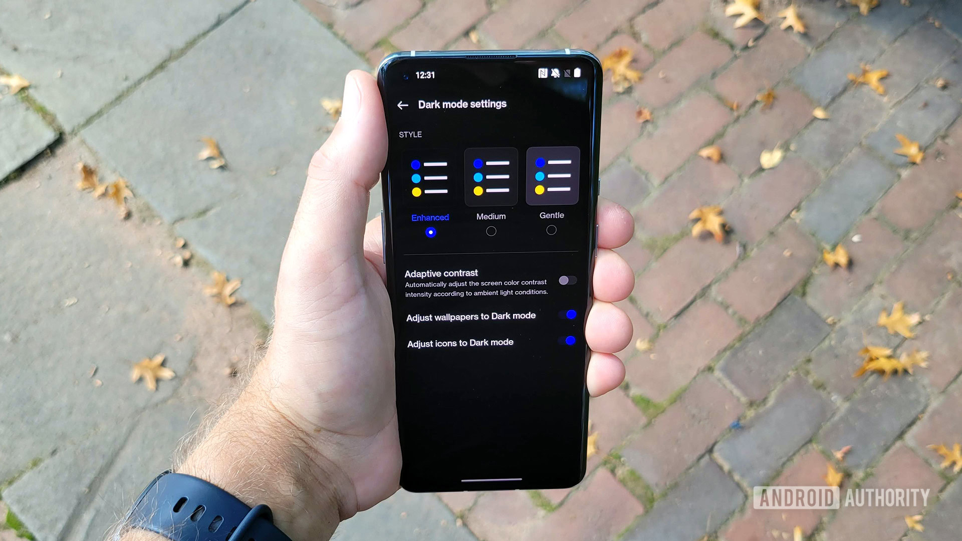
Ever since it first rolled out a dark mode, OnePlus has given users the ability to tweak it. However, this ability sees a huge expansion in Oxygen OS 12. You can now choose between three different types of dark mode: Enhanced, Medium, and Gentle. The Enhanced mode is a “true” dark mode, meaning the dark parts of the display are actually black. This creates a very contrasty viewing experience.
On the other end of the spectrum, we have the Gentle dark mode which turns the true black aspects of the display into a dark gray. This makes things less contrasty, but still easier on the eyes than a non-dark mode. Obviously, the Medium setting strikes a balance between Enhanced and Gentle.
Dark mode fans will appreciate the level of control OnePlus gives you here.
On top of these three modes, you can also toggle other aspects of how your phone looks. You can have contrast automatically adjust based on the ambient light sensor and you can have wallpapers and icons also adapt to dark mode.
Other Android skins out there have dark modes, and Android even has one built right in. OnePlus, though, is giving you a level of control here you seldom see, which is nice. The only other skin that comes with this level of customizability is Color OS, which — you guessed it — has this exact same system.
Private Safe and Hide Apps

Private Safe is a new feature in OnePlus phones, but the company lifted it beat-for-beat from Color OS. Basically, Private Safe gives you a place to securely stash images, videos, documents, and other bits of data. You need to run through a bunch of setup steps before you can use it, but once you do, it’s easy to lock things away from any prying eyes.
The new privacy suite also includes the ability to hide applications, so it replaces OnePlus’ own Hidden Space feature. The new Hide Apps system works just like Hidden Space. First, you select which apps you want to hide. Then, when you want to access those apps, you simply swipe to the left while in the app drawer. There, you’ll see your hidden apps collected.
‘Inventive’ wallpapers

Oxygen OS 12 does not include the Material You auto-customization features Google created for Android 12 (at least not yet). However, OnePlus does give you a way to create unique wallpapers based on images you find online or take yourself.
To start, just hit the Inventive Wallpapers icon within the usual wallpapers settings. There, you’ll be able to capture or upload a photo. The software will analyze that photo and turn it into a unique abstract design. When you’ve tweaked it how you like, you can set it as your wallpaper.
Once again, this feature is lifted right from Color OS, although it has a new coat of paint to make it slightly different from what OPPO offers.
Oxygen OS 12 recent tasks manager
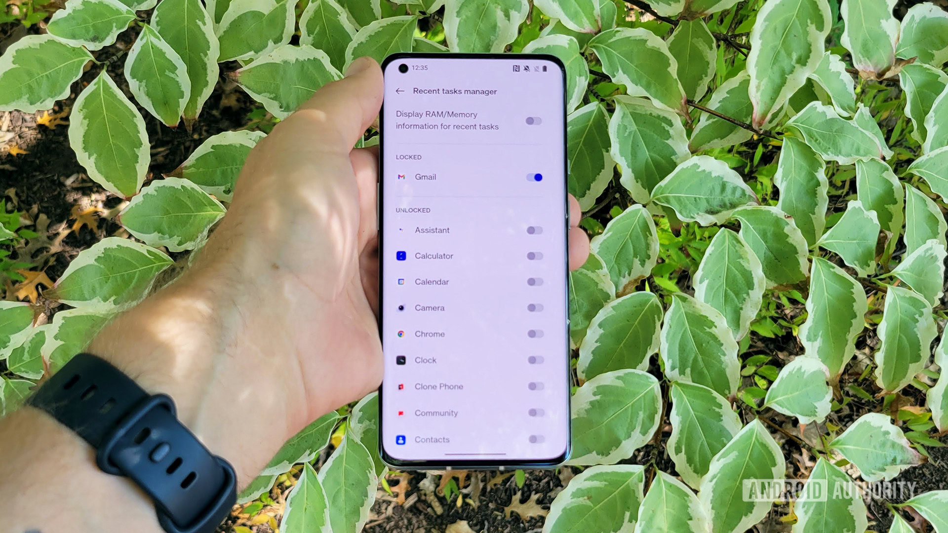
For years now, you’ve been able to “lock” apps within Oxygen OS. This prevents the apps from fully closing out of memory, even when you clear all apps out at once. The idea is that locking apps you use all the time will help them launch faster since they never really close.
Thankfully, this feature survives in Oxygen OS 12. In fact, it’s even expanded with a new recent tasks manager section that gives you a current list of all locked and unlocked apps. This is a welcome change since it prevents you from needing to use the apps switcher to lock/unlock apps as necessary.
Of course, locking too many apps in the memory could cause issues, so try to rein your ambitions in to match the capabilities of your phone.
Scout
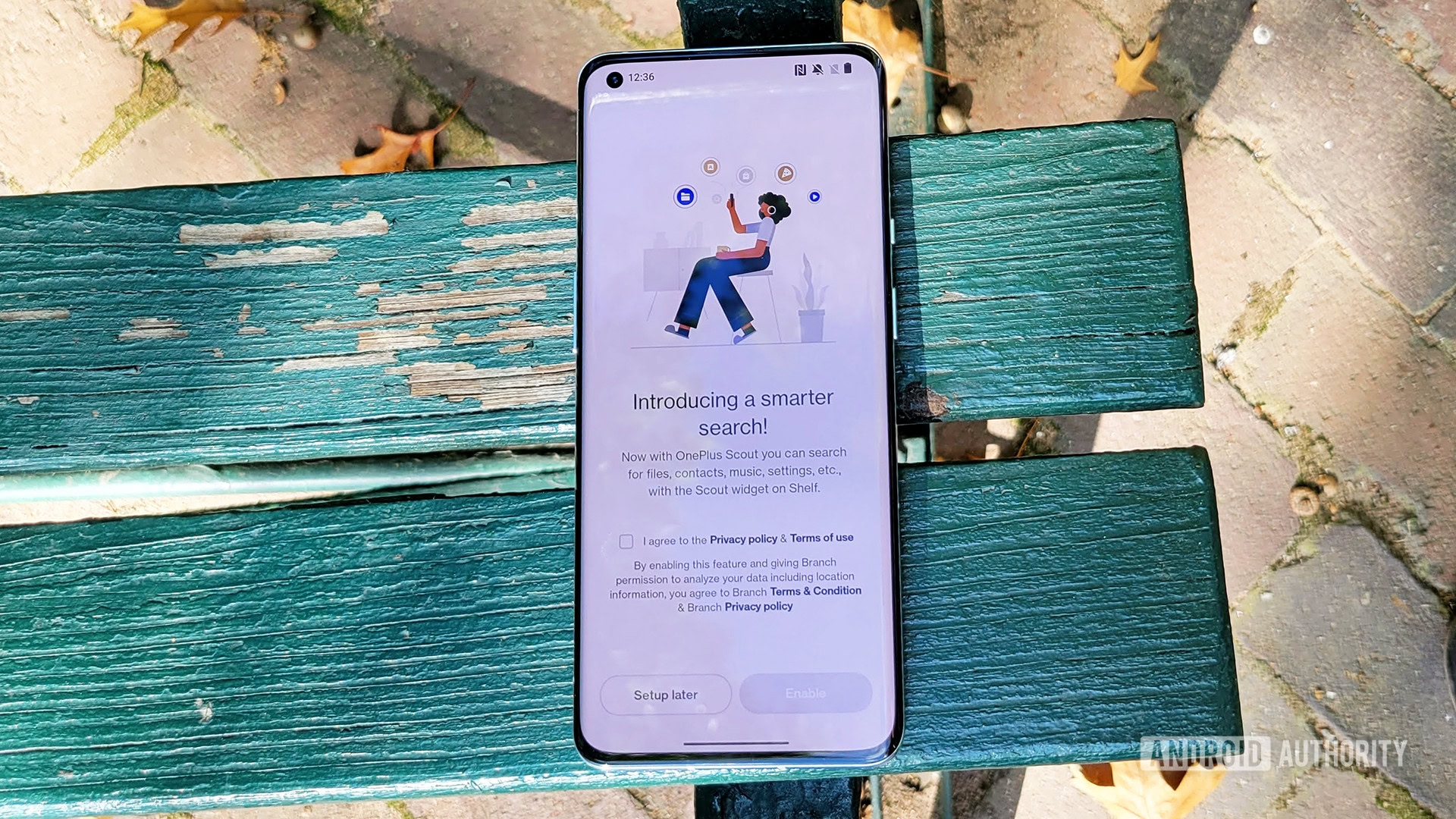
Scout isn’t actually a new feature, since OnePlus phones in India have had it for some time. However, the universal search engine feature is now in Oxygen OS 12 proper, so it should (theoretically) come to all OnePlus phones, not just those in India.
Interestingly, Scout is very much like the on-device search feature that’s now integrated into Android 12 itself. It gives you the ability to search all over your device for apps, documents, images, etc. On OnePlus phones, Scout lives in Shelf, the company’s aggregator of various smartphone features. Confusingly, Android 12 has this feature within the app drawer, but on the first Oxygen OS 12 beta, the app drawer search section just searches apps and nothing else.
It’s possible OnePlus could move Scout to the app drawer, but we doubt that would happen. It’s more likely it would just use the built-in feature Google offers in Android 12 for the app drawer search bar and then its own proprietary system in Shelf.
New Canvas AOD tweaks
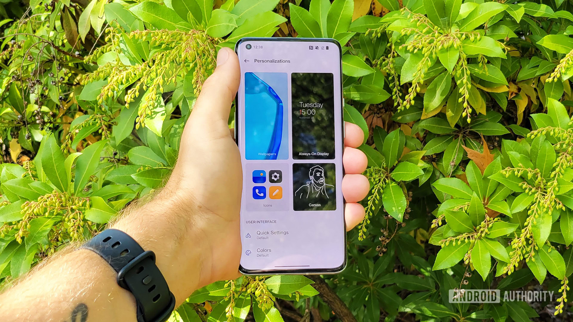
Since OnePlus didn’t offer an always-on display (AOD) at all until the OnePlus 8 series, it’s still refining the experience. With Oxygen OS 11, the company introduced Canvas AOD, which creates a wire “drawing” of a photo that you can then use as a background of your AOD.
Canvas AOD 2.0 gives you more control over how your wire image looks.
In Oxygen OS 12, this system gets a bunch of new tweaks. You can change the color and style of the wire lines and those lines are more accurate and detailed than they were previously. Interestingly, the super cool make-your-own-AOD tool offered on Color OS 11 hasn’t been ported to Oxygen OS 12. Judging from the rest of the features here, though, it’s only a matter of time.
Oxygen OS 12 beta: Release date, eligibility, and first impressions
Anyone who was concerned the OnePlus/OPPO integration was going to result in the death of Oxygen OS can now blurt out a smug “told ya so.” While this first beta of Oxygen OS 12 is rough around the edges and no doubt missing lots of features OnePlus fans expect to be there, it’s very clearly not Oxygen OS at its core. Instead, it is Color OS and OnePlus isn’t even making much of an attempt to doctor it up so it doesn’t seem that way.
Some people will be fine with this, of course. Some might even appreciate the “new” look. OnePlus fans in the United States, in particular, might dig this since they haven’t really had the chance to use Color OS before. For them, this will feel fresh.
Continued commentary: The OPPO-ification of OnePlus is complete
Oxygen OS purists, though, will very much dislike Oxygen OS 12. Unless OnePlus makes some drastic changes here, it looks like the original feel of Oxygen OS that already began seeping away in Oxygen OS 11 is almost entirely gone from this new version. This will force fans to either not update to Android 12 or use custom ROMs or other tricks to replicate the system to which they’ve become accustomed.
When OnePlus announced “OnePlus 2.0,” we knew things were going to shift. Now, there is no question of where that shift is headed.
Those looking to download the Oxygen OS 12 beta to try for themselves can do so from today — check out our article here for more details. There are currently 13 devices eligible for the Oxygen OS 12 open beta. There’s no word on an official stable Oxygen OS 12 release date, but considering Oxygen OS 11 rolled out a month after its initial beta it’s fair to expect it’ll hit at least the OnePlus 9 series in the next month or so.
Thank you for being part of our community. Read our Comment Policy before posting.