Affiliate links on Android Authority may earn us a commission. Learn more.
Google is testing out a radically different design for Google Assistant

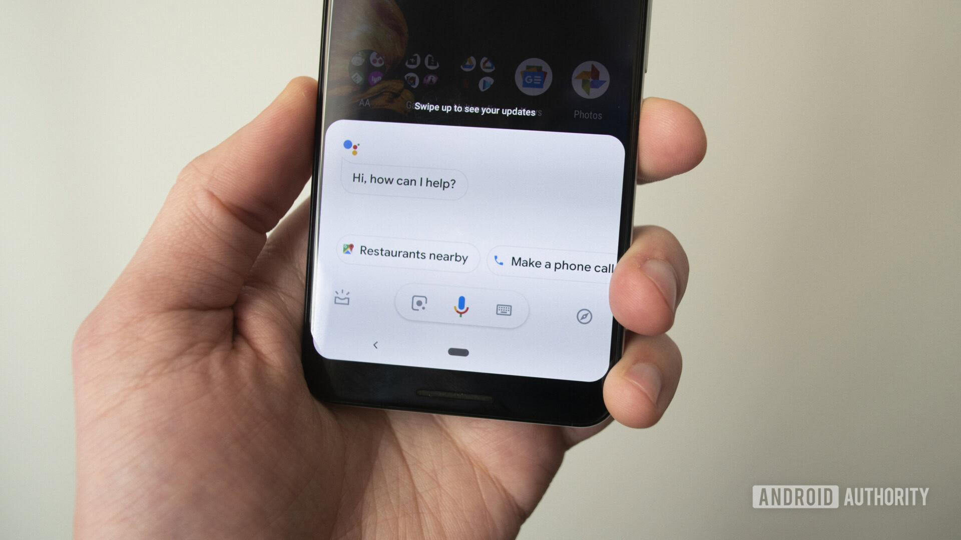
During its developer conference earlier in May, Google showed off an improved Google Assistant that will debut later this year. However, several Reddit users reported earlier today that Google is also working on a dramatically different design for its virtual assistant.
The new design features a transparent overlay that darkens the area at the bottom of the display. The bottom left option takes you to a snapshot of your day, while the bottom right option brings up the keyboard.
Once you give a command, Assistant then pops into the current full interface.

The coolest part of the new design is the four-color light bar that shows up at the bottom. The light bar brings back memories of the original Chromebook Pixel and Chromebook Pixel 2, which also feature a light bar on their lids. On the two Chromebooks, the light bar also doubled as a battery indicator when the lid was closed.
Interestingly, folks noticed the new design on a Pixel smartphone, Samsung Galaxy S10 Plus, and Redmi Note 4 running a custom ROM. 9to5Google got the design up and running on a OnePlus smartphone.
This is likely a limited A/B test on Google’s part, so don’t be surprised if you don’t see the new design. That said, let us know in the comments your thoughts on the refresh and if you have it up and running on your device.
NEXT: Fast Pair and Google Assistant are coming to cheaper headphones, thanks to Qualcomm