Affiliate links on Android Authority may earn us a commission. Learn more.
Apple iPhone 13 Pro review second opinion: Striving for perfection
Change for the sake of change rarely leads to tangible improvements. It takes deliberate action to craft something that truly builds upon a solid base and elevates it to new levels. It might sound a bit high and mighty for a mass-market consumer electronics brand to claim careful craftsmanship, but if there’s one company that can claim to come close, it’s Apple.
Sure, skeptics might go as far as saying that Apple’s minimal effort strategy to incrementally improve the iPhone is a ploy to maximize profits, but I disagree. Despite being fully immersed in the world of some of the best Android phones, it is clear even to me that Apple isn’t chasing feature completionism.
Instead, the focus is on striving for perfection. It doesn’t always get there and there are plenty of annoyances along the way (we’ll get to those). However, now that I’ve spent nearly three weeks with the iPhone 13 Pro, I feel the company is definitely onto something.
More of the same design, but that’s fine
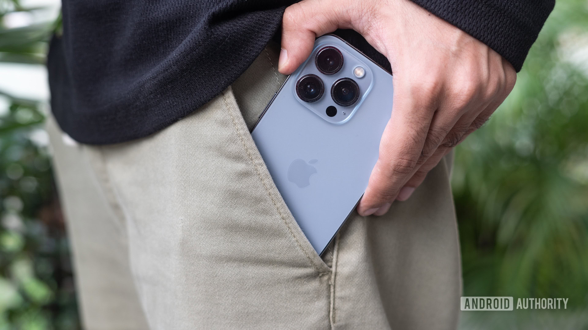
The iPhone 13 Pro makes few concessions for ongoing smartphone design trends and sticks to what Apple does best — consistency.
I’m not going to rehash my colleague Rob’s excellent iPhone 13 Pro Max review. The iPhone 13 Pro and the iPhone 13 Pro Max have the same design and materials. In fact, it’s practically the same design as last year’s iPhone 12 Pro, complete with sharp lines, flat edges, and an ever-so-slightly-smaller notch. Flip the phone over and you’ll find an upsized camera system as well. That said, these design changes are so minimal in the grand scheme that at first glance, the average person likely wouldn’t be able to tell the difference between the iPhone 12 Pro and iPhone 13 Pro.
The design changes here are minimal and deliberate. Does it matter? That’s debatable.
Does it really matter? That’s debatable. Looking from the perspective of someone who breathes Android and is always looking forward to the next major design breakthrough, the iPhone is boring to a fault. The iPhone 13 certainly isn’t going to catch your eye the way the cyclopean camera bar or whimsical colors of the Pixel 6 series do. Ask any iPhone user, however, and opinions might not be as harsh.
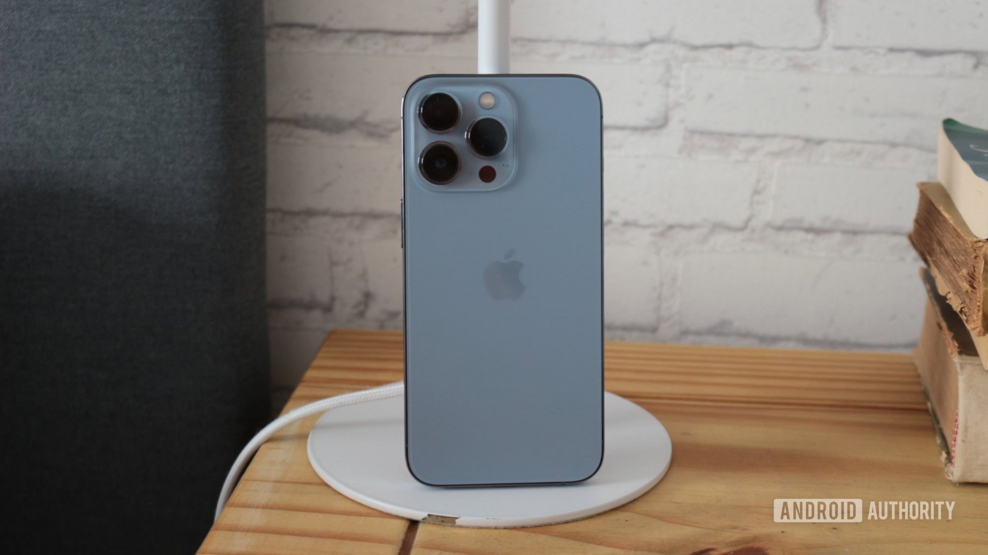
Personally, my biggest takeaway is in how the phone becomes a part of your life instead of being an accessory that is screaming for attention. For one, despite being a year old design, the iPhone 13 Pro is still a very good-looking phone. The unassuming looks and subtle colors merge beautifully with the stainless steel rails, fortified front glass, and sapphire crystal on the cameras, all of which come together to make a phone that looks professional, chic, and kinda robust. There’s nothing here that yells “look at me” which is exactly how I like it.
More pertinent is the fact that a few weeks of use later, any smartphone design would lose its charm, but the iPhone 13 Pro’s refinements still stand out. From the click of the volume buttons to the unparalleled haptics that ties together the entire user experience, the little things add up. That attention to detail is exactly what you are paying a premium for. And the iPhone 13 Pro rarely, if ever, skips a beat. It achieves the kind of fit and finish levels that even the most premium Android phones don’t always manage consistently. There’s value in that consistent high-end design.
Related: The best iPhone deals
But it is that same insistence on consistency that has the company straddling the line of cutting-edge hardware while holding onto standards like Lightning that are almost a decade old. It’s an antiquated port relegated to USB 2.0 speeds that serves no real benefit bar a steady revenue stream from licensing. In fact, Apple’s entire line-up minus the iPhone has moved to USB-C. Sure, there’s wireless charging but at 15W (when paired with a MagSafe charger) the speeds are more a relic of the past than a peek into the future. Come on Apple, I no longer want to have to scramble around searching for a Lightning cable amongst a sea of USB-C chargers.
The phenomenal battery life mitigates the annoyance of dealing with the Lightning port and slow wireless charging speeds.
The saving grace, however, is its incredible battery life. And it truly is incredible. With normal day-to-day use, the iPhone 13 Pro has consistently been a two-day use device for me. Part of it is due to a much more frugal processor, but also Apple begrudgingly making the phone just a bit thicker than the iPhone 12 Pro to slot in a larger battery. By absolute numbers, the battery here still pales next to Android competitors, but the phone’s battery life runs circles around any other premium flagship on the market. I never felt the need to plug in the phone beyond plopping it on a wireless charger for an overnight top-up.
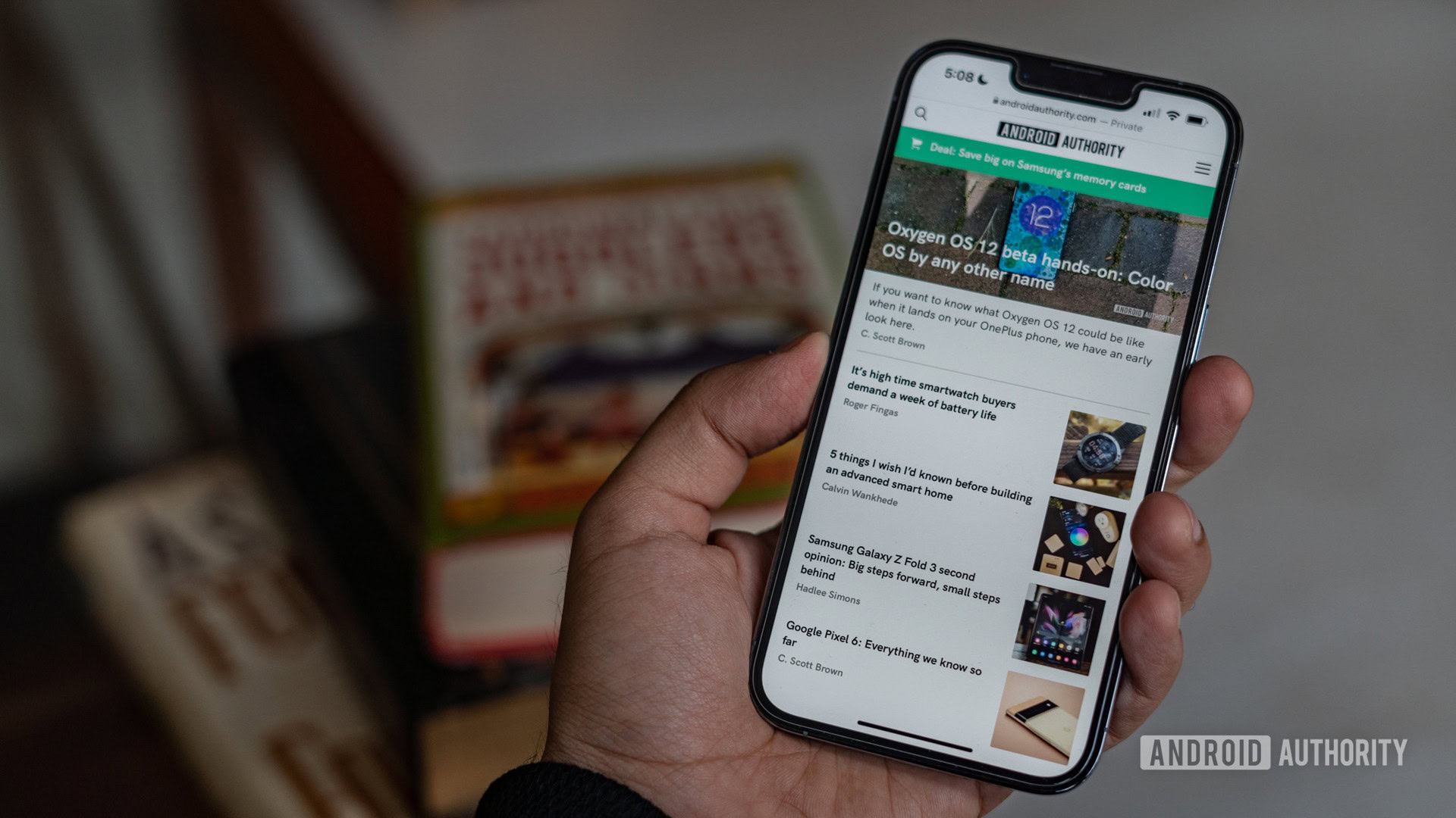
Elsewhere, the iPhone 13 Pro’s jump to a high refresh rate panel has been long-awaited and anticipated. Yup, 120Hz “ProMotion” support is here and it brings a subtle yet meaningful improvement to the user experience. The difference isn’t night and day and Apple’s animations have always been sublimely smooth even on older iPhones, but the premium feature is table stakes in a pro-themed phone. The real issue here, however, is that barring a few apps, almost nothing supports 120Hz mode just yet. I expect this to be solved soon rather than later thanks to Apple’s excellent developer ecosystem, but for now the smoothness is relegated mostly to navigating around the phone’s UI.
Anyway, as a panel, the screen is top-tier. I’ve long been a fan of the 6.1-inch size and aspect ratio adopted by Apple. It is perfectly suited for texting and easy scrolling. The screen is now brighter still and hits over 1,000 nits under direct light. Indoors, outdoors, and even under blazing sunlight, the screen remains perfectly visible. All around, excellent… as long as you don’t mind the notch.
Competent cameras that are anything but path-breaking
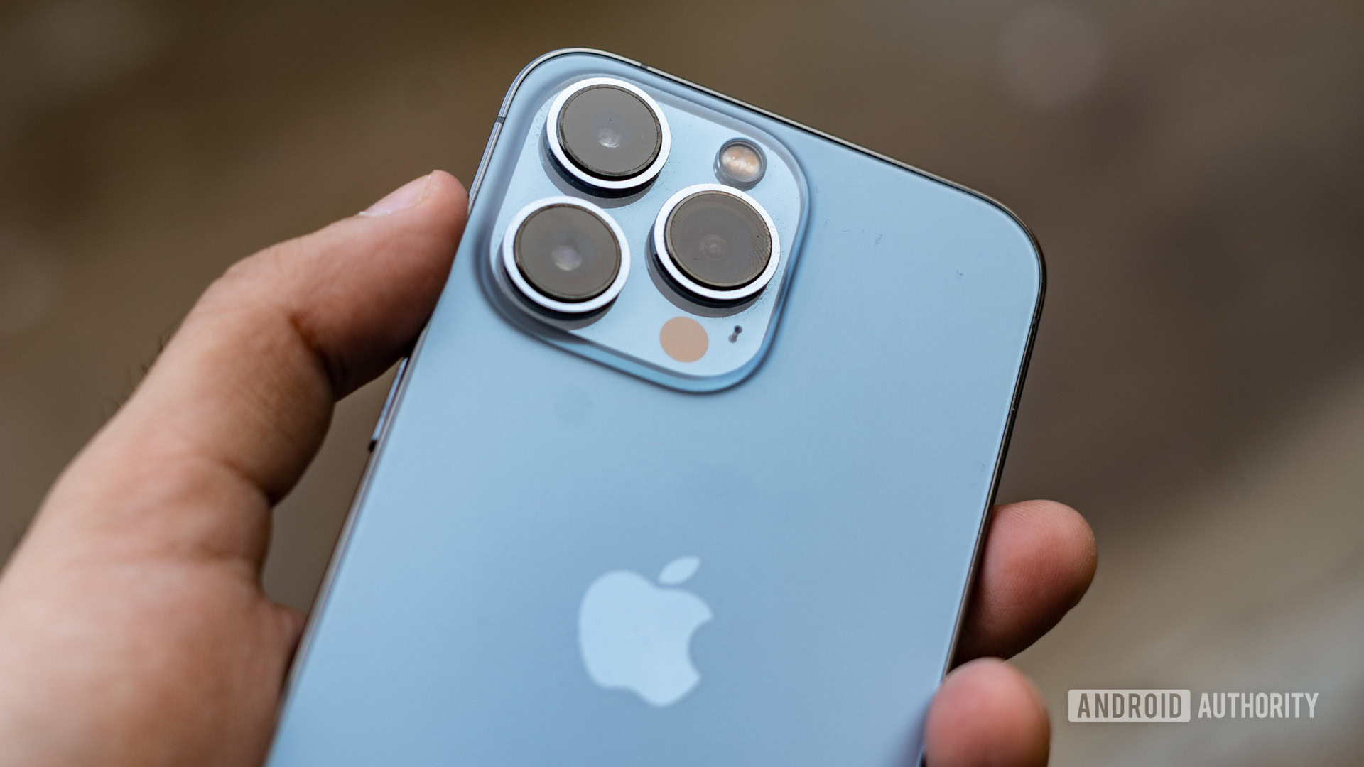
The general theme of consistency touches almost every facet of the phone including the cameras. You can refer to our iPhone 13 Pro Max review for the low-down on all the hardware changes. As a quick recap, you’ll get brighter lenses, slightly better zoom, and a much faster f/1.8 lens for ultra-wide shots. For most users, the larger primary sensor and sensor-shift stabilization system, previously exclusive to the iPhone 12 Pro Max, is what will make the most tangible difference.

The phone really nails the whip-out and snap a photo experience through its casual reliability. More often than not, you just won’t need to bother with the litany of options. I noticed that the phone favors warmer tones, but that’s where the new Photographic Styles feature come into play. More than a simple filter, Apple is now giving users the stylistic choice of warmer, cooler, or more saturated colors that are applied based on semantic segmentation that works on every single frame of a multi-frame pipeline.
The iPhone 13 Pro is the epitome of whipping out your phone to take a quick snap with its sure-shot guarantee of a good shot.
The effect is convincing and the phone can bump up the saturation in a photograph while still identifying individuals and keep them looking true to life with accurate skin tones. Personally, though, I preferred sticking to Apple’s default color rendering.
Generally speaking, there’s a lot of detail in the shots and the top-notch white balance metering even under a variety of lighting conditions impressed me.
The general uniformity of the color science is another aspect of the cameras that shines through. It’s a recurring problem with more than a few phones where white balance metering and color science can be drastically different across the three camera sensors.
Related: The best camera phones you can get
The shot above is a bit of an extreme example with an overcast sky but the phone handles the switch from the ultra-wide camera to primary with aplomb. It’s a very uniform transition across the lenses.
Now, the telephoto lens might appear to have flatter tones but, in this case, it makes sense to meter brighter and tone down cool tones to accurately capture the scene. With more consistent lighting, you’ll get very similar colors across the board.
Despite the generally excellent photography, there are a few bugs in Apple’s Smart HDR 4 implementation. On more than one occasion, the camera failed to tone down highlights which resulted in highlight clipping in the shot from the ultra-wide camera. Taking the photograph again usually resulted in better results pointing to a bug rather than deliberate action.
The iPhone 13 Pro’s low-light imaging gets a solid boost courtesy of the sensor-shift stabilization system. Sure, the phone doesn’t capture the most vibrant or brightest shots around, but there is a clear and evident focus on going for accuracy. Noise levels are kept in check for the most part though I do feel that the camera pulls down shadows just a bit too much. Images with a wide dynamic range can also suffer from the same HDR issues where a signboard might show highlight clipping.
Overall, placed next to, say, a Galaxy S21 Ultra or Pixel 6, the low-light shots might not look as striking but they are definitely closer to what you can see with your eyes.
This year, the iPhone 13 Pro is adding a feature that has become commonplace on Android devices. Both the iPhone 13 Pro and Pro Max gain a macro mode that uses the ultra-wide sensor paired with auto-focus capabilities to get close to your subject. We’ve already seen this on phones going as far back as the OnePlus 7 Pro and it works just the same. Results, in the right hands, can be exceptional though you will need sufficient ambient light to do them justice.
Camera shootout: Samsung Galaxy S21 Ultra vs Apple iPhone 13 Pro Max
Unfortunately, there is no manual toggle to switch off macro mode and the camera doesn’t always switch profiles correctly. On the other hand, you might want to switch over to the regular camera instead of macro mode and there’s no way to manually trigger that either. While Samsung phones do have automatic mode switching, they let you turn off macro mode with a tap — a feature that Apple needs to crib as soon as possible.
Once again, I’ll point you to our full review for all the enhancements to the iPhone 13 Pro’s cameras but there’s one major new feature that left me pleasantly surprised. Sure, iPhones are known to have top-tier video quality and the 13 Pro has only gotten better. However, it is Cinematic Mode that caught me off guard.
Effectively portrait mode for videos, Apple is calling it the next big thing in smartphone videography. In my experience, it’s not quite there yet but for a first-generation piece of technology, it is rather astounding how well it works when it does.
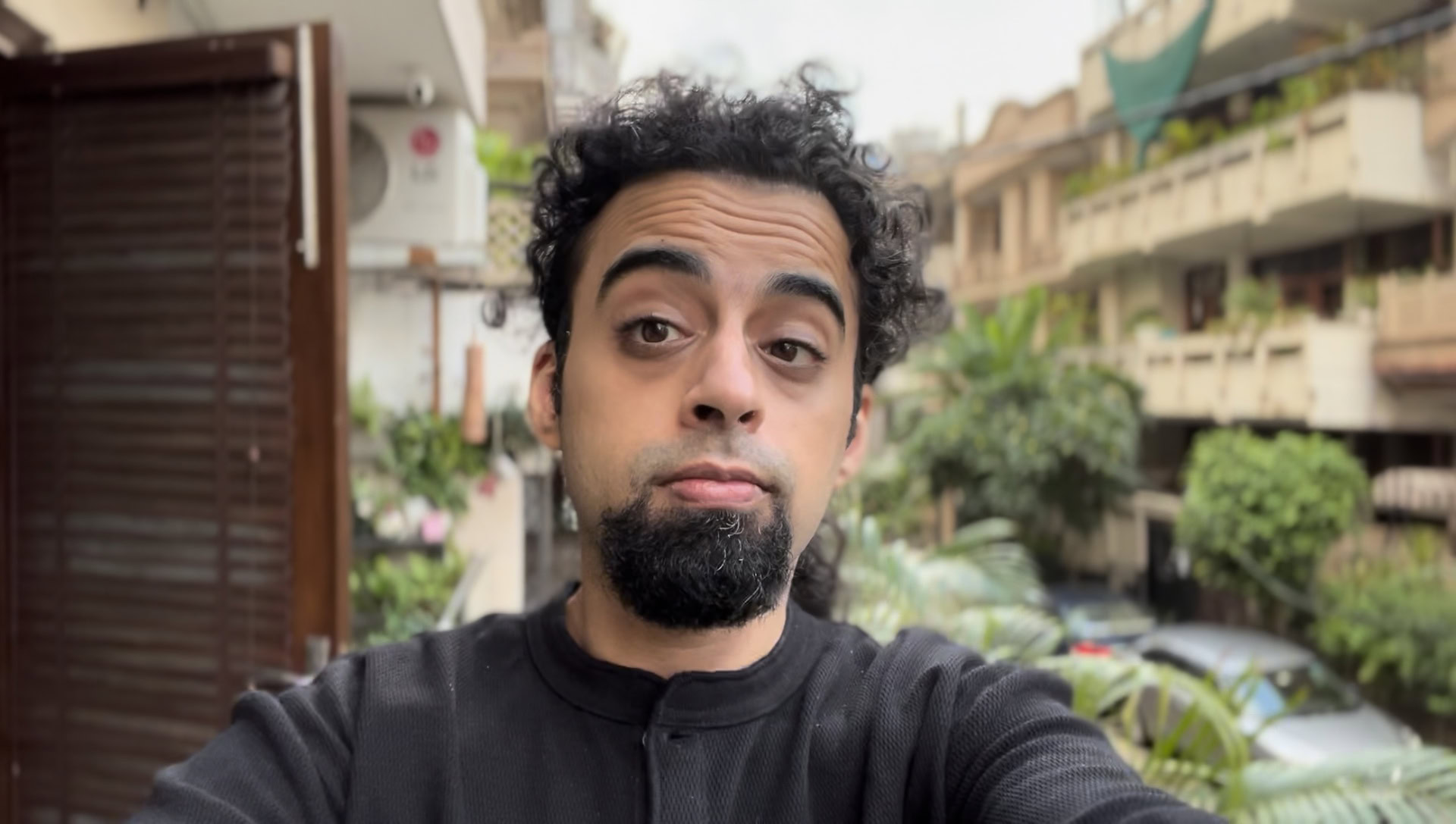
Cinematic Mode can create a very realistic illusion of depth of field as long as there’s sufficient ambient light.
The screengrab above was taken from a Cinematic Mode video clip where you can see the camera system slipping up around errant hair strands. These occasional goof-ups, however, don’t stand out nearly as prominently when viewing a video clip. The phone handles sweeping panning shots or close-ups really well and the mode works both with the front and rear cameras. Overall, the results certainly aren’t perfect, but it does a very good job as long as there is sufficient lighting. It’s a bit disappointing though that the feature maxes out at 1080p video.
We’ve seen some implementations of portrait video on Android phones, but Apple takes it a step further by letting you adjust the depth of field and focus after recording the video. Having that extra creative control makes Cinematic Mode a genuinely useful tool in the iPhone 13 Pro’s camera kit.
More performance than you know what to do with
I’ve purposely refrained from talking much about the performance of the iPhone 13 Pro. The A15 Bionic chipset packs more grunt than almost any user will realistically need today. It is by far the most powerful smartphone chipset around and having oodles of power on tap should guarantee the five to six years of smooth use that Apple seems to project with its long-term updates. Moreover, changes to the operating system this time around are even more minimal, but that doesn’t mean there’s nothing new to talk about.
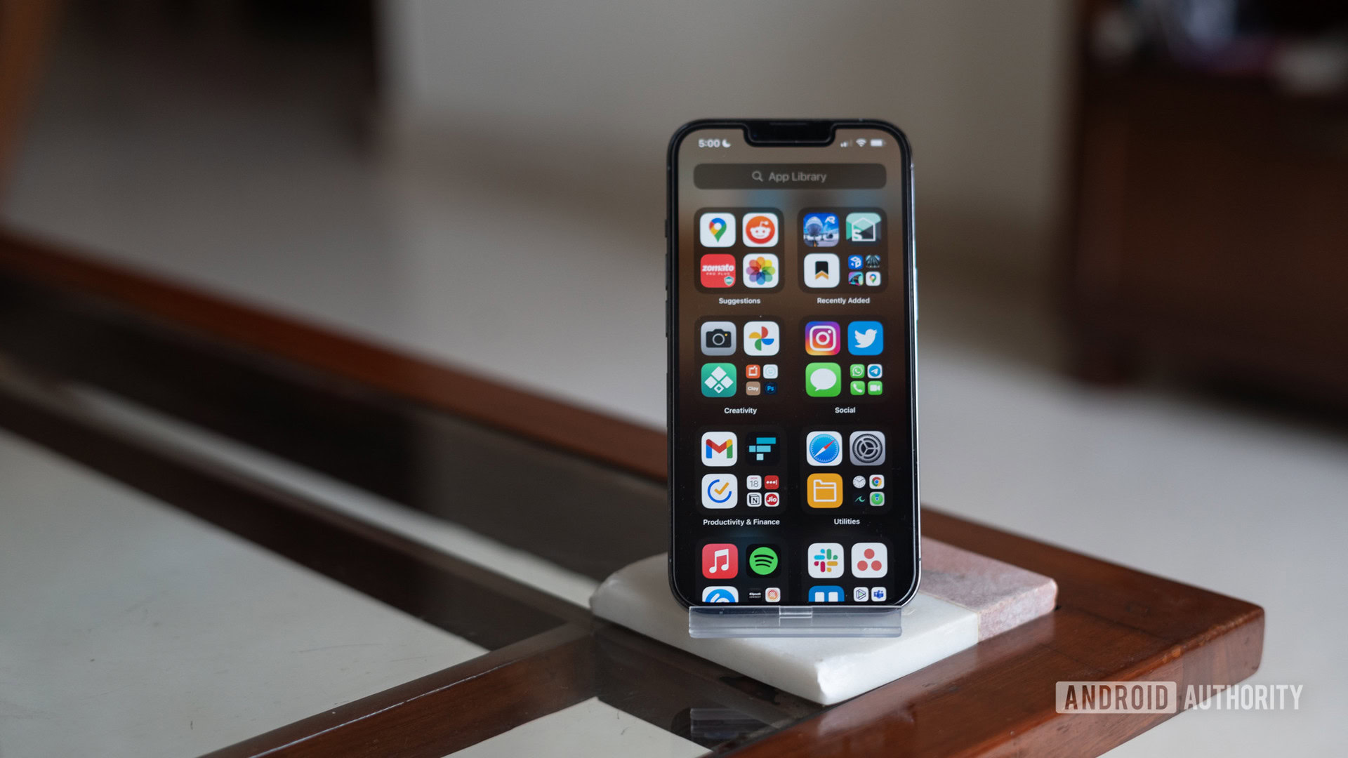
iOS 15 brings with it minor tweaks to notifications like the ability to schedule them out for a summarised account. There’s also offline text recognition that works remarkably well and lets you translate or copy text from real-world objects.
The A15 Bionic chipset has enough power on tap to max out anything you throw at it.
My favorite feature, however, is Focus Mode that lets you set custom profiles and control exactly who can reach out to you, apps that can notify you, and even define specific home screens that are hidden away under specific profiles. The feature works very similar to the equivalent Digital Wellbeing mode on Android, but takes it a bit further with granular control over contacts as well as the ability to set multiple profiles.
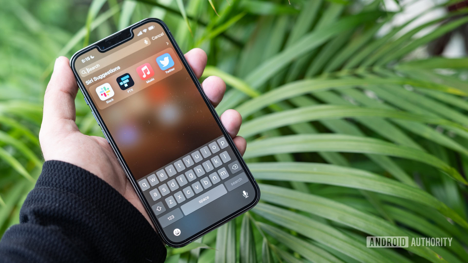
With that said, iOS 15 appears to have more than its fair share of bugs. On more than one occasion, the keyboard simply refused to pop up. On another occasion, the camera viewfinder showed a black screen while there were moments when the touch screen refused to respond. I’ve also observed that saving images can take a second or two. It’s all rather uncharacteristic of Apple though to their credit, the company has issued at least two updates since launch to smoothen out bugs.
Apple iPhone 13 Pro review second opinion: The dependable option
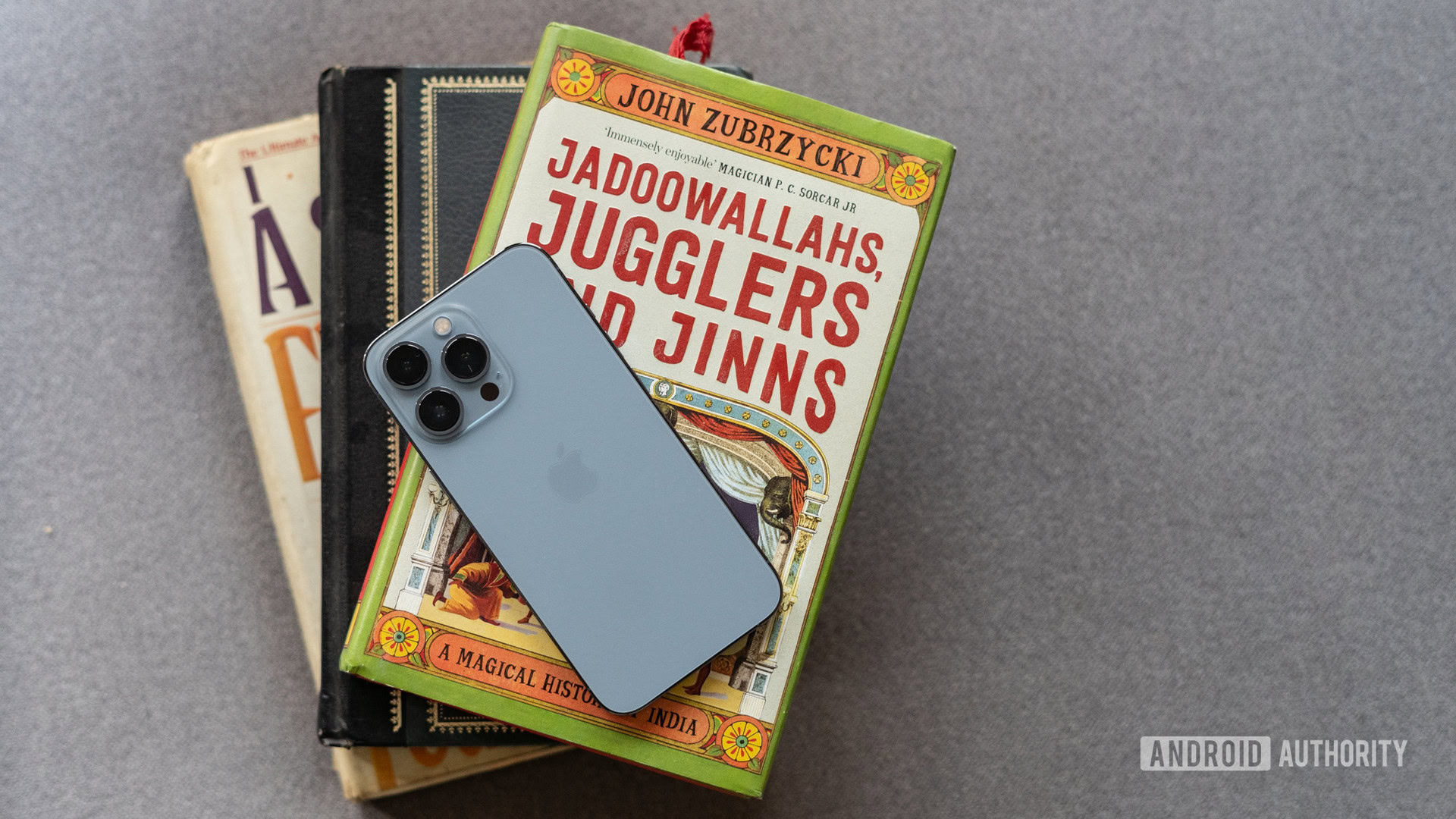
The Apple iPhone 13 Pro sits amongst the upper echelons of premium phones. Not just because of the price, but for the ethos it embodies. While Android smartphones bend over backward to nudge forward the needle of innovation, Apple is taking smaller and more assured steps.
Priced starting at $999, £949, or Rs. 1,19,900 (~$1,600) in my home region of India, the phone needs to justify that aura of premium-ness it has fostered. Instead of introducing, say, a foldable design or more lenses than you can shake a stick at, Apple is offering what it does best — a dependable phone. The iPhone 13 Pro promises only what it can deliver, and it delivers those features nine times out of 10.
Read next: The best iPhone 13 alternatives
The basic foundation of the phone is rock solid and essentials like UI navigation, apps, security, and privacy features are polished to a sheen. The camera works consistently well and takes some of the best pictures you can get out of a phone. The phone further embellishes it with performance that won’t have you reaching for a replacement for years, and the battery life is hands-down amongst the best you can get on a flagship.
Despite all that, if you are on a recent iPhone, I can’t in good conscience recommend the phone. This is especially true for iPhone 12 Pro and, even iPhone 11 Pro users, but that is largely because of how well those phones have aged. For those in the Android camp, things are a bit more complicated. You might be letting go of some bleeding features, but in return, you get an experience that ties the software and hardware together beautifully well with the kind of vertical integration — with watches, laptops, and more — that is rarely seen in consumer technology.
I’m no Apple apologist (my daily driver is still a OnePlus 9 Pro) but even I feel that the nosebleed pricing can be justified simply by accounting for the phone as a multi-year purchase. If you’ve made it this far, I think the conclusion is obvious. If you’ve been eyeing an iPhone, the iPhone 13 Pro is as good as it gets.
Thank you for being part of our community. Read our Comment Policy before posting.