Affiliate links on Android Authority may earn us a commission. Learn more.
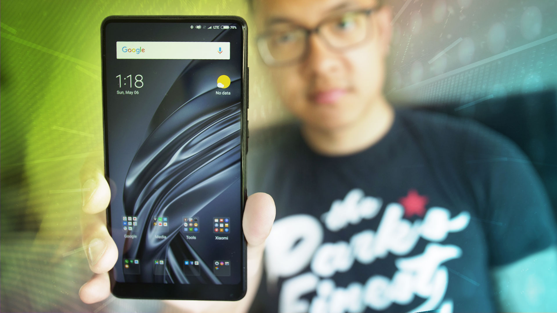
Xiaomi Mi Mix 2S Review: The luster remains
Xiaomi Mi Mix 2S
What we like
What we don't like
Our scores
Xiaomi Mi Mix 2S
Hot off the heels of Xiaomi announcing its IPO, we’re taking a look at the latest version of the company’s most unique smartphone offering. In a world full of notches and similar tweaks to the full screen experience, this mid-year update provides a worthy alternative, now with a dual camera setup. This is the Xiaomi Mi Mix 2S.
Read Next: Xiaomi Mi Mix 3: Five things I want to see
During the final stages of our Xiaomi Mi Mix 2S review, Google and Xiaomi announced that the Mi Mix 2S is part of the Android P Beta Program! We are putting the new beta on the phone now and will report our experiences in a new piece soon.
Design
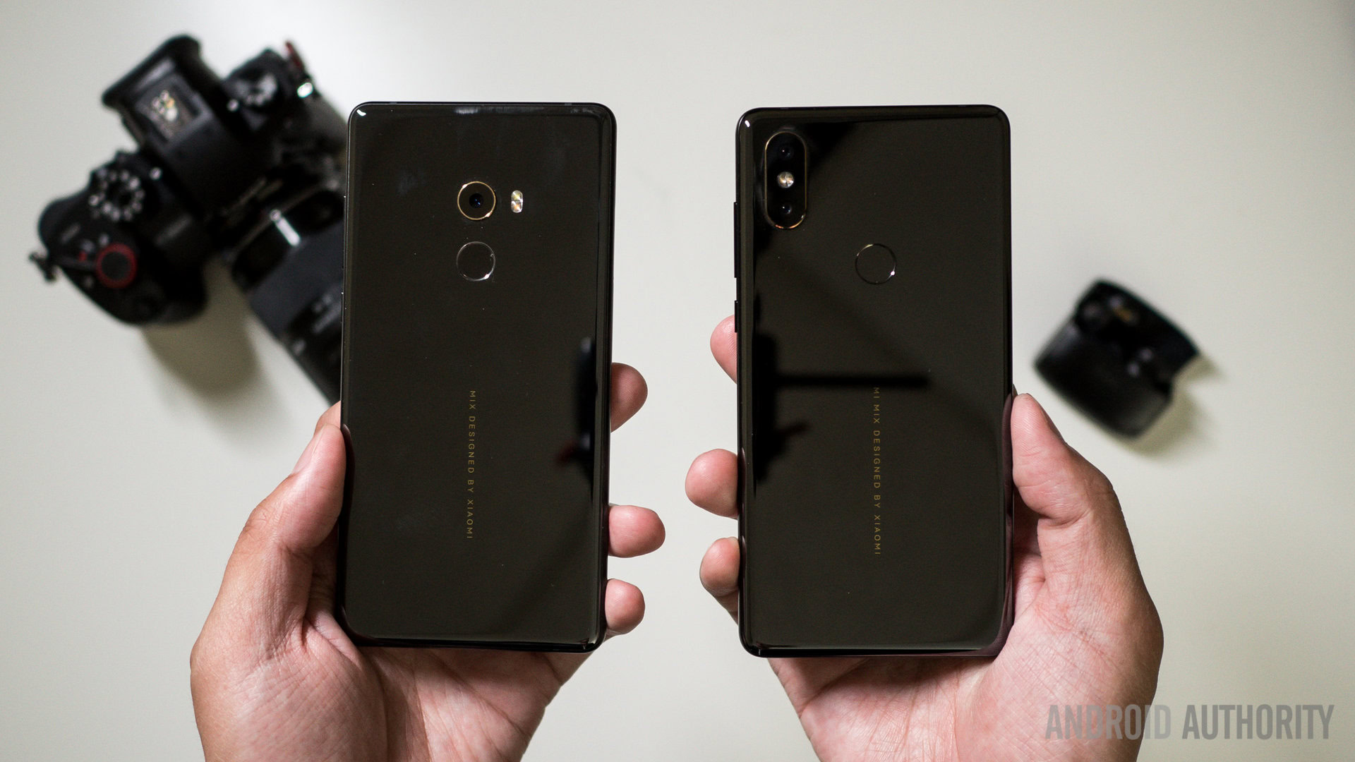
A side by side comparison to the original Mi Mix 2 makes it pretty clear what has been added — a second lens adds telephoto and portrait capabilities to the shooting experience. Aside from that, much of the phone is still the same, right down to the ceramic body. The sleek backing is separated from the full screen front by a metal frame and looks very sleek in this black version and striking in the white version. While the previous version had special editions with a unibody ceramic design, that is the not the case here.
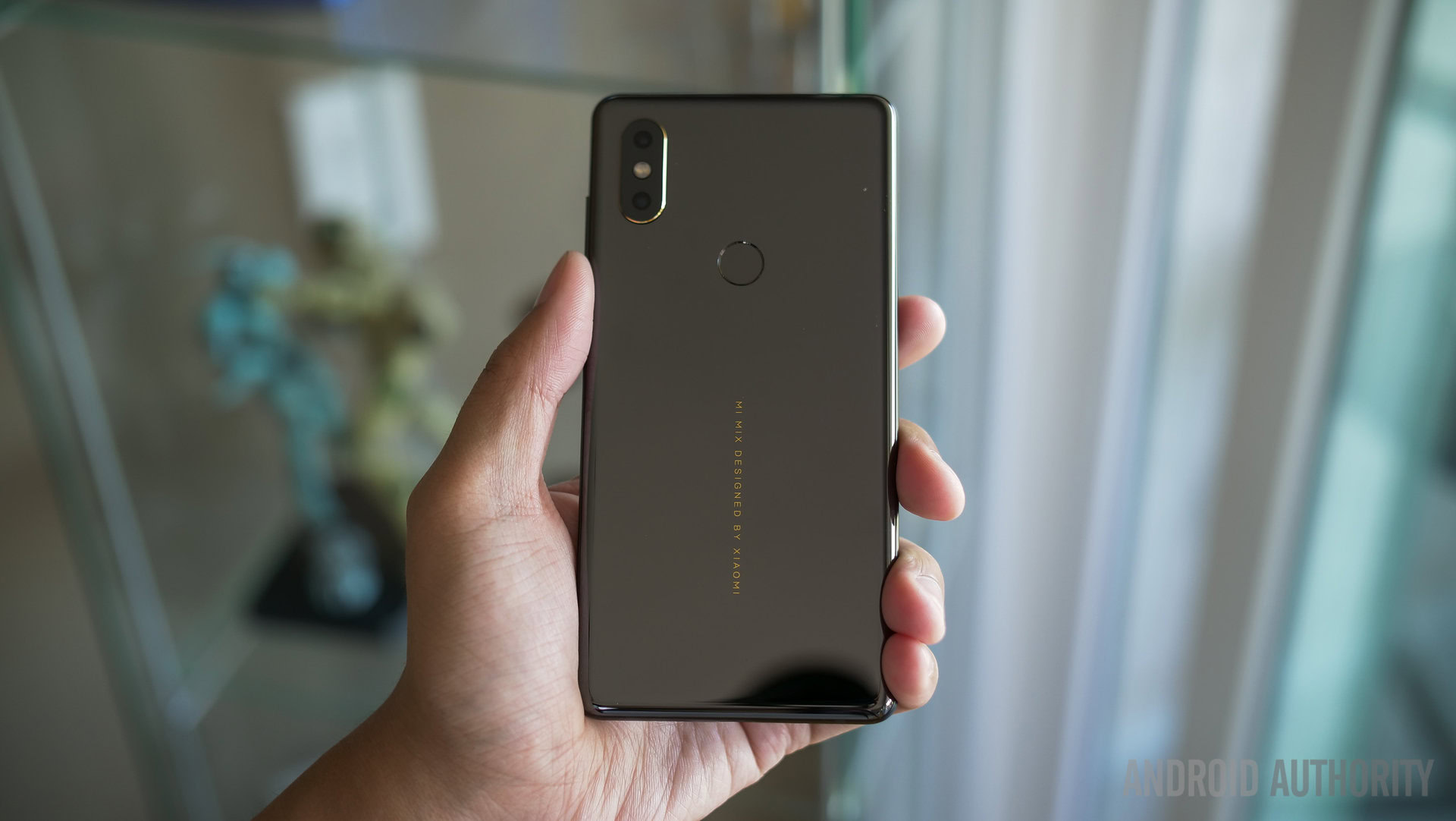
The ceramic backing is still one of the most unique and eye-catching materials of any smartphone and Xiaomi continues to use it. It can be a little slippery at first, but after some time the heft and potential smudges make it easier to keep a secure grip. A form fitting and minimalist black case that slips on perfectly is included in the box, providing easy and tactile access to the button layout.
Ceramic has become a Xiaomi calling card, and it continues to make their devices shine.
As before, there are no buttons on the front due to the full screen experience, but the usual offerings — a volume rocker with a power button below it — are all on the right. Jumping down to the bottom, the little bezel that remains allows for not only the front facing camera (yes, it is still bottom mounted) but also the USB-C charging port and a single bottom speaker. There is no headphone jack on the Xiaomi Mi Mix 2S.
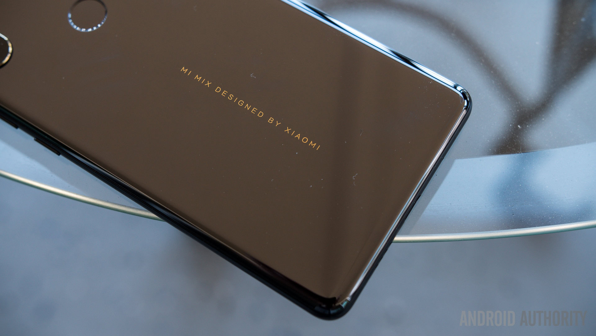
This is still Xiaomi’s best design, and ceramic goes a long way to keep what is ultimately familiar still great to look at. Just like before, it’s hard not to like the phone.
Display
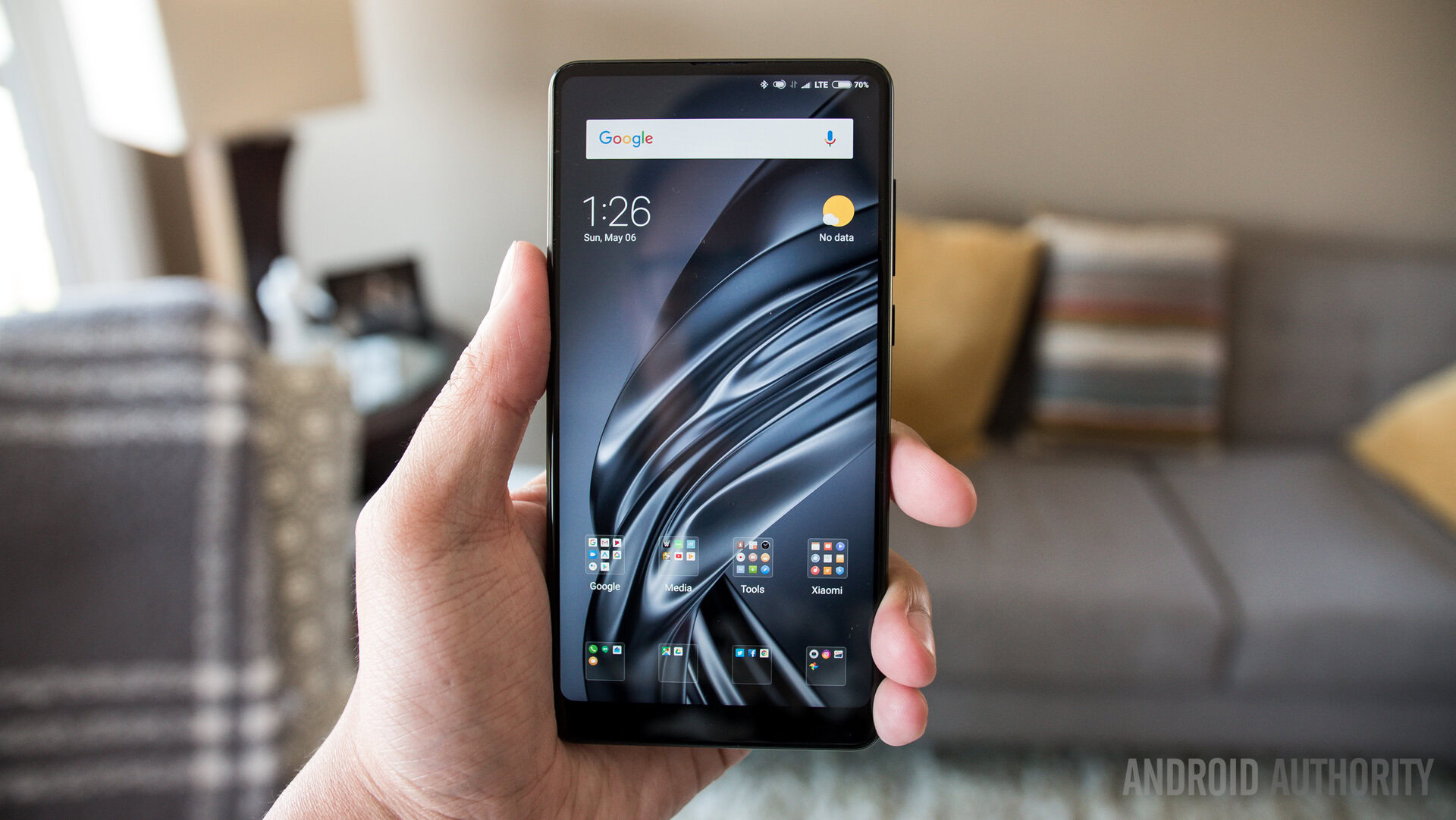
Part of that good design is owed to the phone’s full screen display. Of course, the compromises of the Mi Mix 2 return in this mid-season update. The 6 inch 18:9 display is still a Full HD+ display, but it renders elements quite well, mostly due to the MIUI’s tighter use of space. Colors look a bit muted compared to some of the saturated displays out there, but it didn’t take away from any form of usage — from media to gaming to work. More enjoyable viewing experiences are out there, but the Xiaomi Mi Mix 2S is no slouch — after all, just look at how much screen you get, especially since nothing cuts into the panel.
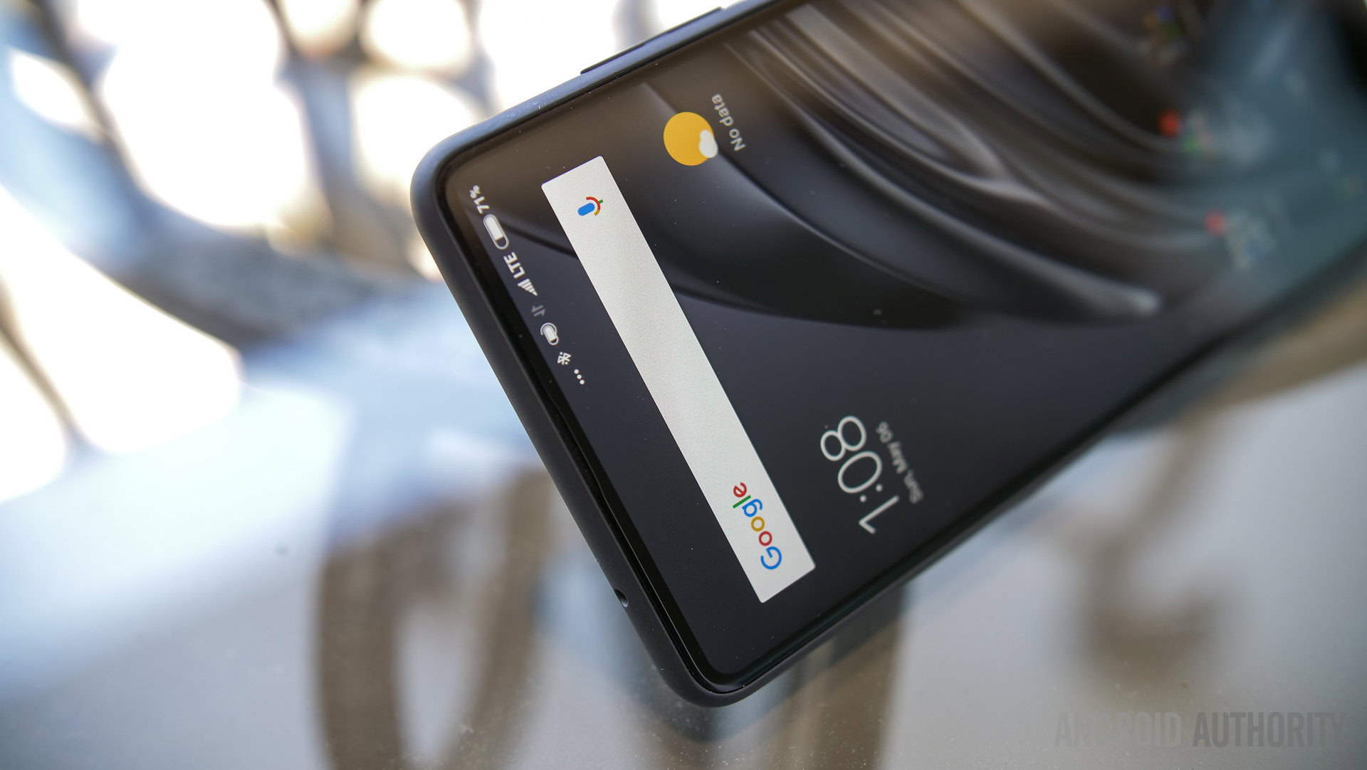
The Mi Mix 2S doesn't have a notch, but the bottom front facing camera might be its own form of annoyance.
I wish that the display got brighter in broad daylight. Even cranking the brightness to max didn’t seem to help very much with the sun baring down. The auto-brightness was also a bit hit or miss. I had to go into the quick settings to bring up the level in situations where auto should have already done it.
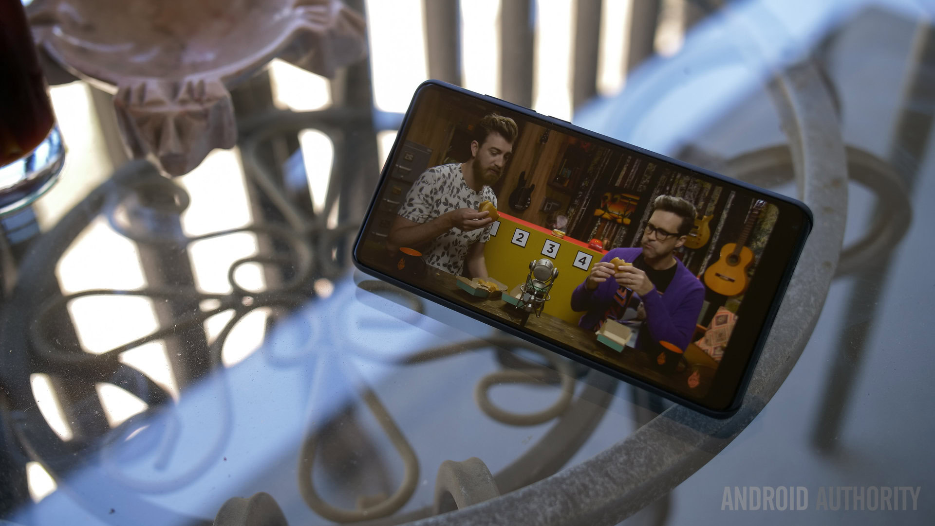
MIUI still crowdsources its features from its robust forum community, and its newest addition is a feature Apple introduced with the iPhone X: full screen gestures. If you really want to open up the whole screen, you can make the softkey bar go away and simply use swipes from the edges of the screen to either to back, go home, or bring up recent apps. Personally, I am not a fan of these kinds of gestures, but I got used to them after a little while. What is annoying about this shift in navigation is how it clashes with other functions. Watching Youtube in landscape orientation makes swiping up for related videos hard to do because it might trigger the MIUI home button instead. In other apps, swiping from the sides to go back could cut into Material Design menus which are supposed to come from the left side. Without a home button to press and hold, I had to find other ways to get to Google Assistant.
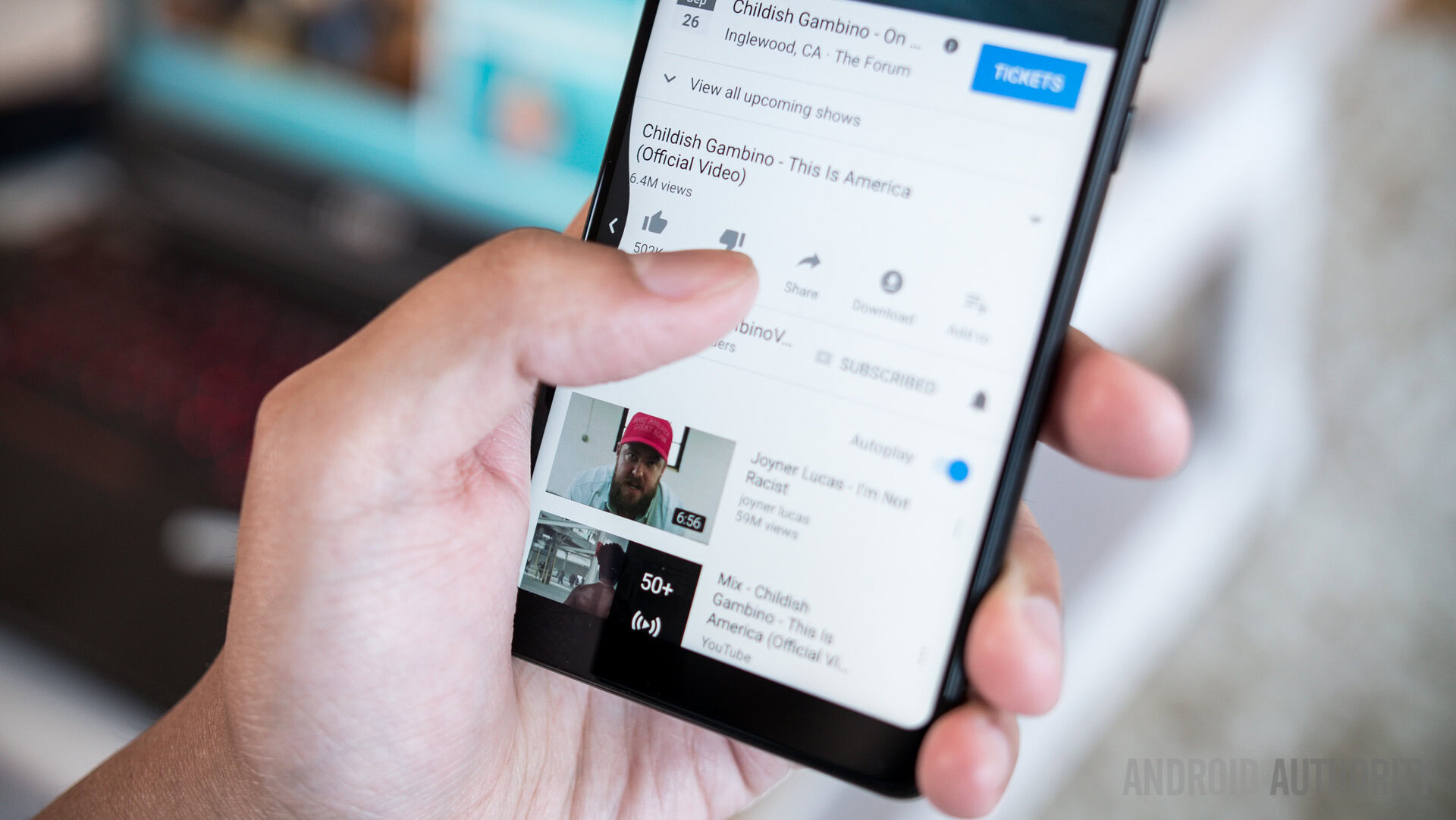
To its credit, Xiaomi bucks the notch trend with the Mi Mix line. A number of other phone makers centered front facing cameras at the top their phones, usually by carving a notch in the center of the screen. The Xiaomi Mi Mix 2S keeps the front camera at the bottom, which is the only place where there’s any substantial bezel on the phone. This compromise is annoying on its own, so maybe the bottom bezel is just as bad an idea as the notch.
Performance
Where Xiaomi really gets things right is in the spec sheet, at least in terms of performance. The Xiaomi Mi Mix 2S now sports the Snapdragon 845. The base model comes with 6GB of RAM and either 64 or 128GB of onboard storage. If you want to spend a little bit more, there is an 8GB RAM edition with a whopping 256GB of storage. This extra storage option softens the blow of having no microSD card slot, so heavy media or camera users have plenty of space to play with out of the box.

I had no issues with any performance whatsoever. The phone worked just as fast as any current flagship phone should. A lot of media play took up the majority of my usage and I played a good amount of Fire Emblem Heroes without any stutters, issues, or problems. Even popping in and out of the camera was a smooth experience — if you recall the previous unit I was using had performance issues mainly with the camera — rest assured that my final review unit had accounted for all of that.
Hardware
This phone still has global bands, so it can be used anywhere outside of its core markets.
There is little new to talk about with the hardware offerings, as the same connectivity bits and pieces from the original Mi Mix 2 remain. The phone speaker is noteworthy — it uses a small slit above the massive screen for a normal phone call experience instead of the bone conduction Xiaomi attempted in the very first Mi Mix. The phone also still uses the ultrasonic sensor to give the phone automatic screen deactivation when the device is near one’s face during calls.
Audio quality
Where we took exception to the sound experience was with the speaker, which is still a single bottom mounted unit without any impressive tuning. Audio lacks body and is quiet compared to some of the far better experiences in competitors’ flagships. The Mix line already made it clear to its fanbase that the headphone jack is not a consideration, but it is still a sore point that an adapter is required for any wired headphones.
Battery life
Battery life is about the same between the Xiaomi Mi Mix 2S and the Mi Mix 2. The Full HD+ resolution display helps the battery last a bit longer, it seems. In my somewhat heavy usage that was generally on Project Fi data and constantly playing either YouTube videos in the background or podcasts, the phone could easily get up to 5 hours of screen-on time, with a full work days of usage. Because of my typical level of usage, I did not get many instances of a day and a half but I am certain it is more than possible for more casual users.
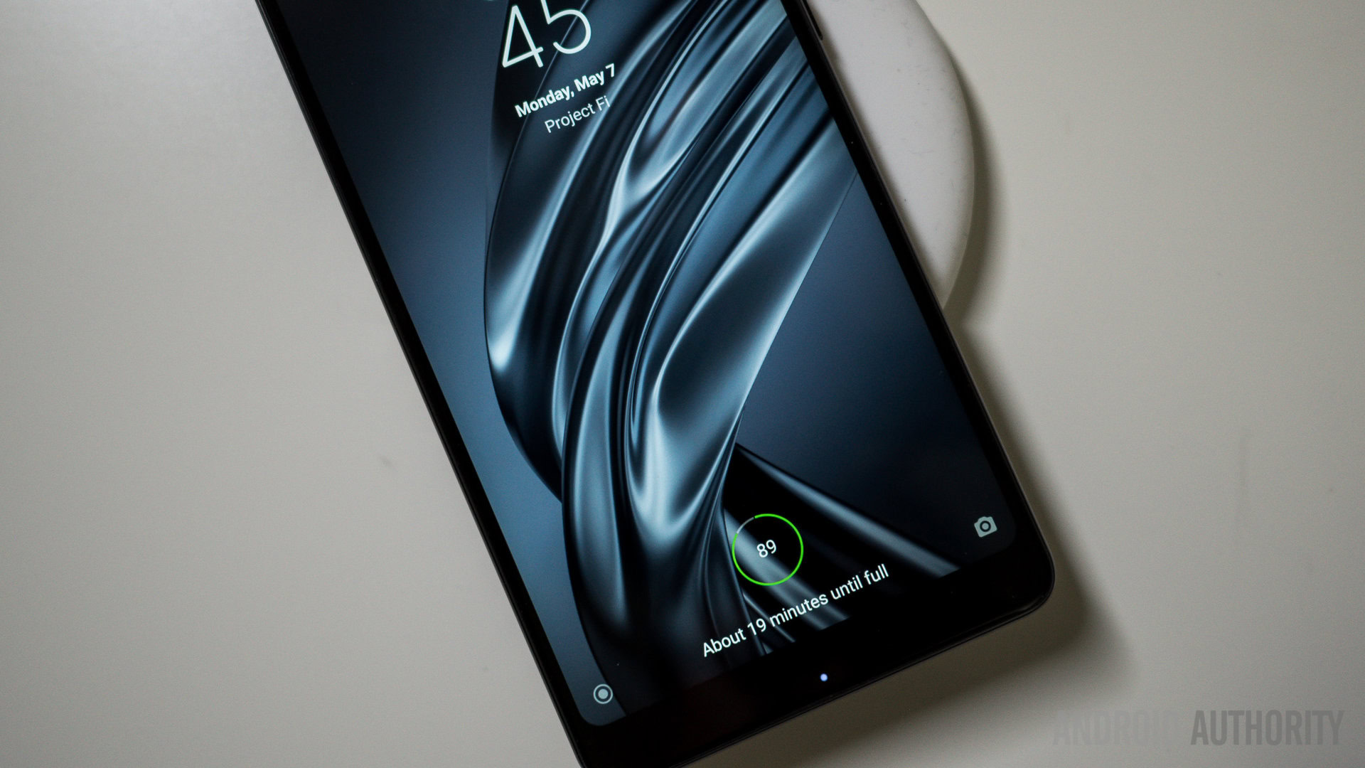
Xiaomi's own wireless charger is only $15!
The phone now supports wireless charging, even with its ceramic backing. This is an exciting development not just for the phone specifically, but for the Mi ecosystem. After all, this facilitated the creation of a very affordable and simple wireless charging mat. It is priced at just 99 yuan (~$15) and supports pretty much any phone with wireless charging capabilities. It wouldn’t be surprising if this mat became as popular as other peripherals in Xiaomi’s catalog, like the Mi Band.
Camera
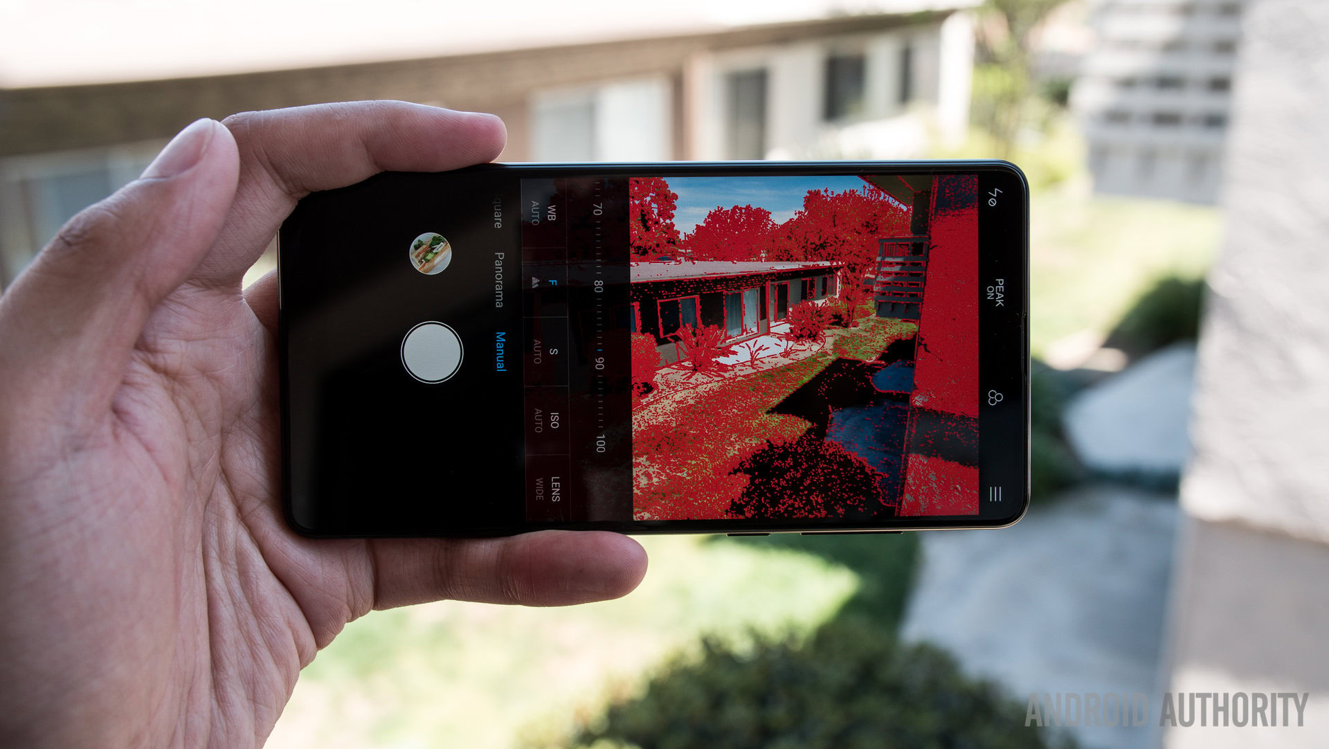
Aside from just adding a telephoto lens, the Xiaomi Mi Mix 2S also has a better sensor, which should lead to better overall quality. The main lens now has an f/1.8 aperture with pixels at 1.4 micron sizes. The zoom lens, on the other hand, is at f/2.4 aperture and has 1-micron sized pixels. Only the main shooter has OIS.
Inconvenient bottom-mounted front camera lens
Before we get into the main camera quality, let’s talk briefly about the front facing shooter and its positioning. This is the same placement as always, so I can’t add much on how inconvenient its location is. True, you can turn the phone over when in the main camera app and shoot selfies in a more conventional manner, but applications like Instagram would lead to upside down pictures. Of course, you can always take the pictures and import them into whatever platform you desire, but the bottom-mounted lens is still not good for live video or video calling.
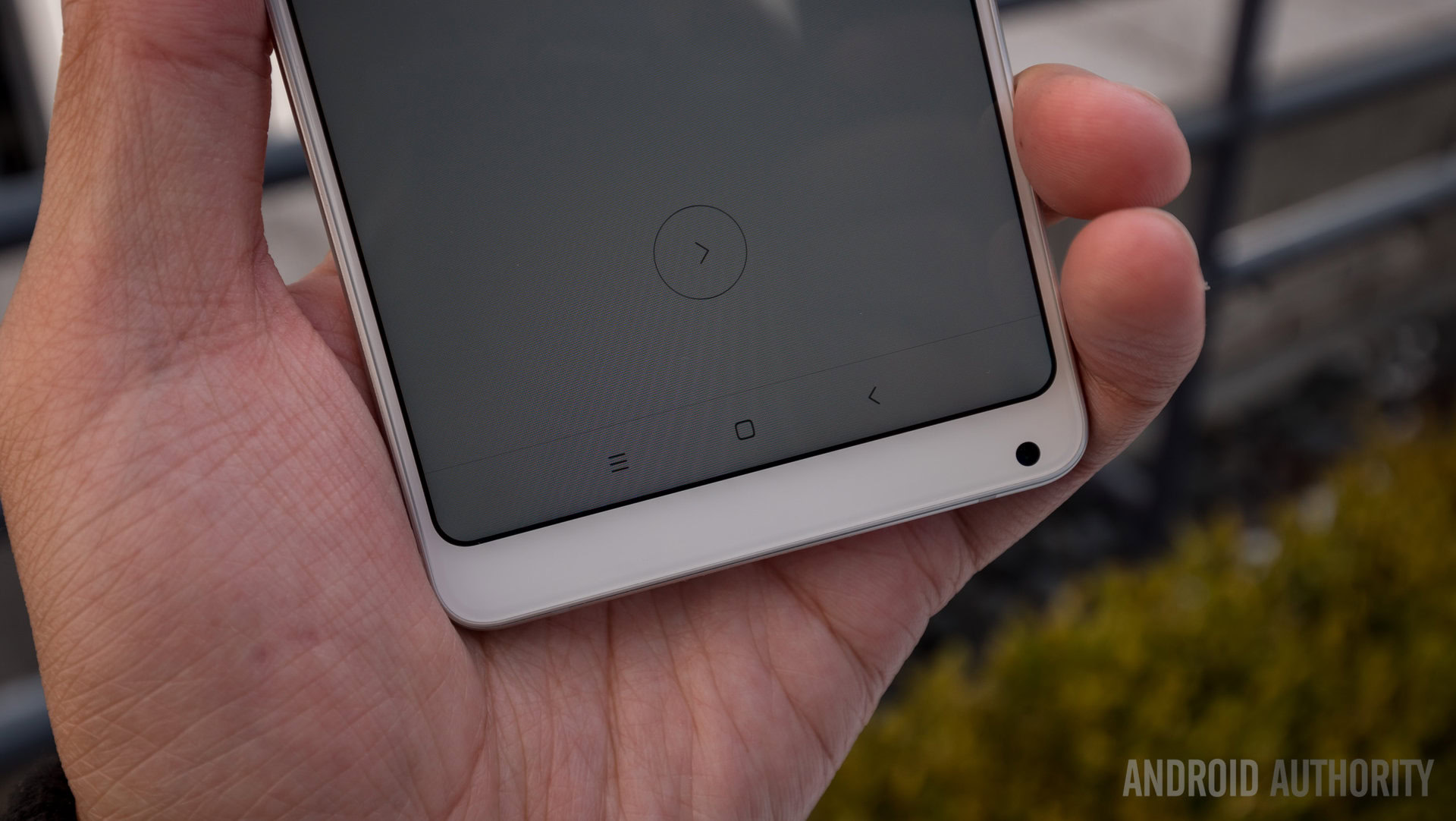
The pictures out of the front facing camera are decent but not particularly exciting. A depth effect mode can add background bokeh effects but it softens the overall photo. Activating this setting turns off HDR outright, however. The softening is also due to the beauty mode settings which are at a three (out of five) by default. Xiaomi’s beauty mode is still pretty aggressive — even my freckles disappeared from my face.
The rear camera brings much needed depth
The rear shooter provides the necessary tools for better portrait mode photos all around — namely, the telephoto lens. Using the two cameras together, the frame zooms in a little and is always detecting for a face. When it finds one it will add the depth effect to elements outside of the subject cutout. The cutout is still software based, which means the effect can sometimes mess up the lines. In terms of detail, the portrait mode shots are ultimately pleasing.
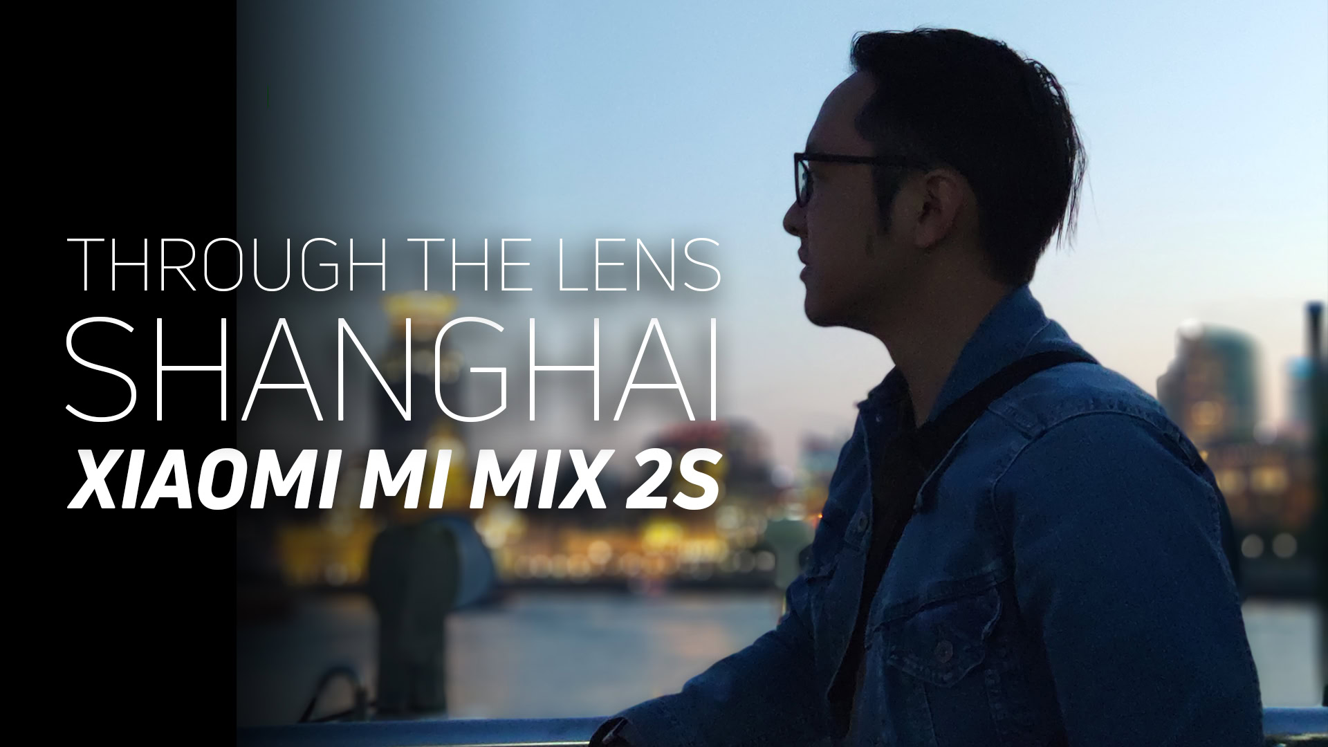
The same can be said for most photos coming out of the Xiaomi Mi Mix 2S. You may recall a vlog and photo journal of my time in Shanghai, shot entirely through the lenses of the Mi Mix 2S preview unit. The software has been updated since then, with fixes primarily focused on the camera app performance. While those problems have been remedied, the picture quality is still mostly represented in those previous photos. I was very impressed with the photos from Shanghai and continue to enjoy the pictures I captured using the final software since then.

When shooting on auto, colors come out looking good without overdoing the saturation. Dynamic range could be a little bit better even when HDR tries its best to compensate for an uneven scene. Video capture is pretty detailed when the exposure is dialed in properly, as you may have noticed in mainly the low light footage of the Shanghai skyline from my photo journal post. Audio could be much better, however, as plenty of my videos exhibited a lack of clarity.
Camera AI Engine
The camera’s last addition is the AI engine, denoted by a simple AI icon on the top. When activated, it cycles through different modes depending on what is in the viewfinder: Flower for flower, building for building, person for portrait, and so on. Except for that last one, where we wish the auto AI would change the mode over to Portrait automatically. AI pictures didn’t seem very different from normal ones in those instances. For food and flower situations, however, it seemed like the camera’s main priority was brightening up the frame and increasing the saturation. I hardly felt like the AI mode was doing much more than that in most cases, which makes me think some more work has to be done on the software development of their engine. Pictures out of the phone already look pretty good so you won’t need even toggle AI on. It was a decent first attempt by Xiaomi but it needs to be fleshed out more in the future.
The AI engine seems to require a bit more work, but at least pictures in general look good so you don't have to turn it on.
Software
The crowdsourced Android skin MIUI essentially gave Xiaomi its start. It retains a lot of the same elements and features as before, from a quick ball for floating navigation keys, a complete “second space” where a fresh user space can be created, and no app drawer, which means a bit of work has to be done to make the homescreens look clean.
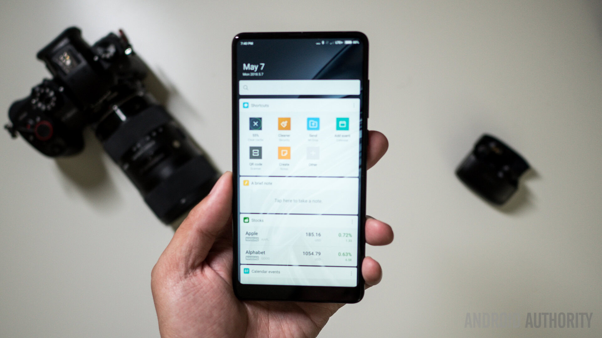
A new homescreen has also appeared to the left, called the Guide. It is a little bit like the OnePlus Shelf which allows adding app shortcuts. One widget gives quick access to a note taking area. It is a simple but welcome addition that doesn’t try too hard to flood the user with information, though we wouldn’t be surprised if that’s how it turns out.
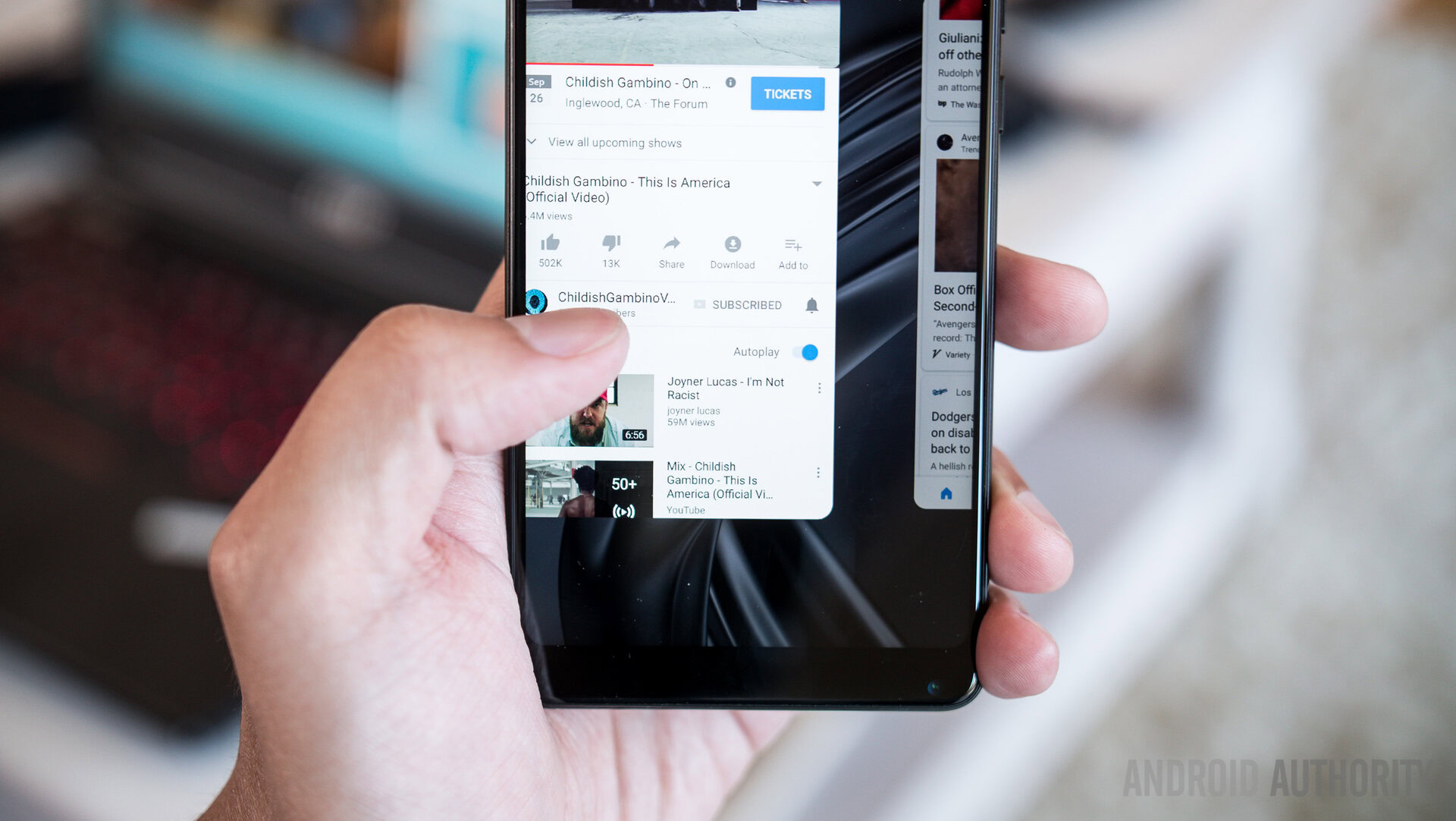
There is plenty more in the software settings that users can tweak. We promptly put quite a few Xiaomi-installed applications into their own folder for a cleaner interface. MIUI can do a lot. A lot of old issues with localization have been fixed — every element seems further refined and easy on the eyes. MIUI still won’t be everyone’s cup of tea. As the operating system carrying the Xiaomi experience, it does a fine job on top of Android Oreo.
Specifications
| Xiaomi Mi Mix 2S | |
|---|---|
Display | 6-inch IPS 2,160 x 1,080 (FHD+) 18:9 aspect ratio |
Processor | 10nm, 64-bit, octa-core Qualcomm Snapdragon 845 |
GPU | Adreno 630 |
RAM | 6 or 8GB |
Storage | 64, 128, or 256GB |
Cameras | Rear: Dual cameras Primary: 12MP Sony IMX363, 1.4μm, and f/1.8 aperture Telephoto: 12MP Samsung S5K3M3, 1.0μm, and f/2.4 aperture Front: 5MP, 1.12μm, and f/2.0 aperture |
Battery | 3,400mAh Non-removable Fast wired charging with Quick Charge 3.0 Qi wireless charging |
Network | 4x4 MIMO |
Connectivity | 43 global bands (8GB + 256GB model) Dual nano SIM 2.4/5G Wi-Fi Wi-Fi Direct Wi-Fi Display NFC |
Software | Android 8.0 Oreo MIUI 9 |
Dimensions and weight | 150.9 x 74.9 x 8.1mm 191g |
Colors | Black, White |
Final Thoughts
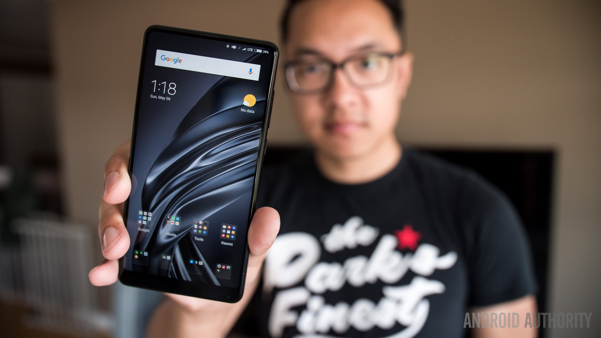
The Xiaomi Mi Mix 2S is yet another high end phone from the Chinese company that’s yet to make its way to the west. Though Xiaomi is strong in India and slowly popping up in Europe, plans for the U.S. seem inevitable but continue to be an ongoing internal discussion.
For those in the U.S. that really want to get their hands on the phone? Your best bet will be to import the phone, which goes for around 3,299 yuan (~$520) — a great price considering its nearly $1000 competitors. We hope it can maintain prices like that if and when it ever come to the West.
For now, we can look at the Xiaomi Mi Mix 2S as a sign that Xiaomi isn’t lounging around — it is doubling down on the full screen experience. Even if it is a bit rough around the edges, the Mi Mix 2S is a top Xiaomi phone and a top device in the Asian market. If you are looking to upgrade, the camera alone makes the move worth it.
So that’s it for our Xiaomi Mi Mix 2S review. What do you think of Xiaomi’s latest? Let us know your thoughts in the comments.
Read more:
Thank you for being part of our community. Read our Comment Policy before posting.