Affiliate links on Android Authority may earn us a commission. Learn more.
Check out the Material Design Refresh of the Google I/O 2018 app

- The Google I/O 2018 Android app features many Material Design Refresh themes.
- An update to the original Material Design, Material Design Refresh is a design language made by Google.
- We will likely learn a lot more about Material Design Refresh at Google I/O 2018, which is less than two weeks away.
First, there was Material Design: a design language put together by Google to give clear instructions on how to design Android products to match the intended aesthetic of the operating system. Now, this year we are seeing the rollout of the updated language, Material Design Refresh (formerly with the less clever title Material Design 2).
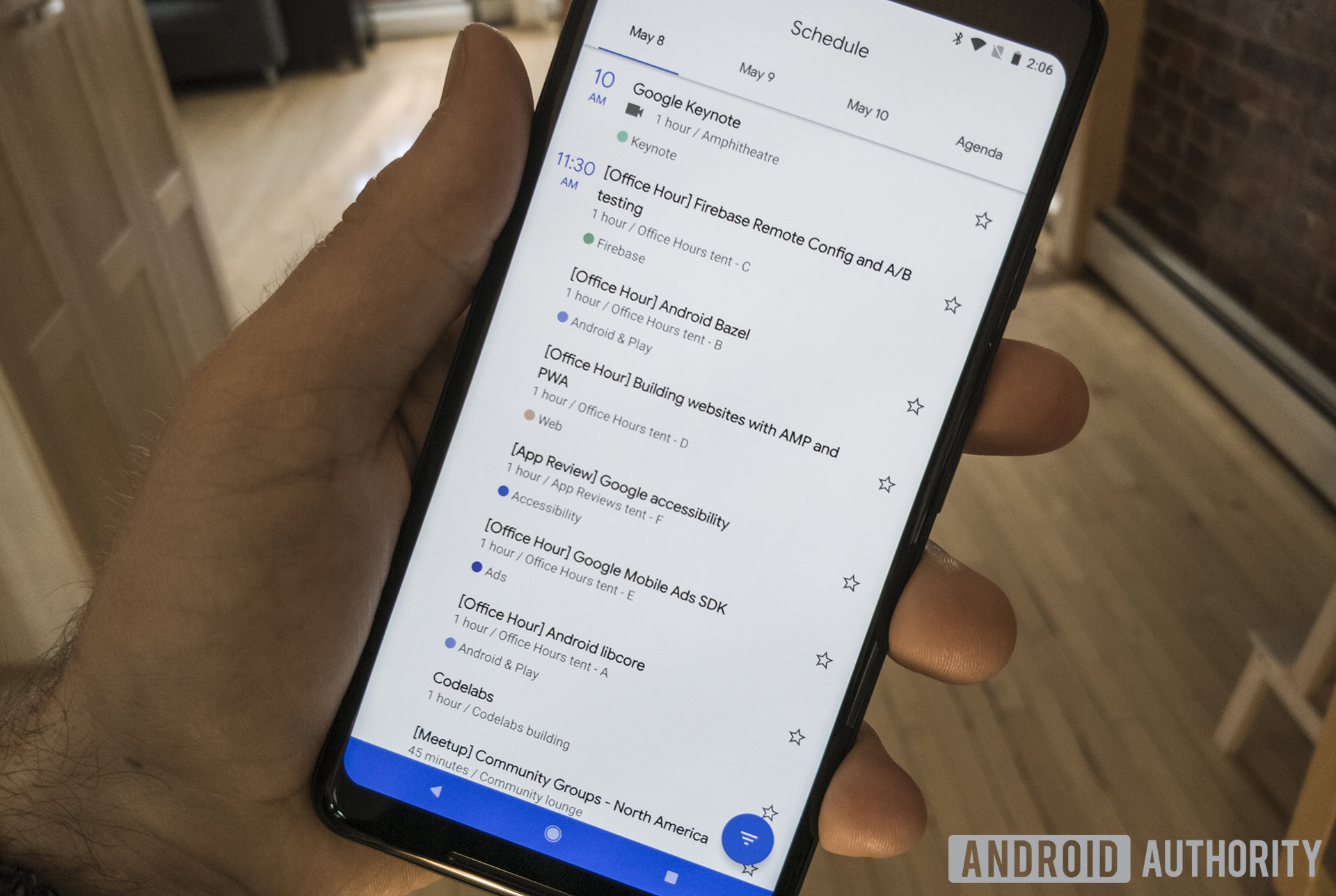
We’ve already seen some Material Design Refresh efforts show up in Canary versions of the Chrome browser. Now, we can see some in the Google I/O 2018 app, available to all on the Google Play Store.
Obviously, if you’re not attending Google I/O 2018 the app won’t be incredibly useful for you. But if you’re interested in seeing what design elements will eventually show up in Android apps not only from Google but many other app developers as well, it’s certainly worth a look.

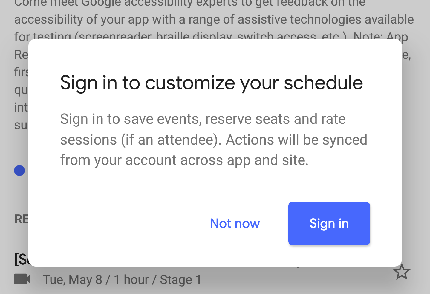
The first thing you’re likely to notice is that the status bar matches the app bar color, to create a merged effect. You’ll probably also notice the rounded dialog panels and buttons, a stark contrast to the squared look currently found in most Google apps.

If you have an on-screen navigation bar on your device, you’ll also notice that that changes color as well to match the color scheme of the app. All Material Design Refresh apps will likely do that going forward.
Overall, the whole app is very clean and bright with lots of white space and not a lot of clutter. While there are a lot of people out there who dislike bright white apps, it is nice to see a more streamlined and straightforward design scheme.
The original Material Design was announced at Google I/O 2014, and we’re likely to hear a lot about Material Design Refresh at Google I/O 2018. That event starts in less than two weeks, so you can expect a lot of Google news to drop from now until mid-May.
Thank you for being part of our community. Read our Comment Policy before posting.