Affiliate links on Android Authority may earn us a commission. Learn more.
Apple is changing the way iPhone users hang up calls

- Apple is changing the placement of the end call button on the caller screen in iOS 17.
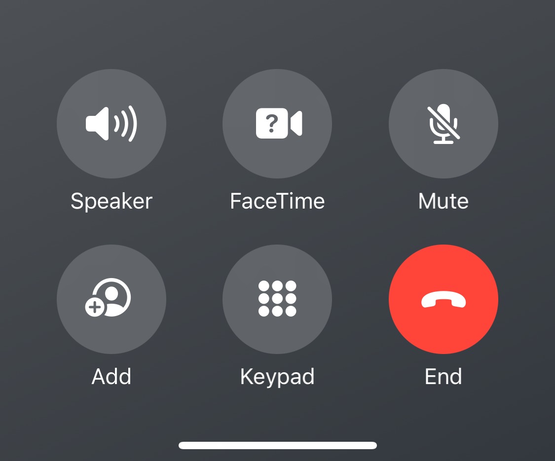
- The latest iOS 17 beta 5 moves the button to the bottom right corner alongside the other group of buttons.
- This small change is expected to greatly impact user experience as it goes against muscle memory.
Apple’s marketing would have you believe that the company is the innovator supreme of the smartphone world, but that’s not usually the case. In fact, Apple is one of the slowest to make any changes to the iPhone or iOS. Every small change will affect how millions of users use their iPhones, and the company is slow and deliberate about them. Even the iPhone 15‘s shift to USB-C is coming against the backdrop of regulations in the EU. Now, Apple is making another small but substantial change, and that is moving the “end call” button on iOS.
Apple rolled out iOS 17 beta 5 recently, and one of the changes within is where the end call button is placed on the call screen. As Gizmodo points out, Apple has changed the button’s position, moving it from the unmistakable prominent center spot to the right corner. The other buttons are also moved around, so now you have a group of buttons at the bottom where the red button used to live alone.
Before you say it, I will say This is a small change, and there’s no reason to outrage over it. But I’m afraid I have to disagree with that sentiment. This may be a slight change in the UI, but it is a significant change in the user experience, and it goes against a decade’s worth of muscle memory for hundreds of millions of iPhone users.
That red button floating alone at the bottom was unmissable, and you couldn’t accidentally hit other buttons when trying to click it.

But with iOS 17, this button will be placed alongside buttons of the same shape and size. The color is still red and thus a bit distinct, but there’s no denying that the uniformity in shape and size and the button’s placement will confuse many users. A lot of people will end up hitting the keypad or the mute button when they intend to end the call, and it will take a fair few attempts to retrain their muscle memory.
For all the criticisms of the caller UI screen on iOS, the original placement of the end call button wasn’t something that users wanted improved. So it is pretty perplexing to figure out why Apple made this change.
Since this is a beta, there’s a chance that Apple will revert the change by the time iOS 17 rolls out in stable. iOS 17 stable will launch alongside the iPhone 15, and we hope Apple reverts this change.
Thank you for being part of our community. Read our Comment Policy before posting.
