Affiliate links on Android Authority may earn us a commission. Learn more.
HUAWEI EMUI 10 hands-on impressions: Snappy and subtly improved

HUAWEI has given us an early look at EMUI 10 running on the HUAWEI P30 Pro before the beta rolls out to the public in a few days time. As such, there’s still the odd niggle here and there and HUAWEI hasn’t thrown all of its improvements into the build just yet. Apparently, there’s much more to come in the way of performance enhancements and features by the time EMUI 10 rolls out later in the year.
Another interesting tidbit is that an unnamed upcoming HUAWEI flagship, almost certainly the HUAWEI Mate 30, will benefit from some additional exclusive features too – most likely linked to its unique hardware. The HUAWEI P30 Pro we’re using only has a subset of EMUI 10’s full features.
Let’s dive into what’s new in our early build of EMUI 10.
The look you know, only better
Key changes in EMUI 10 focus on improving the look and feel of the operating system. HUAWEI has broken this down into four main categories — the new Magazine Design philosophy, a low saturation color palette, enhanced Dark Mode, and improved natural animations. We’ll get to all of them in time, but let’s start with the cosmetic changes.
EMUI 10 retains a familiar look and feel to its past few versions. The desktop drawer, flexible navigation options, and various menus all retain that familiar HUAWEI aesthetic. You will notice a few icon changes here and there but nothing drastically different in that department.
What is more noticeable is the new text layout dubbed Magazine Design. There’s now much more white space around headers and title texts, such as the clock and date in the quick settings menu and the icons in the notification bar. This extends throughout HUAWEI’s apps, including email, contacts, and even the options in the settings menu are separated by a tad more space. There’s also more space around notifications too, so they’re not as tightly crammed together as in previous versions.
The UI takes inspiration from magazines, with more white space and a soft color palette.
I must say that while I was hesitant to see space wasted in such a way at first, the new look quickly grew on me. It’s a little easier on the eyes and does a good job of helping to draw attention to each unique element.
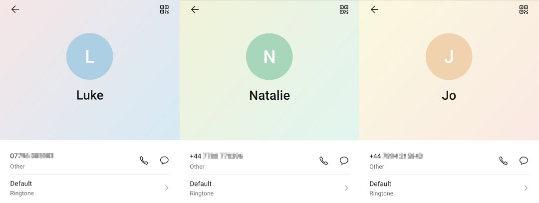
As you may have also spotted, the quick settings menu is slightly off-white. This use of light grey is reflected in a few other UI elements, including email, clock, and contacts apps. It’s in this last app that we can also see HUAWEI’s new low saturation color palette in action. This new color palette was invented by George Morandi, the famous Italian painter, and comprises of soft subtle colors over a light grey background. In the contacts app, contacts without a picture are given one of the six soft color tones instead.

Overall, EMUI 10 looks nicer than it ever has. The style choice will remain a case of personal taste, but HUAWEI has done a good job at building something not just inoffensive, but actually pretty good looking.
Fluid animations
Another cosmetic change in EMUI 10 is the introduction of more “natural” animations. HUAWEI says that it’s redone a lot of animations throughout the system and modeled them on real-world physics. For example, pressing a button or object it depresses it down into the screen before springing up. Larger objects appear to spring back up with more force. It’s pretty cool to watch, but I get the feeling not too many people will notice. Which maybe is the point after all?
HUAWEI has also improved the animation transitions between apps. The frame rate of these transitions has increased, smoothing out their appearance and reducing any appearance of lag. There’s also a cool “Projectile Motion” animation when exiting an app, where you can move the window around the screen and watch it fly back towards the home screen app icon.
EMUI 10's new animations aren't about looking fancy, but rather making the UI feel more responsive.
I asked HUAWEI about the performance effect of these new animations and the reply was that there’s no detrimental cost. What HUAWEI is doing here is creating animations that fit with how your brain perceives wait times and movement to create something that actually makes the OS feel even snappier. This makes sense, animations that are too fast don’t really register and we may perceive a judder or a jank when moving between apps. Too slow and the animation has made performance appear worse. But a fluid motion from one screen to another gives a perception of a smooth, speedy transition. It works.
The best way to show off these changes in video form, which you can check out above.
Enhanced Dark Mode
Dark Mode is a major feature of Android Q and EMUI 10 implements this with a few of its own bells and whistles. HUAWEI has actually gone to some major lengths to improve on the default Dark Mode formula, polling test participants on a range of colors, icons, and styles that they found most comfortable to read in low light. This same testing was also used for a lot of the sounds, animations, colors, and other aspects of EMUI 10’s design.
The result is that HUAWEI’s Dark Mode provides a slightly tweaked color palette rather than simply inverting blacks and whites. In theory, this makes text easier to read when in Dark Mode and also tweaks other icon colors so that they don’t strain your eyes. Much of this is a subtle difference, but it’s clear that HUAWEI opts for not quite white text and a mix of greys and blacks across its darkened UI.
Huawei’s Dark Mode applies not just to the OS UI but also to its pre-installed apps. This includes email, contacts, clock, photos, notes, etc. HUAWEI is also working with third-party developers to enable them to utilize its enhanced Dark Mode. Apps available through the HUAWEI app store that are dark mode compatible will work with HUAWEI’s enhanced color pallet without any extra development efforts. Unfortunately, I wasn’t able to find a setting to force Dark Mode onto all apps in this EMUI 10 build.
New camera options
HUAWEI is well known for its smartphone camera prowess and it appears that a number of new features and tweaks are heading to the camera app in EMUI 10 as well.
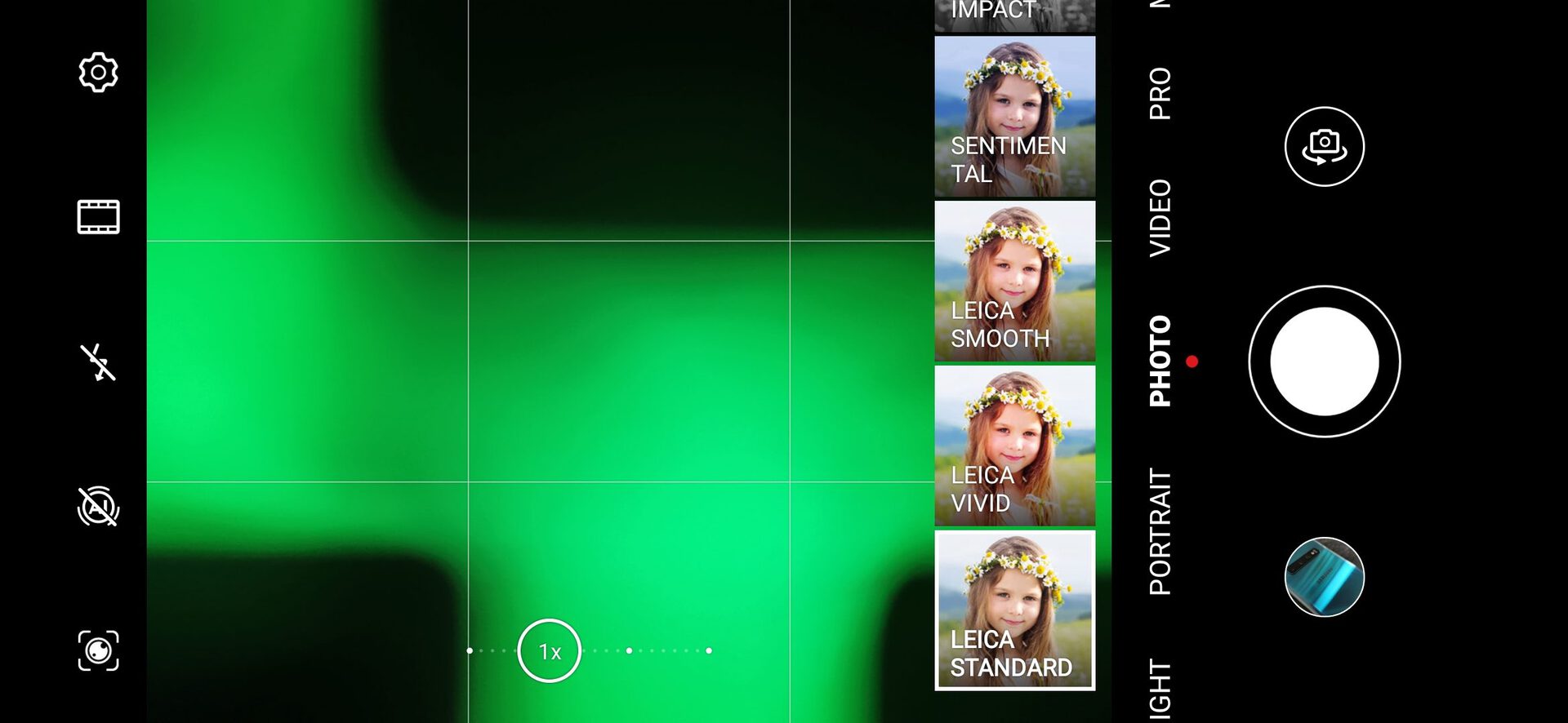
A few UI changes caught my eye, including a simple black background, reworked zoom slider, and an AI toggle button that’s much more like Honor devices. The Aperture shooting mode now also lists the level of bokeh blur by f-stop rather than just a number. The app’s resolution settings option suggests 10MP as the recommended resolution for some reason, over the 40MP camera.

The biggest change though is the introduction of new color grading options. The old Standard, Vivid, and Smooth options have been replaced by your choice of 11 new filters. These still include the three original options, now with Leica branding, while also offering monochrome and other color palettes. Other manufacturers have provided a wide range of shooting profiles for a while now, so it’s nice to see HUAWEI expanding its options too.
I can’t yet comment on whether anything has changed in terms of camera quality with the move to EMUI 10. That will have to wait until the final software version ships.
Thoughts on the EMUI 10 beta
Just like most Android updates these days, EMUI 10 is much more of a gradual evolution than a major overhaul. The beta showcases a selection of cosmetic changes that culminate in a smoother, more visually pleasing experience. The changes are mostly subtle and probably won’t change too many opinions about the pros and cons of EMUI over, say, stock Android, but you can’t please everyone with an Android skin.
EMUI 10 is shaping up pretty well.
HUAWEI is also promising to tell more about the performance optimizations coming to EMUI 10 as well. The beta version already feels plenty smooth running on the P30 Pro. Although we can’t run any benchmarks to check for any more meaningful performance improvements on the current version.
Personally, I think that EMUI 10 is shaping up pretty well. I would still like to see better app drawer customization options to compete with some of the best third-party launchers. Barring that, EMUI 10 is visually more user-friendly than ever before, its gargantuan settings menu continues to be simplified, and it’s snappy to boot. Best of all, the speedy nature of this beta suggests that we won’t have to wait too long before EMUI 10 starts rolling out to the masses.
Thank you for being part of our community. Read our Comment Policy before posting.