Affiliate links on Android Authority may earn us a commission. Learn more.
Why it has taken so long to get Android gesture controls right
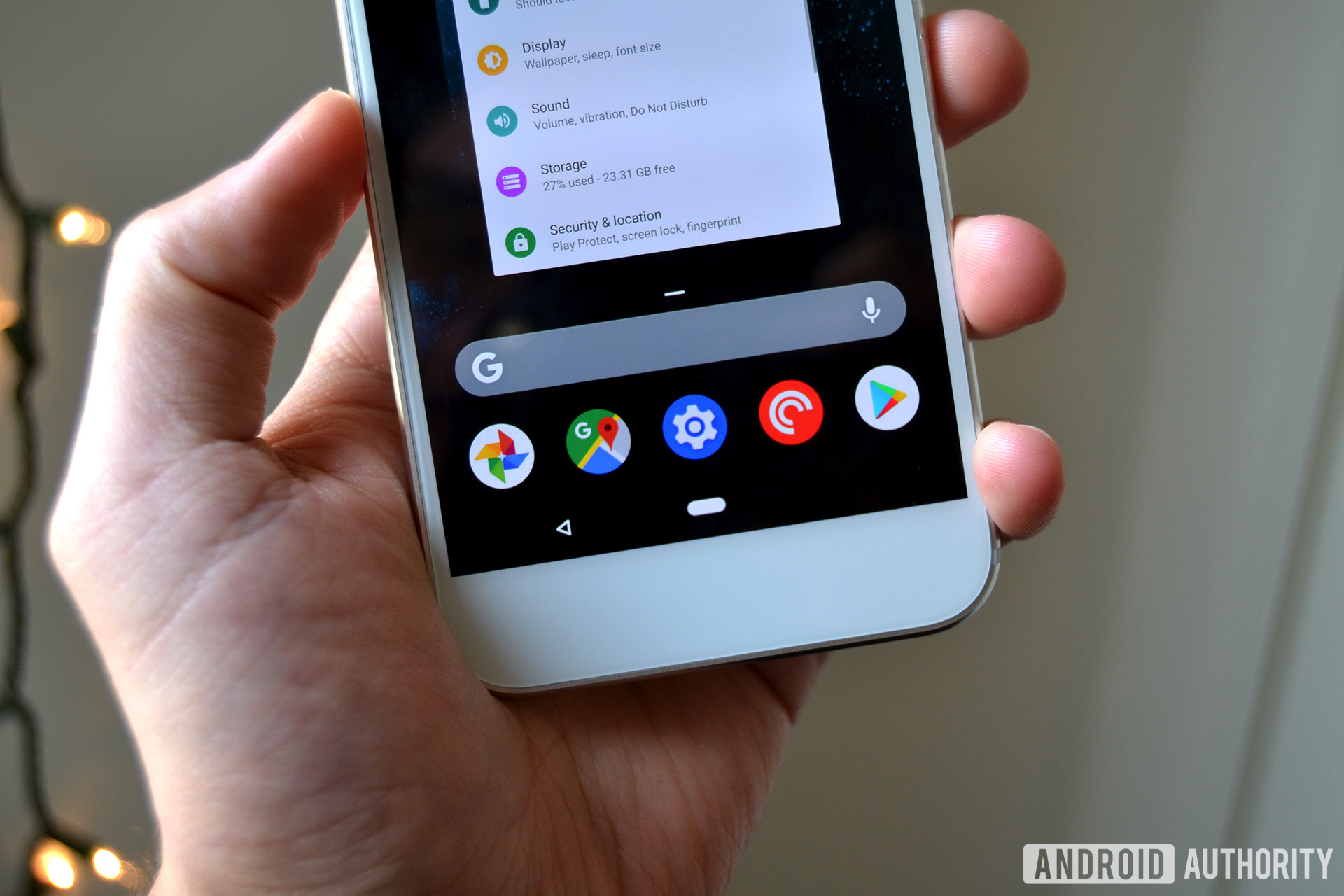
Android P is bringing a host of new features to Android in the coming months, and one of its biggest changes is gesture controls. Gesture controls are designed to replace the back, home, and recents buttons that we’ve all been using for years, augmenting these traditional controls with new features.
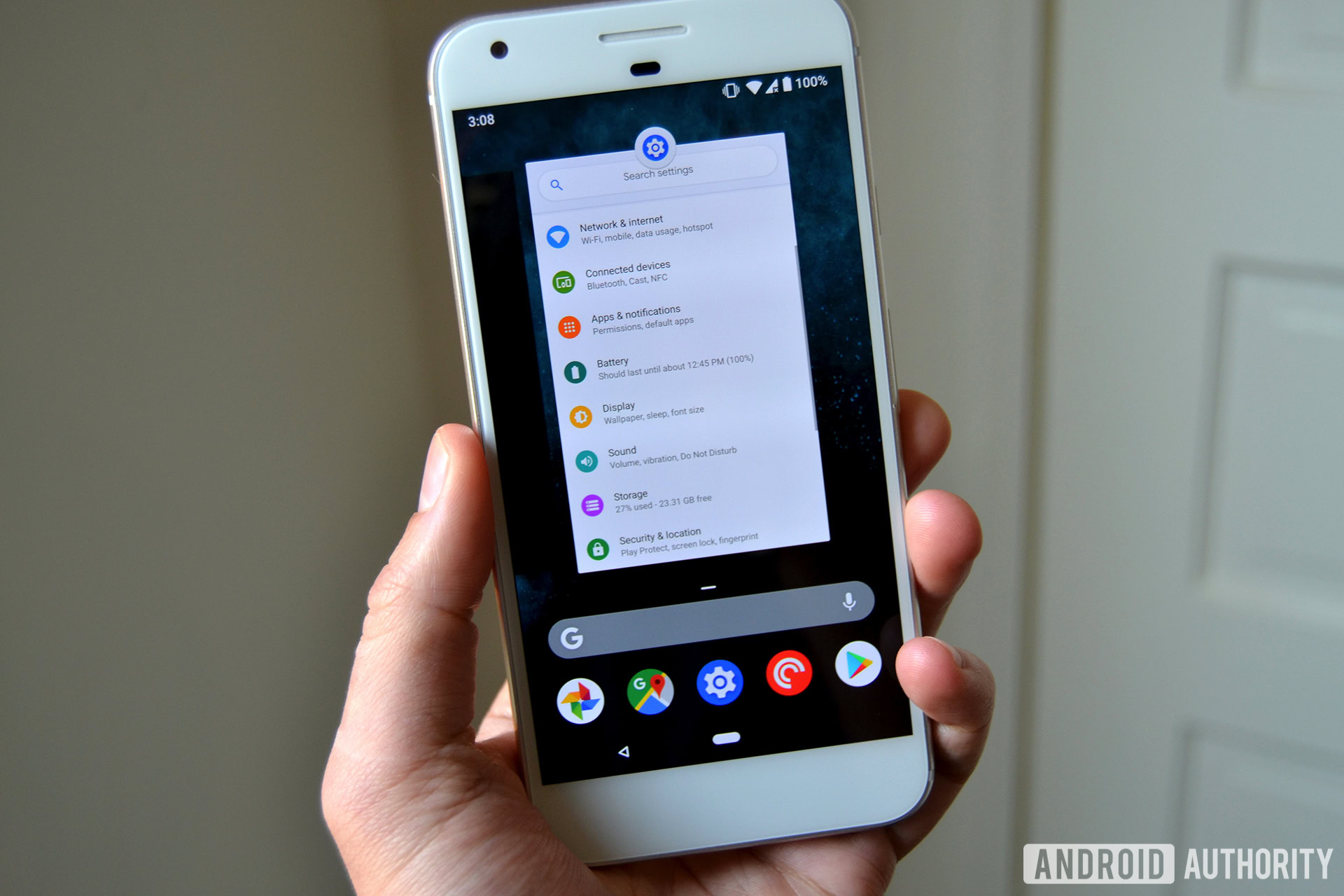
Android P’s gesture navigation introduces one elongated central button — aka the “pill.” It still functions as the home button via a tap and summons Google Assistant with a long press. You can also swipe on this home button. An upward swipe opens the Overview of your recent apps and five “AI” curated suggestions. Sliding the little pill icon left or right will bring up a more familiar recent apps menu. The back button only appears on the left if an app supports a back function.
There’s no doubt that this new way of doing things will take some getting used to. The big question is: why make this change now?
Google states that it has been working on gesture navigation within Android for a while now, and it certainly isn’t a new idea in the mobile space.
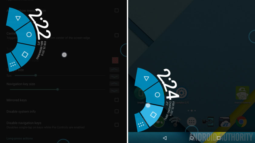
A number of OEM and custom Android builds have offered tweaks to navigation controls over the years, from Google’s and HUAWEI’s fingerprint gestures to the radically different radial Pie controls. Stranger ideas like OnePlus’ offscreen swipe gestures have also stuck around. HUAWEI even produced its own single key navigation option, which is very similar to the new Android P feature.
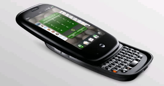
We can actually trace the idea of gesture navigation back further, to webOS and the Palm Pre. This operating system included a wide range of gesture controls for its card-based UI, including a central button or full swipe to open the multitasking view, a half swipe up to bring up the app dock, and swiping from either side of the screen to move between cards.
The Palm Pre also included a gesture area under the display that could be used as a back button, for switching between apps, and even copy-pasting shortcuts using a variation of swipe patterns. This is clearly a bit different to Android P’s implementation, but clearly the use of cards to show app thumbnails and swiping between cards isn’t a brand new idea.
While most of the systems mentioned above found a number of converts, they all have the same problem — the controls aren’t as opaque as on-screen buttons. They all require a bit more knowledge and research to use, and they’re a bit less intuitive. It’s easy to learn what a button does at a glance — there is no UI hint for a swipe gesture.
This is a particularly acute problem for ideas like fingerprint gestures, OnePlus’ off-screen swipes, and the Palm Pre’s touch area. It takes a bit of time for consumers to develop the muscle memory needed to really fly through this type of navigation. The learning period will be infuriating for lots of consumers as they swipe the wrong way or use the incorrect gesture.
Some solutions also introduce additional steps to accomplish the same goal — like the Pie radial wheel — which a big no-no in the rulebook of good UI design. However, there’s clearly a push to make home screen UIs do more. Ideas like Samsung’s Edge UX and HTC’s Edge Launcher shortcuts are attempts to present users with more options with just a single swipe or squeeze. However, they feel slightly tacked on as they aren’t integrated into the main navigation experience and tend to overlap with the functions of the app drawer and home screen.
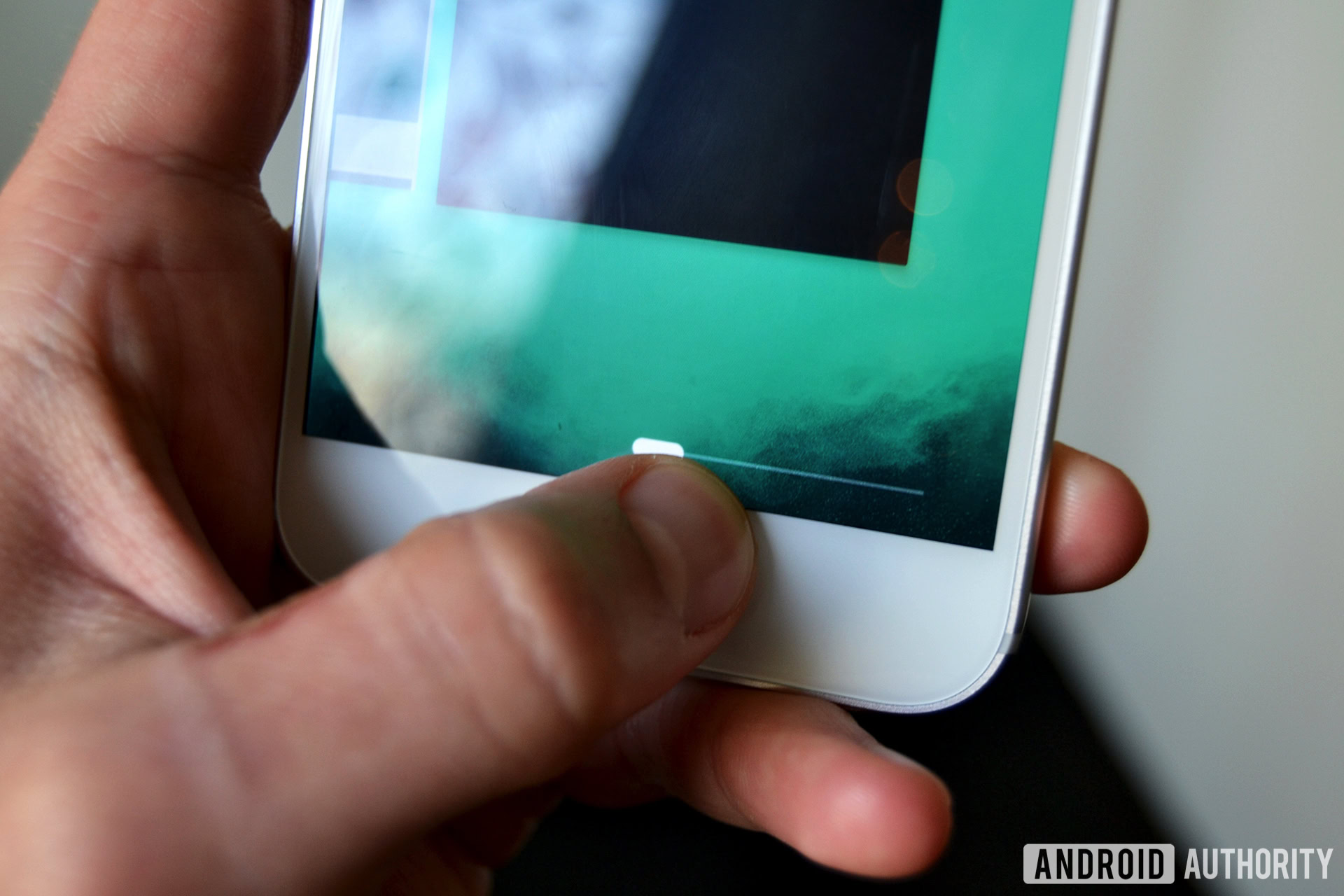
So are Android P’s gesture controls just another finicky gimmick or are they actually superior to the old buttons? Google’s using machine learning and “AI” to incorporate useful extra functionality to make sure its the latter.
Tucked into the swipe up feature on the home pill are five recommended applications that you might want to open, along with a Google search bar. These are positioned at the bottom of the screen near your thumb and below the recent apps previews, suggesting Google expects you to click on these options most regularly.
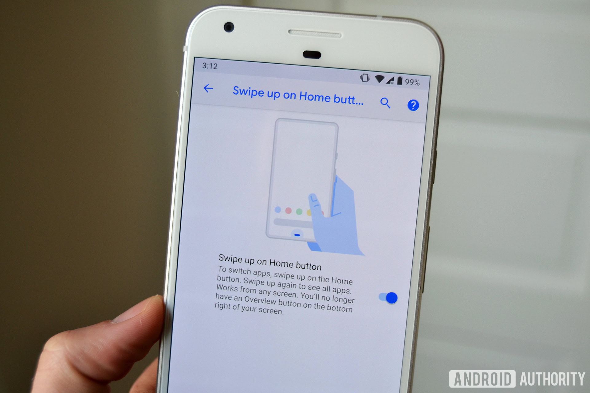
The key ingredient Android P also introduces is new App Actions for shortcuts and Slices with Search. These will bring richer integration with your apps directly from the Overview menu, without having to sift through your app drawer or list of recents. Google Assistant and voice search are also just a swipe away from every app you’re in, and it’s clear the company wants these features to be heavily integrated into everyone’s phone usage going forward.
Android P’s gesture controls aren’t just a cosmetic change, they’re part of a fundamental revamp of the way we interact with applications. It’s not clear that gestures are strictly necessary to implement these features, or whether consumers will even take to them. The company’s advancements in machine learning will be key to enabling this implementation and making it notably different.
Ultimately, Google hopes this new UI will save you time and make Android more efficient. The tools to accomplish this certainly seem to be in place for when Android P arrives.
Thank you for being part of our community. Read our Comment Policy before posting.