Affiliate links on Android Authority may earn us a commission. Learn more.
Galaxy S7 Edge Feature Focus: Edge UX

The Samsung Galaxy S6 Edge’s curved display was certainly elegant looking, but perhaps not quite as functional as some hoped that it could be. Thankfully, Samsung has introduced some new features with its Marshmallow software and the Galaxy S7 Edge is really showing how useful the curved display can be with some new Edge UX features.
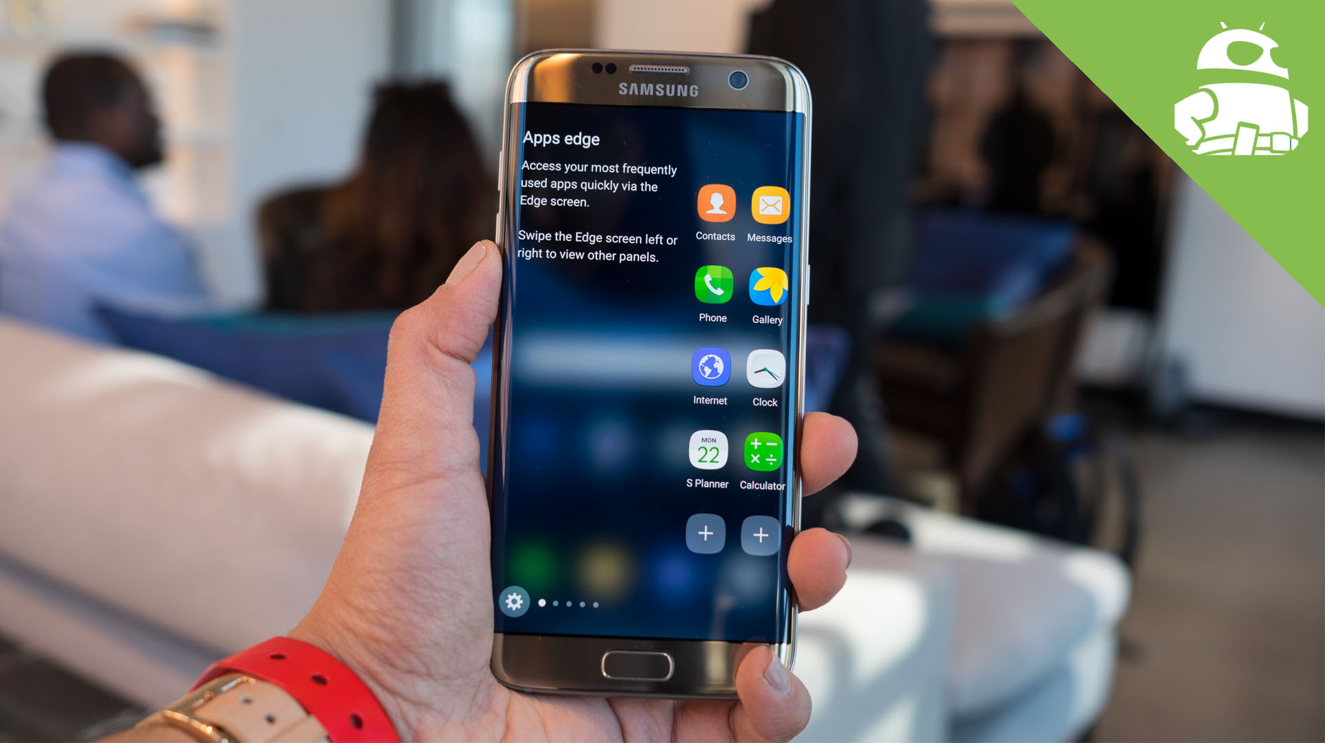
Samsung has caught on to the fact that most users attempt to use their smartphones one handed, despite the large display size. From the home screen or the lock screen, users can swipe from either edge of the display to bring up a menu of multi-tasking Edge features. We are not just looking at the standard People Edge features any more, Samsung has a range of new Edge apps with the Galaxy S7 Edge, including Apps Edge, Tasks Edge, and a dedicated widget panel. So there are four different panel types and users can have up to 9 of them active at once, obviously with some duplicate types.

Beginning with the Apps Edge option, the name is really pretty self-explanatory. Users can setup and access their favorite and most commonly used apps from this panel. It is also possible to add your own custom apps by clicking on the + icons, until the tray is filled with the maximum of 10 apps. The little settings icon in the bottom left corner allows for adding and deleting of shortcuts.
Swiping over again will move on to the next Edge screen, which in our case is the “Task Edge” panel. Here users can setup quick access to some of their favorite and most commonly used tasks, ranging from opening the camera app and snapping a selfie, to starting a new text message or opening up a conversation with your best buddy. Rather than opening up specific apps, think about this menu as starting up more specific app actions. Again, there are 10 spaces on the screen to customize to your liking and it can certainly be an efficient way to perform all your most common tasks, so long as you remember that the option is there.
People Edge will be a familiar feature to Galaxy S6 users, allowing for you to quickly call your contacts, but it has been updated with some slight changes. There are now name tags under each contact and the addition of the settings menu.
The final Edge panel type doesn’t have a specific name, but it essentially operates as an expanded Widget pane. You can add long vertical widgets to the edge of your screen, which is a nice way to avoid cluttering up your home screen while also providing additional detail over a smaller widget. Widget examples include Yahoo News, Stocks, Sports Scores, calendar reminders, the weather, and even a compass. You can even chose to have a widget that displays certain apps based on your current location, which could be handy for setting your phone up for work versus home and play.
As we said at the beginning, there are a maximum of 9 panels available to use based on these four types, so users can rearrange, enable and even disable these pages as they see fit. Pages can also be renamed to whatever you prefer. The options menu also allows you to specify on which edge and position these panels will appear, allowing for some really optimized access to your favorite apps and tools.
Clearly it’s going to take a little practice to become fluent with all these options, but these new Edge features look pretty helpful for accessing things faster and declutter my home screen. And that’s it for our first look at the Edge UX. What do you think of the new changes? Let us know your thoughts in the comments.
Next – Check out more great news and vids from MWC 2016!
Thank you for being part of our community. Read our Comment Policy before posting.