Affiliate links on Android Authority may earn us a commission. Learn more.
Android 17's leaked UI looks great — and is a huge mistake

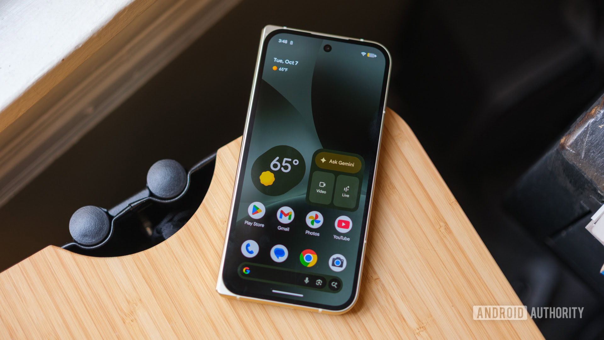
Since its release this past September, Google’s Material 3 Expressive UI has quickly become my favorite Android skin around. The bouncy, responsive animations, big buttons, and distinctive shapes/colors result in an Android interface I love spending time with — and it’s a big reason I carry a Pixel every day instead of an Android phone from another brand.
However, that could all be in danger.
A new look at Android 17 suggests Google’s next big Android update may draw heavily on iOS 26 and its controversial Liquid Glass UI. And if true, Google could risk throwing away what makes Material 3 Expressive so great.
Do you think Android 17 is at risk of becoming too much like iOS?
The problem with this Android 17 leak

Earlier this week, leaked Android 17 screenshots revealed that the update is going all-in on transparent/glass-like UI effects. Android 16 already features some translucency in the app drawer and Quick Settings, and Android 17 is apparently continuing what Google started there. Per this leak, Android 17 is adding that blurred glass effect to the volume bar, volume menu, and the power menu.
Looking at these changes in the screenshots below, I’ll be the first to admit that — from a purely visual standpoint — they’re fine; I’d even call them great. Google isn’t fundamentally changing how these UI elements work. Instead, it’s just adding some polish and visual flair to match the volume and power interfaces to the blur effects that already exist in Android 16.
Apple’s Liquid Glass design language in iOS 26 is distinct and easily recognizable. Just as Android brands release hardware that looks like the iPhone, it makes sense for companies to adapt parts of their software to mimic iOS features. If some extra blur effects are what it takes to make current iPhone users more comfortable with the idea of switching to Android, that’s fine — especially when the execution looks as good as it does.
However, what has me worried is what these changes may signal for Google’s Android skin going forward.
Making UI elements look glassy and transparent is one thing, but can we trust Google to stop its Apple inspirations there? If we’re already seeing this much Liquid Glass design less than a year after Google rolled out Material 3 Expressive, it’s easy to see Google continuing down this path.
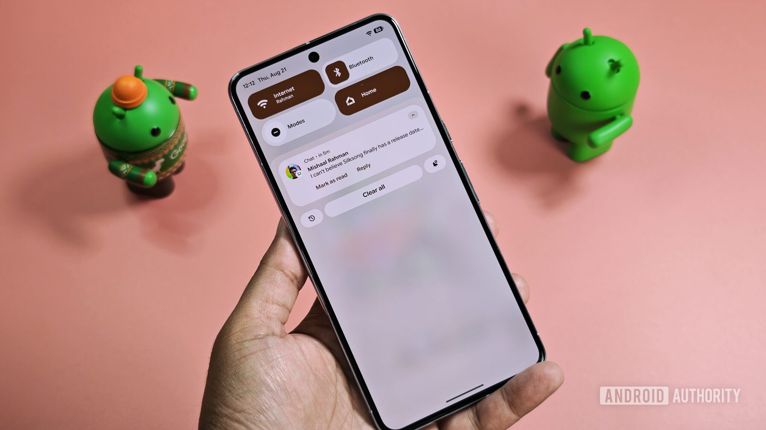
That’s easy to see because Google is already doing so. Another leak this month revealed that Android 17 is getting a new split design for the notification panel and quick settings, just like iOS. Plenty of other Android skins already offer this, but it would mark the first time the split design has come to Google’s Pixel interface.
From here, what’s next? Transparent application icons? Mimicking iOS 26’s app navigation bar? Bringing the blur effect to apps like the phone and calculator? At this point, I wouldn’t be surprised if Google is considering it all.
We’ve seen this story before

You could say that I’m getting too worked up over minor UI tweaks, but I’d argue my concern is justified. Why? Because we’ve seen this story play out time and time again.
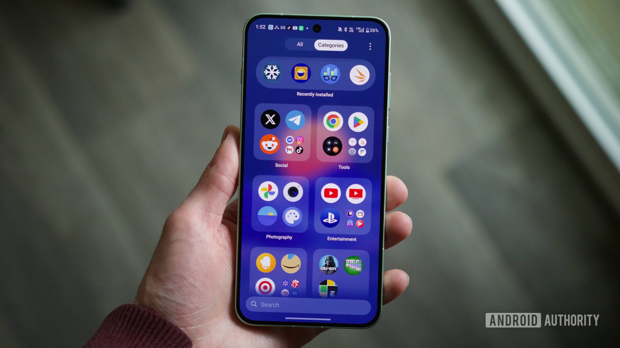
We saw it with OnePlus last year. OnePlus’s OxygenOS 16 update took what made OxygenOS 15 so great and turned it into a blatant iOS rip-off — adding an abundance of cheap Liquid Glass-like effects and a folder-focused app drawer that’s ripped straight from the iPhone. Samsung’s One UI 8.5 update is going down a similar path, adopting iOS 26-esque navigation bars and other UI elements that clearly only exist because Apple did it first.
What was once a unique and distinct Android skin with Material 3 Expressive could morph into just another iOS clone.
Google hasn’t gotten this blatant with its iOS mimicry yet, but what the company is doing with Android 17 is how it starts. It’s a few blurry backgrounds today and split notifications tomorrow. Before you know it, what was once a unique and distinct Android skin with Material 3 Expressive could morph into just another iOS clone.
As it exists today, what makes Material 3 Expressive so enjoyable is that it thoroughly looks and feels like Android. In a world where so many Android OEMs are modifying their software to operate more and more like iOS, Google’s approach to M3E is exactly what I want.
Google is at risk of throwing that all away, and I desperately hope it doesn’t.
Don’t want to miss the best from Android Authority?
- Set us as a favorite source in Google Discover to never miss our latest exclusive reports, expert analysis, and much more.
- You can also set us as a preferred source in Google Search by clicking the button below.
Thank you for being part of our community. Read our Comment Policy before posting.

