Affiliate links on Android Authority may earn us a commission. Learn more.
You told us: The Note-inspired Galaxy S22 Ultra design is growing on you
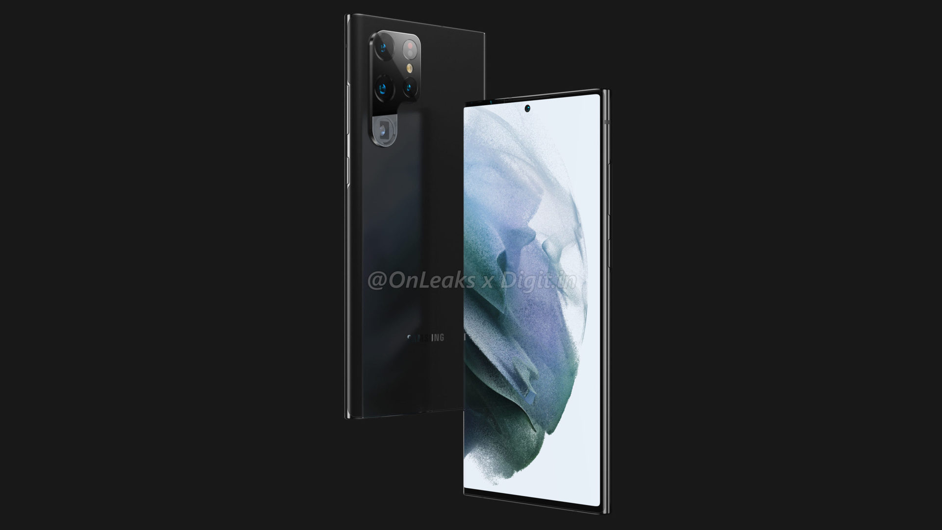
Apparent renders of the Samsung Galaxy S22 Ultra broke cover recently, showcasing a phone that looks nothing like its predecessors. A new camera array, flatter top and bottom edges, and an S Pen slot make the phone seem more like a Note than a Galaxy S flagship.
But what do readers think of the changes? Well, we posed this question in a recent poll, and the results are in!
What do you think of the leaked S22 Ultra design?
Results
We garnered over 1,500 responses on this poll, first published on September 28. Interestingly, there’s a near two-thirds majority for the “I like it” camp. 65.1% of readers ticked this box, indicating that they would approve the Galaxy S22 Ultra redesign. However, a sizeable 34.9% portion of respondents “hate” the design.
See also: Samsung is clearly done with the Galaxy Note line, and I’m OK with it
We only provided two options, but some in the comments suggest they fall into neither camp but rather express “indifference” towards the design. Note fans will likely approve the design, especially considering that no Note will debut this year. However, those who side with the Galaxy S design evolution of recent years will likely feel more aggrieved.
Your comments
- Yakubu Tukur: There should have been a third option that reads “indifferent.”
- Wongwatt: It’s just dumb, please tell me they’re not thinking “P for Photography” because that would be utterly lame.
- sopenco1: A smaller screen AND an uglier design? Thanks, but I’m not trying to downgrade. I’ll hang onto my Note 20 Ultra until the Xiaomi Mi 12 Ultra comes out next year.
- paulius: I like this approach. They are going to keep Note fans happy, and still reduce the number of different devices they are releasing. Instead of having 3 notes and 3 s series, they will have 2 of the s series and 1 note (kind of). This allows them to have foldable phones in Note place.
- John Sims: I like it. The top and bottom being flat with rounded edges reminds me of the old Nokia Lumia windows phones.
That’s it for our Samsung Galaxy S22 Ultra design poll. Thanks for your votes and comments. If you have any additional thoughts about the apparent design changes or the results of this poll, drop a comment down below.
Thank you for being part of our community. Read our Comment Policy before posting.
