Affiliate links on Android Authority may earn us a commission. Learn more.
Fitbit Versa: By a recovering Pebble user
When Fitbit bought Pebble, the future of users who were still big fans of the smartwatch that could was uncertain. I was one of those users, stuck in my ways of tactile navigation, e-paper displays, and days of battery life. Though Pebbles would mostly work well for a little while, the day of reckoning is fast approaching and most users are looking for an alternative, which Fitbit hoped to provide in its newest smart fitness tracker.
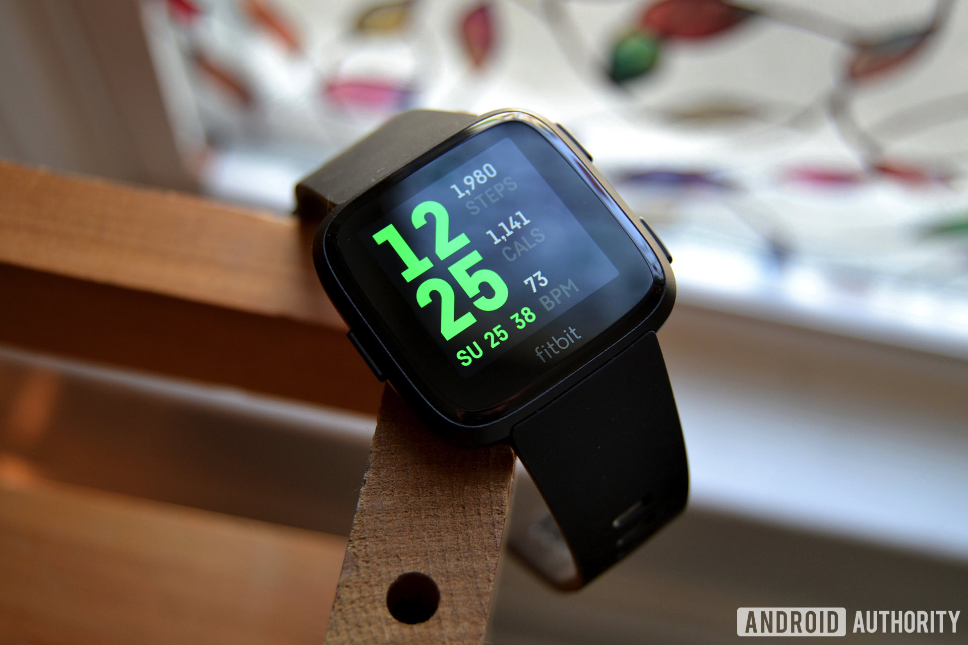
In our written review, Jimmy described the Versa as a decent enough smartwatch and a better fitness tracker, saved by the grace of an entry-level price. I have used the Fitbit Versa for about a week. It is the first smartwatch I’ve used since I converted to hybrids and basically started shunning touchscreen smartwatches. I’ll admit the Versa is probably one of the better entry points aside from offerings from Samsung, Google Wear OS, and Apple, but is it enough to make this recovering Pebble user come back into the smartwatch game?
The short answer is “not really.”
Missing the point about buttons
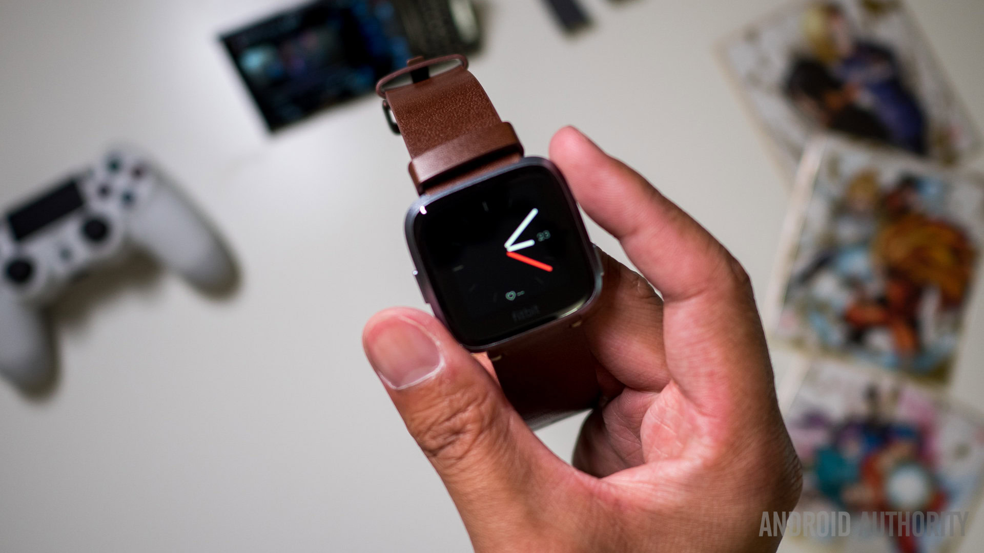
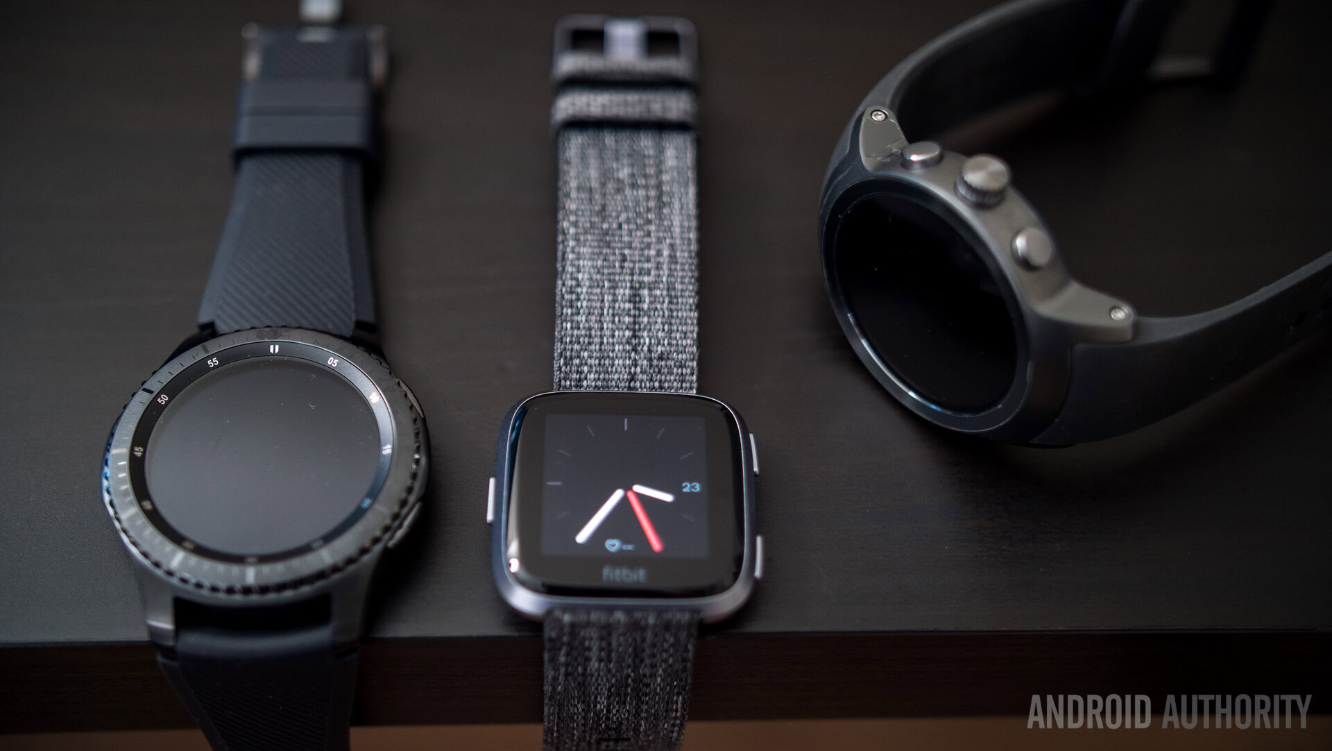
At a first glance, the design of the Versa looks a lot like the Pebble. There is a lot to like about how this watch has been developed — it is really light, comes with a bunch of different watch bands available for customizing the look, and it looks enough like a normal watch that it doesn’t scream “runner” or “fit life” the way the Ionic or other fitness trackers tend to.
The Versa strikes a good middle ground design between 'smart' and 'fit'
Many users will look at this as the spiritual successor (or remnant) of the long defunct Pebble, however. There is one less button overall, but a couple are on the right and one on the left. One might think that even if there is a touchscreen involved, these might be used for navigation or at least for triggering specific functions when in particular modes or screens. That isn’t really the case.
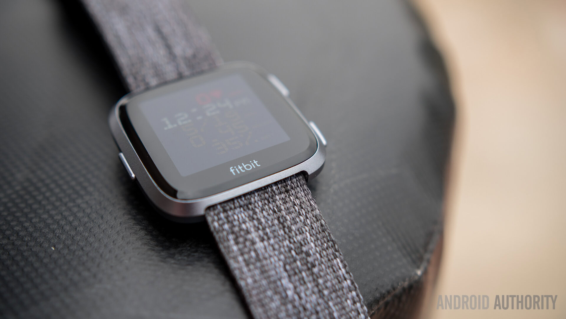
When on the general home screens, the two buttons on the right are used for shortcuts. Tapping the top button brings up Exercises, while holding it brings down a notification shade that lists every notification sent from the phone to the watch in chronological order. The bottom button simply opens up the Alarms app. You can customize the single tap shortcuts in the menu, but this is the main function.
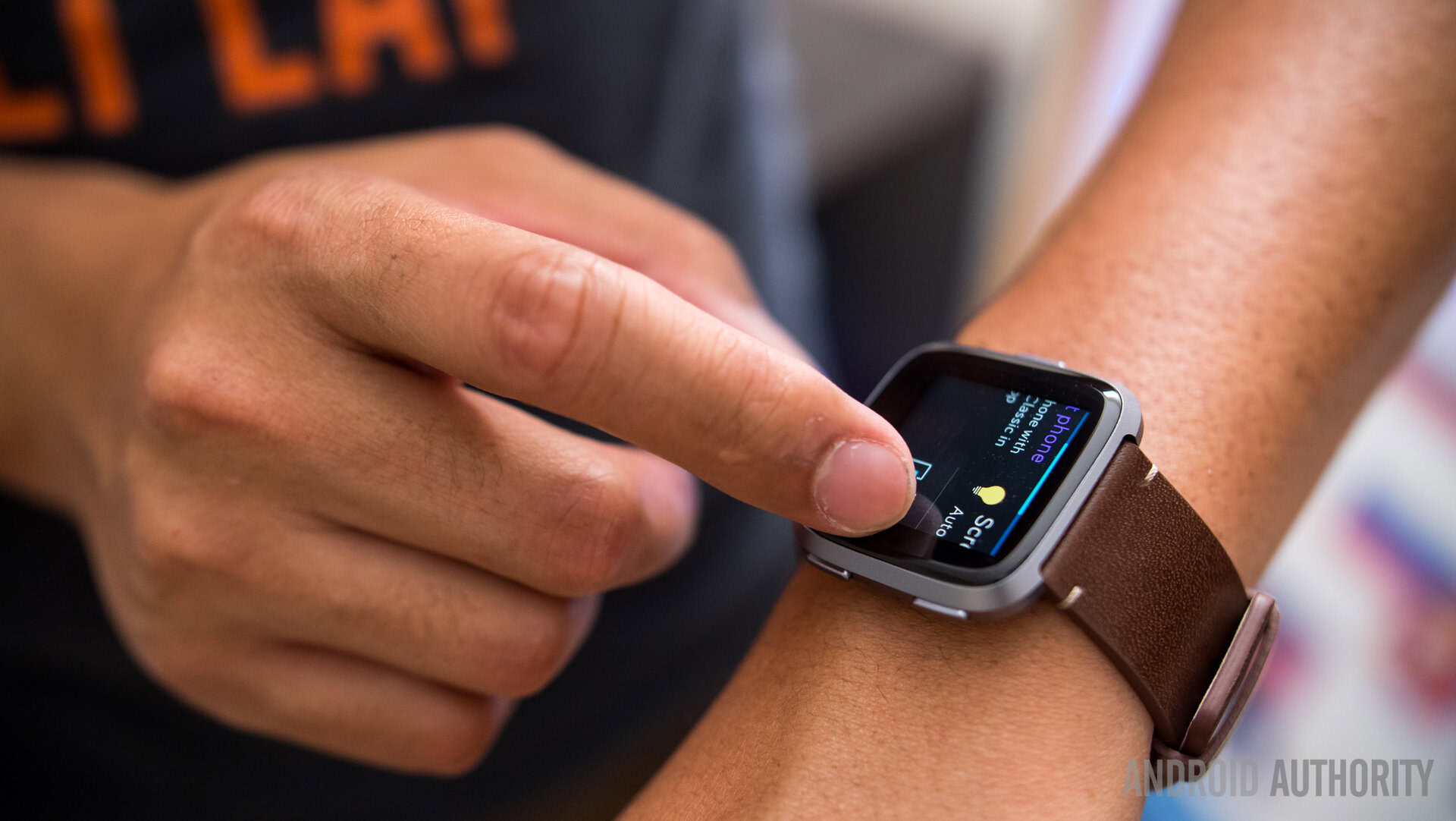
The touchscreen is not bad in and of itself, but the Versa is obviously trying to marry the two concepts and not going all in on either one. Certain functions require the buttons, while others require tapping the screen. This proved most cumbersome with the music controls (which are initially a headache to even get working, but more on that later) where the buttons are for volume control and changing songs requires use of the screen. At any given moment when I might want to change songs, I would have preferred to have no-look controls, rather than diverting my eyes and attention to the screen just to be sure I pressed the right thing. Even then, bringing up the music controls requires holding down the left button — a button-specific gesture — and then swiping on the resulting screen to get to the music controls and using on-screen elements to change songs.
See also: Fitbit Versa vs Ionic: Which is the best Fitbit smartwatch?
Imagine driving or Boosted Boarding and wanting to go from home screen to music controls to changed song — all that time having to focus on the watch keeps you from looking at the road and creates unsafe conditions.
Allowing customization of the buttons would help — perhaps holding either button to go backward and forward in the song playlist, or programming their presses to go straight to apps or functions you want so that the chore of swiping can be mitigate. That level of freedom isn’t afforded this version of Fitbit’s OS. At least not yet.
If the touchscreen is still a consideration, I don’t think future versions of this watch will go that far.
Still not smart enough
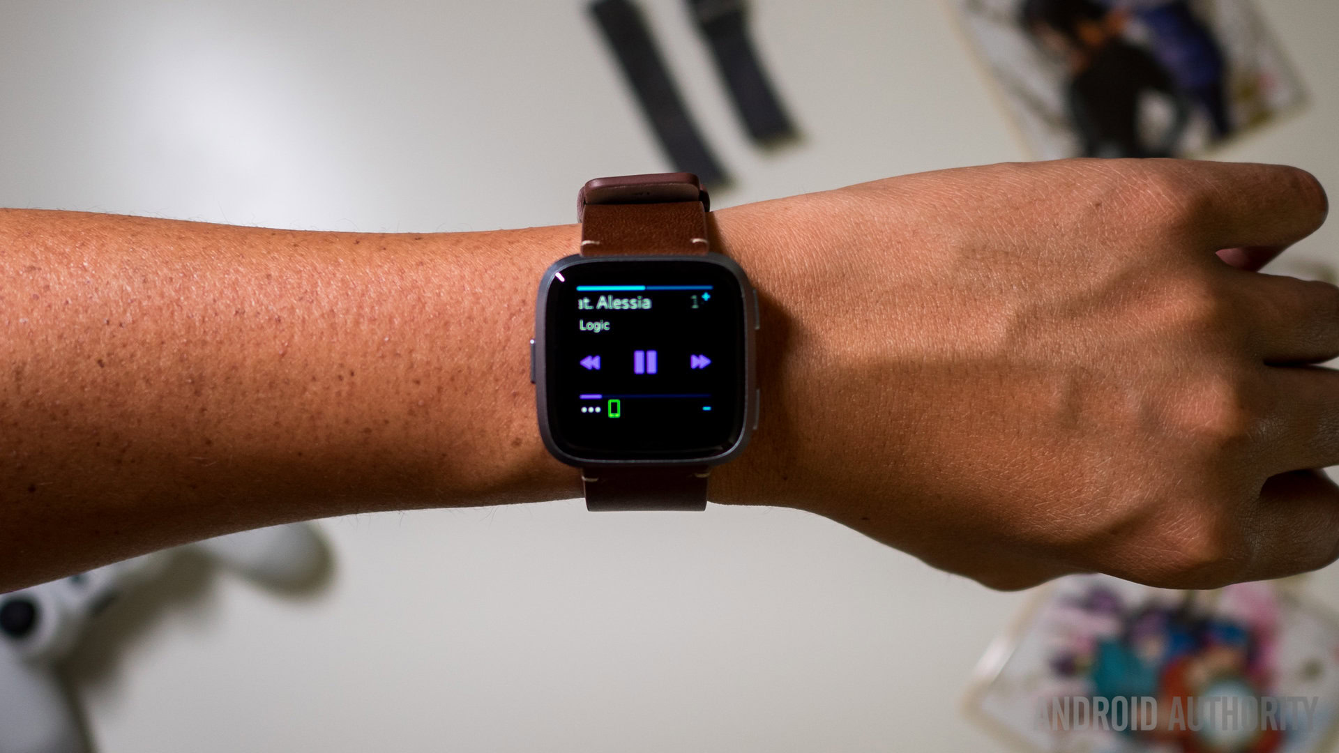
To illustrate this point, let’s go back to the music controls. To access music controls one has to hold the left button, which brings up some quick settings that have to be swiped aside to reveal the Music Controls. Here, users can either control the music stored in the watch and being played through the watch app, or they can control the music playing on the connected smartphone.
Getting this portion of the watch to work consistently has been a chore, requiring a second Bluetooth connection as an input device. Only then will it show up on the watch. I have never been able to get the controls to reliably appear when I am already playing music. At worst, I had to refresh the Bluetooth connection to bring them back up.
Unless you use local files transferred to the watch, music control is just inconsistent
Obviously the onboard storage is what Fitbit hopes users will take advantage of, but not too many users have locally downloaded music to transfer over. Pandora is a consideration here, but it only has access to specific playlists and has to download them locally anyway because there is no connectivity on the watch without the phone. Simply put, this is not a great watch for music lovers and it takes some work to make those tunes easily controllable for runs and other workouts.
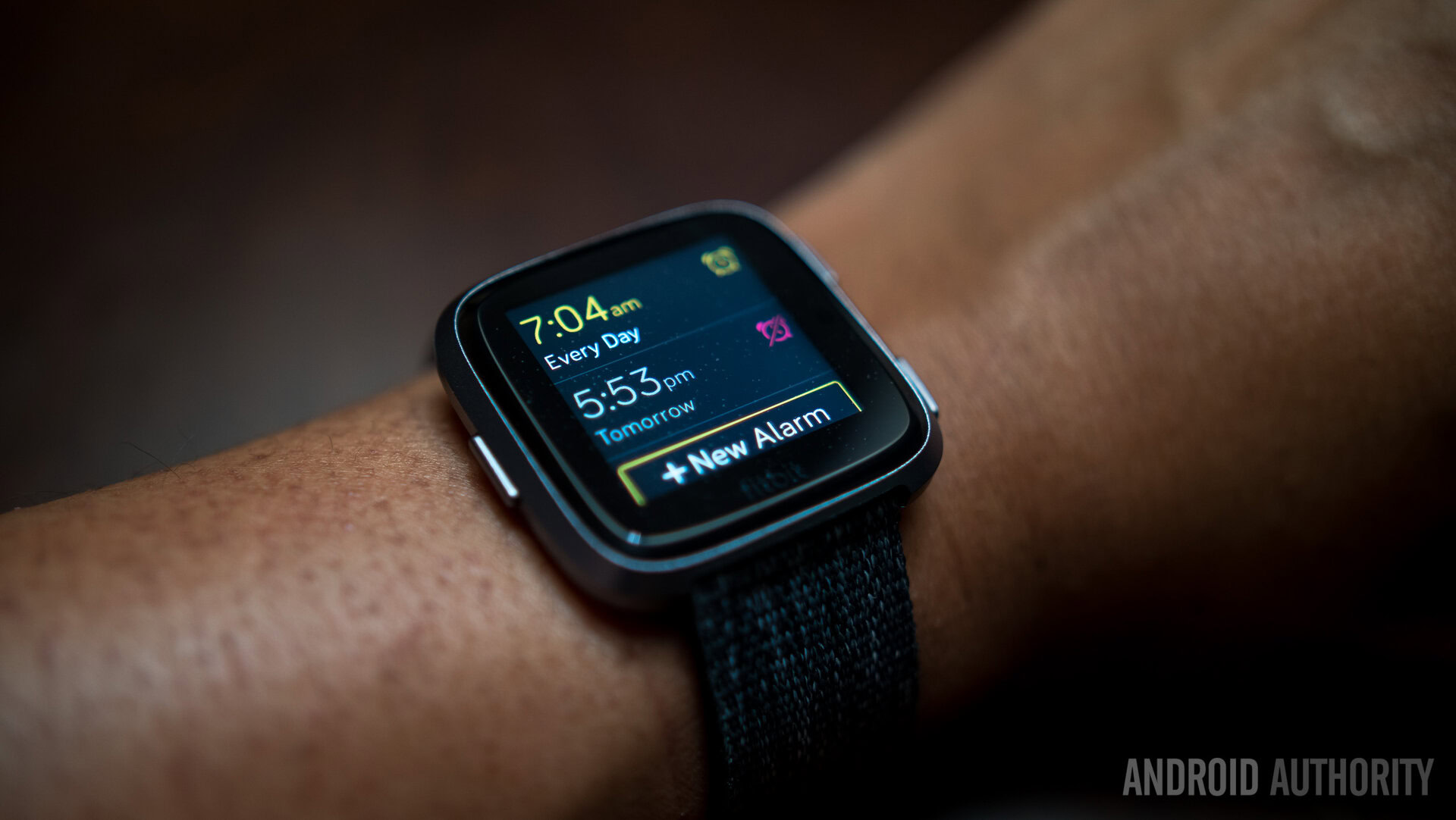
One key consideration I make with watches is vibration feedback — I like having a silent alarm. There is an alarm apparatus in the Versa but it is far too basic. For one, it should tie into the good sleep tracking to figure out when the light cycles are happening and alarm at those points, like Sleep as Android. For a company that puts a lot of emphasis on sleep cycles, it really isn’t using it to its full potential.
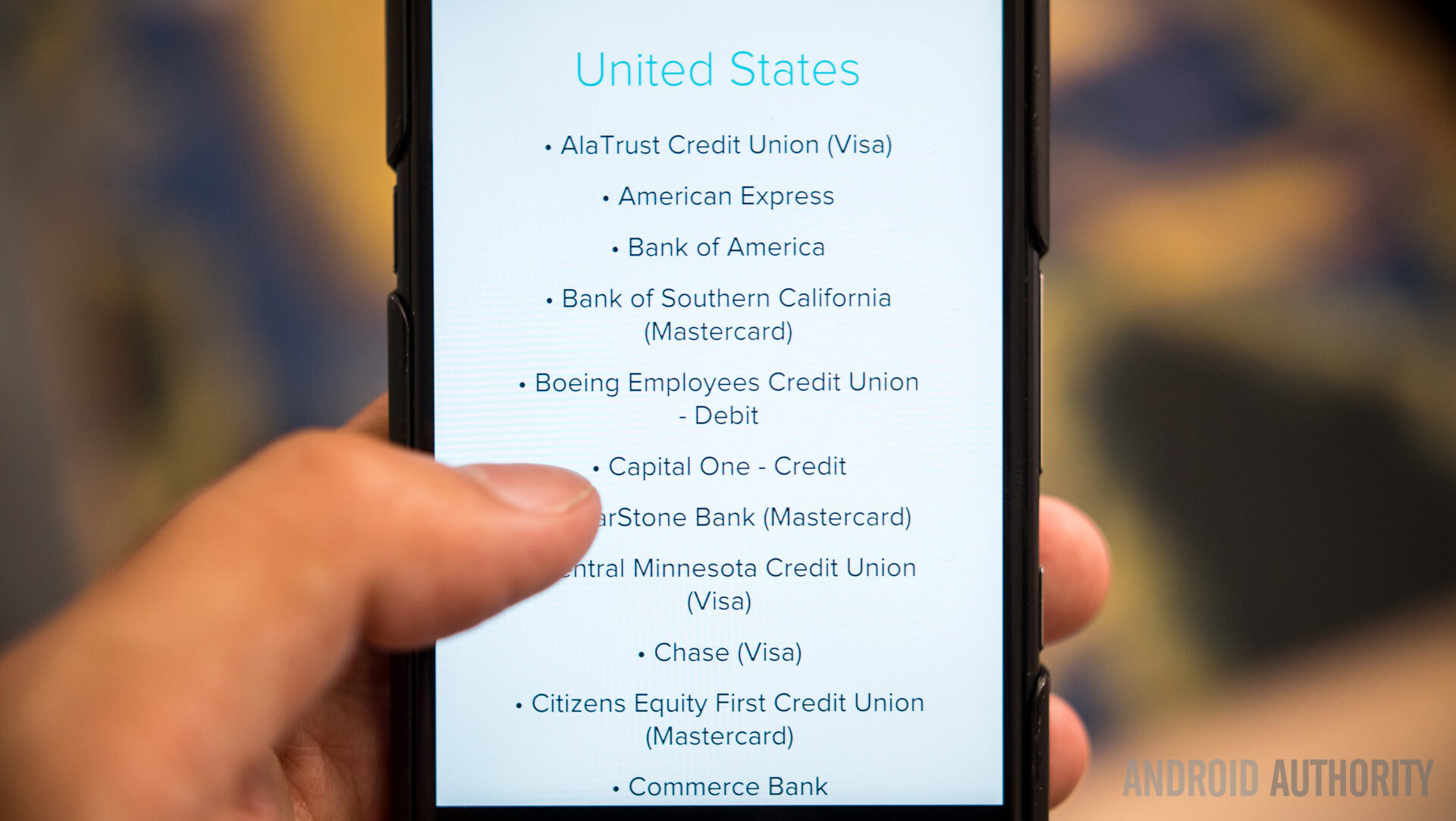
I went for the special edition that comes with a fabric band and NFC for contactless payment support via Fitbit Pay. It does not support many banks, so it limits the number of users who can use it. When I got it to work, the contactless payment system worked well. I wish more stores accepted it, but that is admittedly not the fault of the watch.
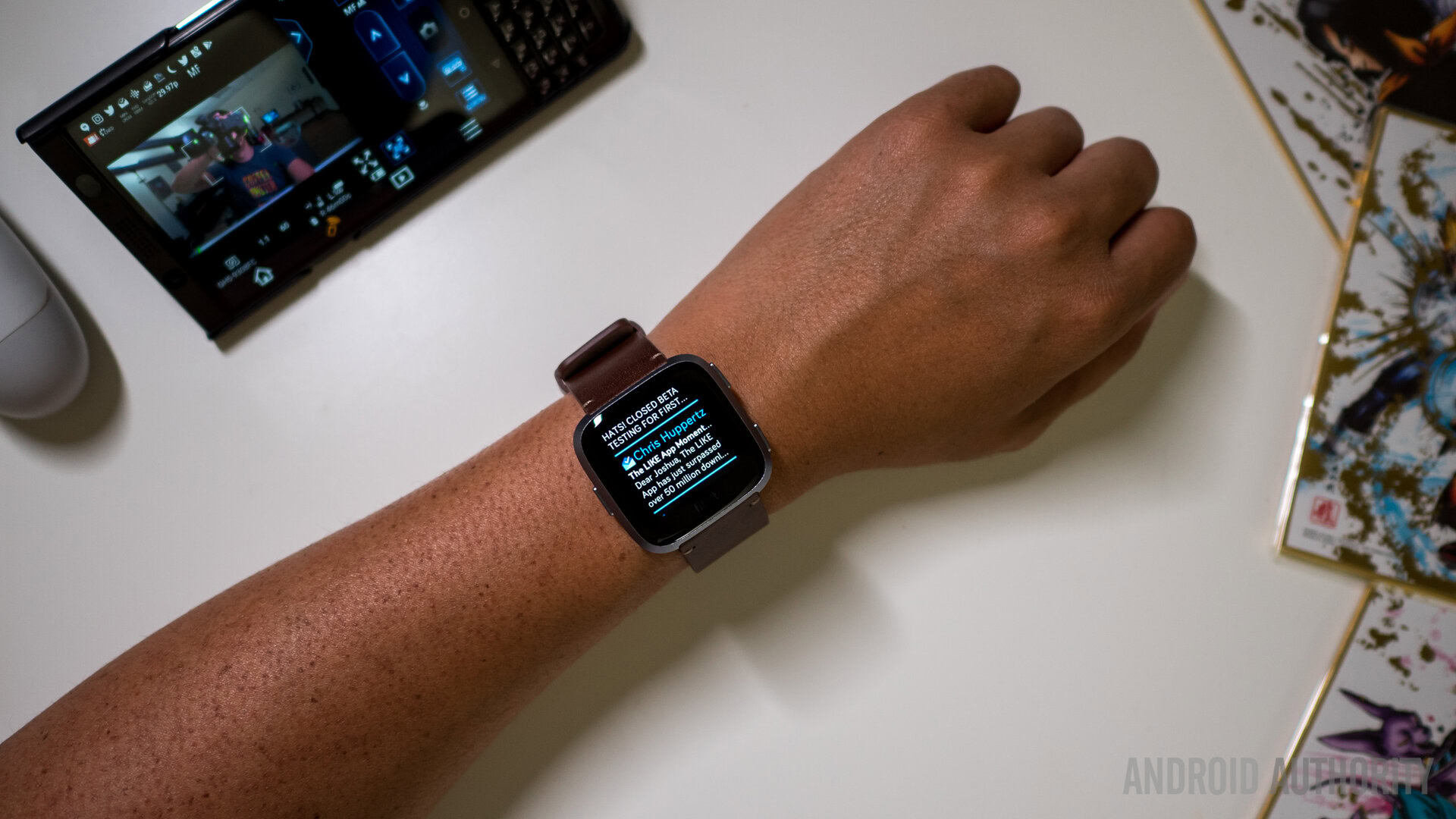
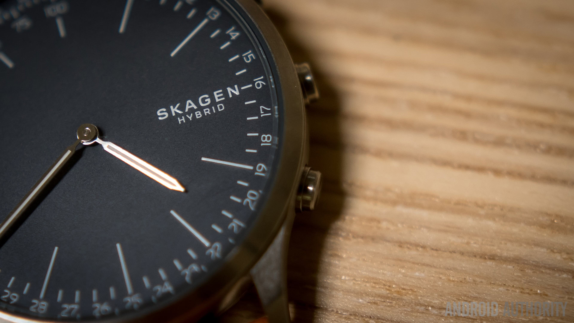
I still enjoy my hybrid SKAGEN watch for the simple, basically notification-free look. For priority notifications, I put a little customization work in on a Mi Band 2, so whenever it goes off I know it’s an important email, work, or my girlfriend messaging me. The vibration motor is great on the Versa, but there is no real customization on notifications.
Turning on an apps notification sends every single one to the watch, without allowing for any filters. This means every inconsequential email gets through and I am wastefully being buzzed and nudged. This is the point I was making about smartwatch notifications in my previous video about hybrids. A smartwatch can tell you if you need to act upon a notification, but having to look at it incessantly to know which notifications are worth acting on is inefficient.
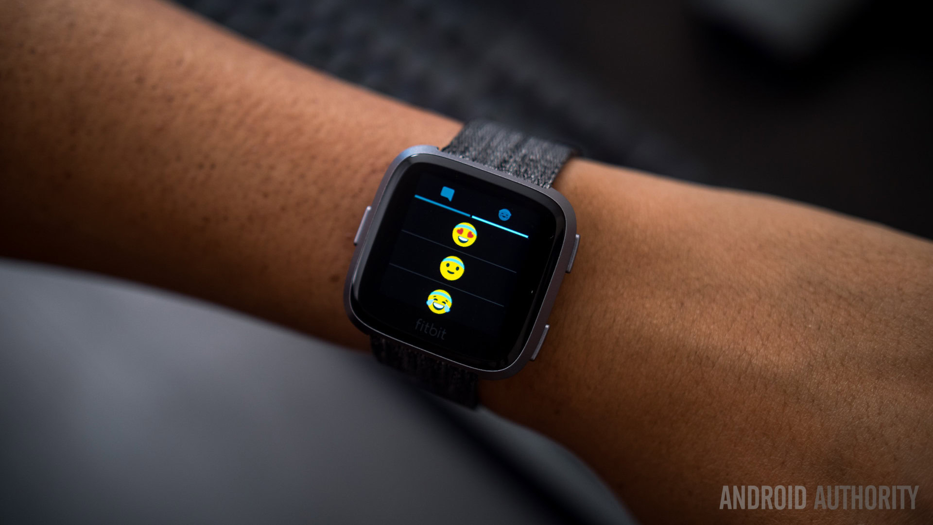
Swiping down on the main screen brings a notification shade, much like on the phone. It lists them in the same manner as Android’s expanded notification view — a longer but still truncated version. Quick replies recently made it to the Versa software, but they are canned responses programmed in the Fitbit app. If you need to respond to a message or email, you might as well pick up the phone and do it properly.
This goes for looking back on notifications, as well. Because you cannot swipe away notifications selectively, you are left with the full feed to look through. If I were going to ignore the buzzes and just look at what has accumulated later, I might as well do that on a phone.
Notifications are still bare, even with Quick Replies
Obviously all of this can get better; the Fitbit OS is in its early stages. Still, it feels like Fitbit hasn’t used the knowledge and experience it gained by buying Pebble. Even Pebble learned to tap into Android Wear (Wear OS, as it is called now) to properly incorporate smart responses and voice commands (which are not in the Versa). The Pebble ecosystem also provided a level of notification customization that helped slightly more advanced users filter through the muck and the spam. The smartwatch acted more as a filter rather than just a cool looking repository for every notification users already sick of getting in their pocket.
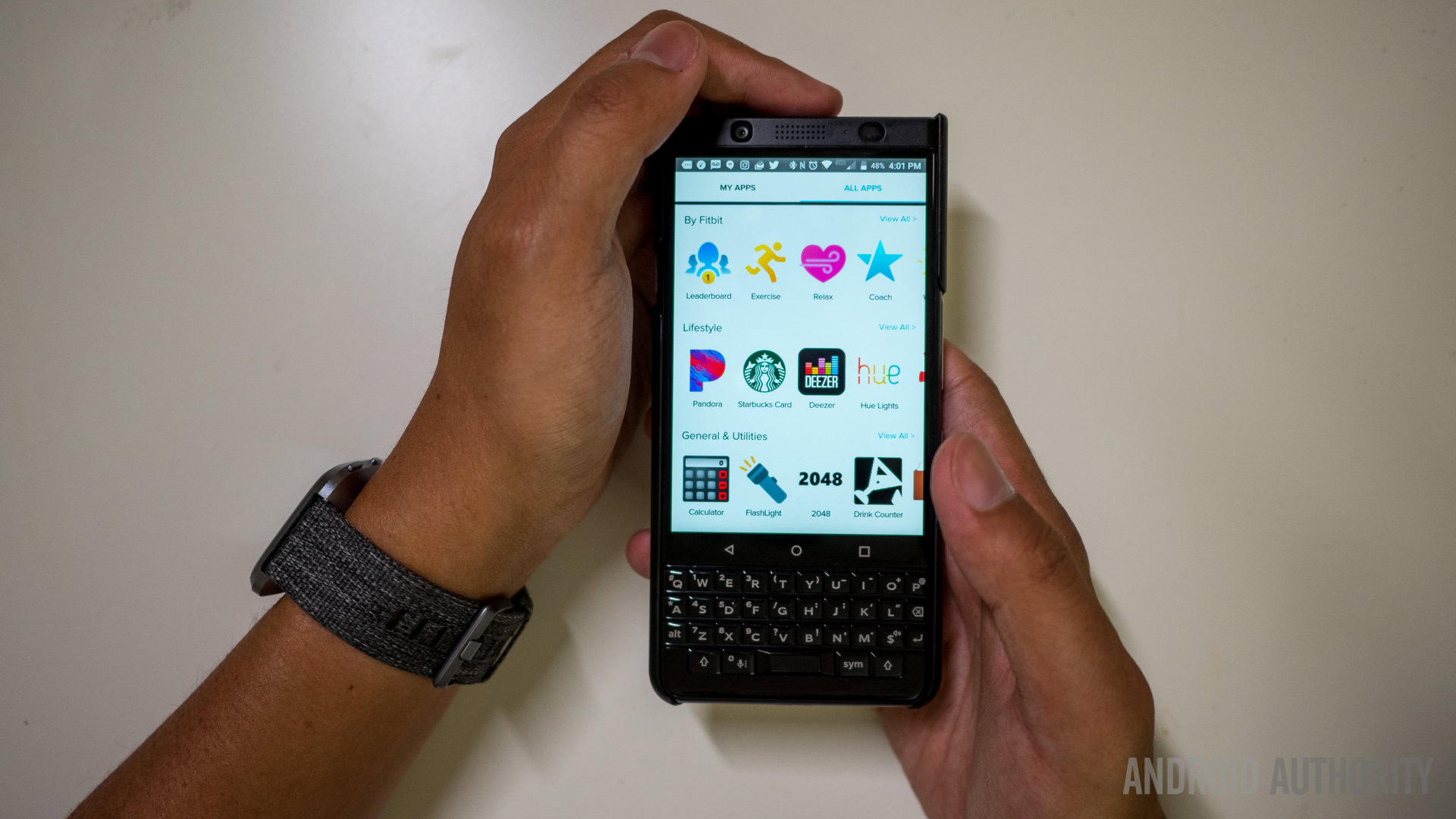
If I had one piece of advice for the Fitbit OS development, it is to make the ecosystem more than just a walled garden. Clearly some developers from the Pebble days are coming into the fold to create good looking watch faces. But as it stands, Fitbit OS will not let users replace what is already developed in-house, like the Alarms app. A third-party alarm app that talks with the sleep tracker and has CAPTCHA tests to ensure the user is awake not only adds to the basic functionality, but actually falls in line with the point of a Fitbit — to make you better or healthier person, or in this case, to help you be an early riser.
Keeping the FIT in Fitbit
It might come as no surprise that the Versa is still a great fitness tracker — perhaps one of the best for general consumers. It tracks steps, active minutes (which is a better metric, by the way), and even water intake. Sleep tracking is quite good, despite working automatically without the user triggering it, and provides a decent enough snapshot of deep sleep, REM, and light sleep cycles. Advice on what could be causing less restful sleep would make this information more helpful — I fear a lot of users simply look at it and continue on uninformed of what they could do to improve those numbers. After all, there is a heart rate sensor that is always firing, which is good for sleep tracking, but also resting heart rate metering and workouts.
Make no mistake — Fitbit dominates the fitness tracker space for a reason.
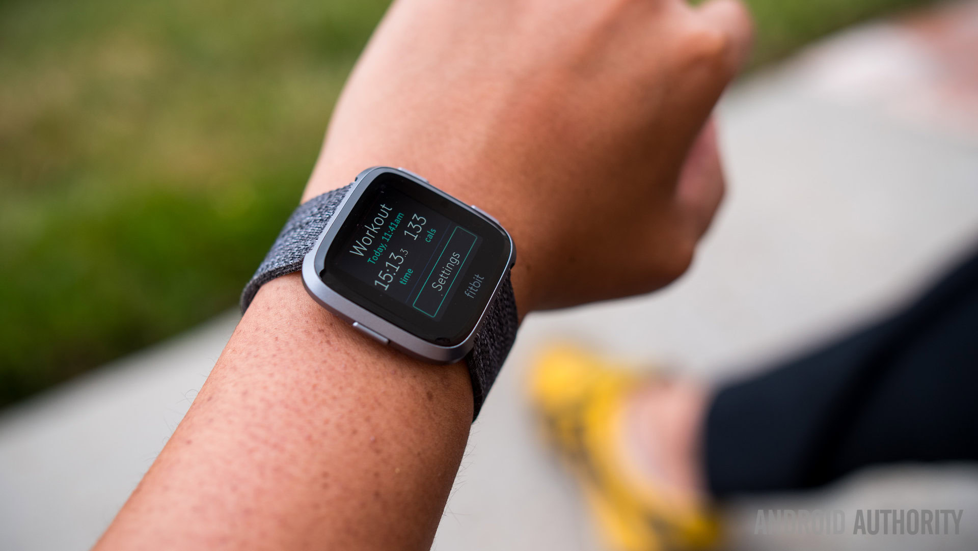
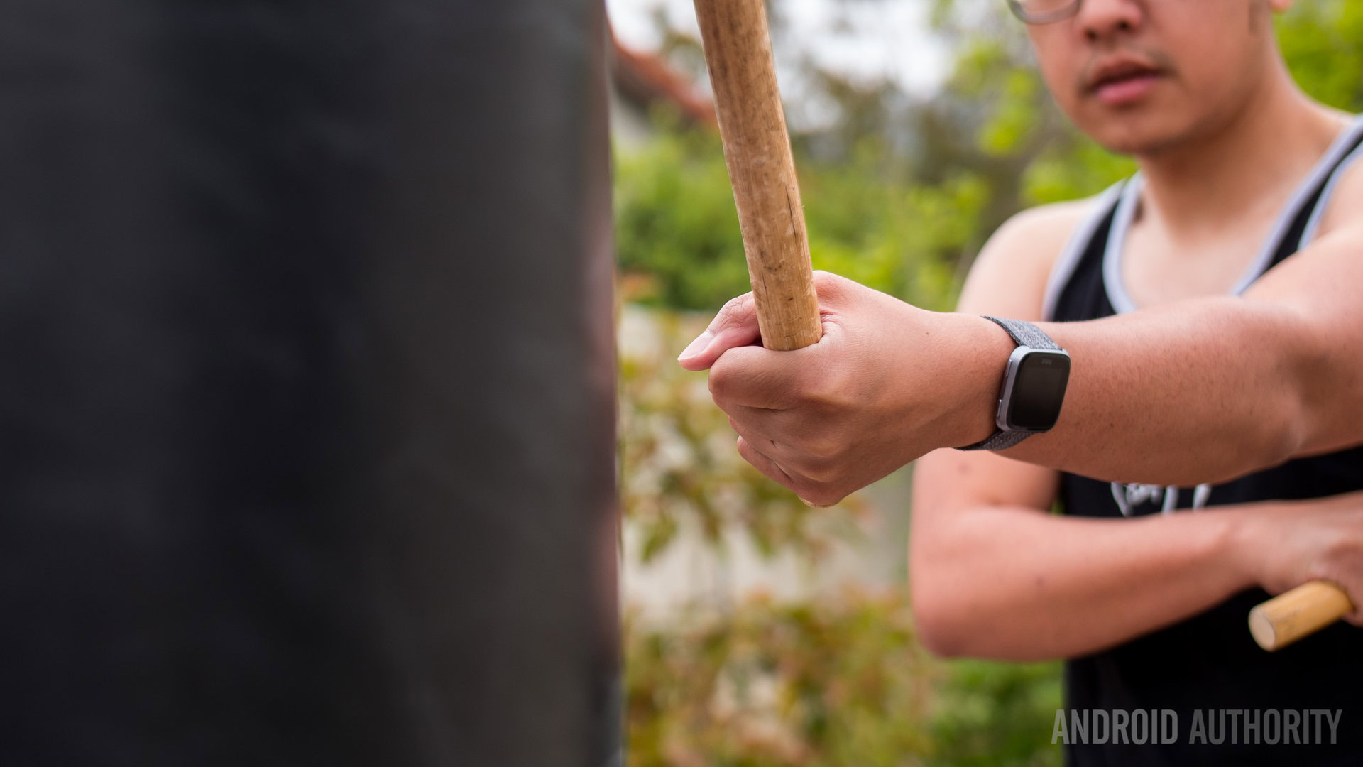
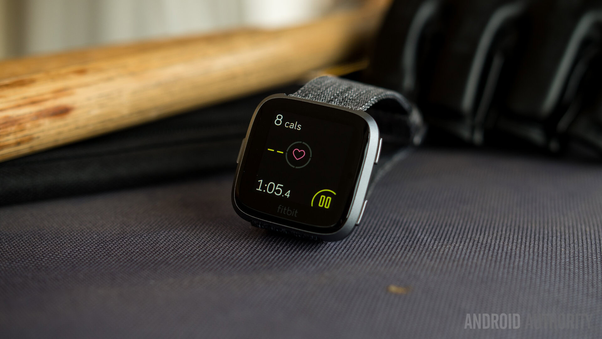
Using the Versa for actual exercise is easy enough, even if you are not doing anything specific. I used a basic workout mode in the Exercise app and it was able to track my heart rate and general movement for 15 minutes, telling me I burned close to 200 calories hitting a punching bag. Even if it is not super accurate, having a ballpark figure is enough to motivate me to do it again, armed with at least a little information about my workout. The Exercise app’s interval timer can also be an invaluable tool for those looking to get in an intense session in a short amount of time.
The Coach is a bright spot, though something we already saw in the Ionic. It works great here, giving strong and obvious vibration feedback between sets along with diagrams of the next movement. There are a few different modes here: 10 Minute Abs, 7 Minute Workouts, and 15 Minute Warm Up. If you are looking for a place to start, doing at least one (or, even better, all three) every single morning should be your first priority. You bought a smartwatch, but you’re also getting a great fitness tool, so use it.
See also: Fitbit does female health tracking, too
Participation award
The times when I was happy to have the Versa on my wrist were contradictory. When I hardly remembered I was wearing a smartwatch, it was a good looking piece of tech that told me the time and rang when I hit my steps or bothered me when I sat too long. When I was actively trying to use the fitness tools to get informed about my health or to get myself moving, Fitbit proved to me again why it is one of the best selling brands in this segment.
When I needed a “smartwatch,” I couldn’t help but wonder where all this drama with Pebble ended up. Fitbit could have tapped into a very loyal fanbase by bringing back even some of the functionality of the watch we enjoyed using. Instead, it hasn’t gone all in on any single concept that makes a wearable truly smart, and it shows. Notifications are quick but still mostly useless glances at boxes and text that don’t lead to much. The app ecosystem is kneecapped by limited development. The use cases the tactile Pebble provided are more cumbersomely handled now.
Clearly, this is a smartwatch casual users will benefit from, and I applaud that about the Versa. If you haven’t gotten a well-performing Fitbit tracker before, you will get all of that and enjoy the extra bits that the “smart” OS provides.
Anyone looking for a viable smartwatch alternative won’t find the Versa any better than the Gears, the Wear OS watches, or the Apples Watches of the world. In my case, the search for a simpler wearable life doesn’t end with Fitbit’s latest device. This watch just reminds me why I moved on in the first place, after Fitbit got rid the one I had on my wrist already.