Affiliate links on Android Authority may earn us a commission. Learn more.
Fitbit Charge 2 vs Garmin vívosmart HR+
Looking for our Fitbit Charge HR vs Garmin vívosmart HR comparison? Head here.
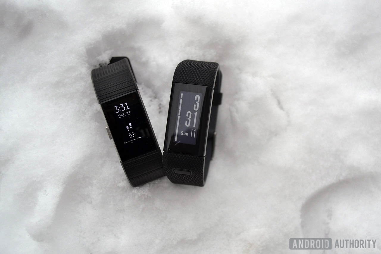
If you’re looking to keep better track of your daily activity, the Fitbit Charge 2 and Garmin vívosmart HR+ are two devices that may be on your radar. While they aren’t the most feature-packed fitness trackers on the market, they do in fact offer a good handful of features that are worth checking out.
How should you spend your 150 fitness tracker dollars? Find out, in our full Fitbit Charge 2 vs Garmin vívosmart HR+ comparison.
Fitbit Charge 2 vs Garmin vívosmart HR+: design
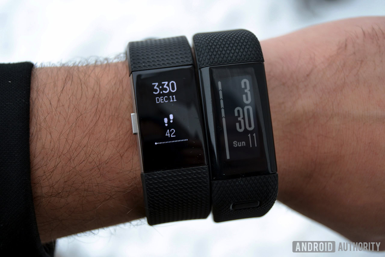
The Fitbit Charge 2 and Garmin vívosmart HR+ look very similar, at least a first glance. They’re both medium-sized, wrist-mounted fitness trackers with big displays and a sleek design.
As noted in our Fitbit Charge 2 review, Fitbit used to have a big design problem. While it was clear the company mostly focused on creating accurate, feature-packed trackers, it seemed as though aesthetics took a back seat. Those days are finally over, and the Charge 2 is one of the better looking trackers on the market. With a stainless steel chassis and a high-quality rubber strap, Fitbit’s latest tracker almost looks like a fashion accessory rather than a fitness band.
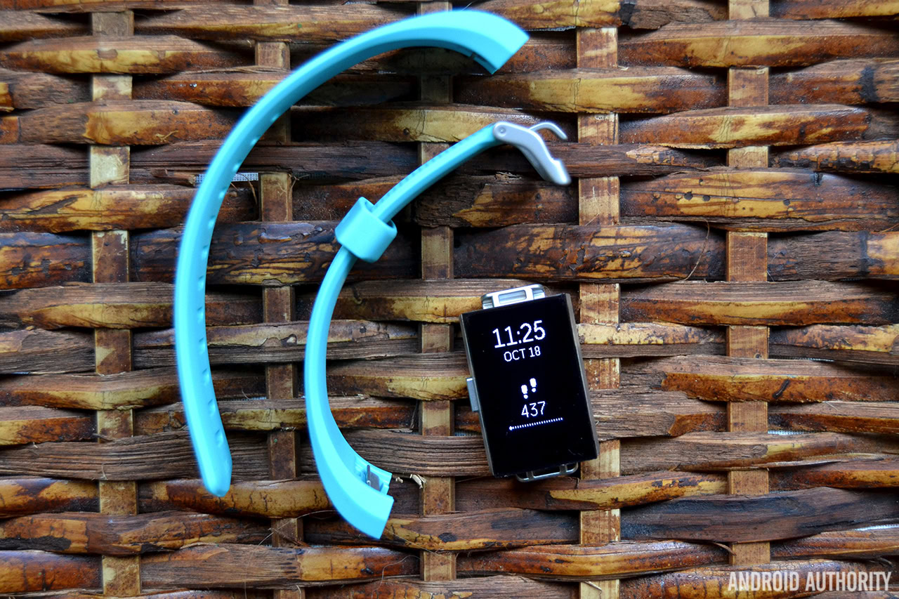
That’s especially the case if you don’t mind spending some extra dough on accessories, as the Charge 2 also has interchangeable straps. Leather straps can be purchased from Fitbit’s website, and there are plenty of cheaper third-party options on Amazon.
Don’t miss: Best fitness trackers | Fitbit Charge 2 review
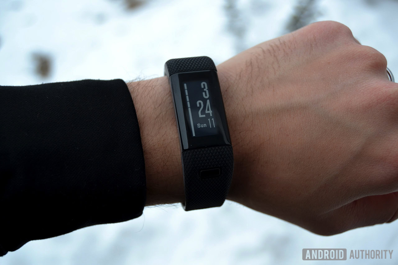
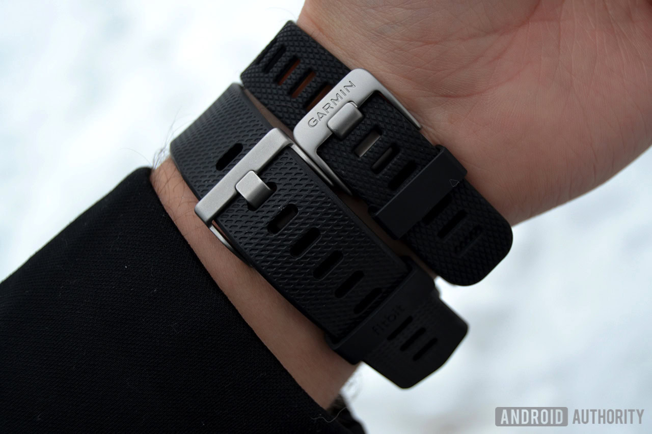
Where Fitbit includes high-quality stainless steel on the Charge 2, Garmin uses a lighter, lower quality rubber and plastic
The vívosmart HR+, on the other hand, sports a design that’s sure close to that of the Charge 2, just a little less pretty. Where Fitbit includes high-quality stainless steel on the Charge 2, Garmin uses a lighter, lower quality rubber and plastic. The vívosmart HR+ also doesn’t support interchangeable straps. Overall, both devices just feel a lot different from one another. The Charge 2 feels sturdy and overall more well thought out, while the vívosmart HR+ is an okay-looking device. In a vacuum, the vívosmart HR+ looks and feels great, but throwing the Charge 2 into the mix leaves much to be desired with Garmin’s latest offering.
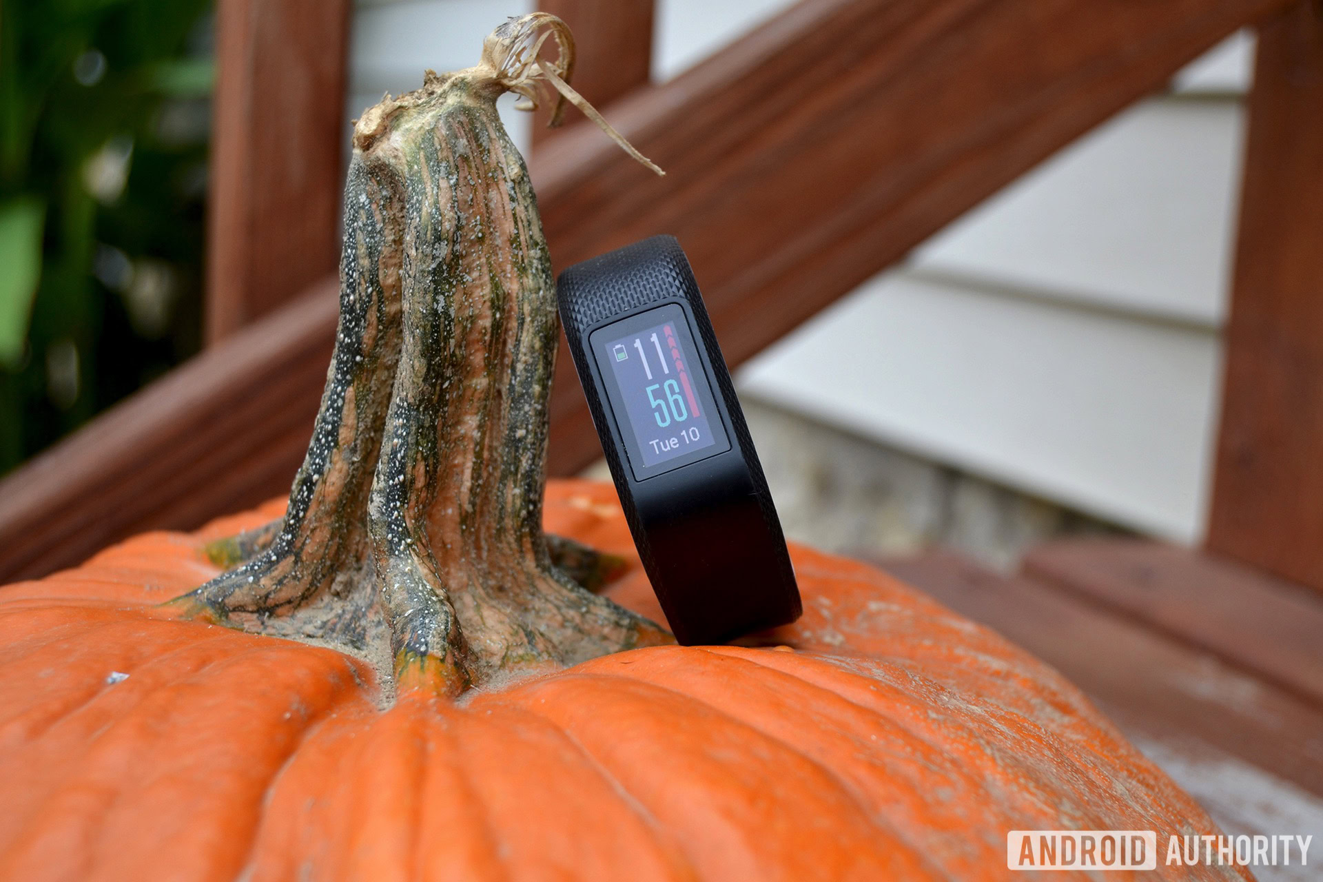
Tapping on the vívosmart HR+’s button brings you to a swipeable menu that gives you access to activity modes, do not disturb, alarms, Bluetooth settings, sync, find my phone, past workouts, settings and device information. That may sound like a lot of options – and the interface does seem a bit cluttered at times – but it gets easier to use once you spend some time with it. I still prefer Fitbit’s minimalistic interface to Garmin’s, but you might feel differently.
I actually prefer the vívosmart HR+'s display
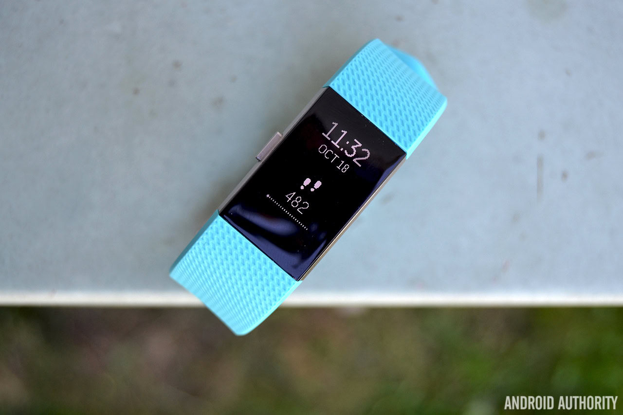
Both the Charge 2 and vívosmart HR+ have displays, but they’re quite a bit different from one another. The Charge 2’s 1.5-inch OLED display is much brighter than the vívosmart HR+’s, though it can be a tad more difficult to read outdoors. It’s also not a touchscreen, which means you’ll have to tap on the bottom of the display to swipe through menus. It takes some time to get used to, but it actually becomes more intuitive the more you use it.
On paper, the vívosmart HR+’s display doesn’t seem all that great compared to the Charge 2’s, but I actually prefer it. It’s 1.0-inch touchscreen LCD display, meaning you’ll be able to swipe through menus with ease. It’s also an always-on display, so you never have to tap on it or raise your wrist to get the time to show up.
More: Best smartwatches
The Garmin device also comes out ahead when it comes to smartphone notification options. The vívosmart HR+ can display call, text, email, social media, and basically any other notification from your smartphone that you’d like. The Fitbit, on the other hand, only supports call, text and calendar event notifications. No matter which device you’re using, though, notifications can be a bit hard to read since their display’s aren’t that big.
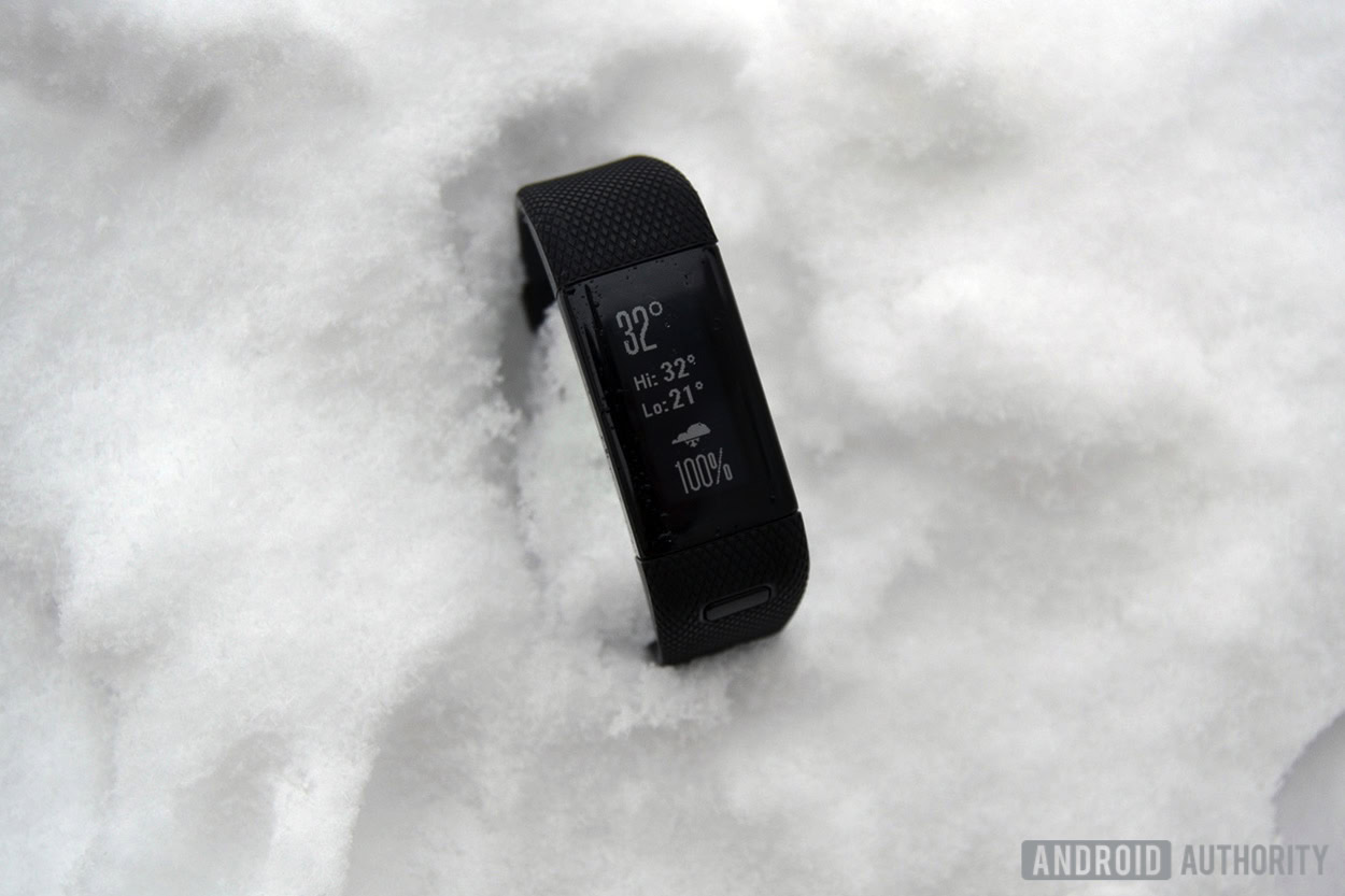
There’s also one area where the vívosmart HR+ blows the Charge 2 out of the water, literally. As is the case with most of its other fitness trackers, Garmin made the vívosmart HR+ water resistant up to 50 meters. The Charge 2, on the other hand, is only splash proof, so you shouldn’t go swimming with it or take it in the shower. Fitbit really needs to make more devices water resistant. It does have the Flex 2, but none of the company’s higher-end trackers have anything more than a lowly ‘splash proof’ rating.
Fitbit Charge 2 vs Garmin vívosmart HR+: specs, features, and performance
| Fitbit Charge 2 | Garmin vívosmart HR+ | |
|---|---|---|
Display | Fitbit Charge 2 1.5-inch multi-line OLED Tap display | Garmin vívosmart HR+ 1.0-inch LCD Touchscreen |
Heart rate monitor | Fitbit Charge 2 Yes, optical | Garmin vívosmart HR+ Yes, optical |
GPS | Fitbit Charge 2 No, Connected GPS | Garmin vívosmart HR+ Yes, built-in GPS |
Water resistant | Fitbit Charge 2 No, splash proof | Garmin vívosmart HR+ Yes, 5 ATM |
Sleep tracking | Fitbit Charge 2 Yes, automatic | Garmin vívosmart HR+ Yes, automatic |
Silent alarms | Fitbit Charge 2 Yes | Garmin vívosmart HR+ Yes |
Notifications | Fitbit Charge 2 Call, text and calendar alerts | Garmin vívosmart HR+ Call, text, calendar alerts, and many more |
Battery life | Fitbit Charge 2 Up to 5 days | Garmin vívosmart HR+ Up to 5 days |
Sensors | Fitbit Charge 2 Optical heart rate monitor 3-axis accelerometer Altimeter Vibration motor | Garmin vívosmart HR+ Optical heart rate monitor |
Compatibility | Fitbit Charge 2 Android, iOS, Windows, web | Garmin vívosmart HR+ Android, iOS, Windows, web |
Interchangeable bands | Fitbit Charge 2 Yes | Garmin vívosmart HR+ No |
Colors | Fitbit Charge 2 Standard: Black, Blue, Plum, Teal Special edition: Lavender/Rose Gold, Black/Gunmetal | Garmin vívosmart HR+ Black/Shark Fin Gray, Imperial Purple/Kona Purple, Midnight Blue/Bolt Blue |
Dimensions | Fitbit Charge 2 Small: 139.7mm - 170.2mm (21.3mm wide) Large: 170.2mm - 205.7mm (21.3mm wide) XL: 205.7mm - 236.2mm (21.3mm wide) | Garmin vívosmart HR+ Regular: 136mm - 192mm X-Large: 180mm - 224mm |
Price | Fitbit Charge 2 Standard: $149.95 Special edition: $179.95 Additional classic bands: $29.95 Additional leather bands: $69.95 | Garmin vívosmart HR+ $149.99 |
Both devices can track your steps taken, distance traveled, calories burned, floors climbed, active minutes, sleep and heart rate. That’s a pretty standard affair for most other fitness trackers in this price range, and I can say both devices track all of these metrics quite accurately.
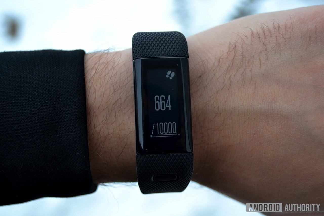
The Charge 2 and vívosmart HR+ are both spot on in terms of step tracking and active minutes, but the vívosmart HR+ comes out ahead in most other metrics. This is because Garmin’s device comes with a built-in GPS, while the Charge 2 unfortunately does not. As a result, the vívosmart HR+ will be able to more accurately track distance and pace metrics, which is a huge plus for the runners out there.
Side note – how Garmin managed to pack a GPS into the vívosmart HR+ is beyond me. It’s not a whole lot bigger than the Charge 2, and it’s certainly not as big and bulky as the vívoactive HR.
It’s worth noting that the Charge 2 is compatible with Fitbit’s Connected GPS feature, which allows you to use your phone’s GPS to get more accurate distance tracking and pace results. This of course means you’ll have to carry your phone with you when you’re exercising, which isn’t all that convenient for most people.
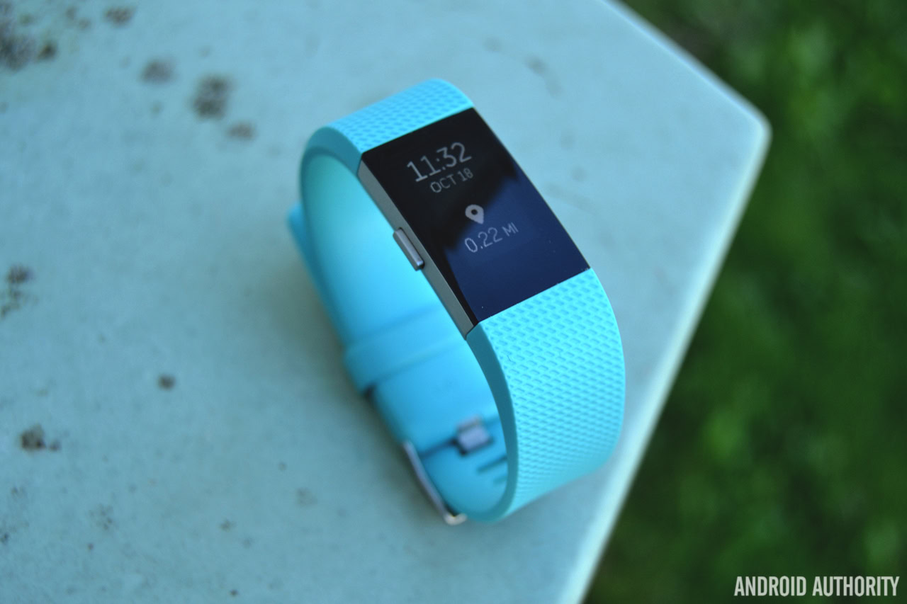
In the case of the Fitbit Charge HR vs Garmin vívosmart HR, we told you that Fitbit’s SmartTrack technology was a standout feature, but that’s because Garmin’s device didn’t offer an alternative. Now the Charge 2 and vívosmart HR+ both offer automatic activity recognition, allowing each device to track workouts automatically inside their respective companion apps. Whether you’re going for an intense run or brisk walk, all of your workout data will be available inside the app when you’re done.
Both devices come with automatic activity recognition, which is a huge plus
Speaking of automatic activity recognition, both trackers will also automatically record your sleep. This is another area where the vívosmart HR+ pulls out ahead. While the Fitbit Charge 2 will display your total time asleep, how many times you woke up and how many times you were restless, Garmin’s device offers a little more insight in terms of sleep trends overtime. The vívosmart HR+ will be able to show you the total time you were asleep, how long you were in deep and light sleep, as well as the total time you were awake. It also displays your movement levels throughout the night. Plus, you can check out your average sleep data overtime, which is super helpful if you’re looking to catch some more z’s.
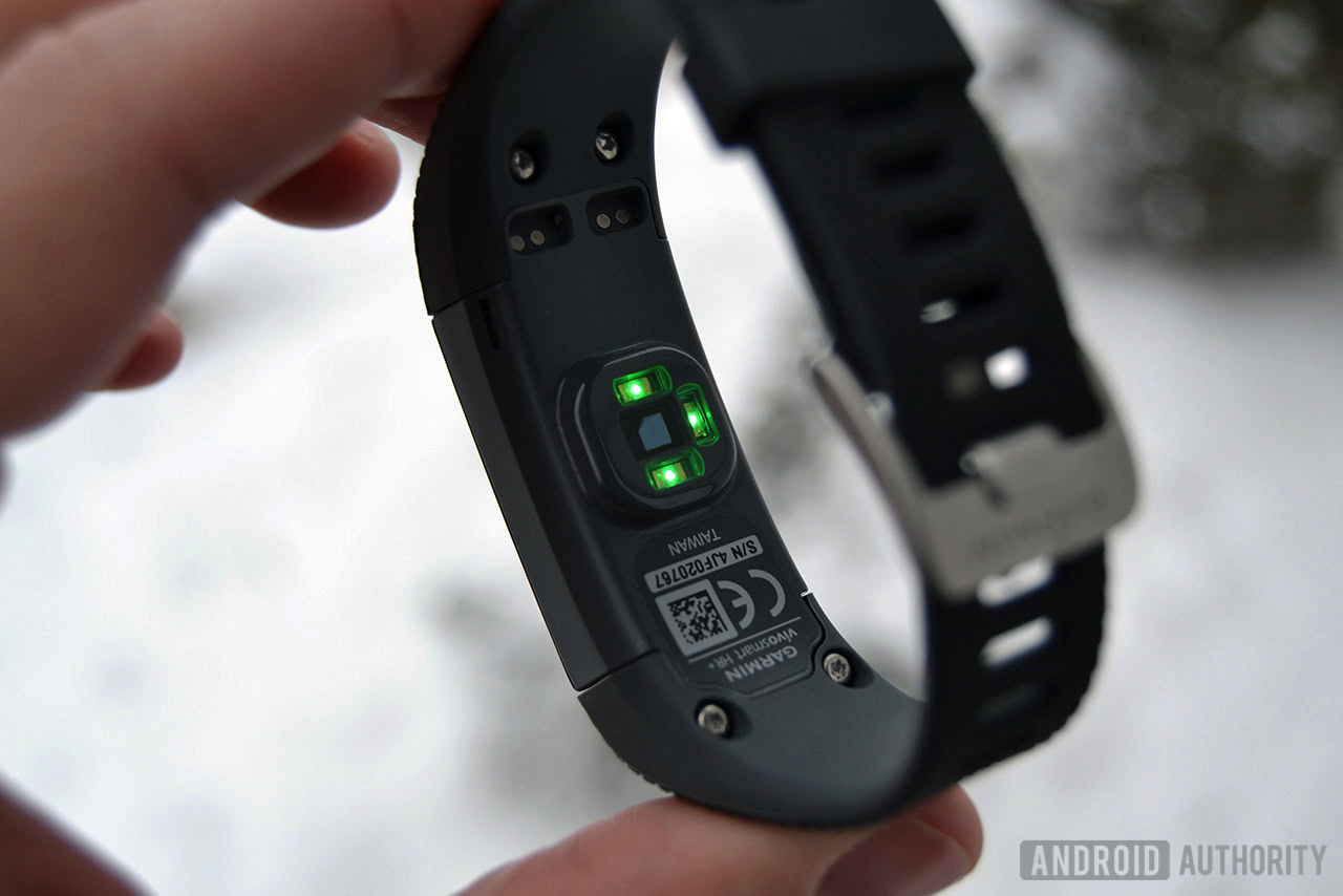
As mentioned earlier, both the Fitbit and Garmin feature optical heart rate sensors. We’ve found both of these heart rate monitors to be plenty accurate when it comes to resting heart rate, though active heart rate readings can be a little off at times. For comparison’s sake, we tested each of these sensors against the Wahoo TICKR X chest strap on multiple occasions. The Charge 2 and vívosmart HR+’s heart rate sensors are quite accurate between 80-120bpm, but anything more than that will throw off each sensor.
Fitbit has also included a few extra features in the Charge 2 that help it stand out from the competition. The first of these new features is a measurement of your Cardio Fitness Level, which is a personalized score based on an estimation of your VO2 Max (how well your body uses oxygen when you’re working out the hardest). Estimated VO2 Max is pretty much the gold standard for grading cardiovascular fitness. Basically, the higher your VO2 Max and Cardio Fitness Score, the better your cardiovascular fitness.
Related: The dark side of fitness trackers: how to avoid common mistakes that could hurt your fitness goals
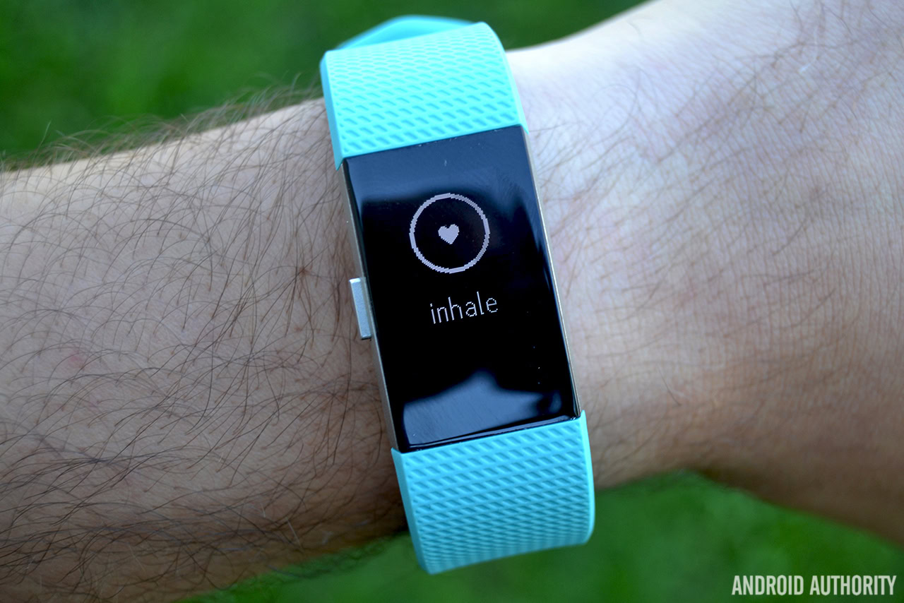
Another new feature on the Charge 2 is on-device guided breathing exercises, or Relax, as Fitbit calls it. Just press the physical button on the device until you get to the Relax screen, and your device will walk you through 2- to 5-minute breathing exercises that should help you reduce stress, lessen anxiety and lower blood pressure.
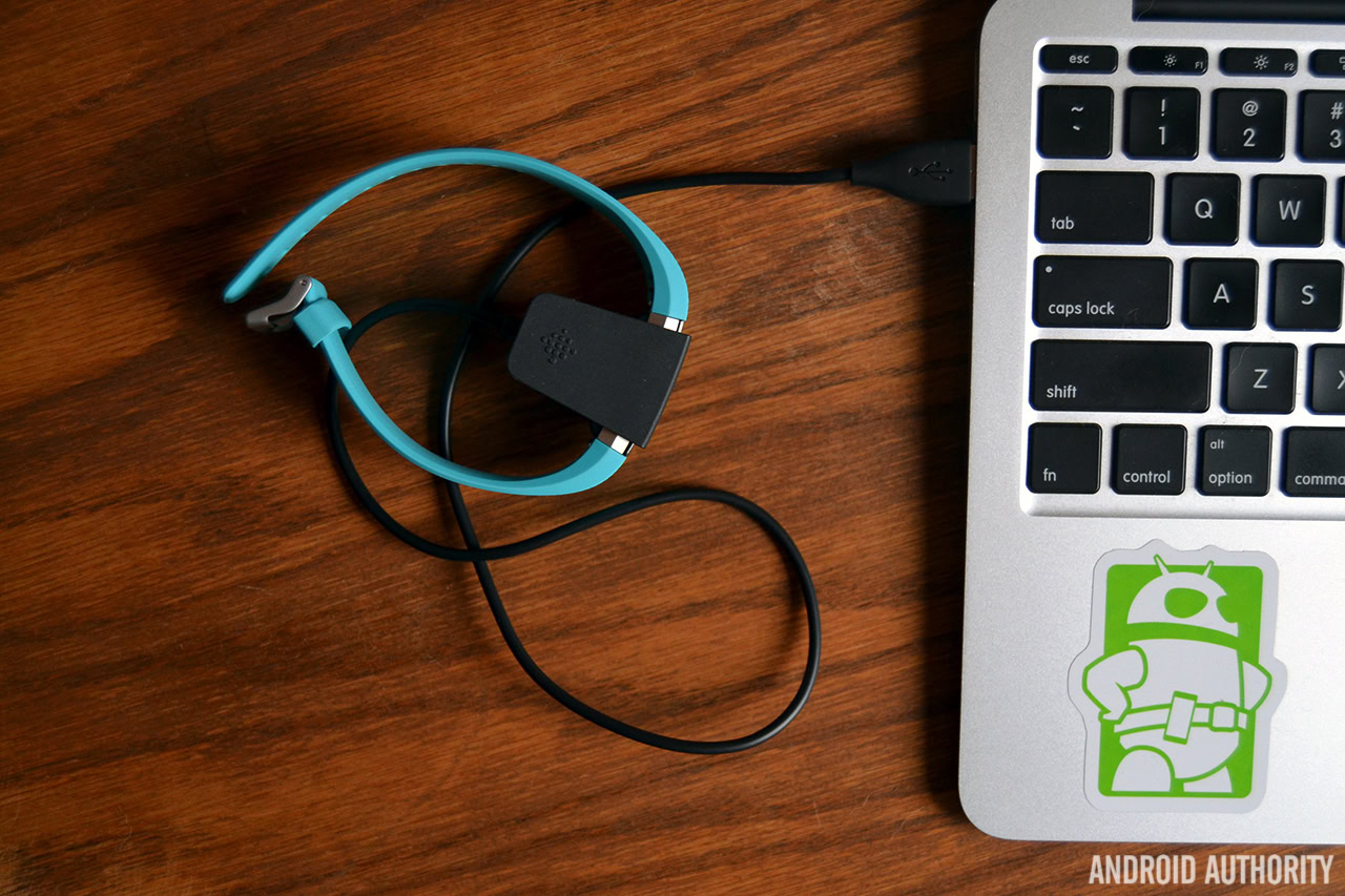
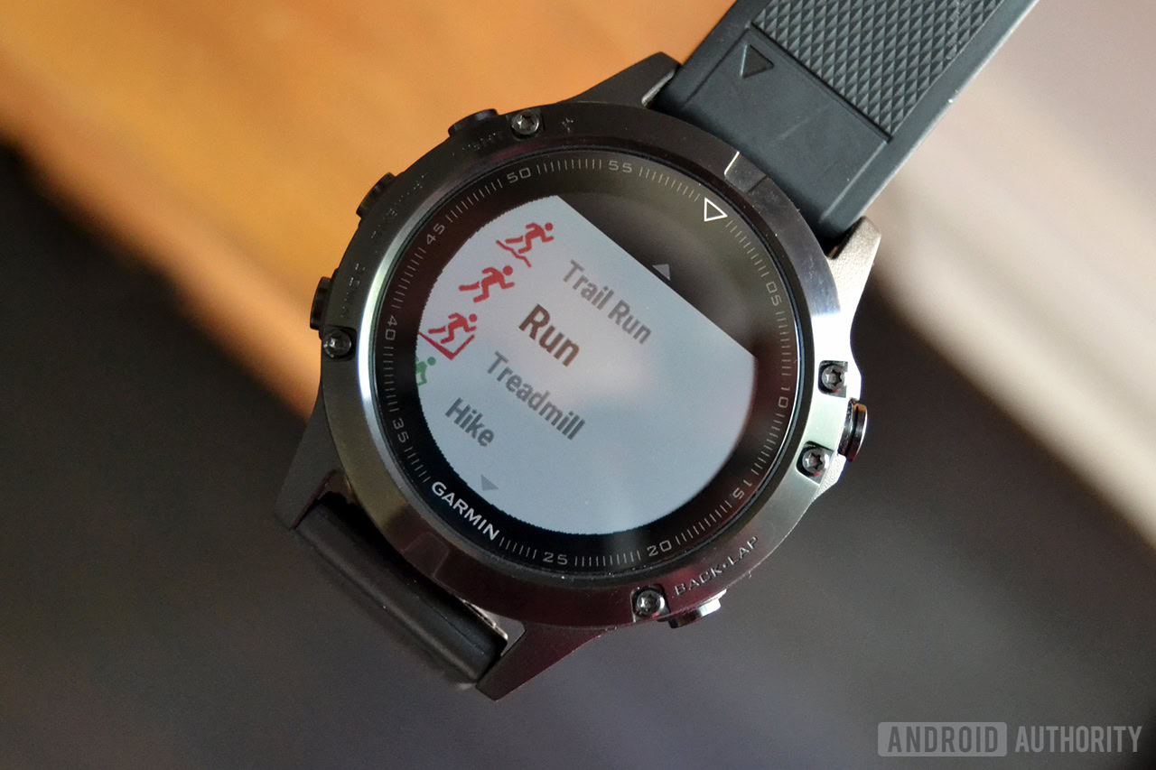
The vívosmart HR+, on the other hand, has been very impressive in the battery department. Even with the heart rate monitor and GPS turned on, we’ve managed to achieve five full days of battery with no problems at all. Good job, Garmin.
Fitbit Charge 2 vs Garmin vívosmart HR+: software
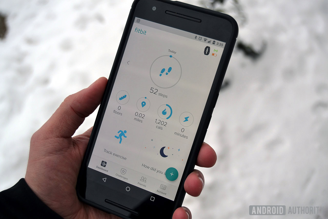
In the great Fitbit vs Garmin debate, software used to be a pretty contentious topic. It’s not so much anymore, and that changes things.
Fitbit’s smartphone companion app is by far one of our favorite fitness applications out there. It’s simple, clean, super intuitive, and does a great job at give you a ton of information without seeming to cluttered at any given moment. This is a good thing, too, since you aren’t able to do a ton of stuff on the Charge 2 itself, you’ll need to open the app to look through your daily activity summaries.
The main screen in the Fitbit app shows off your daily activity, as well as options to log food, water, or your weight. The Challenges section is home to plenty of daily and weekly goals that aim to help you go the extra mile (literally). You can also invite friends to take part in challenges with you. There’s also a dedicated Friends section of the app that lets you see how your friends are doing on their daily activity goals.
Whether you’re a first time or professional Fitbit user, you’ll probably love this app.
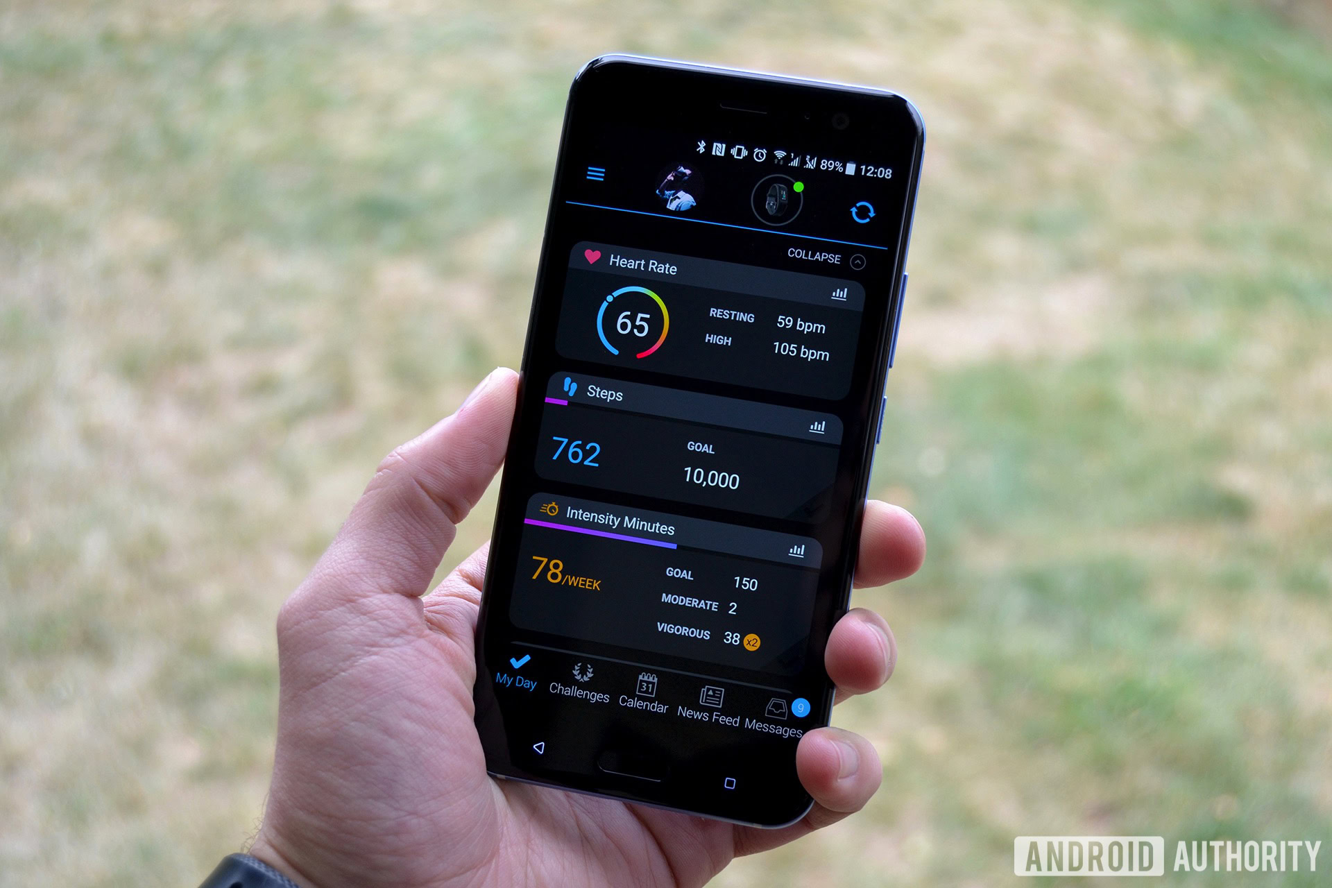
I’ve written a lot about Garmin Connect in the past, and I’m happy to say it’s finally improving. It’s still not the most approachable or easy to use fitness app out there, but it’s definitely getting better.
Garmin's mobile app is finally improving
It’s worth noting the My Day screen is still in open beta, but I’d definitely recommend trying it out if it means not having to go back to the older, more cumbersome layout. If you don’t like it, you can always revert back.The main improvements are in the new My Day screen, which greets you every time you open the Garmin Connect app. You can see your recent workout activity at the top of the screen, and below that you’ll find the current day’s heart rate data, steps, stress levels, and other activity stats throughout the day. In the past, you’d need to horizontally swipe through an endless amount of screens, which was annoying and very hard to understand at times. I’m very thankful Garmin has finally made improvements here—it just makes the whole experience that much better.
There’s still a navigation tab at the bottom which gives you quick access to Challenges, Calendar, News Feed, and Notifications. Challenges lets you connect with friends and participate in different exercise challenges. The Calendar section gives you an easy way to look back at a previous day’s activity, while the News Feed section shows your recent activities from the past 30 days.
Garmin Connect also lets you sync activity data to third-party apps such as MyFitnessPal and Strava. That’s a huge benefit for folks already using those services. However, the list of services compatible with Connect isn’t nearly as long as Fitbit’s.
Which comes out on top?

So, which one should you buy? That all depends, of course.
Both the Charge 2 and vívosmart HR+ are available for around $150, and that actually makes this decision a little easier. I can wholeheartedly say that I prefer the vívosmart HR+ over the Charge 2. Not only does it have a built-in GPS, an always-on touchscreen display, and killer battery life, overall it provides much more than other fitness trackers in this price range. No, it’s not the prettiest fitness tracker out there, but it sure is powerful.
The Fitbit Charge 2 is still a great option, though, especially if you don’t need a GPS and prefer something a little more stylish.
All in all, both fitness trackers are accurate and packed with features; your decision simply depends on what you value more.
Thank you for being part of our community. Read our Comment Policy before posting.