Affiliate links on Android Authority may earn us a commission. Learn more.
Facebook will release simplified Messenger soon, add dark mode

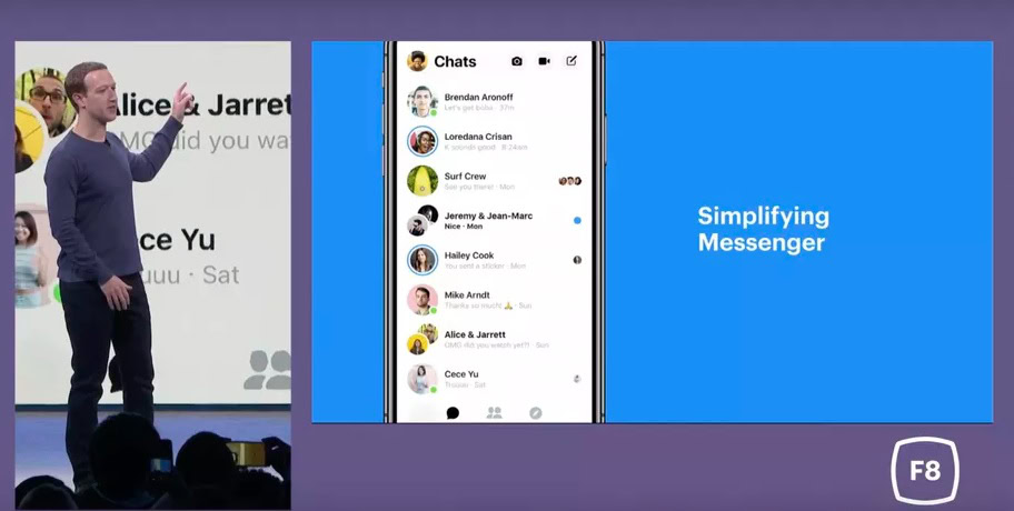
- Facebook revealed that it would redesign the Facebook Messenger app to make it cleaner and simpler.
- Along with the redesign, there will be a Facebook Messenger dark mode option.
- The new design will roll out “very, very soon” according to the company.
You can use a lot of words to describe the Facebook Messenger app, but “simple” isn’t one of them. Over the years, the chat app has become a bit bloated.
That’s why it’s good news that today, via The Verge, Mark Zuckerberg revealed that a simplified redesign of the Facebook Messenger app is coming soon. What’s more, the app will have a dark mode feature.

“When you’re messaging, you really want a simple and fast experience,” Mark Zuckerberg said during the conference. “We’re taking this moment to completely redesign Messenger to focus on these ideas.” Zuckerberg then emphasized the words “clean” and “fast” a few more times.

According to the Vice President of the Messenger arm of Facebook, David Marcus, the redesigned app will land “very, very soon” and the team has been developing the app since the start of this year.
When you first start up the chat app, you’ll only have three tabs at the bottom of the screen as opposed to the five that are there now. The three icons appear to link to your chats, your contacts, and some sort of geolocation function. The camera app that currently takes center stage at the bottom of the app is moved up top, and the game icon and app icon appear to be gone entirely.
Along with the camera icon which was moved to the top of the app, the video chat and compose icons are moved there as well.
The whole UI looks a lot cleaner and will be a welcome change. The new dark mode also will make a lot of people happy, as the all-white layout can be a strain on the eyes if you use it too much.
We’ll update this article when we have a release date for the updated Messenger app.
Thank you for being part of our community. Read our Comment Policy before posting.