Affiliate links on Android Authority may earn us a commission. Learn more.
Design in mind: Google gives Chrome OS version 50 a Material makeover

Android’s dramatic 2014 visual overhaul, branded “Material Design“, brought forth lots of changes with respect to not only the way Google’s mobile OS looks, but also the way it animates. Many praised the new design for its paper-like inspiration and colorful icons however Android Lollipop was not without some degree of controversy, as numerous outpourings of disgust can be found on Internet outlets. Regardless of one’s personal opinion, Mountain View is now expanding its Material world to Chrome OS as well.
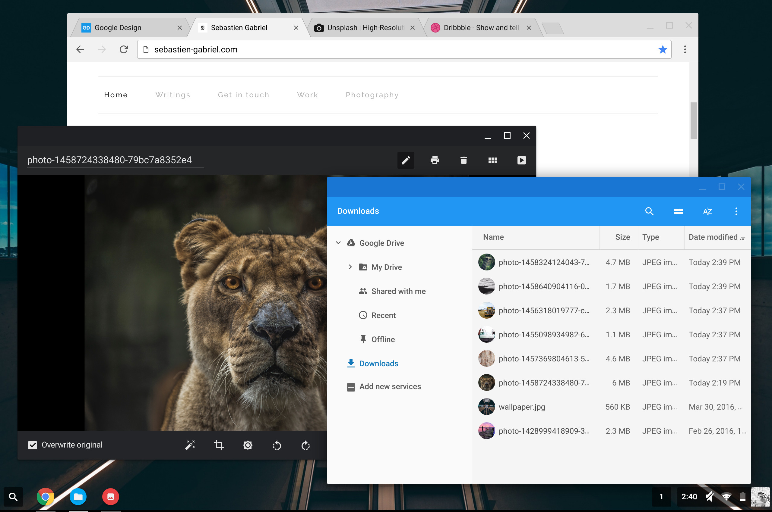
Sebastien Gabriel, Senior designer at Google, recently posted some insight into the changes with Chrome OS. He details them – both the visual and otherwise – as follows:
Starting with Chrome OS, we entirely rethought the way Chrome is implemented, starting by removing any type of bitmap assets such as .png to entirely render it programmatically, which removed a total of ~1200 pngs. Chrome should now scale way better across PPIs, including on Windows when it will be deployed.In addition, we brought Material motion to the core UI with complex morphing ripples and bubbles burst on the icons. We also created two different layout: One mouse optimized layout and a more spaced-out one that we are calling “hybrid”, which will be deployed by default on touch-enabled Chromebooks. The goal of the layout is to enable better touchability without compromising layout density and productivity.Also new with Chrome, we introduced a fully re-themed Incognito mode, sporting a beautiful black layout from the tabs to the toolbar and even the NTP and omnibox dropdown.
He also took the liberty to post a cornucopia of screen captures to illustrate the visual overhaul. Some of the more prominent examples are included below, including a look at the “hybrid” interface mentioned:
A sign of future changes?
Suffice to say, Chrome OS is gradually looking more like Android, something that may add to speculation about a merging of the two OS platforms. This was a major discussion point last fall and has come up in the past as well. Google itself denies this is going to occur, however. Regardless of what ultimately befalls the platform, the fact that dedicated efforts are continuously being made to update its features and functionality show a clear commitment to not only the cause, but to consumers as well.
With the new “hybrid” mode in particular, Google is placing added importance on touch, something missing from its own Chromebook Pixel products. Could this year reveal a more “hands on” refresh?
What do you think? Are you pleased with the new look of Chrome OS? Leave a comment below!
Thank you for being part of our community. Read our Comment Policy before posting.