Affiliate links on Android Authority may earn us a commission. Learn more.
“Bottom navigation” officially added to Material Design guidelines

Bottom navigation has now officially been added to Google’s Material Design guidelines, meaning you’ll likely start seeing more and more navigation bars being added to the bottom of your favorite apps rather than having different sections separated out into tabs at the top or in sections in the navigation drawer.

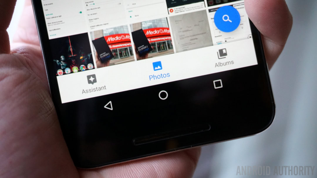
Google added the new bottom navigation rules to the Material Design guidelines. That is, the standard by which all Android developers are supposed to adhere if they want to be following the official design rules Google lays out for Android. Now, Google itself doesn’t even strictly follow the rules, and the same can be said of the bottom navigation bars in Google Photos and Google+.

In case you don’t know what “bottom navigation” means, it’s the presence of a navigation bar at the bottom of an app just above the on-screen navigation buttons. It’s designed to replace the need for tabbed sections at the top of an app or in the navigation drawer, arguably because it puts navigation closer to your fingertips. However, Google’s new guidelines allow for both tabs and bottom navigation as well as the hamburger menu.
Ideally, Google would like between three and five items in the bottom navigation bar that provide access to key areas that should always be only one tap away in an app. Tabbed sections can still be used to divide content and the hamburger menu/navigation drawer is still the repository for everything else. If you think this is likely to lead to confusion, you’re probably right.
What do you think about bottom navigation? An improvement over tabs or change for change’s sake?
Thank you for being part of our community. Read our Comment Policy before posting.