Affiliate links on Android Authority may earn us a commission. Learn more.
What are display color gamuts? sRGB, DCI-P3, Rec. 2020 explained
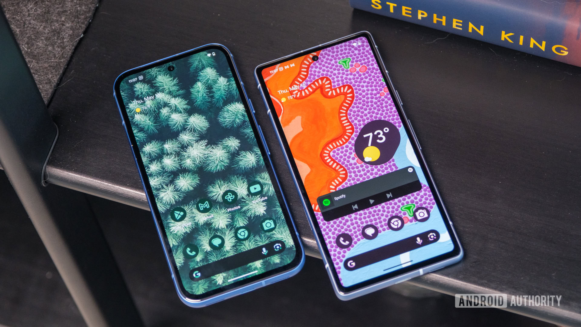
Most of us don’t think twice about how displays produce color. But if you’ve ever looked at a sampling of televisions next to each other at an electronics store, you may have realized that practically none of them match up. Even if you play the same video, different displays just tend to process and output colors differently. So why is that?
It turns out that there’s a hidden display specification most people don’t know about, called color gamut. So in this article, let’s take a closer look at color gamuts, how they affect image quality, and what you should look out for when shopping for your next display.
What is a color gamut and why does it matter?
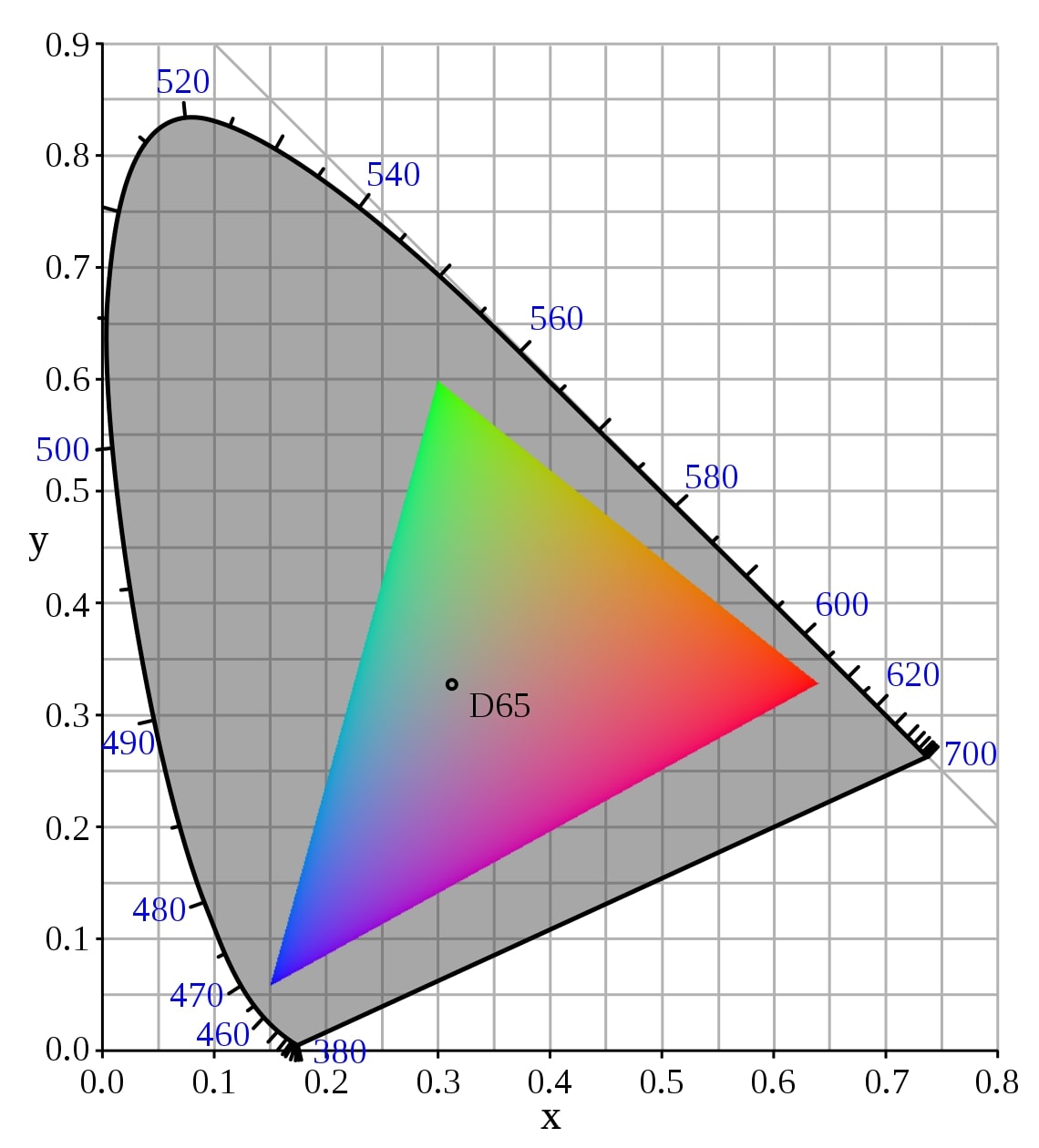
In general terms, the phrase color gamut simply refers to all of the colors our eyes can perceive. It is commonly represented by a horseshoe-shaped figure — called the xy chromaticity diagram (shown below). There’s also a three-dimensional representation, but that’s a technicality we don’t need to worry about.
When we’re talking about computer graphics, however, gamut refers to a display’s color handling capabilities. Simply put, it is a measure of the colors a given display can reproduce.
Knowing a display's color gamut is enough to give you some indication of its color handling capabilities.
Display color gamuts are a subset of the chromaticity diagram — almost always in the shape of a triangle, as shown below. In other words, displays can only output a fraction of all visible colors. sRGB, the most common display color gamut in use today, is highlighted in the following diagram. An sRGB display simply cannot reproduce any color that lies outside of the triangle.
A larger triangular area means that the display’s gamut covers a greater percentage of the visible spectrum. And as you’d expect, the larger the overlap between a display’s color gamut and what our eyes can distinguish, the better.
No consumer display on the market right now can cover our entire visual spectrum. But that’s not a problem as such.
A word on bit-depth
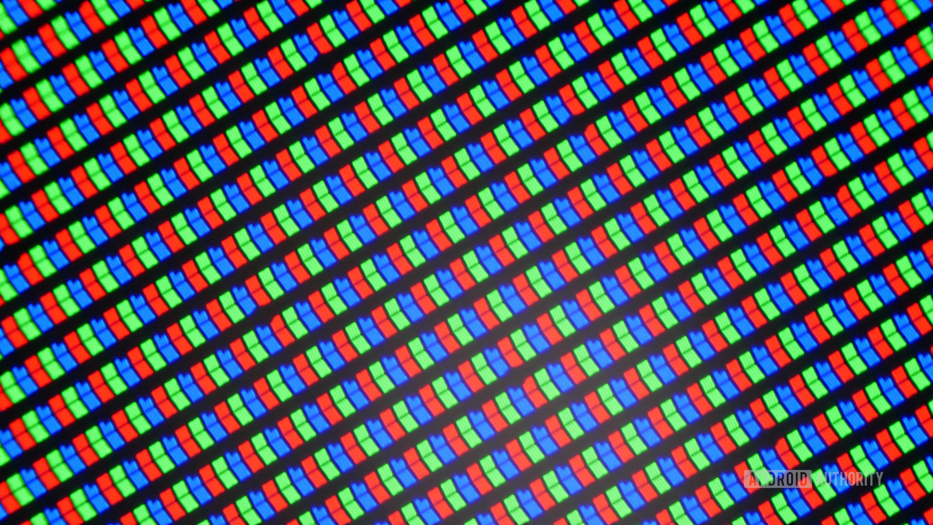
Before we can talk about the different types of color gamuts, it’s worth understanding how displays produce colors in the first place. In a nutshell, virtually all displays are made up of tiny red, green, and blue sub-pixels that combine to output a desired color. These sub-pixels are invisible to our eyes, but you can see them pretty clearly under a microscope.
To that end, a wide color gamut isn’t the only criteria necessary for an image to look good. Displays must also be capable of producing unique red, green, and blue shades within their limited gamut.
We use bit-depth to measure the number of unique shades a display can produce. Put simply, it is the amount of data used to indicate the brightness level of each sub-pixel.
A higher bit-depth ensures that the display can accurately output subtle transitions or gradients between colors.
A display with a bit-depth of 8 bits will produce 28 or 256 shades of each primary color (red, green, and blue). Combined, that gives you 16.7 million possible color combinations. A 10-bit display, on the other hand, can output 1,024 shades or a cumulative 1.07 billion colors.
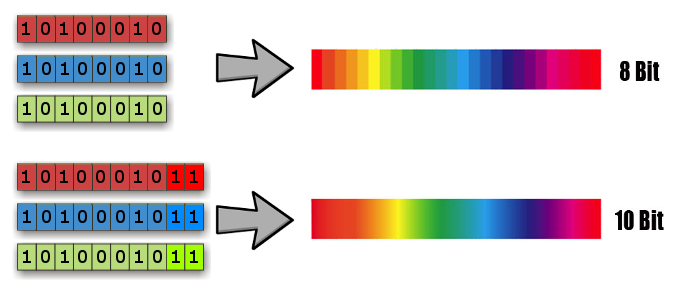
A higher bit-depth ensures that the display can accurately output subtle transitions or gradients between colors. This is simply because the display has more “steps” in between similar colors. Otherwise, you observe an effect commonly known as banding, which visually looks like well-demarcated gradations between similar colors. This is even more important for wide-gamut displays. An exaggerated rendition of this is highlighted in the above illustration.
Now that we’ve got the technical definitions out of the way, let’s talk about the four most prominent color gamuts in use today.
sRGB explained
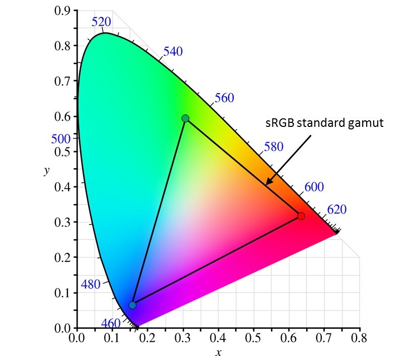
sRGB, or standard RGB, is the oldest but still the most commonly used color space. It was originally designed by the International Electrotechnical Commission (IEC) in the 1990s for CRT displays. Since then, it has been adapted for LCDs and other display technologies as well.
While popular, sRGB only covers a fraction of the visible light spectrum. Put simply, an sRGB display can reproduce 25 to 33% of the colors our eyes can perceive. Looking at the chromaticity diagram, it’s immediately apparent that we’re missing a lot of the outer sections of each primary color.
While sRGB includes a range of red, green, and blue shades, it doesn’t cover the more saturated sections. This is especially true if you look at the green area. Naturally, this reduces the so-called vividness of the image, making colors look a bit more muted than they perhaps would in real life.
While sRGB includes a range of red, green, and blue shades, it doesn’t cover the more saturated sections.
sRGB is closely related to the Rec. 709 gamut. In fact, the two standards cover the same area of the chromaticity diagram. The only difference is that sRGB uses a lower gamma value than Rec. 709.
sRGB’s lower gamma facilitates better color perception in brighter rooms such as an office space. Rec. 709, on the other hand, was designed for televisions and assumes that the display is viewed in dimly lit environments. Since most displays allow you to tweak the gamma yourself, the distinction between sRGB and Rec. 709 is largely irrelevant.
In spite of its limited color coverage, sRGB has become the dominant standard for displays of all shapes and sizes. Most PC operating systems, including Windows, are tuned for sRGB out of the box. Similarly, most websites and content are also designed with sRGB in mind.
AdobeRGB: designed for photos
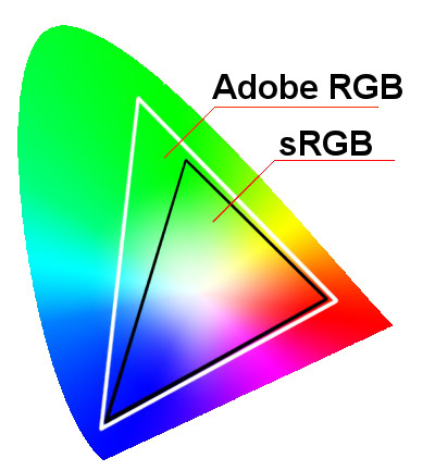
As you may have guessed, the AdobeRGB color space was developed and popularized by software giant Adobe. It is a wider gamut than sRGB, covering approximately 50% of the visible color spectrum.
Unlike most other color spaces on this list, AdobeRGB is not used for video at all. Instead, it was designed specifically for photography and popularly used in programs like Adobe Lightroom. To understand why, we’ll have to shift our focus to photo printers. You may have noticed that color printers don’t combine red, green, and blue (RGB) ink to produce color prints.
Instead, most color (and photo) printing equipment uses the CMYK (cyan, magenta, yellow, and black) color model. In 1998, Adobe developed AdobeRGB to cover this color space and provide photographers with more control over their prints. In effect, AdobeRGB expands sRGB’s limited coverage of cyan and green hues — immediately apparent if you look at the chromaticity diagram.
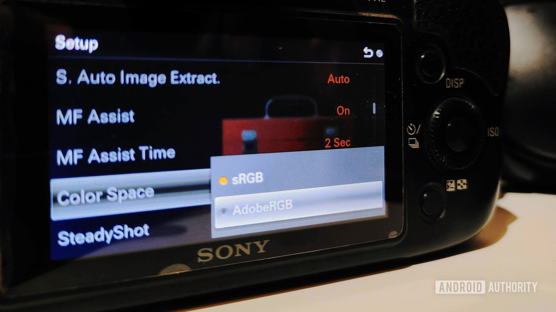
While AdobeRGB is undoubtedly beneficial for photography, most cameras still default to the sRGB color space. This is because most images are viewed digitally, on screens that are limited to the sRGB gamut. Furthermore, even on compatible displays, most programs cannot output AdobeRGB.
AdobeRGB has limited utility today because it was designed to mimic the color space used by photo printers.
If a website includes an AdobeRGB file, for example, web browsers will automatically attempt to render it in sRGB instead. However, this conversion process is not perfect and the result is often significantly worse-looking than an sRGB image.
In summary, handling AdobeRGB content requires the use of photo-specific software and tools. If the file is handled improperly at any point, you could end up with an inferior sRGB image. All of this, coupled with low consumer demand over the years, means that AdobeRGB is a niche color gamut today. Still, some high-end computer monitors offer a dedicated picture profile that is calibrated specifically for this use case.
DCI-P3 or Display P3
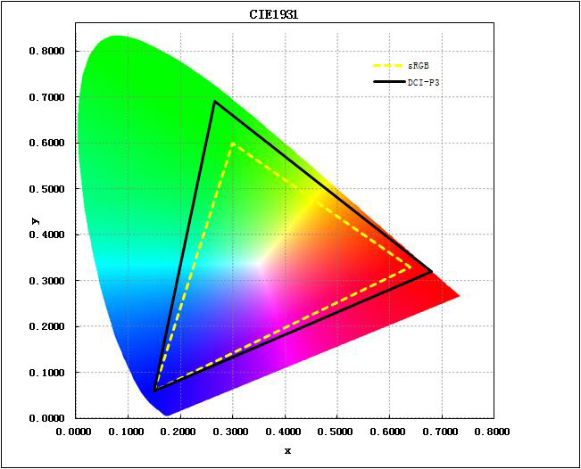
Digital Cinema Initiatives — Protocol 3, commonly shortened to DCI-P3 or Display P3, was developed by the cinema industry to replace sRGB.
DCI-P3 covers a 25% larger area of the chromaticity diagram, a figure that’s pretty similar to AdobeRGB. As opposed to AdobeRGB’s green-cyan bias, however, P3’s gains are more evenly spread out across all three primary colors. In practice, this means that DCI-P3 displays can output more saturated and vivid colors across the board.
Since DCI-P3 was developed for use over a digital medium, it has seen much wider adoption than AdobeRGB. Almost every single device type, from televisions to smartphones, now aims for at least some coverage of this color space, with higher-end displays offering around or above 90% coverage.
DCI-P3 has become increasingly popular over the past few years, and is considered the baseline for a good HDR display.
As with all color gamuts, keep in mind that you also need content mastered for DCI-P3 to appreciate the full extent of its range. If you view an image that was mastered for sRGB, you’ll get much more saturated colors on a DCI-P3 display than the creator probably intended.
Display P3 or DCI-P3 is a wider color gamut or space compared to sRGB. A Display P3 image will show more saturated colors compared to an sRGB one.
Rec. 2020, BT2020 and Rec. 2100
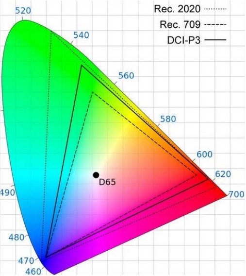
Rec. 2020 and 2100 are the newest gamuts on this list. Besides covering the largest area on the chromaticity diagram, Rec. 2020 also helped define the UHDTV (ultra high definition television) standard. In a nutshell, it was the first standard to include support for 10 and 12-bit displays alongside higher resolutions such as 4K and 8K. The specification also lists support for higher than 60Hz refresh rates, topping out at 120Hz.
The Rec. 2020 gamut, also referred to as the BTU2020, covers an impressive 75% of the visible light spectrum. That’s a nearly 40% jump from DCI P3 and an even more significant leap from sRGB.
In fact, the color gamut is so wide that even the best consumer displays can only cover around 60 to 80% of it. Advancements in microLED, OLED and quantum dot display technologies, however, will likely improve their color reproduction capabilities in the long term.
The Rec. 2020 gamut covers an impressive 75% of the visible light spectrum, but most displays can't offer full coverage yet.
Rec. 2100, on the other hand, is an expansion of Rec. 2020. It leaves most parameters unchanged from Rec. 2020, including the color coverage. The only thing it adds is support for high dynamic range (HDR) through two techniques: hybrid log gamma (HLG) and perceptual quantization. The latter forms the basis of common HDR formats like HDR10 and Dolby Vision. HLG, on the other hand, is exclusively used for broadcast television.
Beyond color: Color errors and white point

While a wide color gamut is certainly desirable, it’s not the only factor that determines how well a given display will perform. We’ve already spoken at length about how gamma and bit-depth influence the overall perceived image.
In that vein, no two displays ever look the same, even if they boast nearly identical color gamuts. That’s because there are a couple of other important metrics that can lead to variances in a display’s color rendering capability. You typically won’t find these attributes represented on most display spec sheets. Besides the display’s gamut coverage, we also need to look at two more metrics, namely Delta E and color temperature.
Delta E
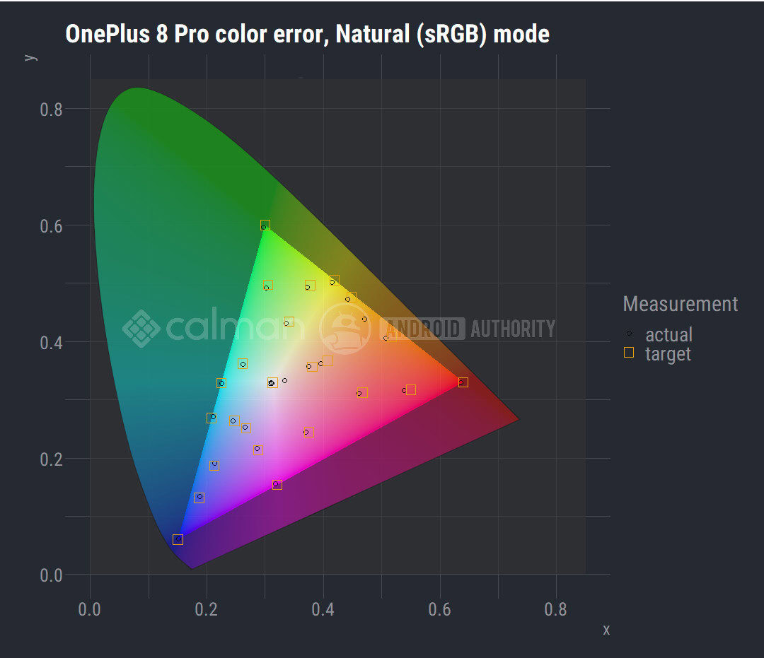
You can think of Delta E as a way to measure the error in a display’s color output. What does an error look like in practical terms? A display that makes reds look like dark orange, for example.
More specifically, though, Delta E measures the difference between a display’s color output versus the standard gamuts like sRGB.
The above graph, for instance, shows our benchmark of the OnePlus 8 Pro’s display against the sRGB standard. The result indicates that the display is well-calibrated in most areas, except for a couple of offshoots in the red-yellow sections. The average Delta E (or the difference between output and reference) in this case was approximately 2.8.
For context, a Delta E value below one represents an imperceptible error, at least to the human eye. Professionals that use calibrated displays tend to prefer a maximum Delta E of 2.0. Any higher than that and the shift in color accuracy quickly becomes apparent.
Color temperature

White point, also commonly known as color temperature, has a large impact on the appearance of whites on a display. The above image, for example, shows what “white” looks like on different smartphone displays.
We typically measure color temperature in Kelvin and you’ll find values typically lie in the range of 4,000 to 7,000K. Why Kelvin when we’re not talking about a display’s actual temperature? Because the scale corresponds to the color of light radiated from a hot, glowing metal object. Think of a gas flame — you see reddish-yellow hues at one extreme and bluish tones at the other. In displays, we refer to whites with a blue cast as having a “cooler” look and vice-versa.
Color standards typically expect displays to have a white point of 6,500K, also known as D65. For some context, the color temperature of sunlight lies somewhere between 5,000 and 6,000 Kelvin.
Most color gamuts are designed around the D65 white point, or 6,500 Kelvin.
If either the white point or Delta E values are off by a significant margin, it may be possible to recalibrate the display. In fact, even high-end displays that ship properly calibrated from the factory can experience drift after long periods of time. The tools needed to accomplish this, however, are not cheap. And unless you’re a creative professional, you’re unlikely to notice or care about a small error anyway.
Should I buy a TV or display with a wide color gamut?
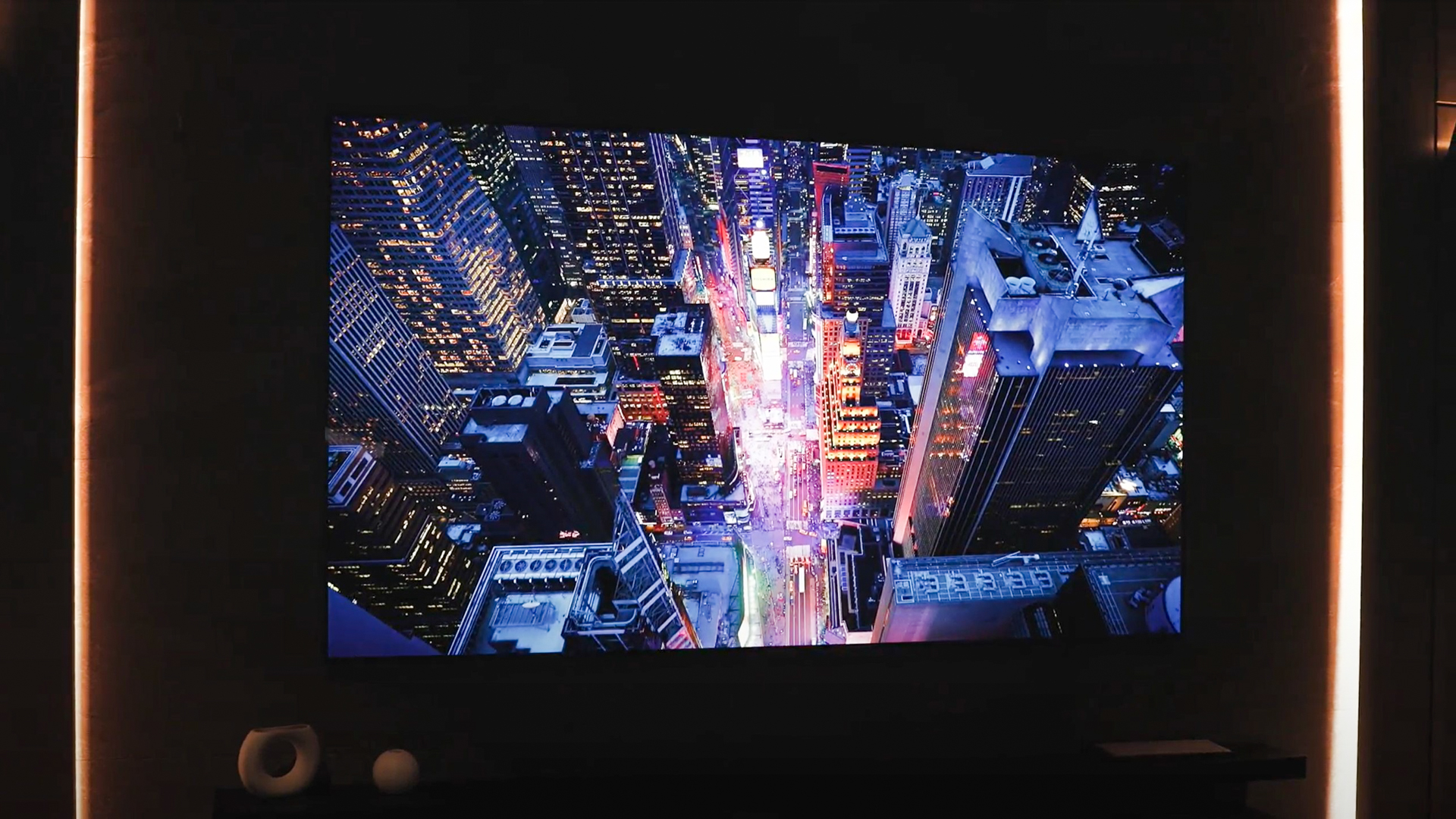
Our eyes have become rather accustomed to the narrow sRGB gamut over the past few decades. However, that’s only because, until recently, just a handful of displays featured wider color gamuts. These often cost a pretty premium too — so only creative professionals could justify picking one up. That’s no longer true today, though.
The display industry has finally progressed to the point where mass-produced panels with wide color gamuts have become affordable. Simultaneously, advancements in camera technology have made it easier than ever for filmmakers to capture additional color detail. Combined, these two factors have made gamuts like DCI-P3 extremely accessible and affordable.
Many mid-range and flagship smartphones these days strive to offer good coverage of the DCI-P3 color space, thanks to the proliferation of OLED displays. Many flagships, including Google’s Pixel 8 series and Apple’s iPhone 15, will even shoot photos and videos in a wider color gamut. Similarly, televisions and computer monitors are finally moving past sRGB as well. On the software side of things, major desktop and mobile operating systems also now support color spaces beyond sRGB.
Many mid-range and flagship smartphones these days offer good coverage of the DCI-P3 color space, as do televisions and monitors.
The content industry’s push for HDR has further helped drive demand for wider color spaces. Indeed, you’ll find that most content — from video games to TV shows — is available in a wider color gamut than sRGB. Moreover, HDR sources such as gaming consoles, video streaming services, and even broadcast televisions are now readily available. Even web design standards like CSS are starting to include support for Display-P3 (Apple’s implementation of DCI-P3).
In a nutshell, HDR aims to make images look more lifelike and realistic. As you’d expect, delivering a more vivid color palette helps to achieve that goal. Most HDR formats, including Dolby Vision and HDR10+, mandate that displays and content covers the DCI-P3 color space at a minimum.
The display industry is also aiming for full coverage of the more expansive Rec. 2020 color space at some point in the future. While no consumer product delivers a color gamut that wide today, it’s only a matter of time before that changes.
BT 2020 or Rec 2020 is the widest color space adopted by the latest high-end displays. Adobe RGB is a smaller color space that was specifically created to produce the best results for traditional photo printing.
Thank you for being part of our community. Read our Comment Policy before posting.
