Affiliate links on Android Authority may earn us a commission. Learn more.
iOS just got widgets and an app library. Where have we seen those before?

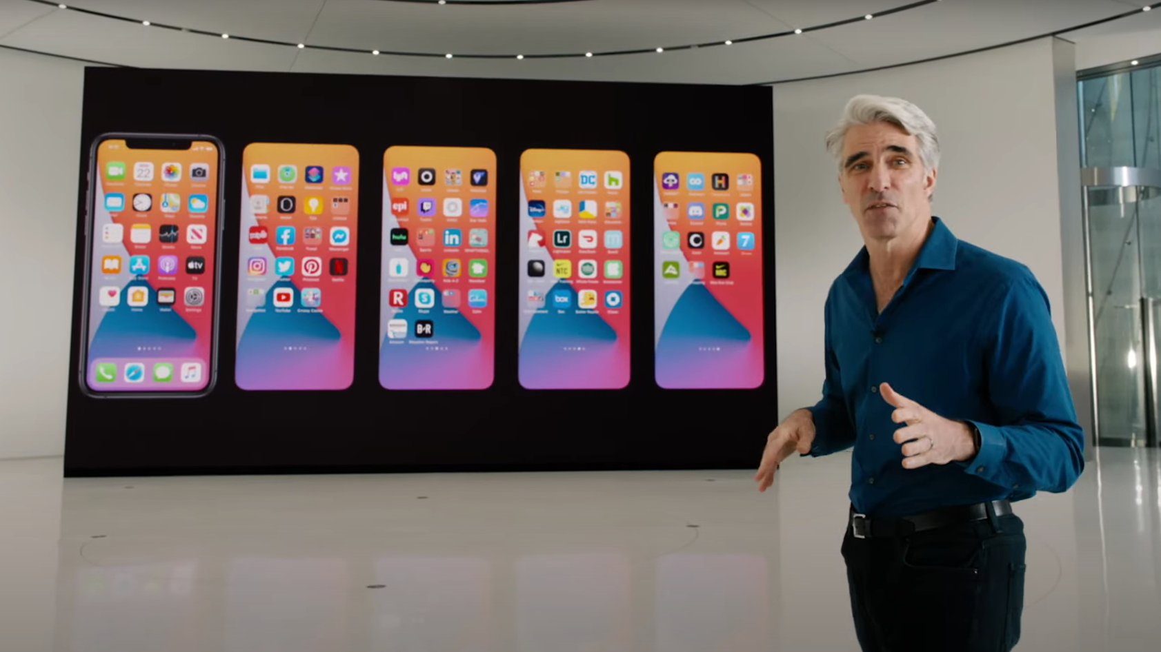
Apple held its annual Worldwide Developer Conference yesterday (June 22) and one of its biggest announcements was the grand unveiling of iOS 14. A quick look at all the changes shows that Apple has once again taken some inspiration from Android for its latest iPhone OS upgrade.
This is certainly not the first (nor will it be the last) time the Cupertino company has effectively repackaged existing Android features and presented them as unique selling points. Just last year we saw Apple “introduce” things like swiping to type and sign-in with Apple on iOS 13.
Similarly, bundled notification and Screen Time on iOS 12 were also lifted from the Google-made OS. But this year, the iOS 14 features list includes some examples that are so deeply rooted in Android’s history that it’s hard to ignore how late Apple is to the party.

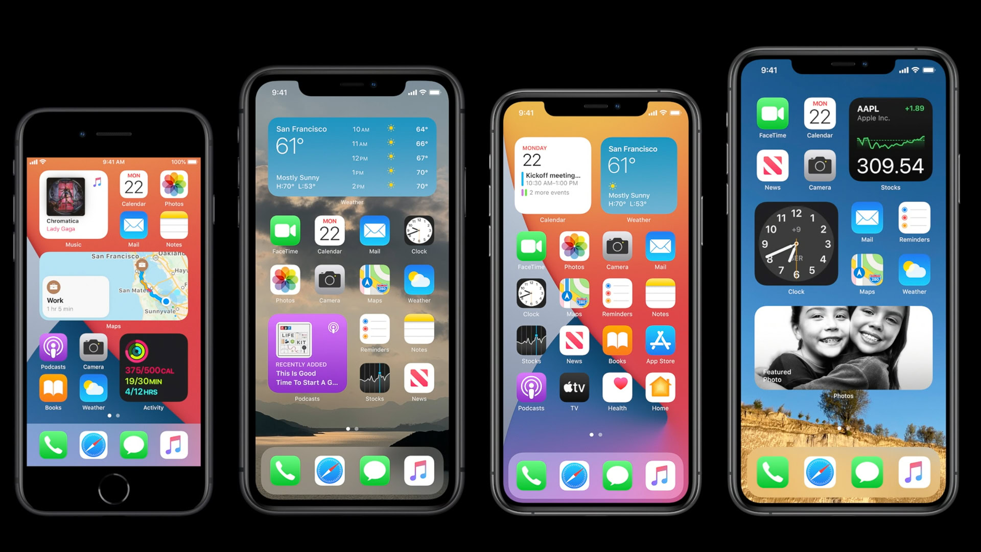
Take for instance the new home screen widgets on iOS 14. Any true-blue Android users would know that widgets have existed on Android phones since the infancy of the operating system — Android Cupcake to be exact. Heck, even the now-defunct Windows Phone UI had widgets in the form of Live Tiles. Why Apple took almost a decade longer to introduce widgets is anybody’s guess, but it’s probably something Android users switching to iOS would appreciate.
Widgets might be the most Android-esque thing for Apple to do, but thankfully, its version is not a brazen copy.
For years, Apple has restricted information tiles to the left-most side of the home screen in a section called Today View. Now they’re finally done hiding in that corner and can be placed anywhere on the home page just like on Android phones. It’s not a brazen copy, though. In fact, with the little attention Google has given to widgets in recent years, Apple’s approach might just revive interest in them even on the Android platform.

Unlike Android widgets which can be of any size and shape, iOS’ widgets are more uniform and come in three different sizes that can be altered to fit the amount of information you want to see. While this is typical of Apple’s controlled approach to UI design, it allows for a very cool feature on iOS 14 called Smart Stack. As the name suggests, the feature lets you create a swipeable stack of widgets that takes up the same space as one single widget. This way, you don’t have to swipe through multiple pages with multiple widgets on them.
iOS 14 also uses on-device AI to switch the widgets in the stack according to the time of day, location, and user activity. For instance, it could show a news widget early in the morning and a summary of your activity at the end of the day. This intuitiveness is definitely something Android could look to adopt.
I'm not sure if I'll ever use this rendition of Android's native app drawer.
Another typical and very obvious Android feature borrowed by iOS 14 is something Apple calls “App Library.” As a long-time iOS user, I am now so used to just swiping down on the home screen and searching for an app I want to open that I’m not sure if I’ll ever use this rendition of Android’s native app drawer. Honestly, I find it much simpler and faster to just type search an app than swipe through the multiple app pages to find it. But that doesn’t work in situations where I don’t remember an app’s name or just want to see a category of apps, games for example, in one place.
Here’s where Apple has does things differently from Android. The App Library on iOS 14 automatically bundles different types of apps into clearly labeled folders. You had to do this yourself until now in order to better organize your app pages. With the App Library, you don’t need all those pages in the first place. You can simply hide as many app pages as you want and swipe to the right to access the new App Library. This dedicated hotspot for apps even shows you recently added apps in a box right on top, along with another one for app suggestions. All-in-all, it’s a vast improvement on previous versions of iOS.
iOS 14: Hot or not?
I would even go as far as to argue that Apple is doing this better than Android with the automatic app categorization. Besides organizing apps in alphabetical order and placing the most used apps on top, Android’s app drawer has little intuitiveness to it (check out a visual comparison below). If you want to group apps on Android (the stock version, at least), you’ll have to manually create folders on the home screen. There are some third-party skins, apps, and launchers you can use to better organize your app drawer, but I hope Android adopts iOS’ auto-grouping approach in a future UI upgrade.
So in essence, Apple might have mimicked Android’s widgets and app drawer, but its approach is sophisticated and intelligent enough to avoid any accusations of being a shameless copycat. That said, for Android users it’s very much a case of “been there, done that,” while iOS users are only just getting a taste of these features now. A lot will depend on continuous developer support for the future of iOS widgets, otherwise they’ll end up being as ignored as they are on Android. As for the App Library, it’s certainly a welcome change, but as I said before, it might be too late to change old habits and iOS users like me might just stick to using the global search to find apps.
Want to know about some more iOS 14 features borrowed from Android? Check out how Apple is letting users choose default email and browser apps on iOS 14.
Thank you for being part of our community. Read our Comment Policy before posting.