Affiliate links on Android Authority may earn us a commission. Learn more.
Google testing Material Design search on desktop browsers

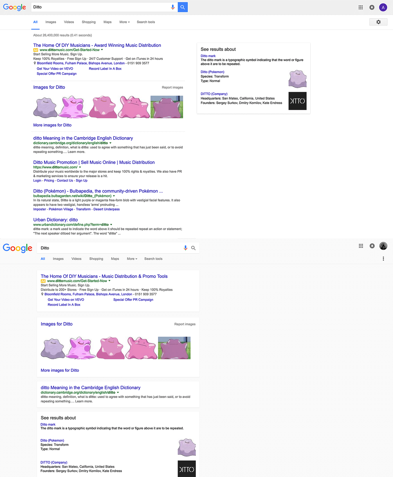
The alterations are subtle, and some users might not even notice them immediately. However, the close observer will notice that search results on this new design are divided onto clean white ‘cards’ that appear to float over the off-white background thanks to faint drop shadows. Also new is a firm gray bar that runs along the top and calls to mind the kind of interface that we’re used to seeing on mobile devices.

Everything is still essentially where you would expect it to be, but some have pointed out that the new layout uses much more white space, meaning fewer results are displayed on the screen simultaneously. This potential problem is exacerbated by information modules being integrated with the search results instead of showing up in a separate box off to the right hand side. Although it’s more visually relaxing, does decreasing the amount of displayed content diminish Search’s usability somewhat? The jury is still out, and since we’re only seeing this on a small percentage of users, it appears that Google is still undecided about the change themselves.

There are a handful of additional subtle changes like the settings gear icon being changed to a three-dot icon that we’re used to seeing on our smartphones. Whether or not Google decides to stick with these changes is yet to be determined, but while we wait for the Search team to make up their minds, let us know what you think of this possible new look in the comments below!
Images via Engadget.
Thank you for being part of our community. Read our Comment Policy before posting.