Affiliate links on Android Authority may earn us a commission. Learn more.
Samsung Galaxy S3 Mini Review! [video]
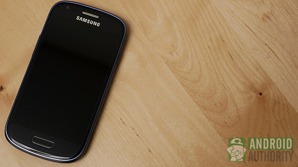
So you’ve taken the smartphone world by storm by having one of the most sought after devices in recent history. With record sales, the Samsung Galaxy S3 marked a new chapter in the Korean phone manufacturer’s tenure as one of the top companies in the smartphone game. After all that, what’s next?
Apparently, you experiment a little.
The Galaxy S3 is not the only type of device that Samsung is known for, in terms of quality equipment – their Note line, with the S Pen, is perhaps the best phablet out there right now; on the bigger side, the Tab series is a very well-received and sought after part of the tablet market. But it isn’t always great to go bigger – sometimes you have think smaller in order to innovate.
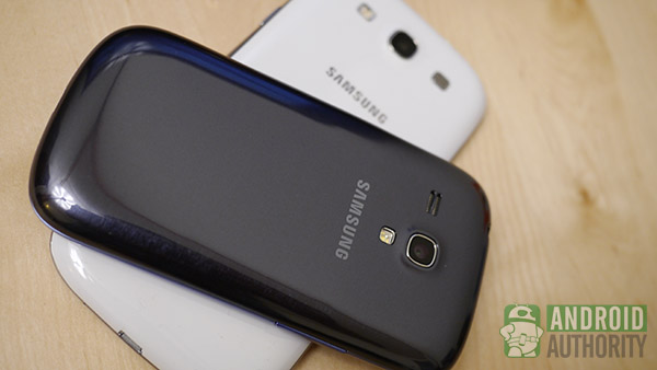
Enter the Samsung Galaxy S3 Mini. Yes, you heard that right – Mini.
Anyone who is used to smartphones as they are now will look at this phone and think the same three letter word – Why? The evolution of smartphones has seen a dramatic increase in the size of displays within just the last two years and small phones ultimately seem to be a thing of the past. Should the Galaxy S3 Mini, then, be considered a backwards step? Find out in this in-depth review and in my video at the end.
Look and Feel
Okay, let’s get the incredibly obvious part out of the way – this thing is small. Actual measurements come in at 4.79 x 2.48 x 0.39 inches. For an easier way of gauging the size, the 4.7 inch screen of the original S3 has been brought down to 4 inches, actually making the entire phone take up just a little more than the display portion of its big brother. It is a funny thought to think that if you own the Mini and someone you know has the original S3, you can literally say your phone is “as big as his/her screen.”
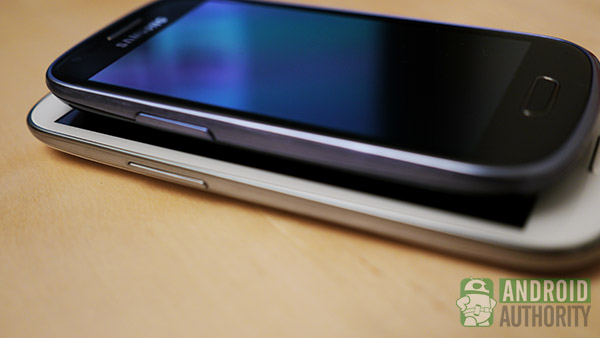
The small stature comes out even more once you feel the phone in your hand. But this isn’t entirely just because of the shorter form in the Mini – it has just as much to do with our programming as current smartphone users. Even for a smaller guy like me, I am used to having my hand not be able to wrap all around my phone. While some may argue that hand gymnastics are impractical with smartphone usage, it has become the norm for many a user. As such, the common larger smartphone will have a size that allows for balanced shuffling in the hand in order to reach particular portions of the display.
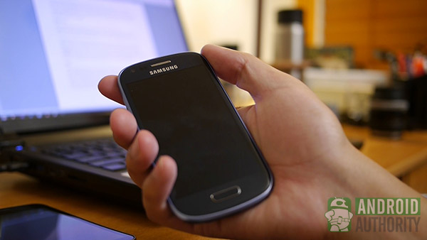
Not the case with the Mini. What is so jarring is that you can reach everything from a neutral grip – and it just feels weird. Although you may think that the iPhone is marketed to have this kind of size and feel to it, I must say that it is the shape of the Apple device that allows for that ease of use in one hand. The S3 Mini, on the other hand, retains the rounded form and feel of its big brother, which worked well for the S3 but lends to a constant fear of slippage from the hand this time around. Eventually, you will be able to grip and use this phone in a way that is comfortable, but at first usage, your old big phone ways will get the best of you.
As I said before, the Mini takes after the original S3 in terms of its look. Fingerprint hungry plastic runs all the way around this device in a rounded shape. The power button is opposite the volume rockers, as Samsung does, and the ‘home’ button on the front is flanked by two softkeys for ‘back’ and ‘menu’. Above all this is the display, below the front facing camera and phone grill. The back has the simple Samsung logo under the 5 megapixel rear camera and the speaker – the back cover can also be removed, allowing access to the battery, SIM slot, and microSD tray.
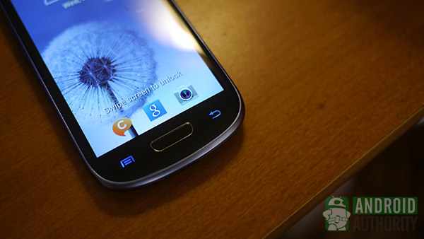
Indeed, the S3 Mini is really just a smaller version of the S3. Even if you have a bit of a rough time getting used to the new form factor, once you get it down, one hand operations become the milieu. You won’t too much time using the Mini with two hands (typing, though the included Swype should minimize this too) and you’ll get through much of your usage with one flying thumb.
Screen and Display
With smaller form comes smaller screen, and the Mini certainly follows through. The rather ubiquitous size of 4.7 inches for current smartphones is being tested by 5 inch phablets, but the Mini is a flashback to the days of 4 inch screens. This screen and form factor remind me more of previous phones I’ve owned and used like the HTCEris and Incredible, mid-tier and high-end smartphones, respectively.
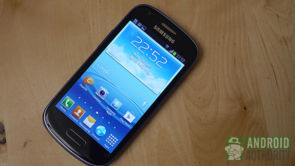
The 4 inch Super AMOLED display has an unsurprisingly lower resolution at 480×800, but has a surprising vibrancy and brightness to it. Attribute this to the Super AMOLED technology Samsung has gotten right on many of its devices. The pixel density of 233 ppi might not bring great sharpness on the lower resolution screen, but you still get a nice experience out of the display and screen.
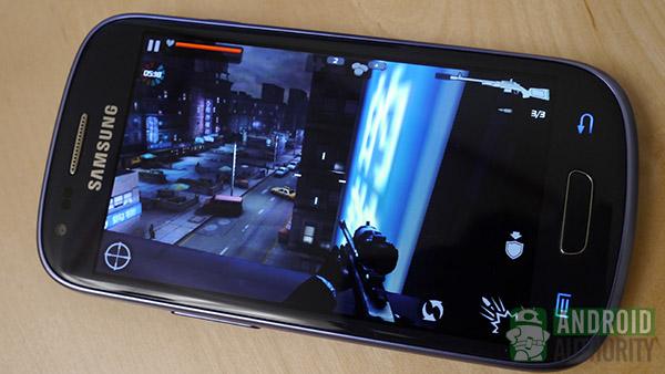
Viewing at different angles still allows for good sight and colors are about as vibrant as Samsung can deliver – darks and blacks are well rendered, allowing brighter primary colors to pop. The brightness of the screen allows for viewing in direct daylight, but you will probably have to set it to full for the best results. Really, the only true gripes on this screen are the obvious ones – the smaller screen makes for lower resolution and thus brings with it decreased sharpness.
Nonetheless, the vibrancy and brightness still help make this an enjoyable display to use – and when you’re using a phone that is supposed to make some compromises compared to its namesake big brother, these are things you come to expect.
Hardware and Performance
It should be expected that the performance on this Mini will not be quite the same as that found on the original S3. This is exactly the case, as the phone is indeed slower than its big brother. That being said, the Galaxy S3 Mini is hardly a slow poke, as while apps might take a little longer to load, performance after it is all said and done is still quite good. Just don’t expect the same kind of speed as in the high-end phones in the market today – this is squarely a mid-tier device and acts as such.
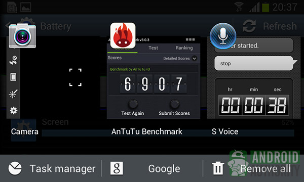
A 1GHz dual-core Cortex A9 is responsible for this performance, as it is a downgraded package compared to the powerful processor found in the Galaxy S3. The Mini also sports the smaller 1GB of RAM for multitasking. These downgraded specs still have some optimization built in, as I mentioned before that apps do run quite well despite their long load up times.
Even gaming was a decent experience on this device. Despite having to squint a bit due to the smaller screen, I was able to run Contract Killer 2 quite well and get through the first couple levels with ease. There was no real slowdown found even in the more intense portions of the game. It would seem that once all the loading is said and done, everything performs as expected
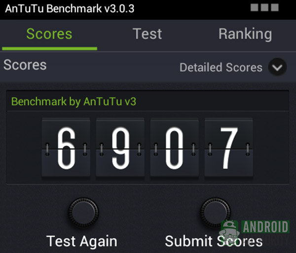
Don’t go looking for the best scores here when it comes to benchmarks. Knowing that this is definitely not a top-tier device, I only ran AnTuTu benchmark for the sake of empirical evidence.
As was the case with the Galaxy S3, the Mini sports some important features not found on other devices and are thus big selling points. The removable cover allows for battery replacement, while a microSD slot hidden underneath the 1500mAh unit allows for the expansion of memory. Coming in 8 or 16GB varieties, the S3 Mini benefits from having expandable storage – a feature that has been missing in even a number of top-tier devices.
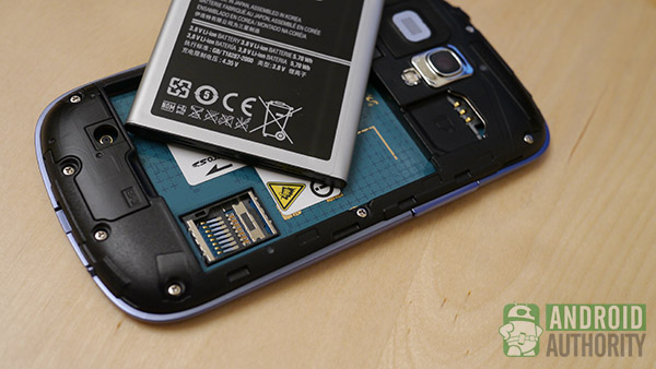
The S3 Mini supports only miniSIM cards, so you won’t be able to swap that microSIM from your original S3 into here. WiFi, Bluetooth, and GPS are all the standard bells and whistles you’ll be getting here, but despite being reported as included in this device, my copy of the S3 Mini seems to not have NFC for S-Beam available.
Ultimately, if you are a power user, you won’t be getting the kind of performance you’re used to from top-tier devices that you would buy anyway. Come into the S3 Mini with the right expectations and you will see that it is still a very decent performer despite the compromises made. The lag (when loading apps) is noticeable compared to the S3 but won’t bother most average users to whom this device is being marketed. Expandable memory is a big plus here, as many users look to it as a feature that can make or break their purchase of a new phone. And as long as you have the right sized SIM for the job, you should be able to use this phone on any of the available and fast GSM networks out there.
Battery
The mention of a 1500mAh battery might be a little disconcerting to some, but rest assured that the downgraded processor allows for an evening out of this phone’s longevity. The battery works quite well despite the smaller size (as seems to be a trend for much of this well-optimized Samsung device) and was able to go through a whole day without really breaking a sweat.
I had the phone on hand for an entire day this past holiday weekend and was able to use it even before I went to bed – the battery was down to about 20% after 12 hours. The 1GHz processor, smaller screen with lower resolution, and any power saving optimization that Samsung threw in seem to do the trick. Coupled with the fact that this battery can be replaced, the power situation on the S3 Mini is definitely impressive.
Power saving options are available within the settings and they limit the maximum CPU usage and keep the screen dimmed for maximum longevity. I am sure that having this on would allow for even longer usage, but seeing that I didn’t have a SIM card installed for constant cell data connections (notorious for battery hogging), perhaps this feature will likely just even out those power hungry features.
Camera
As has been the theme for this phone, the compromises made in comparison to the original S3 all seem to work quite well given the circumstances. This is obviously not a phone that is geared toward the feature hungry user, though it packs in the right performance for all the things that typical user would need. Would this be the same case for the camera?
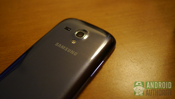
The 8 megapixel camera of the Galaxy S3 has been brought down to 5, which some might think is something that didn’t have to happen – there are plenty of smaller devices out there that still sport powerful, high megapixel count cameras. This is not the case with the Mini, as it seems everything needed to follow along with the ‘miniaturizing’ theme.
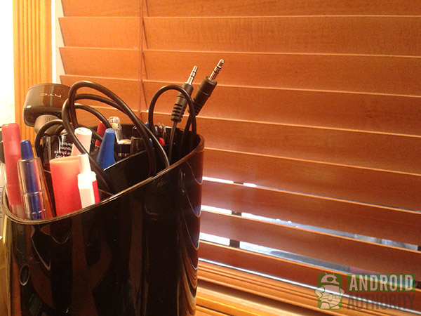
Unsurprisingly, then, is the quality of the resulting photos and videos. Pictures are given a decent amount of rendering quality and the optics do a good job of ensuring proper exposure. Of course, when adequate light is taken away, the grain appears. The differences can be seen in the pictures found above and below. Video is recorded at 720p and suffers from the same lower quality as these still images.
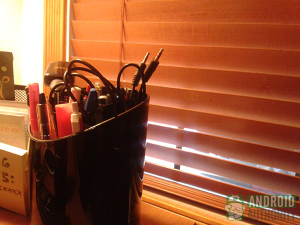
Having a small phone pocketed and handy is nice for quick camera shots, though – going from pocket to camera through the lockscreen and then finally to the shutter didn’t take too long at all. The pictures might not be spectacular, but at least you’ll likely be able to get the shot off in time.
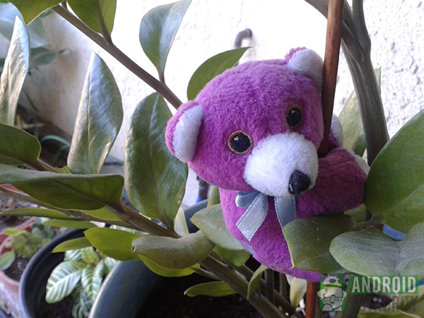
Software
Finally, we have the software. As a seasoned Nexus user, I always take the time to look through modified UIs made by the phone companies to see how different the experiences are. Since this is a smaller phone that brings with its size some already implied changes to the overall usage, the TouchWiz UI should see a few changes to make life easier.
That being said, TouchWiz is not my favorite looking user interface among the bunch. HTC’s Sense probably remains one of my favorites, although the Optimus UI was surprisingly customizable and useful in practice. Say what you will, but the large uber-colorful icons and menus with large text just don’t do it for me.
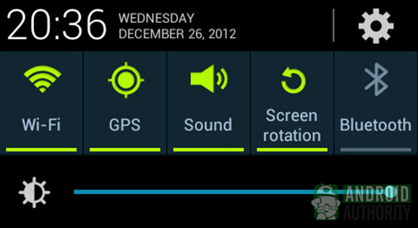
As far as function goes, TouchWiz on the Mini is as good as any proper UI. Some nice additions include the power widgets found in the notification dropdown and the inclusion of S-Voice, as seen in the original S3. While S-Voice does seem to get the job done, I still prefer Google’s own Voice Search – especially the one found in Google Now.
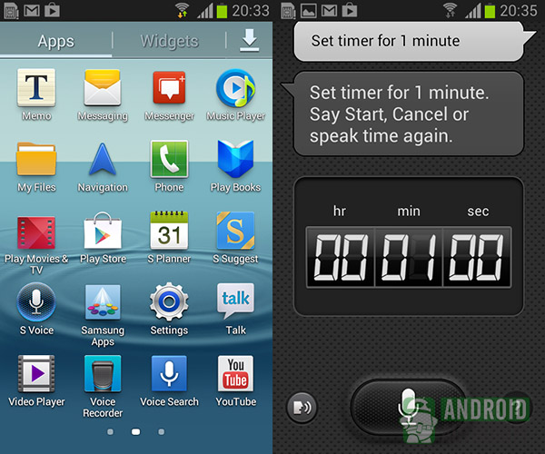
Another nice touch that I found has to do with the text size. While this might attribute to my near-sightedness, I usually go straight to the settings and bring down the text size on any new device. This usually allows for a little more content to be shown on the screen. However, on large displays, having tiny text can mean some squinting and eye strain will result. This isn’t the case on the Mini even when you go to the smallest size, as all text is still very legible and easy to read even at a decent distance. This is probably due to what I see as a bloated UI, but this time around that which I don’t like about TouchWiz proves to be an advantage.
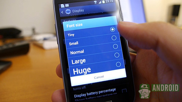
The easy-on-the-eyes text despite the smaller form factor makes me give the Mini’s TouchWiz quite a bit of credit for not being just a lazy port of the original OS. Samsung put quite a bit of thought into the user experience on this phone through hardware changes and software optimization, and succeeded as a result. The small screen might be a little cramped, but you won’t have much trouble seeing what you’re doing.
Conclusion
After all of this, I have to admit something – having this phone for a few days, especially throughout the holidays, was interesting. Why? Because despite having the HTCOne X+, the original Samsung Galaxy S3, and even the Google Nexus 4 available on hand, I found myself coming back to the S3 Mini. It’s just that intriguing. The size alone makes this phone feel unique while its features and look make it just as familiar as ever.
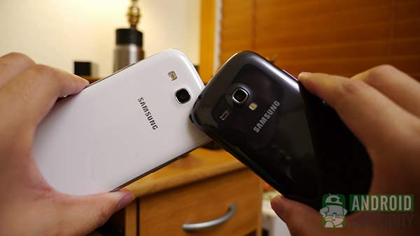
Some might wonder what kind of market would need a smaller phone like this, when so many great devices come out at typically larger sizes. After spending some time with the S3 Mini, I can safely say that there are definitely people out there who want a smaller phone. Some of my friends were delighted to see a current Android device in a smaller form factor, and I actually became enamored myself with the “Little Smartphone that Could.”
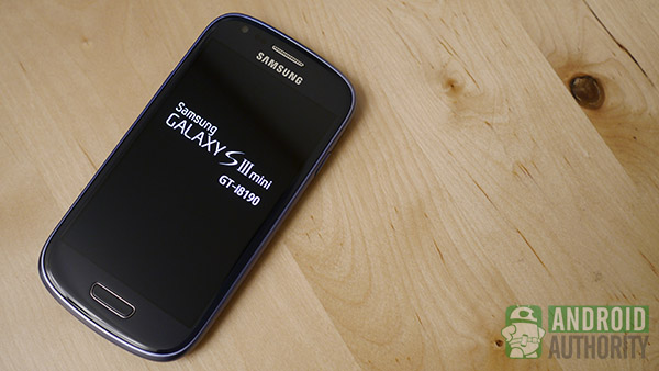
We’re spoiled here at Android Authority as we look to the latest and greatest phones for all best features, the greatest number of bells and whistles, and the fastest possible experiences that we can buy. But not too long ago, phones like the Mini were the norm, and we appreciated them all the same.
Technology (in this case, phones) might be changing all the time – we went from colorful bar and flip phones chock full of accessorizing possibilities to nearly all black slates in which the customization primarily came from the built-in OS. We came from phones made for calling and texting to mobile pocketable computers. With this in mind, I actually think that the Galaxy S3 Mini is a device that fits squarely in the middle, in a time and place where we didn’t need the highest pixel density or the fastest processor or even the biggest screen – we just needed a phone that was different, fun, and most of all, worked.
And for all intents and purposes, the S3 Mini certainly does that – it works. It isn’t the best performer but it is definitely deserving of the Galaxy name. It might have been better to name this the Galaxy S Mini or the Galaxy Mini, because the S3 brings some unrealistic expectations, but that’s all up to Samsung – nonetheless, this is a phone made for the everyman and everywoman, geared especially for the user in us who remembers a time when what we once wanted from phones (and technology) used to be a little bit smaller… and a little bit simpler.
Thank you for being part of our community. Read our Comment Policy before posting.