Affiliate links on Android Authority may earn us a commission. Learn more.
Google to unify all of its design across all platforms, introducing Quantum Paper


It is no secret that Google has been pushing for designers to get involved in this year’s Google I/O developers conference. The folks over at Android Police think they know why, Quantum Paper.
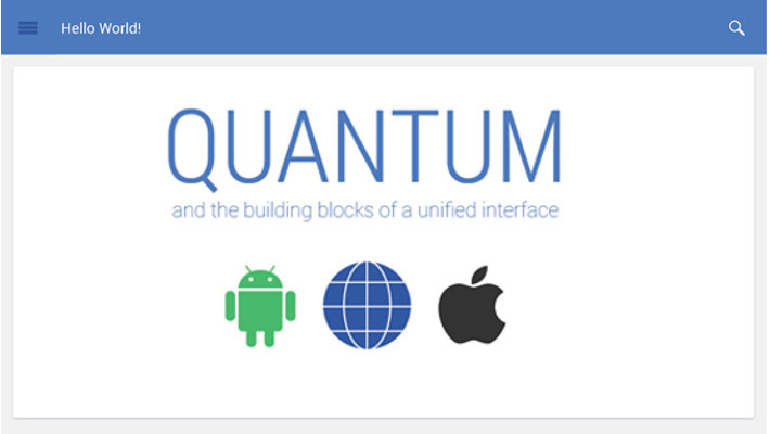
Quantum Paper is the name given to Google’s initiative to design its properties so that they provide a consistent experience across all platforms. Plainly put, services like Gmail and Google+ would look and act the same way, whether on the web, iOS or on Android.
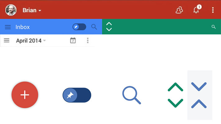
The updated design is expected to bring a new icon set, one that we’ve seen a few pieces of in the new Google+ Android app. Does that mean the loved/hated hamburger menu icon is going away? Nope, it lives on, with no apologies to the menu-icon-vegetarians in the crowd, as it may move completely onto the screen, instead of lurking in the corner. An expand/contract ‘cluster’ icon set brings clear indication whether or not an expandable item is open or closed. Another icon, also stolen from recent Gmail and Calendar redesign leaks, provides a big red circle with a plus symbol in it, to be used as a ‘create new’ button.
It appears that each service will gain its own color identifier. We already see red for the Google+ app, Gmail may get blue, Calendar white or green and so on.

In an effort to guide and assist developers in utilizing the design elements and ideologies of Quantum Paper, it is expected Google will roll out GoogleKit. GoogleKit would be the iOS framework for third party developers to conform to Google’s design and implement aspects into their own apps. We presume that Android developers would continue to visit the Android Developers site for their goodies.
Keep in mind that all of this is rumor thus far, we hope to learn more soon, maybe even get a peek in just under two weeks, when Google I/O gets underway. The rumor suggests that the new design would become official with the launch of the next full letter release of Android; the next release is “L,” but we still have no idea what sweet treat it will be named after, nor when it will be announced. Credit where it is due, the original story does a great job of expanding on the subject, all images credit Android Police as well..
What do you think, is Google going in the right direction, or should there be a slight design difference across platforms, taking advantage of the strengths and weaknesses of each?