Affiliate links on Android Authority may earn us a commission. Learn more.
Plex's new interface is a big step forward, and two steps back
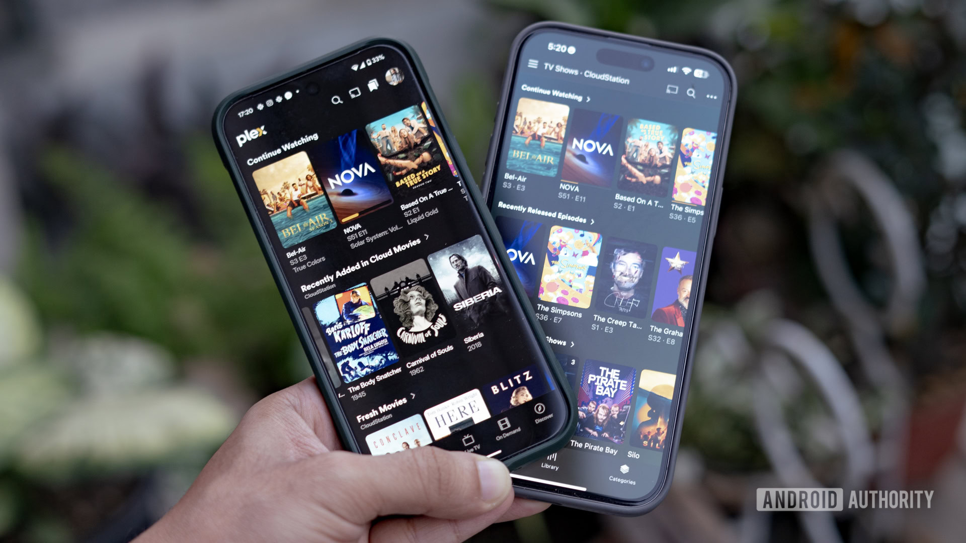
It might surprise you, but Plex is the center of my media consumption. Much of what I watch has been dumped from my Blu-ray and DVD collection and, rarely, collected from the high seas. The platform offers me everything that streaming services don’t — ownership over my media, the ability to watch uncompressed video on my 75-inch television and home theater system, and the option to take it with me on the go.
The refreshed Plex interface keeps most of the functionality and amps up the design.
But the one thing it’s been lacking is a great interface. Don’t get me wrong. The current Plex UI works and does everything you need from it. However, it looks dated, requires more taps than needed to accomplish oft-used tasks, and just doesn’t feel great. As it turns out, Plex thinks the same. There’s a new Plex interface out — on mobile first, but coming soon too other platforms — and I’ve been testing it over the last few days. Oh boy, there’s a lot to talk about here.
Have you tried out the new Plex interface?
Out with the old, in with the new
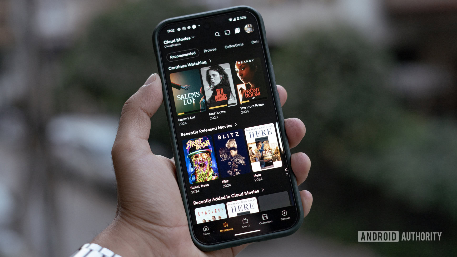
Plex wasn’t kidding when it said that the new Plex experience was completely reimagined. Pop into the app, and you can immediately observe the night-and-day difference in approach.
It all starts with the homepage, where the higher information density, larger posters, and cleaner titling make everything look more modern, for lack of better words. The all-black backdrop further adds to the visual appeal and makes the media pop.
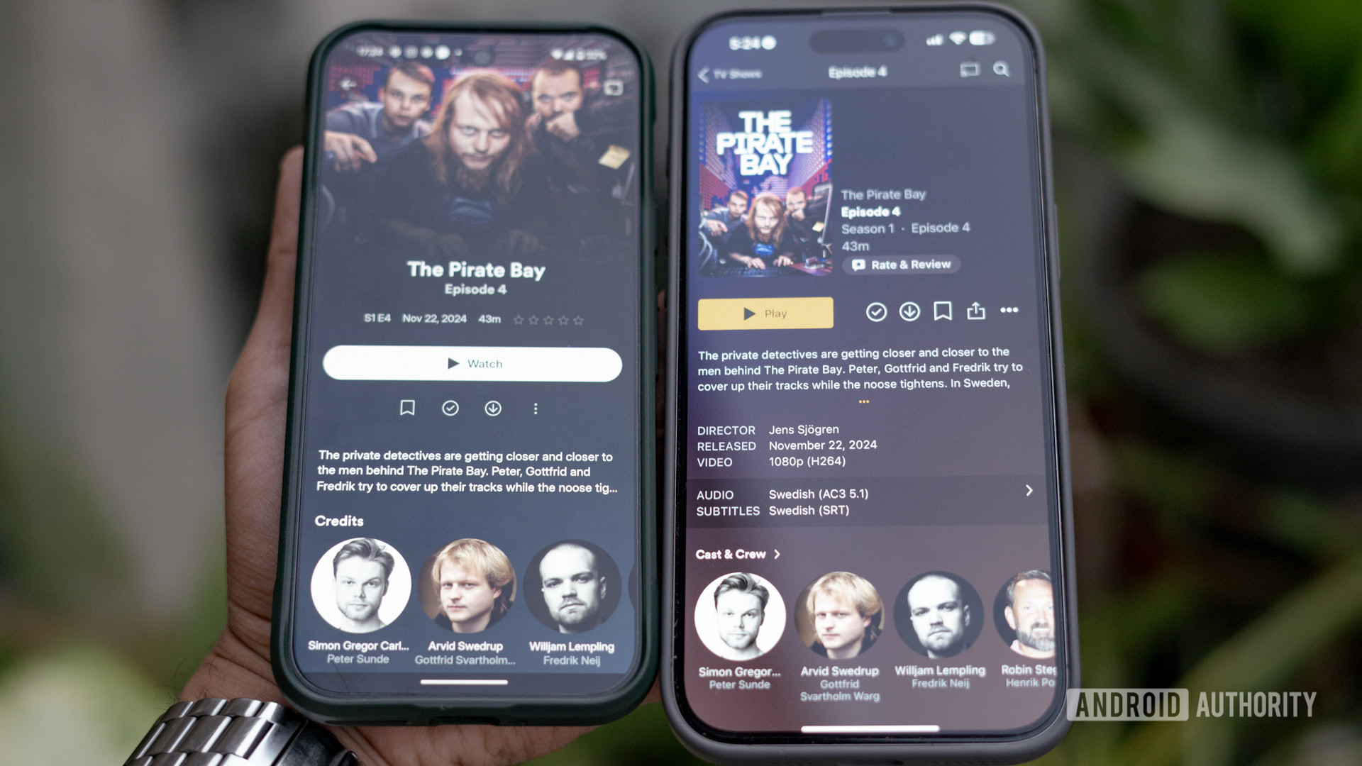
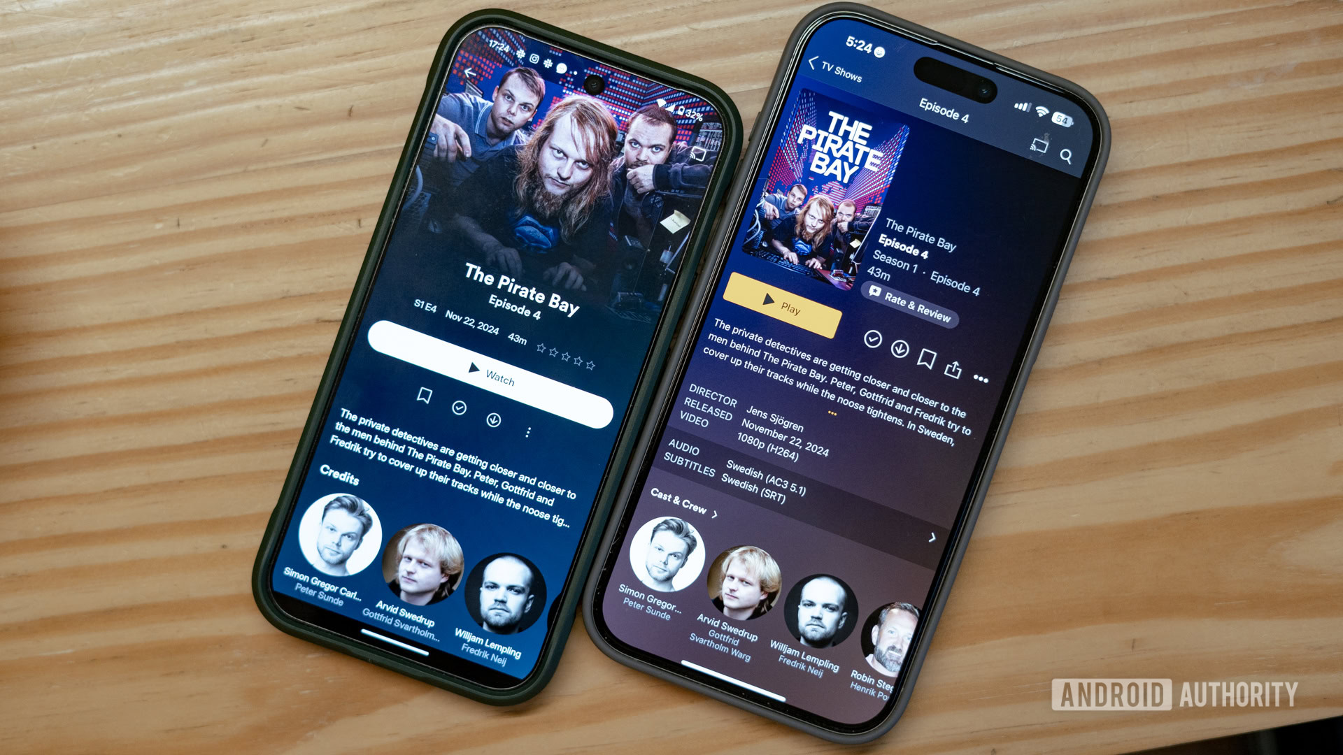
That renewed visual flair extends deep into the library. Tap a movie or TV show, and you’ll be presented with a large artwork that flows down the page. A lot of the extraneous information, like audio and video codecs, has been removed. Instead, you get much simpler details about the episode, including its air date, episode length, a brief description, and the cast.
The updated library page takes a page out of modern streaming services and removes nerdy bits like codecs.
It’s what you’d expect from a modern streaming service, though I can see die-hard data nerds being unhappy with the change. As a fan of movie and television posters, I’m a bit indifferent to the new approach that can hide away a portion of the artwork. However, it’s not a huge deal to me.
The other very noticeable change is the switched-up navigation. Right now, Plex relies on a series of tabs and hamburger menus that can make one-handed use hard. It’s not very intuitive either and makes it a chore to switch between multiple servers and libraries.
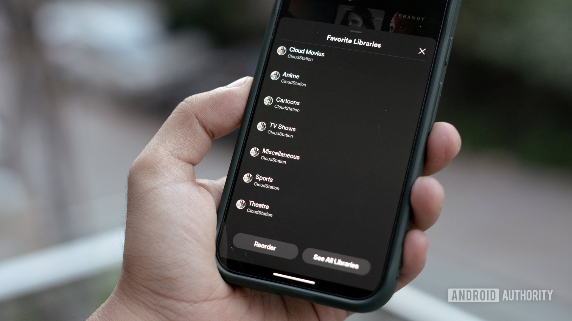
All of that is gone. Instead, the entire interface is optimized for one-handed use. There are no more hamburger menus to switch between libraries. Instead, users are expected to tap the “My Libraries” tab and toggle libraries from the drop-down menu at the top. I’m not a big fan of this change, as it still requires two taps to switch from movies to TV shows. However, Plex is still working on the UI, and I hope this toggle makes it to a more accessible location.
Elsewhere, Plex’s streaming hub ambitions are very clearly on display. Dedicated tabs for collections and playlists, vestiges of the self-hosted origins of Plex, have been swapped out for a Live TV and On-Demand tab.
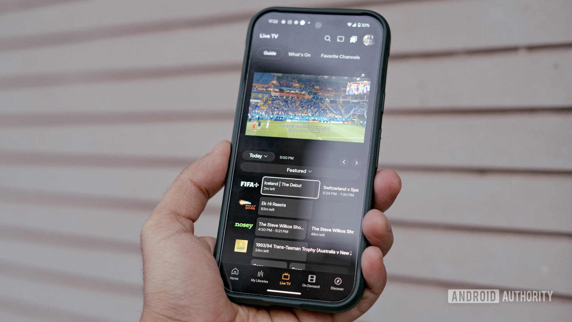
Personally, as someone who rarely catches Live TV or the assortment of low-quality B-films on Plex, I’d like the ability to customize these buttons. In fact, I can see myself adding dedicated buttons for my movie and TV library. However, that’s not possible here. The collections and playlists that I mentioned earlier? Those have now been consolidated under the library feed. It’s not a bad choice considering both the features were decidedly prosumer-oriented.
The new interface makes it obvious that Plex considers ad-supported streaming and discovery the future of its business.
Another fresh addition is the Discover tab. Yet another Plex venture, Plex Discover lets you, well, discover new media to consume. The idea here is that you add interesting upcoming or ongoing shows to a watchlist. Similar to JustWatch, Plex will let you toggle on all the streaming services you subscribe to. If a show on your watchlist is available on a streaming service, the Plex app will redirect you to that streaming service. Conversely, it can also launch the file if you have it on your server.
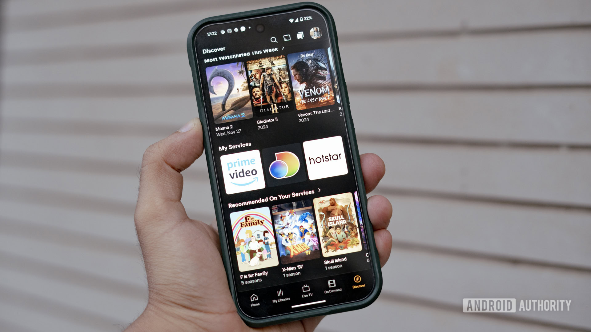
Plex Discover has been available for a while, and honestly, I haven’t found much use for it. It’s not how I consume media, and I’d rather track my viewing habits on Trakt anyway. That said, you can’t fault the implementation, and at least on mobile, watchlists look pretty and work well. Moreover, it can be a nifty way to find something new to watch.
Why now?
The refreshed Plex app is a clear look into the company's ambitions, and long-time users might want to start looking at alternatives like Jellyfin.
That said, I hope I’m just jumping the gun here. The interface, as it stands, is definitely the right step towards modernizing the dated UI. Additionally, the app is only available in preview at the moment, with active development still taking place. So hopefully, there’ll be more options to customize the interface and bring Plex more in line with its streaming roots.
Thank you for being part of our community. Read our Comment Policy before posting.