Affiliate links on Android Authority may earn us a commission. Learn more.
I love that new emoji are coming, but I still just want the blobs back

On Wednesday, Unicode Emoji 13.0 was finalized, adding 62 different emoji to our lives. It includes such selections as bubble tea, people holding babies, and my personal favorite, a *chef’s kiss* hand, incorrectly titled pinched fingers.
This is great news. I, for one, am a hardcore emoji stan, frequenting selections like ✨, 🌈, and 🎉. They help me express emotion in ways words might not always be able to — especially with non-human objects. For instance, what do I mean when I use that ✨? Even I don’t know for sure, but it helps me convey a specific feeling over the hyper-depersonalized system of messaging, and for that I am grateful.
Unicode’s emoji only serve as guidelines for objects or emotions, not the sole version available. Google, Apple, Microsoft, and other platforms still have to produce their own interpretations that fit their specific style guide. Even individual phone manufacturers have their own emoji. And in some circles, this leads to a ferocious discussion over whose is the best.
The blobs
From 2013 to 2017, Google used a selection of emoji on its devices and services which will be mentioned henceforth as “the blobs.” The blobs were cute little yellow circles with a minimalist flat design, and expressed more emotion than any current emoji could, and with very few elements. Google made a slight change to them in 2016 in order to make them more rounded alongside other companies’ designs, but overall, they remained the same blobby bois I had always known and loved.
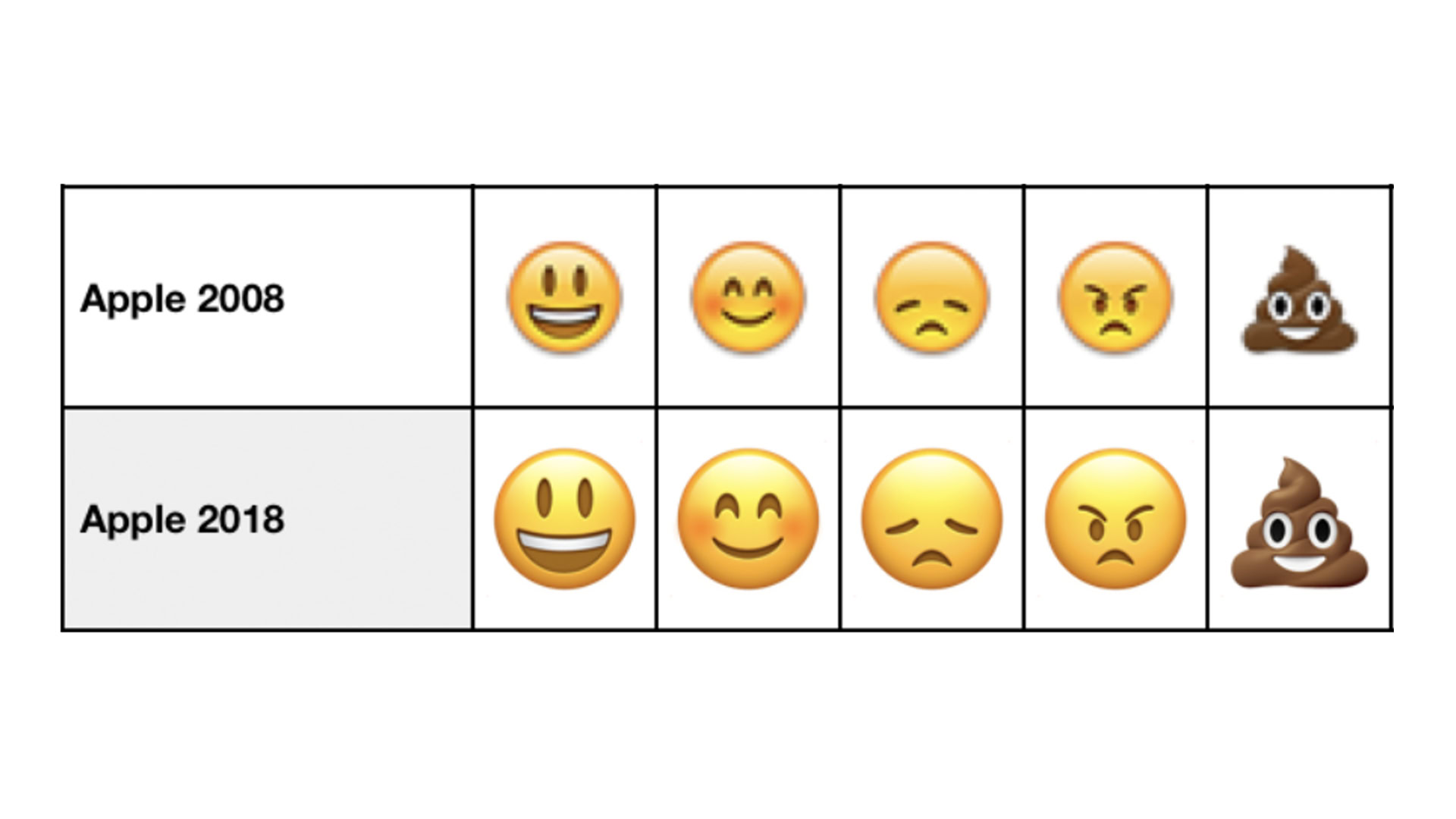
Then, in May 2017, Google introduced Android 8.0 Oreo, and alongside it, a new emoji design which will be mentioned henceforth as “the bad ones.” The bad ones added new shading and extra elements, which was supposed to more closely align them with Apple’s, which had more depth and detail.
In emoji, we are meant to see ourselves
But do we want detail in our emoji? There is a fine line between being able to instantly distinguish the thing or emotion an emoji is trying to represent and forcing an image of how that thing or emotion or thing is supposed to look. In emoji, we are meant to see ourselves. The more detail you add, the less opportunity it has to universally represent our own image.
It’s in this way that they can feel deeply personal. I often catch myself mimicking the face on my screen when deciding what emoji I want to send. I think about the expression I would make if I was standing directly in front of the recipient. Does this emoji represent me? Or more accurately, does it represent what I’m feeling? The blobs sure did.

I understand why Google shifted to the new design. Not everyone in the world uses Google devices and services, and it’s important that we’re able to accurately pass emotion across platforms. But personally, I don’t agree with Apple’s interpretation, which hasn’t fundamentally changed since 2008, when 3D design was cool. And it’s annoying that everyone is pressured to use Apple as the standard to strive for, even if its emoji are ferociously outdated.
Still, there are many people out there that feel similarly to me. Apparently, some even work at Google. If you use Gboard, there are two animated sticker packs that feature my blobby bois, which will live on in this format. One is titled “The Blobs Live On,” and the other is “Long Live the Blob.” Clearly, blob fans’ pains were heard far and wide. These stickers actually first appeared in Google Allo, but Google loves killing everything I love.
This isn’t the future I wanted, but it’s the future I’ve got. But hey, at least now I’ve got Chef’s Kiss.
Thank you for being part of our community. Read our Comment Policy before posting.