Affiliate links on Android Authority may earn us a commission. Learn more.
The Motorola Razr Plus is still the most fun foldable I've used

We’ll probably look back at 2023 as the year that the foldable phone market burst wide open — at least in the US. It’s the year that Google and OnePlus finally challenged the Galaxy Z Fold 5, while Motorola took the Galaxy Z Flip 5 to task. I’ve been fortunate to spend time with all of the US-based launches in the last year, finding features I love and flaws that still need work. Through it all, there’s one foldable that I keep coming back to for its sheer fun factor, and that’s the Motorola Razr Plus.
King of the cover screen

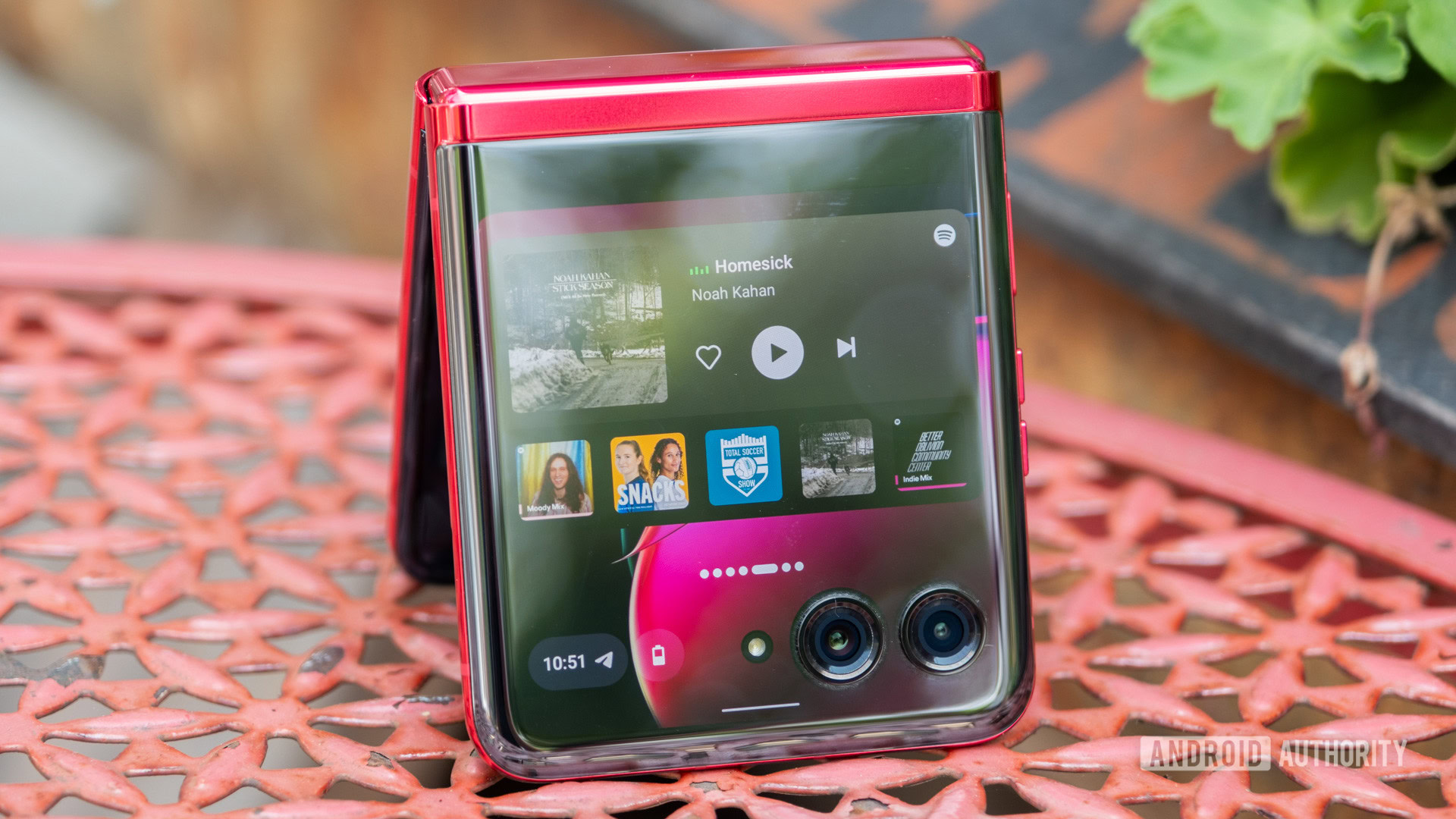
Honestly, the main feature that draws me back to the Razr Plus is its excellent cover screen. It’s a 3.6-inch display that feels like it was meant to be used rather than simply a way to check notifications. I often feel like I’m using the cover of a book-style foldable phone because I don’t need the extra real estate of the internal display, but using the front of the Razr Plus feels like I’m making the most of what the flip phone should be.
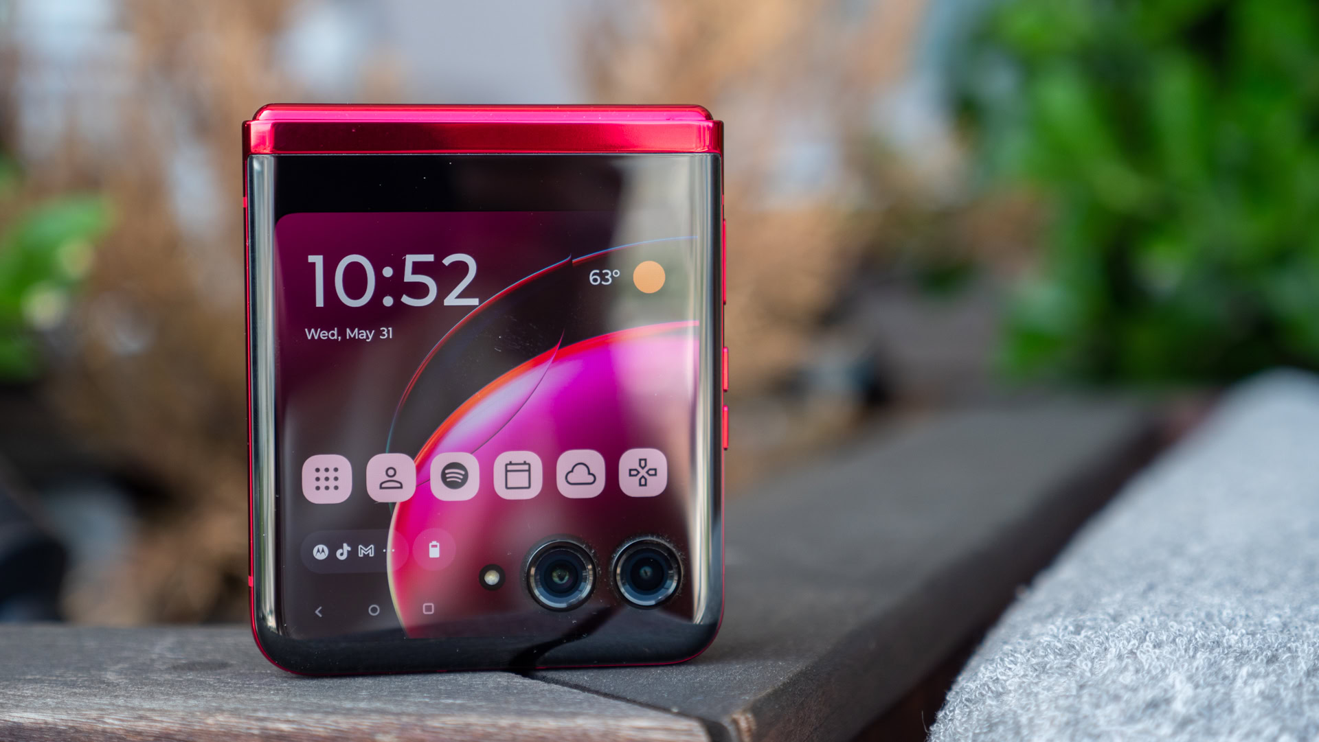
Motorola beat Samsung to the punch by adopting a larger cover screen first, and it packed that AMOLED with more powerful specs than it could ever need. The square panel pairs a buttery smooth 144Hz refresh rate with 1,100 nits of peak brightness and a square design that stretches around the dual cameras rather than cutting off ahead of them, and the result is a tier above the competition.
Motorola's cover screen is not only the biggest, but it's also the brightest and smoothest of the bunch.
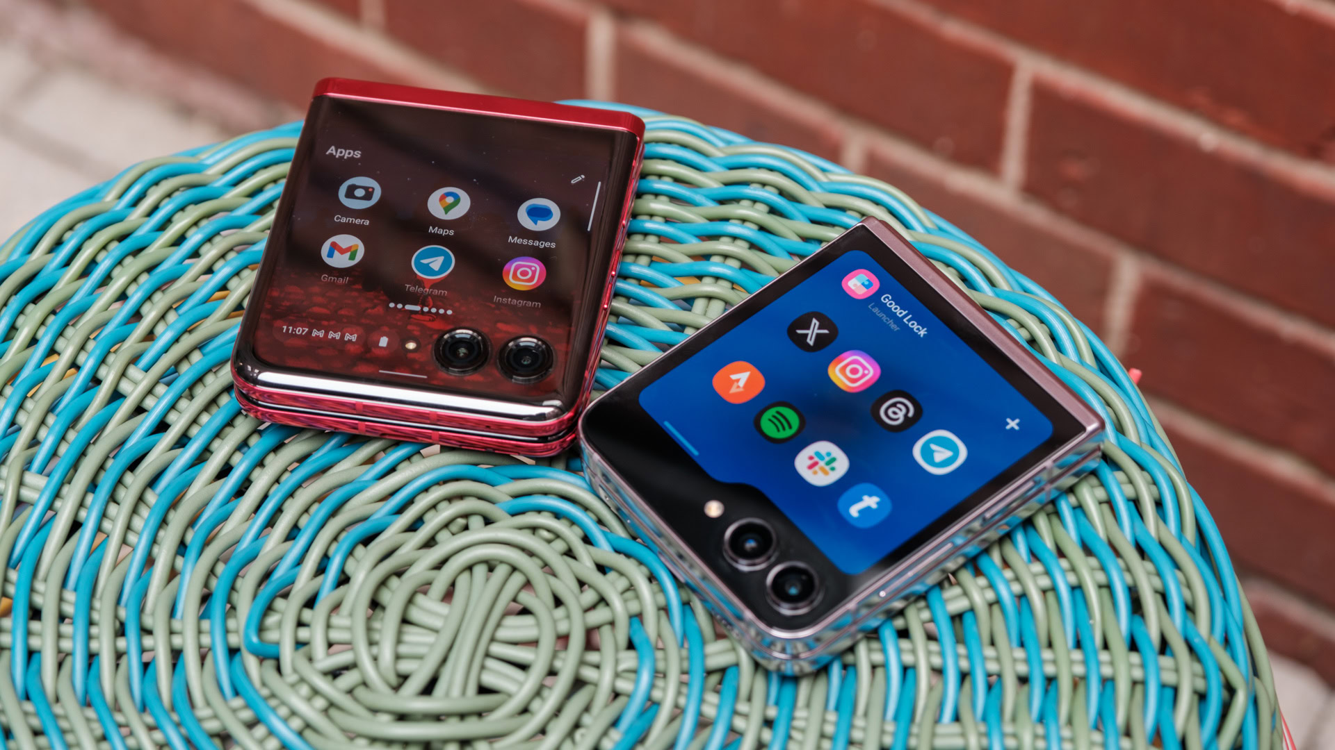
Granted, Samsung wasn’t far behind Motorola, sizing up its own Flex Window shortly after the Razr Plus hit the market, but the two displays are hardly created equal. The Razr Plus’ colors come through much deeper and more vibrantly than those on the Galaxy Z Flip 5, and stretching the cover display around the cameras gives it the illusion of being much larger than Samsung’s panel. The Galaxy Z Flip 5’s folder-shaped display also leads to cramped, sometimes unusable app layouts when you least expect them — like in Google Maps when you need the, well, map. Of course, specs and layouts are only part of a successful cover screen experience — Motorola’s software seals the deal.
Using Motorola’s cover screen day after day feels much closer to the experience of using a pint-sized smartphone. It holds onto your recently used apps, allowing you to drag up from the bottom edge to access them quickly, just like you would with the internal display. You can hop into Instagram, jump through a few rounds of Stack Bounce, and then go back to the ‘gram without ever heading back to the home screen. Samsung, on the other hand, has no such luck for the Galaxy Z Flip 5. That lack of app history often leaves Samsung’s fifth-generation flip phone feeling like a souped-up Galaxy Watch much of the time.
Even adding full-sized apps to the cover display is an exercise in fun vs frustration. Samsung asks you to install Good Lock to add more than just a few apps to the Galaxy Z Flip 5’s Flex Window, but the Razr Plus only demands a quick trip to the settings menu. From there, you can add almost anything you need to the cover screen’s app drawer and take advantage of smooth scrolling up and down with the 144Hz refresh rate.
Take the fun, leave the cannoli

Of course, I’ll readily admit that the Motorola Razr Plus isn’t a phone for the power user — flip phones rarely are. Instead, power users will probably gravitate toward book-style foldables like the OnePlus Open or traditional smartphones like the Samsung Galaxy S23 Ultra, and that’s fine. That leaves more fun for the rest of us. After all, I don’t look at Motorola’s Viva Magenta faux leather panel and think business, but I do think it looks darn good.
On top of the flashy pop of Pantone color, the Razr Plus is a flip phone that just feels right in your hand. Whereas Samsung surrounds its Galaxy Z Flip 5 with boxy edges and surgical precision, the Razr Plus has rounded edges that you can hold comfortably for hours. If you get into Stack Bounce just as intensely as all the tech reviewers who used the Razr Plus, holding it comfortably for hours isn’t out of the question. The Razr Plus is also the lightest of the current flip phone crowd while offering the most screen real estate — a two-for-one deal I’m happy to sign up for.
And yes, there are areas where other flip phones outshine the Razr Plus. You might find that you want a little more camera flexibility like you get with the OPPO Find N3 Flip with its three sensors, or you want a little more processing power, which Samsung still has with its Snapdragon 8 Gen 2 for Galaxy. However, the Razr Plus makes trades of its own, offering a bigger battery and faster charging than Samsung, and a more reliable update commitment than OPPO.
Perhaps the real kicker is that the Motorola Razr Plus is available for a killer price ahead of Black Friday. We don’t often see deep price cuts to foldable phones when purchased outside of carriers, but Motorola is happy to offer an exception to the rule. Right now, the Razr Plus is down to just $699 on Amazon, an impressive 30% drop. That brings it almost in line with the launch price of Motorola’s more affordable flip phone, the Razr (2023). If you ask me, that kind of discount is more than enough reason to put a Razr Plus in your pocket.

