Affiliate links on Android Authority may earn us a commission. Learn more.
Android brands keeps copying iOS 26, and I hate it

I’ll admit, I’m hard to please when it comes to UI, but that might be because I’m the sort of person who secretly wishes were peering at green text and living in a world of cassette futurism. I had to invent a new word to describe my displeasure with Google’s Material 3 Expressive revamp, but it’s a bastion of sane design compared to the eyesore that was Apple’s Liquid Glass debut. Honestly, why is modern UX too often hard to get right?
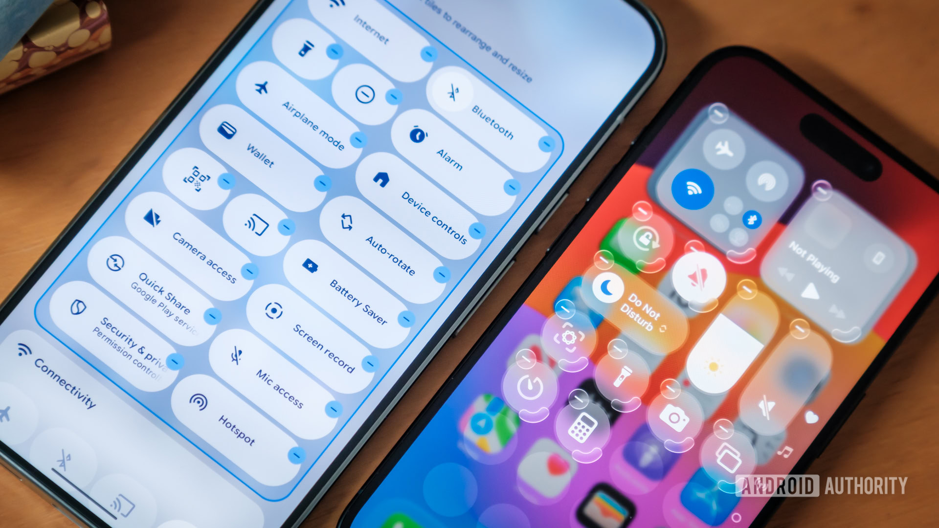
But if there’s one thing worse than either of them, it’s brands copying each other’s bad choices. The revelation that Android 17 is preparing to adopt parts of Apple’s transparent aesthetic had me reaching for the sick bucket.
Do you think Android 17 is at risk of becoming too much like iOS?
Thankfully, Google’s take doesn’t appear to be as ghastly as Apple’s. The more frosted glass appearance doesn’t result in illegible transparency and blends nicely enough with Google’s existing aesthetic rather than reinventing it. But this still begs the question: why adopt aggressive transparency now, and not last year or the year before? In fact, why bother at all?
Annoyingly, the answer is the same as it’s always been — wherever Apple leads, Android soon blindly follows. The lack of originality would be depressing if it weren’t so predictable. Yet if anything, Android 17 is simply catching up with what various manufacturers have been slowly implementing into their designs since the iPhone 17’s launch last year.
Does no one have faith in their own ability to lead the UX conversation?
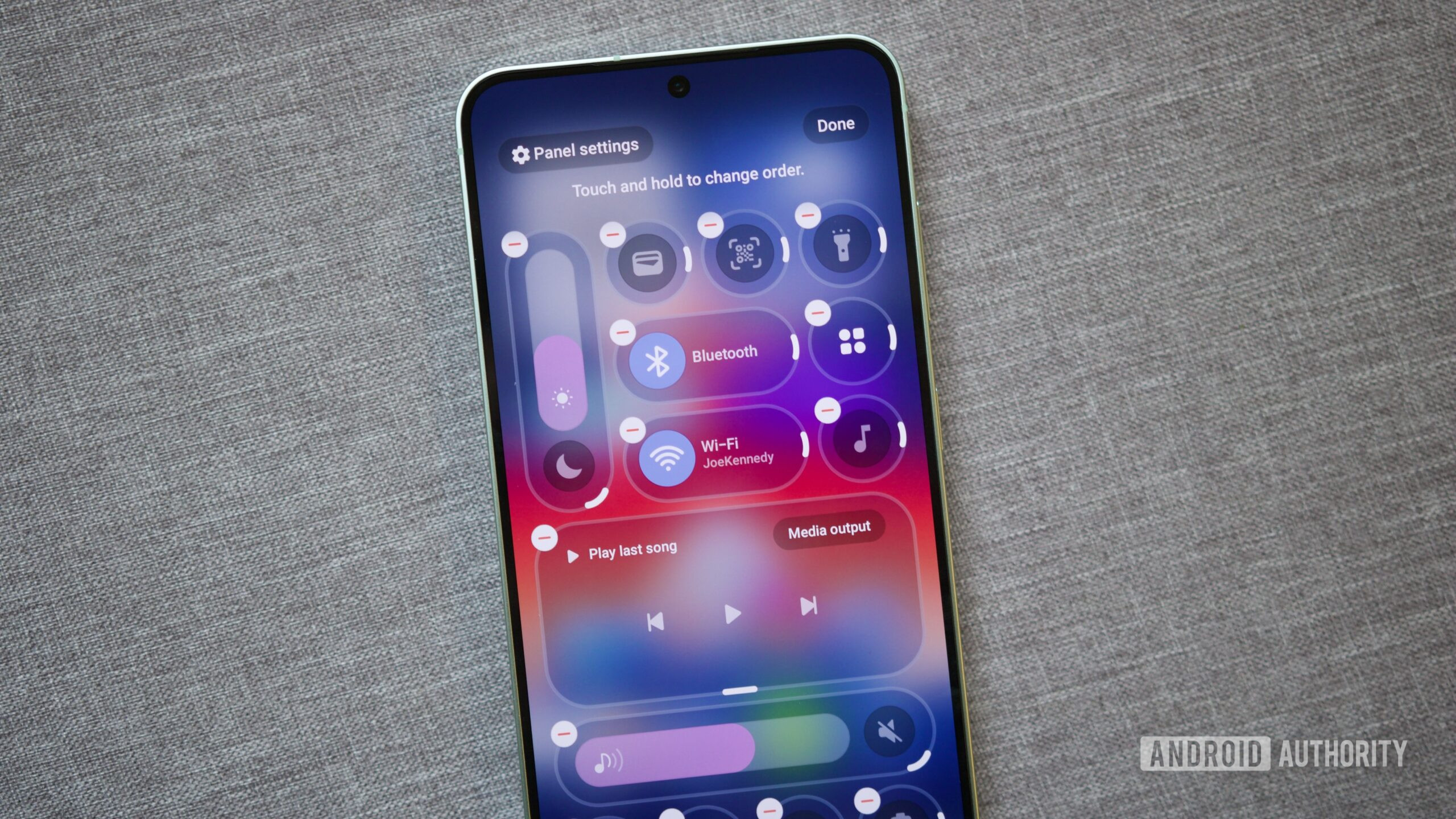
I’ve had the pleasure of running the OPPO Find X8 Pro as my daily driver, but since its Android 16 Color OS update, the company has snuck in more than a few sycophantic hat tips to iOS 26. The status bar now blurs rather than hides what is behind it in certain apps — hardly a major change, and I’m not going to pretend I hate it. I can abide a little bit of imitation, especially in the admittedly rarer cases where brands pinch genuinely superior ideas. Samsung’s new Quick Settings customization in OneUI 8.5 is genuinely useful, even if the aesthetic is a shameless copy-paste.
However, what I really dislike is that a variety of OPPO’s apps, though certainly not all, have now adopted iOS-inspired layouts.
I can look past the fact that the calculator is now unnecessarily glass-inspired, but the pill-shaped menus that hover over the bottom of the calendar and photos (gallery) apps are far more irritating. Besides their unsightly and overly cramped appearance, these changes throw any pretense of muscle memory out the window. There’s no real rhyme or rhythm to what each menu contains, what the small icons on the sides are for, or even where I’ll find the specific setting I’m after. Their design might look familiar, but the functionality is anyone’s guess — why is there a menu on the left in one app but on the right in the other?
But then I’ve always found navigating iOS completely unintuitive; from the upper left back button to the maze that is the Settings menu. For me at least, iOS 26 has only made things worse. Android brands contorting logical flow and aesthetics to accommodate the latest fads at Cupertino is an unforgivable sin.

As much as I’ve had issues with Material Design, at least its design language is consistent. No matter which Google app I’m using (and for a good portion of third-party Android apps too), I’m used to a single hovering button providing the key actionable context for the app (from composing emails to adding calendar events). I instinctively know that a hamburger icon offers access to a deeper menu of features or that I can usually quickly swipe left and right to move between an app’s pages.
While skins and color schemes come and go, consistency and expectation of form and function are essential to a well-planned UX experience. Blindly following what an entirely different ecosystem is doing in its latest update is not only uninspired but downright bad for us users. By melding Android and iOS, the Liquid Glass-inspired apps I’ve had the displeasure of using have completely dismantled my ability to intuitively understand how they work. That’s a recipe for making me never want to use them.
I've always found iOS unintuitive. Why do Android brands copy it?
Thankfully, there’s no indication that Android 17 plans to do more than borrow a little transparency from iOS 26. At least as far as Google is concerned, Android will function virtually the same as before; it’ll just look a bit iOS-inspired.
Still, that doesn’t stop handset manufacturers from skinning their versions in Apple’s likeness and, in the process, foolishly undoing the familiarity of their apps and more. What makes me scratch my head is whether these brands would rather just copy Apple’s UI entirely if they could, as if that would somehow miraculously transform them into household Western brands. That ain’t going to happen, it’s not Apple’s design language that makes the iPhone so popular. You can’t clone cachet.
At its best, copying the latest iOS trends reveals that others have no faith in their own abilities to lead the UX conversation. At its worst, it makes Android products far less familiar and less user-friendly. It has to stop; I’m sick of it.
Don’t want to miss the best from Android Authority?
- Set us as a favorite source in Google Discover to never miss our latest exclusive reports, expert analysis, and much more.
- You can also set us as a preferred source in Google Search by clicking the button below.
Thank you for being part of our community. Read our Comment Policy before posting.

