Affiliate links on Android Authority may earn us a commission. Learn more.
Google updates the desktop Play Store design (Update: Nevermind)

Update 3/26/18 10:30 A.M. EST: Google appears to have conceded that it may have rolled out its Google Play Store desktop update a little too soon, as the redesigned elements mentioned in the article below are all gone, as per Android Police. The updates were met with derision from multiple publications, the chief complaints being the images loading too slowly, the scrolling animation appearing janky, and the removal of certain keyboard shortcuts. We can only presume that Google will head back to the drawing board and issue a new redesign sometime later, but that’s just speculation at this point. Either way, things are back to the way they were, so everyone can rejoice!
Original article: Google continues to tinker with the Play Store’s aesthetics on mobile, but the web version has not seen a visual change in a cool minute. That changed over the weekend, when Android Police noted that the search giant started to roll out a slightly updated UI. However, not every change is for the better.
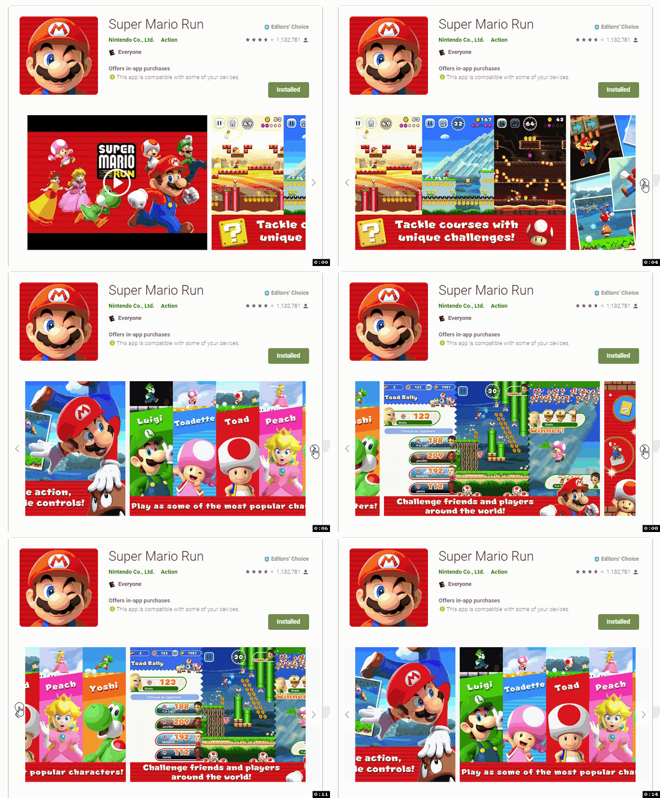
The first change is the way you view screenshots. Previously, you could only view the screenshots within the interface. You could just open the images in a new tab or window, but viewing them within the interface made them appear small.
The updated UI now allows screenshots to be effectively full-screen, so long as there is enough resolution. You can thank the new lightbox UI for that, but you can also thank the UI for not being able to just close the screenshot by clicking on the dimmed area.

No, your computer is not acting up. This is how scrolling through images actually performs. We have no idea why performance is this sluggish, though we should note that the Play Store pre-loads screenshots if you expand one.
Another quirk is the inability to use arrows to go from one screenshot to the next. Admittedly, this is more of a quality-of-life complaint, but it’s still strange.
Moving back to the positives, the redesign provides a drop-down menu for device compatibility and a more generalized format for the number of app installs. Finally, reading all of an app’s reviews now takes you to a dedicated page, where you can now filter reviews by device type.

The changes appear meant to bring the Play Store’s web version in line with the Android app, regardless of the quirks that arise as a result. Here’s hoping that Google irons out some of those issues over time.
You should be able to view the updated web version of the Play Store now, so let us know what you think of the update.