Affiliate links on Android Authority may earn us a commission. Learn more.
Galaxy Note 2 vs Galaxy S3: Display comparison

The display is, for most users, the most important component of mobile devices. It’s no wonder that people love to pick favorites and then proceed to endlessly argue about which technology is better.
For the proponents of AMOLED, the display technology championed by Samsung and used in superstar devices like the Galaxy S series, one issue is especially controversial: RGB vs PenTile.
Both terms refer to the arrangement of the subpixels that make up each pixel on an AMOLED screen. The displays of Samsung’s two flagship devices, the Galaxy S3 and the Galaxy Note 2, use the PenTile pattern and the RGB pattern, respectively. Today, we bring you a comparison of the two displays. But first, let’s lay down a few theoretical notions.
A bit of theory
The RGB pattern (standing for red-green-blue) has one subpixel for each of the three primary colors, with each subpixel usually accounting for a third of the pixel size. Meanwhile, PenTile has a slightly more complicated pattern, with alternating red and blue subpixels sandwiched between green ones. For more info on AMOLED and sub-pixel patterns, check out our How It Works post here.

Right: PenTile – notice the alternating red and blue subpixels
The PenTile pattern uses just two subpixels per one pixel, a green one and a red or blue one. The problem is you need all three primary colors (red, green, and blue) to display most colors. For instance, to show white, a pixel fires up all three subpixels at equal intensity. But with PenTile, you only have two subpixels, so to show white, the display “borrows” the third subpixel from a neighbor. In some cases (especially with text and graphics), those extra pixels cause a colored haze to appear.
Many users consider that RGB is superior to PenTile, although it has to be said that not all users are bothered by the fuzziness of PenTile screens. And the PenTile pattern has its advantages – displays that use it are cheaper to manufacture, are brighter, and according to Samsung, more durable in time.
Now that we’ve covered the theory, the fun part begins.
Samsung Galaxy S3 display
The Samsung Galaxy S3 features a 4.8-inch HD Super AMOLED display, with a 1280 x 720 pixels resolution. The pixel density of the display is 306 PPI, and the sub-pixel arrangement used is red-green-blue-green (RGBG). The Galaxy S3 display is capable of rendering 16 million colors, and its contrast ratio is 3,419 to 1.
The display of the S3 has been criticized by the display specialists at DisplayMate for the distorted color gamut, that casts a greenish hue to many images. Also, the experts say that many images appear “over saturated and gaudy” on the Galaxy S3, due to the prominence of the green subpixel and a lack of calibration. More about that here.

Samsung Galaxy Note 2 display
The Samsung Galaxy Note 2 features a larger, 5.5-inch display with the same HD resolution of 1280 x 720. Due to the larger dimensions of the screen, the pixel density on the Note 2 display is significantly lower than the Galaxy S3’s, at 267 ppi. Like the S3, the Note 2 boasts an HD Super AMOLED display, but one that uses an RGB pattern instead of Pentile.
The Note 2 features a unique RGB pattern; instead of having three equal subpixels, this pattern is comprised of a large blue subpixel, and smaller green and red subpixels. The blue subpixel is darker than the other two, to compensate for the larger size. The reason for which Samsung used this unusual arrangement is because the blue subpixel has a shorter lifespan than the other two. By making it larger, the Korean engineers prolonged its durability.

Interestingly, Samsung has stated a few months back that one of the reasons they chose a Pentile arrangement for the GS3 is its longer lifespan compared with the RGB stripe pattern. The unique pattern used on the Note 2 indicates that Samsung has found a way to increase the lifespan of RGB panels.
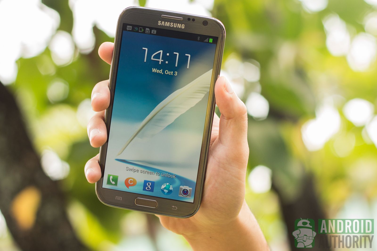
Photo comparison
To show you the differences between the RGB display of the Galaxy Note 2 and the PenTile display of the Galaxy S3, we put them side by side and shot them at increasing magnification levels.
First, here are the two displays side by side. Click for larger versions.

You can see that, at this level, there’s virtually no difference between the two phones. In spite of the different pixel densities, the two displays appear identical to the naked eye.
At roughly 1.5X magnification, we begin to see the rows of pixels. The Galaxy Note 2 seems just a tad sharper and the difference is especially visible in the green areas of the image. Remember that the PenTile matrix arrangement has two green subpixels that are shared between different logical pixels.

The difference between the display of the Galaxy S3 and the Note 2 really becomes obvious at a ~2.5X magnification. You can notice the pixel rows on the two displays. On the Galaxy S3, the large green pixels pop out, which makes the image appear a bit more grainy that the Note 2.

Finally, we zoomed in at ~5.5X, a level at which you can identify individual pixels in both images. Note that the image of the Galaxy S3 display is slightly more magnified (about 6X) to highlight the pixel arrangement. You can clearly see the difference between the two sub-pixel arrangements, with the PenTile being less crisp.

Text and graphics comparison
The PenTile arrangement shows its weaknesses when displaying text, icons, and other fine graphics. For this type of imagery, you can sometimes notice a colored “haze” around the graphic elements.
Here’s a magnified sample of text:


- You can notice that the Galaxy S3 has a more pronounced haze around the text; that fuzziness is not a design element, and on the Note 2, you can clearly see it’s less pronounced.
In the next image, which is even more magnified, you can clearly see the red and blue pixels that cause the fuzziness.


Here’s an image that shows that greenish cast that whites have on the Galaxy S3 when viewed under certain angles.


The fuziness of the Galaxy S3 is also visible in this magnified shot of the Play Store icon.


And again, in the next shot:


Wrap up
To bring this post full circle, picking a display over another is largely a debatable affair.
In the case of today’s Galaxy Note 2 vs Galaxy S3 comparison, the differences in crispness are only noticeable when you magnify the image. The greenish or bluish cast that occurs in some situations can be bothersome, especially if you call yourself a display purist. If that’s the case, pick up the Galaxy Note 2, which features the “better” display. But the truth is most users would never notice the difference, unless someone would specifically point it out.
I handled both the Galaxy S3 and the Note 2, and I can’t say that one display was better than the other. At 1280 x 720, the shortcomings of PenTile are hard to notice. I did notice a bluish hue on the GS3, but perhaps that was subjective. Bottom line, don’t let others tell you which one is better. Spend a few minutes with both phones and make sure to read some text or do some browsing (the use cases where the issues of PenTile are most visible) before making a decision.
What about you? What do you think about the two displays?
Thank you for being part of our community. Read our Comment Policy before posting.