Affiliate links on Android Authority may earn us a commission. Learn more.
Build a custom control panel using Tasker Scenes - Android customization
With our focused Tasker variable tutorial out of the way from last week, this week’s Android customization post will be a little bit more exciting. We plan to start a new project that has us building a completely custom control panel on a dedicated and completely custom new screen on your device. Or, if you’d prefer, this is how you build a Scene in Tasker.
Tasker has a tool built-in called Scenes, which is a method of building your own custom screens or popups on your device. The builder offers up a no frills developer’s IDE type design and functionality, where you start with your overall screen or popup layout, then drop buttons, text and more onto it and re-size them to fit your tastes.
With near unlimited things you can do with Scenes, including building your own Android apps, we are going to keep it simple with a control panel, just so we can focus on the tools instead of the project.
Before we begin
Check out what we’ve used Tasker for in the past to see if it is right for you.
Build a custom control panel in Tasker
Please allow me to explain the project a little more. For starters, please be forewarned, we are less concerned with building a control panel than we are with learning how to use Scenes in Tasker. We will see the project through, probably using a future article or two to go through the elements available for a Scene. For today, we will keep it extremely simple, just in case you were expecting some sort of magic, not today.
Now that we know we are building a Scene, let’s look a little closer at what a Scene is and what you can do with it.
What is a Tasker Scene?
Simply put, a Scene in Tasker is a custom built screen or window on which you place buttons, images, text and more. A scene may be displayed in several methods, including as a small popup window all the way up to being a full screen activity, just like a real app. Further, when you display these Scenes, you may choose them to act as a fully functional app would, or just as a transparent overlay, with a few related options in between.

Please be careful with Scenes. It is no problem to trust your own, but as a Scene is able to create a full screen transparent overlay, I would be cautious about any third party Scenes that can be downloaded from the internet. Acting with the full permissions of Tasker, any ‘app’ built on a Tasker Scene should be verified that it will not hijack your display or steal your input in any way.
Disclaimer out of the way, please take a moment to think about what you want out of the project today. You will be responsible for all design aspects of this project, which is much easier to handle when you know what you want ahead of time.
We will be keeping it simple, we will only be placing one item on our Scene. You are encouraged to add more, but the process is pretty much the same for any element, so we’ll just add one.
Enough of that, let’s start looking at building our own Scene in Tasker.
Build a Scene in Tasker
Open Tasker and head over to the Scene tab.
You will see a default Scene already in place, you could use it, but I’d rather you create a new one.
Tap on the “+” icon to add a new Scene. Provide an appropriate name to it. I’ll go with “ControlPanel“.
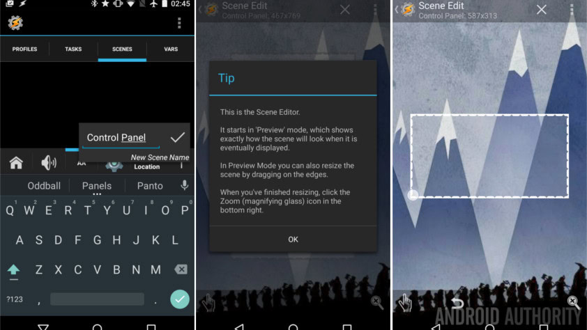
You will now see a transparent rectangle over top your display, and indicators as to its size at the top. This size will vary based on your available display resolution, meaning that, by default, a Scene should be built for only devices with this same resolution. You may have to re-build your project when you get a new device.
Tap and drag a side or corner of the transparent box to give it new dimensions. It will auto-center on your screen, do not worry, we provide placement details when we deploy the Scene later. Just pick your desired shape and size and we’ll start adding elements.
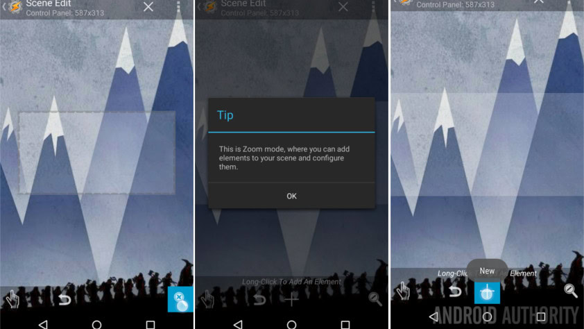
When you are ready, tap the magnifying glass with the “x” in it, found in the bottom right of the screen. This activates the element editing mode.
As indicated, long press on your transparent rectangle, which we will from here on call a window, or hit the “+” button to add a new Element.
As you can see, there is a long list of available elements. Buttons and text labels are pretty straightforward, then you’ll notice that you can embed maps or even web pages using WebView.
I told you I would keep it simple, so, I will choose Slider.
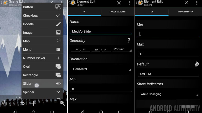
I normally build a WiFi toggle first, but for today, let’s build a media volume slider.
I encourage you to change the name of the slider, I’ll call mine “MedVolSlider”.
If you have an idea what size and position you would like the slider, go ahead and enter the Geometry values. Relax, you’ll be able to drag and drop to position and re-size the slider by hand in a bit.
I will leave orientation on Horizontal, but you may rotate the slider if you’d like it to be vertical.
Leave Min set to 0.
Change Max to be a value of 15. Yes, I know it is a little confusing, but the Tasker media volume adjustment values only go to 15, not 100.
Under Default, tap the label icon on the right hand side, then scroll down to find the variable “Volume – Media.” This way, when your Scene loads, it adjusts the slider to the current volume position.
Finally, this is optional, I like to turn on the Show Indicator option, I set it to “While Changing.” This simply displays the values of the slider when you are actively sliding it.
Hit that system Back button to save the setup and return to the Scene design builder.
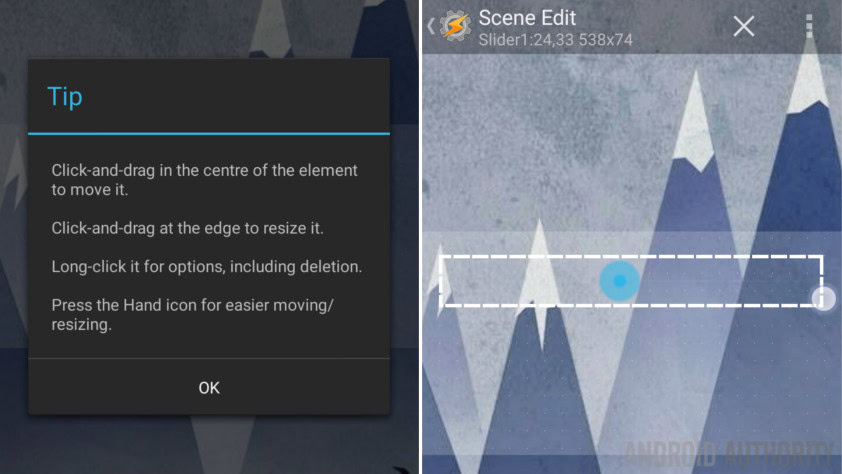
Tap and drag the slider to your desired position, and drag the edges so that the slider is your desired size. I just made mine span the screen for now.
Now we need to add the functionality.
Tap the slider to re-enter the editor.
Tap into the Value Selected tab at the top.
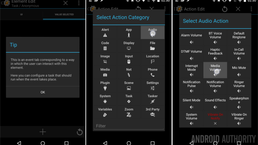
What you see here is a pretty standard Task builder like you’ve seen before. You have three options now, if you have not yet built the Task to perform your desired actions, you’ll need to build a project from scratch. If you have already built a Task, you can either create an action here to run that Task, or you can copy it in completely with just a couple clicks. To do so, tap the ‘refresh’ icon in the bottom right corner, then choose your desired Task.
We will build from scratch today.
Tap the “+” button to start a new action.
Choose Audio.
Choose Media Volume.

To the right of Level, tap the crossing arrows icon.
You can now tap the label icon to choose an existing variable from your system.
When you created the slider, Tasker automatically created a few local variables that you can now choose from.
Choose “%new_val“.
From there, it is optional, but I find it a good idea to turn on the check box beside Display. At least for initial testing. This triggers your system volume slider to display, like I say, great for testing.
Tap the system Back button to save.
You won’t believe this, you’re done building your custom control panel. Sorry, I know, it’s not much of a control panel, but you need only repeat the steps above with each new element to fill your display, making adjustments for what you want to see and have happen, of course.
As mentioned earlier, we will pursue this project further in coming articles. There are a lot of neat tricks you can do with the available elements, we want to make sure you get your fill.
Before we close out today, there is one last important thing to do, we must launch the Scene to actually use it.
Launching a Tasker Scene
When you are ready to see your custom window in action, back out of the Scene and head over to your normal Tasks tab.
Tap the “+” button to add a new Task, name it appropriately, I’ll call mine “ShowControlScene“.
Tap the “+” button to add an action.
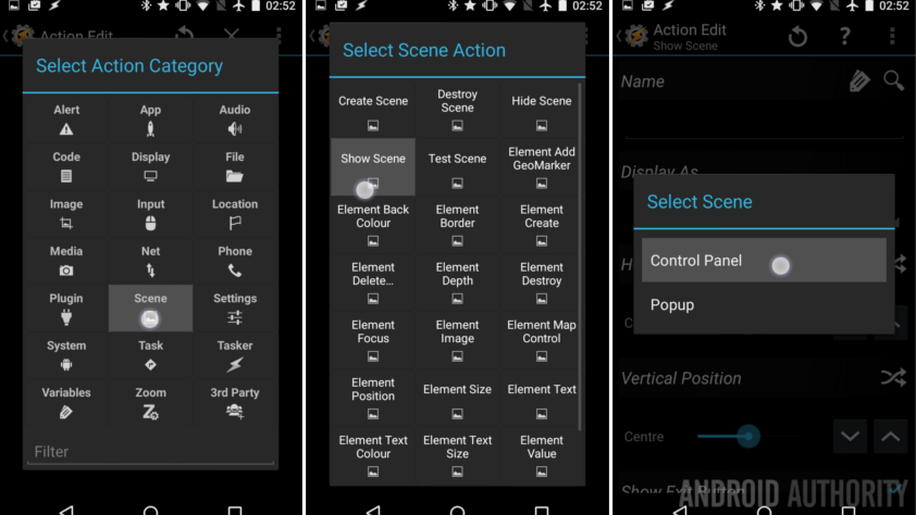
Choose Scene.
Choose Show Scene.
Tap the magnifying glass to the right of Name to see the list of all of your Scenes.
Choose your Control Panel Scene.
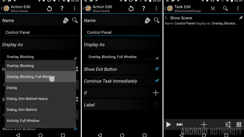
Under Display As you have the ability to control how and where your Scene, or window, will display. Tap through a few of the options to see the additional settings for screen location and for the style of open and close window animations.
For ease, we will choose Overlay, Blocking, Full Window.
I find it best to keep Show Exit Button turned on, but you can always build a close button into the design of your Scene, if you wish. No worries though, your system Back button will operate as expected when your Scene is in place.
Hit your system Back button to save and exit.
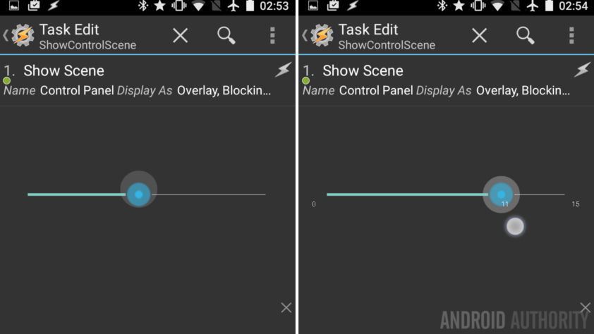
That’s it. You can now figure out how you wish to trigger this Task, either right here with the play button or maybe by setting a Task shortcut on your Homescreen. I’ll leave it to you for now to figure out when and how you access your new control panel, but I may just have a new project coming soon that would work for you. No hints, it’s a surprise.
What’s next
For fun, I added an extra element to my volume changer. At first glance it is just a Text element that displays the current media volume, but wait, there’s more. Using the range of options on this element style, I was able to make is so that a single tap of the text mutes the media volume. A long press of the text cranks up to full volume. Best of all, swipe up from the text to add one to the volume, then swipe down to decrease the volume by one. Hint: if you pursue this yourself, remember to update the current value of both the slider and the text after making any volume changes.
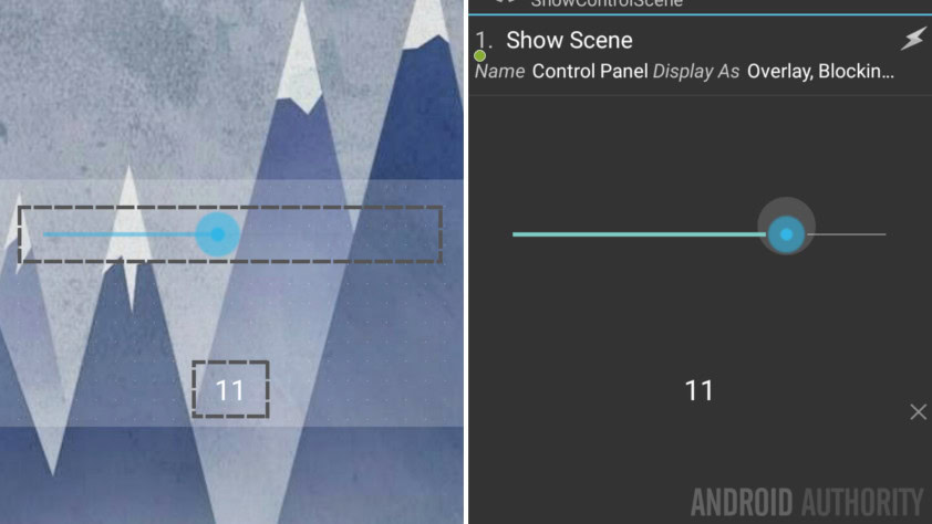
Each of the many elements in a Scene will offer different tools, options and customizations. Be sure to poke around and explore the different functions. Let’s be honest, if all you want is a settings toggle, perhaps with a way to enter the full system Settings, you don’t need Tasker, just use your stock Android notification panel quick settings menu.
Please do not get caught up on the fact that we are playing with Scenes to create a control panel, there are many other uses for them. As a quick example, we’ve heavily utilized the Alert Flash notification action in our Tasker projects, if ever those flash popups were ill suited to your desires, a Scene could be used in place.
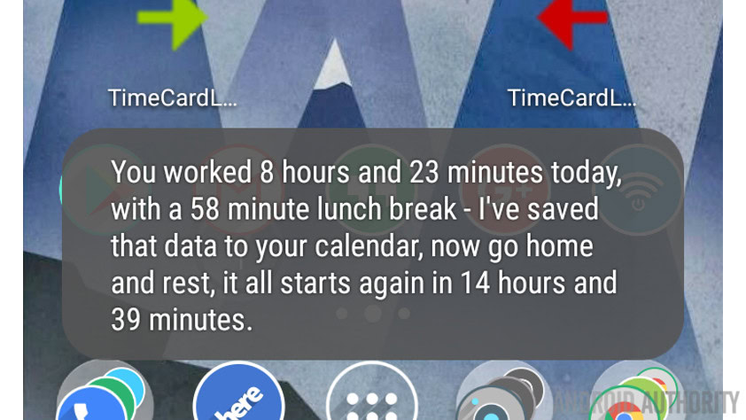
Going to the extreme, it is absolutely possible to build your own custom web browser in a Scene. Don’t expect Chrome level functionality or integration with the OS, but it can, theoretically, be done.
We’ll continue to play with Scenes in future articles, stay tuned for other new and interested ways to put Tasker to work for you.
Next week
As you can see, we only barely touched on the full capabilities of a Tasker Scene. Join us again next week where we will continue this Android customization project. Let us know if you would like further instruction on any of the specific Scene Elements, otherwise, we’ll just keep building using different Elements for the sake of learning.
What do you say, can you think of a use for a Tasker Scene? If not, stay tuned, I hope to change your mind.
Thank you for being part of our community. Read our Comment Policy before posting.