Affiliate links on Android Authority may earn us a commission. Learn more.
I tried a blank homescreen on my Android phone for two weeks
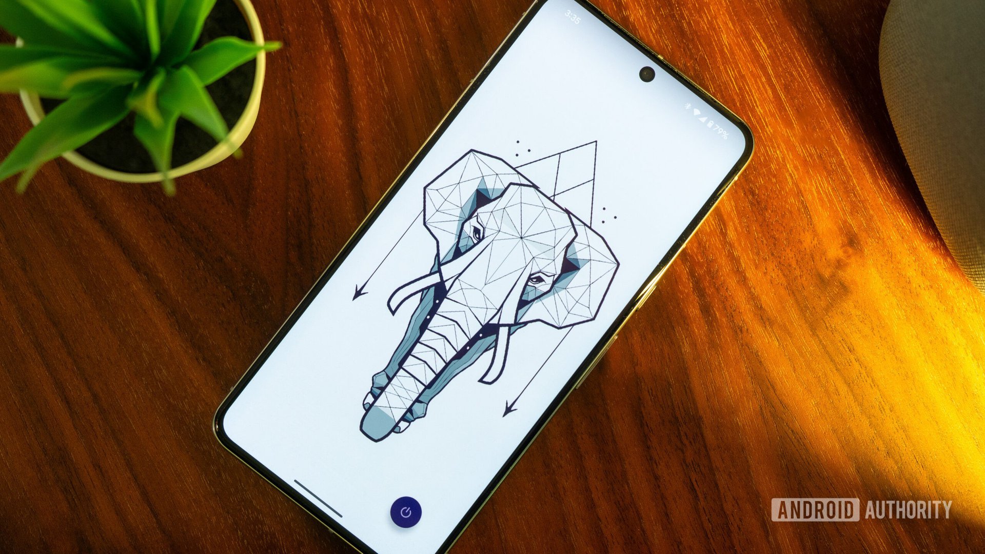
A couple of weeks ago, I found myself installing Niagara Launcher for the first time. It had been years since I’d used a third-party Android launcher and the last time I did, it was Nova Launcher and its very stock-like experience. Niagara’s unique approach intrigued me, but after an hour of tinkering, I realized I could disable every single element on the homescreen. The icons, the widgets, the options, all of it: gone.
What started as a harmless exploration of Niagara transformed into a personal challenge. Could I live with a completely blank homescreen? What would it be like to unlock my Android phone and see no app icon waiting for me? Would it transform the way I use my phone? I decided to stick with that setup for a few days. 18 days later, I think it was time to call the end of the experiment, so here’s what I discovered along the way.
Have you ever tried a blank homescreen on your phone?
From everything on the homescreen to nothing on the homescreen
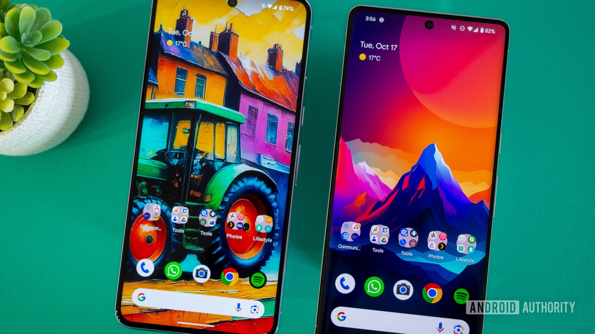
I’ve been using the homescreen setup you see above for years. Seven, eight, maybe more. It’s familiar, it’s functional, and it has everything I need. The wallpaper changes every day or two, but the rest is pretty static.
There’s a Google search bar, the At A Glance widget, plus shortcuts to the phone app and my four most-used apps: WhatsApp, Camera, Chrome, and Spotify. On top of that, you can find folders with dozens of the apps I use. The first one is a productivity mish-mash of banking apps, work apps, and more. The second is just Google apps. Third is a series of tools. Fourth has all the media and fun apps. And the fifth has all my smart home and connected gadget apps.
A secondary homescreen houses a Todoist widget, plus more app folders that I kept piling up when I moved to France and started using several local services.
I intended the blank screen to be a shock that forces me to rethink my stale setup.
The system served me well enough that I never felt the need to change it and that I never even noticed there were two folders with the “Tools” name — ha! I knew how to get to any app in two taps max, or one swipe and two taps max if they were on the second homescreen. I hated the inefficiency of app drawers and having to scroll to find the app I needed; this, I thought, was better for me.
So why did I go the extreme opposite and remove everything? Well, I guess I wanted a real shock to the system. A blank homescreen was the perfect trigger to start questioning everything about my setup. Did I need all of these apps within easy reach, and what happens when they disappear?
How did the blank homescreen experiment go?
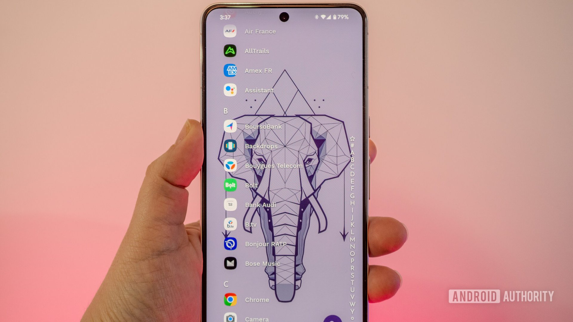
The first 24 hours were very weird, I’ll admit. I unlocked my phone and there was… nothing. Just a cool wallpaper. If I had no pending notification, the experience was disconcerting. There was nothing for me to do, no app waiting to distract me, no icon within easy reach of my bored finger.
I immediately knew I had to find a way to quantify this experiment. So I started noting down my Digital Wellbeing stats every day to keep a tally of things. Below are the average values of daily unlocks, notifications, and screen-on times for the month prior to the experiment, plus the first day (the real shock), first week, second week, and total duration. I also calculated the percentage of unlocks per notification, i.e. my readiness to grab my phone and interact with it when there was a pending notification.
| Before | Day 1 | Week 1 | Week 2 | Total (18 days) | |
|---|---|---|---|---|---|
Unlocks / day | Before 55.4 | Day 1 29 | Week 1 33.43 | Week 2 49.57 | Total (18 days) 41.53 |
Screen time / day | Before 4h 53m | Day 1 3h 18m | Week 1 4h 33m | Week 2 4h 34m | Total (18 days) 4h 25m |
Notifications / day | Before 143.9 | Day 1 195 | Week 1 153.71 | Week 2 158.14 | Total (18 days) 158.88 |
% of unlocks per notification | Before 41% | Day 1 15% | Week 1 23% | Week 2 34% | Total (18 days) 27% |
Digital Wellbeing tells me I unlocked my Pixel 8 Pro 29 times total on November 15 (the first day), down from an average of 55 unlocks/day in the month prior. I was clearly discouraged from even opening the phone. My screen time (3h 18m) was one of the lowest of the entire experiment.
The first day, I was clearly discouraged from even unlocking my phone.
For the first week, I had to be very deliberate about each action I wanted to do. If I wanted to check X/Twitter, I had to go look for it. The icon wasn’t in front of me anymore. Same with Instagram, YouTube, and other time-sucking apps. And even when I unlocked my phone to respond to a notification, there was no extra distraction within easy reach. I had to actively look for it.
As time passed, though, I somehow found my way back to my distractions and old habits. Sure, I had to trigger the app drawer and alphabetically scroll through apps, which was inefficient at best, but I started getting used to it. You can notice my unlocks/day rise up considerably on Week 2 (though, that is partly due to the higher number of notifications too).
You can see that I was getting more notifications, on average, these two weeks than in the previous month, but I was clearly less tempted to unlock each time I got a notification. My phone became boring. That’s how I felt each time I interacted with it.
What did I miss the most from my homescreen?
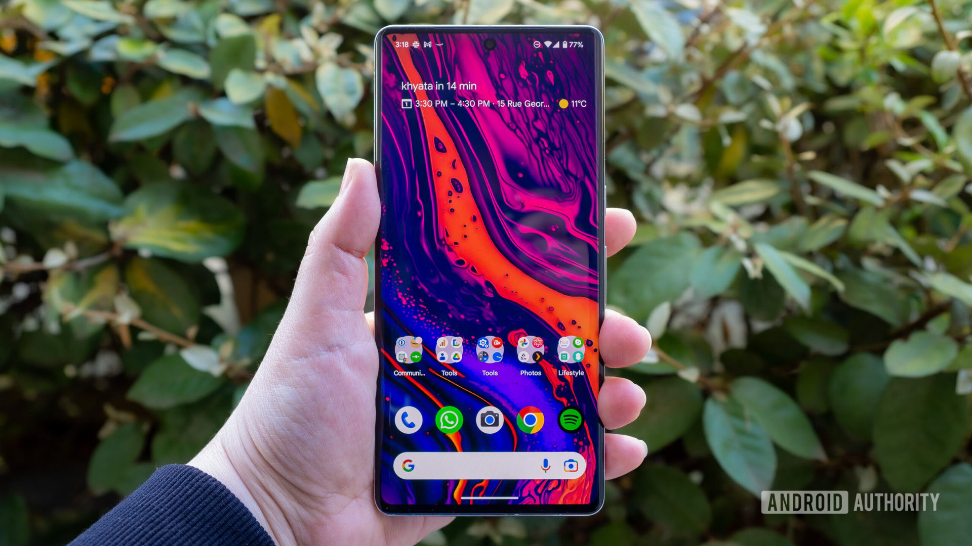
The blank homescreen was equally freeing of distractions when I didn’t have a specific task in mind and frustrating when I knew exactly which app I wanted.
Taking a photo took more time, opening WhatsApp or Slack to send a message was annoying, and checking my photos and videos wasn’t intuitive anymore. Forget about controlling my smart home, listening to podcasts or music, browsing Chrome, or opening my password manager. Really, everything I needed was several steps too far. I got used to some of it, but I kept getting more frustrated with time. Relying on the app drawer for everything is extremely inefficient for me. It’s clear that I don’t need all app icons, but I do need some app icons.
Surprisingly though, the thing I missed the most was my Pixel 8 Pro‘s At A Glance widget. I didn’t know I was this reliant on it, but it’s the fastest way to know if I have an upcoming event, check the weather, see the battery level of my Pixel Watch, and more. When I’m traveling, At A Glance is practically indispensable, but I realized it’s become a part of my everyday phone interactions too. I really hated having to open the Google app and scroll to tap on the weather icon to see the forecast.
I didn't know I'd become so reliant on At A Glance until it was gone.
Another Google feature I missed was the search bar. Having to open the app or Chrome first was annoying. Even worse was the lack of a Lens shortcut, which had become a frequently used tool. On-the-fly text translation and object recognition are things I do often enough that I need a homescreen shortcut for Lens.
On the other hand, I also realized I didn’t need fast access to more than 70% of the icons that previously sat on my main homescreen. Plus, my secondary homescreen had no reason to exist at all. The Google Discover feed was practically a wash too. I only felt its absence when I was bored, and I rarely am bored.
This is how I’m building my new homescreen
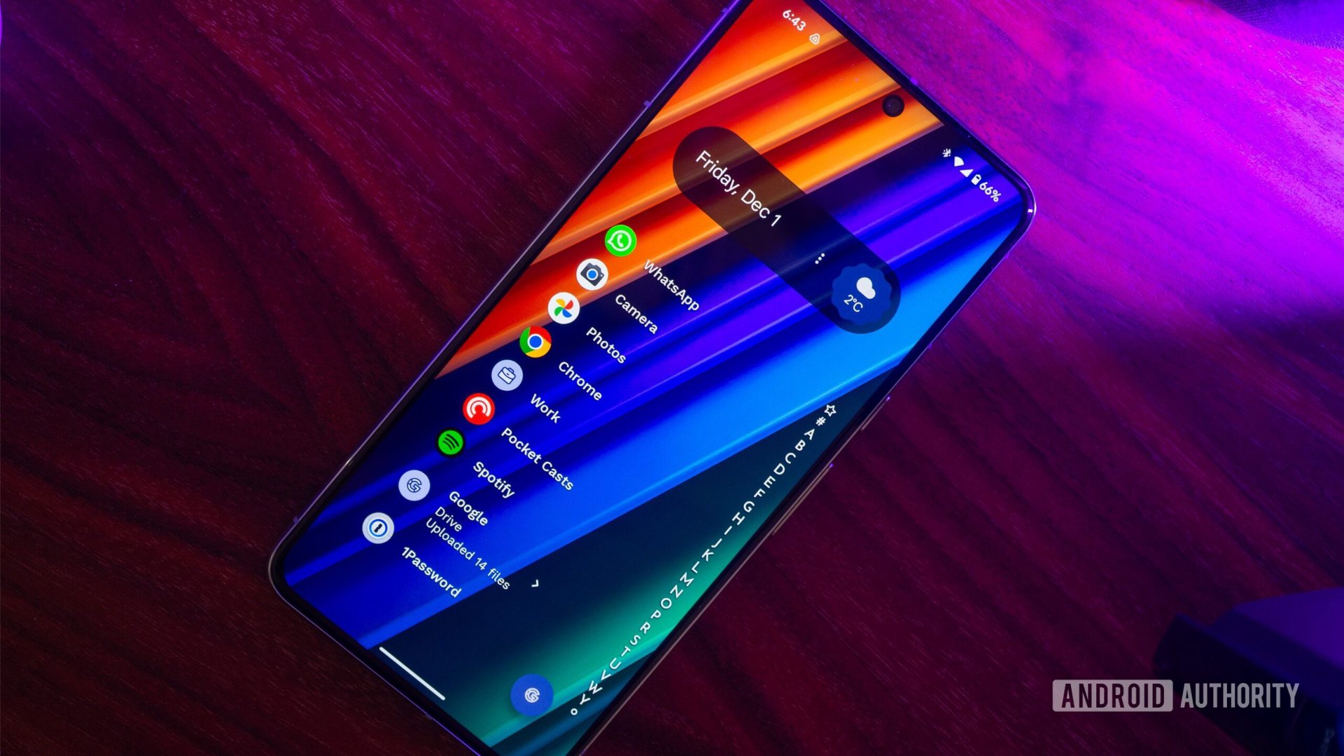
When I ended this experiment, I sat down with my phone and thought of everything I’d learned from the blank canvas approach. I didn’t want to go back to my old tried-and-approved setup; I wanted something better. Easy access to the apps I actively need the most, less access to distractions or infrequently-used apps.
I decided to stick with Niagara Launcher for the time being, which meant bringing back At A Glance through the Google app widget. I’m not sure this has all the features of the Pixel-exclusive launcher widget, but it has the calendar and weather at the very least.
Next was a shortcut to the Google app for quick searches and Lens access. I also enabled the alphabet list for the app drawer. As nice as it was to not see it, I admit it’s holly inefficient to swipe to reveal it each time I want to launch an app that’s not on my homescreen.
I brought back At A Glance, a Google shortcut, and my most-used apps. I left everything else in the drawer.
And finally, I brought back some favorite app icons. WhatsApp, Chrome, Camera, Photos, Spotify, Pocket Casts, and 1Password, plus two folders for my most-used work apps and most-used Google apps.
This feels like a happy medium between the busy original setup and the completely blank homescreen. I’m still in the process of figuring out what my ideal setup looks like, so things are likely to change with time. What I’ve learned is that stagnation and piling up icons on top of icons isn’t as efficient as I thought it was.