Affiliate links on Android Authority may earn us a commission. Learn more.
6 improvements we want to see in Android Wear

As smart watches become an ever increasing part of our lifestyle, the battle is on for supremacy amongst the platforms that power the devices that adorn our wrists. Google’s Android Wear is just one of these platforms and while its smartphone counterpart continues to dominate the smartphone market, Android Wear hasn’t had as much success.
Coupled with the dominance of the Apple Watch in the market – Apple sold 1 million watches in the first day, while Android Wear took a year to reach the same milestone – Google’s platform certainly faces a challenge. What does it need to be able to dominate in wearables though? We’ve used Android Wear across many devices (as well as the Apple Watch and the Gear S2), so here’s a few of the features we’d like to see in the next version of Android Wear.
1. Freedom for OEMs
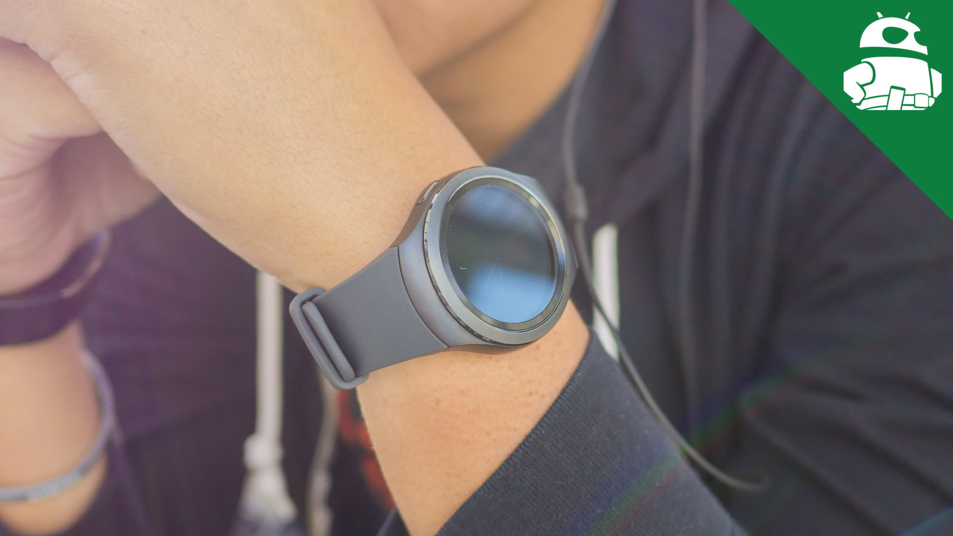
The biggest improvement we’d like to see in the next version of Android Wear is freedom for OEMs to innovate and create unique experiences. As we’ve seen from the Gear S2, Apple Watch and the Pebble range, having the freedom to customise the software to suit a particular style of smartwatch can create excellent – and very unique – experiences.
Unlike its smartphone-powering sibling, Android Wear offers the same experience across multiple devices and this lack of freedom means OEMs are limited to innovating via hardware only. This could potentially be one of the reasons that Samsung opted to use its Tizen OS – as opposed to Android Wear – for the Gear S2, as this offered it the freedom to create an interface that is capable of utilising the unique rotating bezel.

In comparison to this, Android Wear offers a cards approach that relies heavily on touch input for navigating the smartwatch. Offering a homogenous experience across devices is certainly not a bad thing as it means you can use any Android Wear smartwatch and feel comfortable, but it can result in the platform becoming stale.
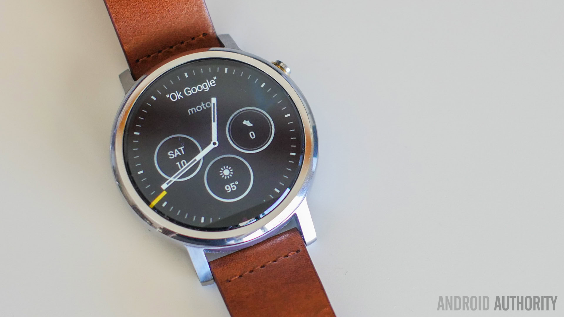
There’s no doubt that sales of Android Wear devices have been less than initially estimated and the initial buzz around the platform seems to have worn off as a series of updates – that, admittedly, have bought a range of improvements and new features – have failed to excite. Can you imagine if an OEM like Motorola or Huawei had been able to create customised interfaces running atop Android Wear to make full use of the round display on the Moto 360 2nd Gen and HUAWEI Watch respectively?
2. Physical buttons
In a world dominated by touch screens, it seems strange to be saying we want to see more physical buttons, but this is exactly what Android Wear needs. Take two of its chief rivals – the Gear S2 and the Apple Watch – and both offer a physical element that is crucial to the experience. The former has a unique rotating bezel and the latter has a digital crown, and while Android Wear devices have had physical buttons on the side, they don’t actually serve a purpose.
Imagine having two buttons on the right of your Android Wear device and – exploring this further – being able to customise them to suit your needs. If you frequently interact with your watch via your voice, you could have one button set to launch Google’s voice search. If you prefer to have different watch faces for different times of the day, you could easily switch by pressing a physical button.

Furthermore, instead of swiping up and down to navigate the display, you could even use the two buttons to replicate that feature, or even have one button to go back a step and another to launch an app drawer. Relying solely on touch inputs has worked so far for Android Wear, but offering physical buttons may provide the extra – and unique functionality – that is arguably missing from Google’s wearable platform.
3. A slicker experience
At launch, Android Wear’s cards-first approach certainly offered something unique as it brought the power and familiarity of Google Now to your wrist but more than 18 months later, the interface hasn’t changed all too much. Broken down to the essentials, Android Wear is a collection of cards displaying useful information and notifications seamlessly together in one list and while it’s definitely functional, we’d certainly expect Google to offer an evolution of an experience in the next version of Android Wear.
A key problem with the cards approach is notifications; if you have ten or even twenty unread notifications, scrolling through them on a small smartwatch display isn’t exactly user-friendly. Furthermore, notifications are in a chronological order and if you’re like me, not checking notifications for a couple of hours results in an endless list of cards. By way of comparison, the Gear S2 offers notifications to the left of the home screen with each app having its own “screen” and while this approach has its own problems, scrolling left and right is a lot easier than navigating a long list of notifications.
Obviously, each platform has its own approach and there’s plenty that like the chronological cards layout of Android Wear, but in the next version, we’d like to see Google change up notifications a little. Whether it’s revolutionising the entire interface or just tweaking notifications to make them more user-friendly, Android Wear’s approach is certainly in need of a revamp, and in the next version of Android Wear, we’d like to see a revamped experience that has less swiping around a small screen.
4. A revamped interface for round displays
While notifications may need a little tweak, the biggest problem facing Android Wear is its interface on round displays. From its initial launch, Android Wear has been designed with square displays in mind, and while this is acceptable for some devices, a lot of OEMs are opting for round displays.
OEMs have approach round displays and Android Wear in a multitude of ways but no approach yet has felt completely natural. On most round Wear devices, cropped notifications and text only appearing in the middle of the display are ‘normal’ occurrences, yet there is definitely a need for innovation here.
Whether it is Google itself innovating in Android Wear as a whole or individual OEMs having the freedom to innovate with the experience on round displays, Android Wear definitely needs to improve on how it handles round displays. As we see smartwatches rise in price and hardware improve, Google needs to ensure its software keeps up otherwise we may see OEMs looking at alternative platforms to power their wearables.
5. Multiple input options
Unlike smartphones, replying to messages or notifications from your wrist poses a number of input challenges. At the moment, Android Wear supports voice input or quick replies and while its voice recognition is certainly impressive, there’s definitely room for improvement, not least as voice input isn’t always appropriate for a particular environment.
In the next version of Android Wear, we’d definitely like to see the list of input options expand past its currently-limited offering. Instead of limiting users to just voice input, it would be nice to see Google include support for additional inputs. For example, having a keyboard – however basic – on your wrist would certainly be useful for when you can’t use voice input. The lack of screen real estate does limit what Google is able to do but adding a T9 keyboard like the Gear S2 would offer a potential solution to this problem.
6. Improved Battery Life
If there’s one area that Android Wear certainly fails to deliver, it’s in the battery department; we’ve seen improvements in battery life since the launch of Android Wear but none have quite delivered the excellent battery life we’ve all been hoping for.
From my personal experience, most Android Wear devices can last a full day, but will then require recharging during the middle of the following day. This then means you have to charge your wearable every night and on more than one occasion, I’ve walked out my house in the morning without putting my wearable on. In comparison, as I covered in my Gear S2 follow up review, I’m able to get two days minimum from the Gear S2 and often, it can last three days (albeit with very low usage). While it may not seem like much of a difference, having to charge your wearable every other day instead of every day does improve the overall experience.
[related_videos title=”Wearables in video:” align=”center” type=”custom” videos=”657671,650695,648705,648417,644990″]
Whether it’s through optimising the software or reducing the requirements of Android Wear, battery life is a key feature that Google definitely needs to fix in the next version of its wearable OS. Sure, manufacturers could increase the size of the battery but, as an example, the 250mAh battery in the Gear S2 is smaller than most Android Wear devices (that are atypically 300-400mAh in capacity) yet offers much better battery life. With wearables having much larger limitations in terms of design compared to smartphones, the onus is on Google to improve Android Wear so it is optimised to offer the best possible battery life.
What do you want to see from Android Wear?
Google’s smartwatch platform is certainly heavily adopted by both, manufacturers and developers alike, but it is running the risk of growing stale. The next version of Android Wear is likely to bring several improvements but we’d like to see Google present a well-thought out experience that has been optimised for wearables.
There’s several improvements we could have listed but we’ve opted for the major improvements that will really enhance the experience on Android Wear devices. What do you want to see from the next version of Android Wear and is there anything you’d like to add to our list above? Let us know your views in the comments below.