Affiliate links on Android Authority may earn us a commission. Learn more.
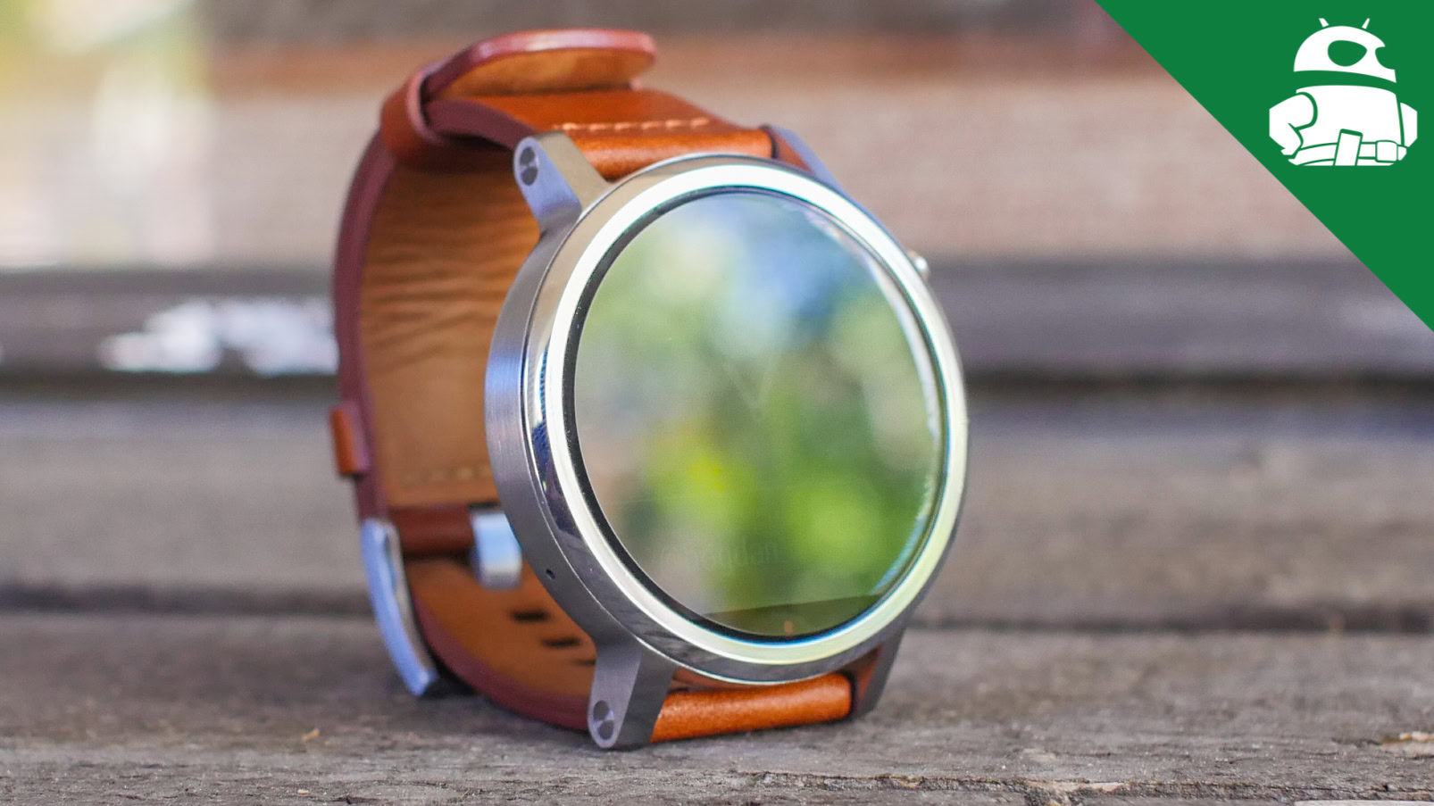
Motorola Moto 360 2nd Gen.
What we like
What we don't like
Our scores
Motorola Moto 360 2nd Gen.
With Motorola kicking off the round Android Wear smartwatch trend last year with the original Moto 360, there was a palpable anticipation as to what its follow-up would bring. Its successor, however, enters a smartwatch market that has seen rapid growth in the number of premium, round-faced, smartwatches, with various OEMs throwing their hats in the ring.
In the face of this increased competition, does the latest smartwatch iteration from Motorola manage to stand out? We find out, in this comprehensive Moto 360 (2nd Gen.) review!
Design
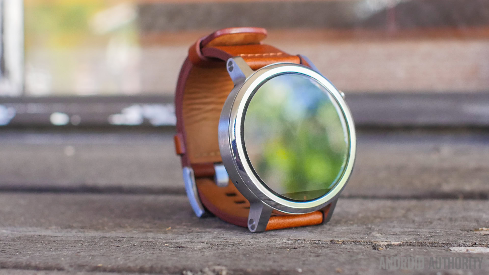
As far as the design is concerned, Motorola tries to inject much of their smartphone buying experience into the second generation Moto 360, introducing the customization capabilities available with Moto Maker for their latest smartwatch. Granted, the level of customization on offer isn’t as robust as what is available with their flagship smartphones, but you do get to choose between different sizes, the design on the bezel, the color of the metallic case, and various watchstraps. This is a pretty important part of the Moto 360 experience now, with the user having a lot of control over how the watch looks.
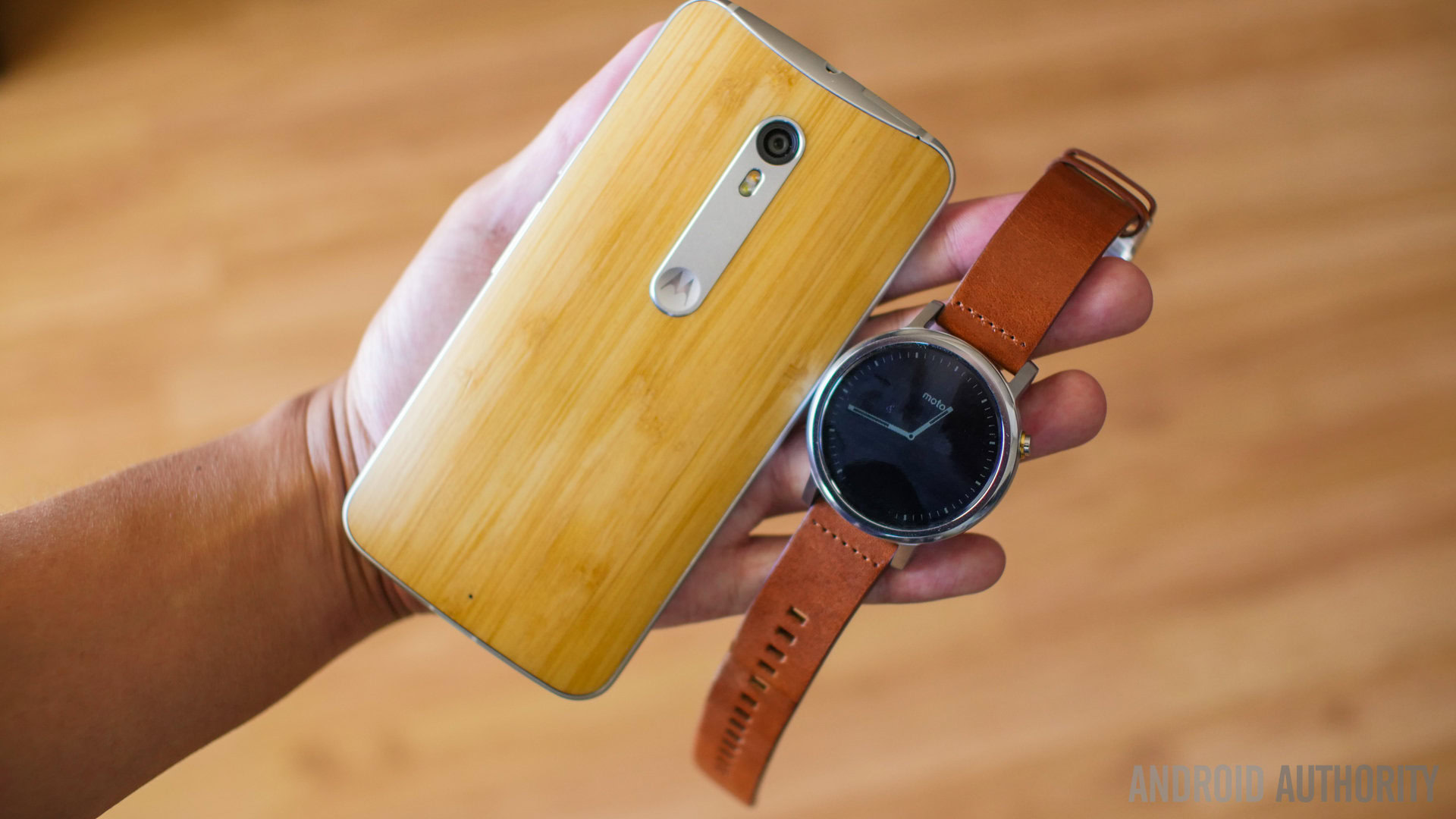
Apart from the availability of Moto Maker, the new Moto 360 has changed quite a bit from the design language of its predecessor, with positive effect. A metallic body can now be finished in a few different colors, and the aluminum bezel can also be given a patterned design, called Micro Knurl, although that will set you back an additional $20. The crown-like button has now moved to the 2 o’ clock position, and has a very solid click to it. Motorola certainly isn’t trying to hide the button either, with it being quite large and obvious, with a lining around it, and the Motorola logo on it.
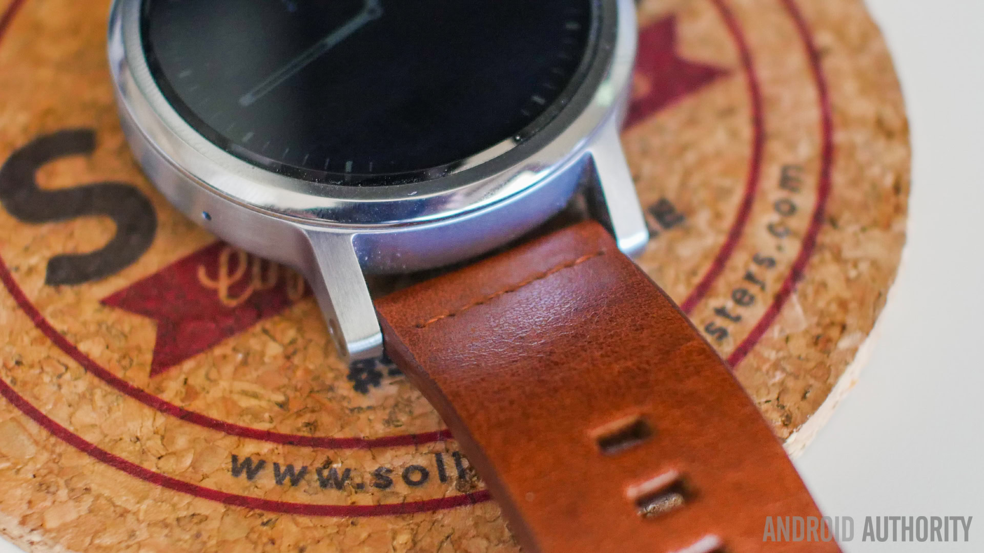
The main design additions are the nubs on the top and bottom, which are a much-appreciated departure from the watchstrap location found with the original Moto 360, and makes it very to easy to switch out the watch straps, especially with the inclusion of the quick release pins. There are also a couple of options available as far as the size is concerned. Seen in this review is the 46 mm version, which can be very big for those with smaller wrists, but a 42 mm iteration is available as well.
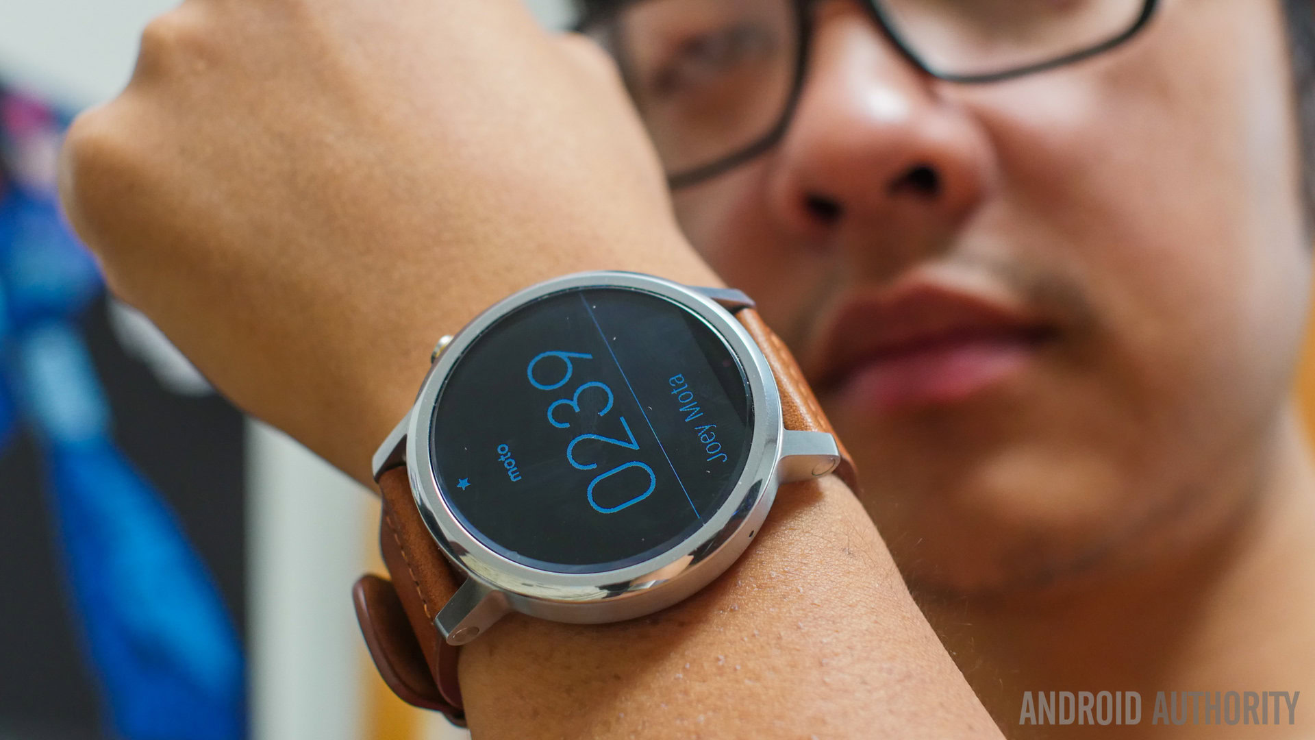
The way the nubs are designed actually add to the overall aesthetic, with their rigid angles fitting in nicely with the large body, which is just over 11 mm thick. This thickness isn’t unsurprising when considering other smartwatches on the market, but Motorola does seem to acknowledge the rather large size, especially of this 46 mm iteration, better than others. Motorola knows that their smartwatch is bulky, and makes every design element reflect that. Industrial might be the best way to describe each and every part, with straight lines everywhere, instead of more curves that others have added for a perception of luxury.
Display
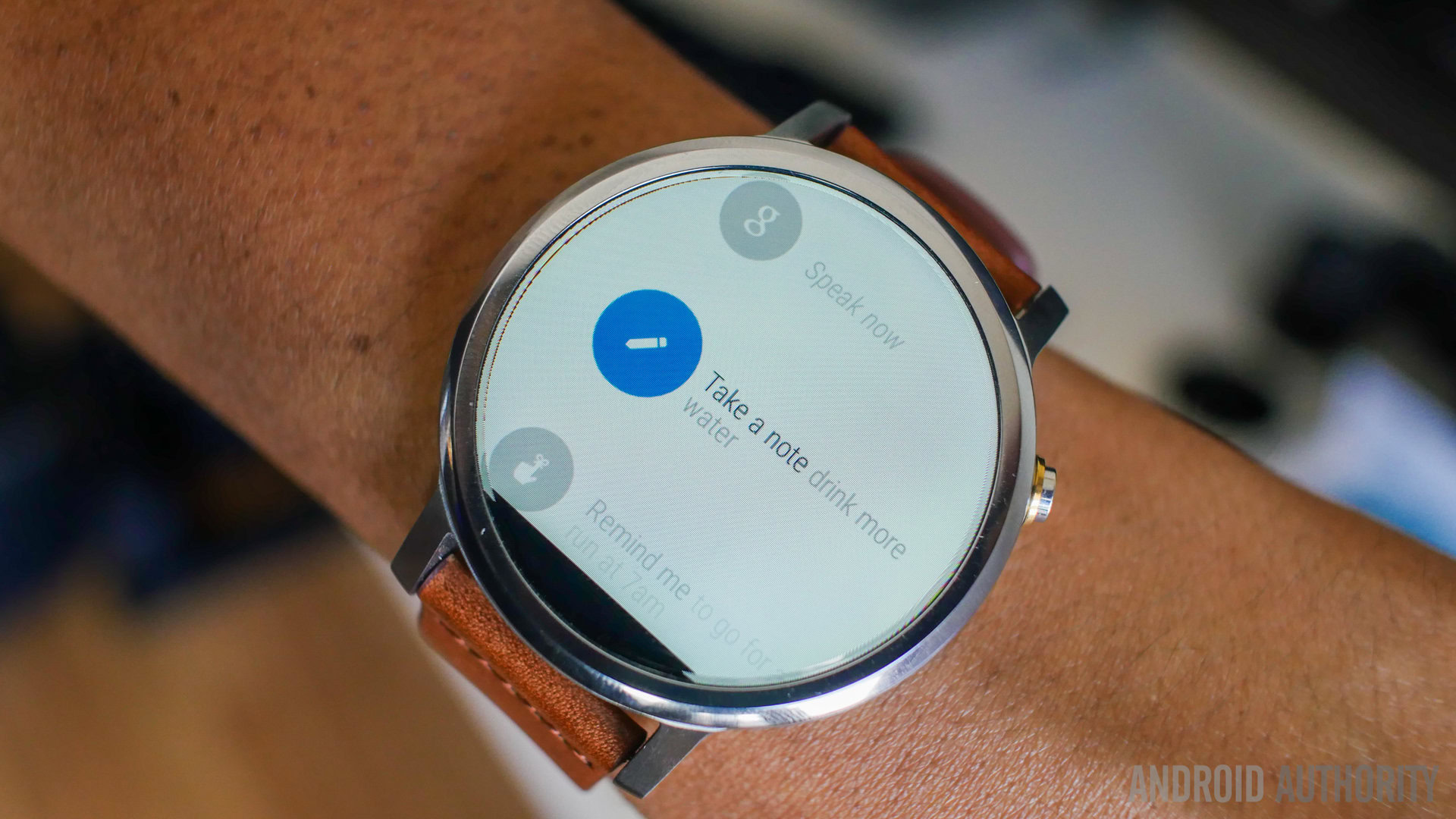
Motorola was the first to bring the round watch face form factor to the Android Wear game, but the company did receive a lot of flak for the inclusion of the infamous “flat tire,” a small portion on the bottom that houses the ambient light sensor. In terms of utility, its presence isn’t as big of an offense as some believe, and now that it returns with the Moto 360 (2nd Gen.), seems to be more like a defining design trait. Motorola continues to justify its existence as the location for the sensor, which provides the benefit of smaller bezels.
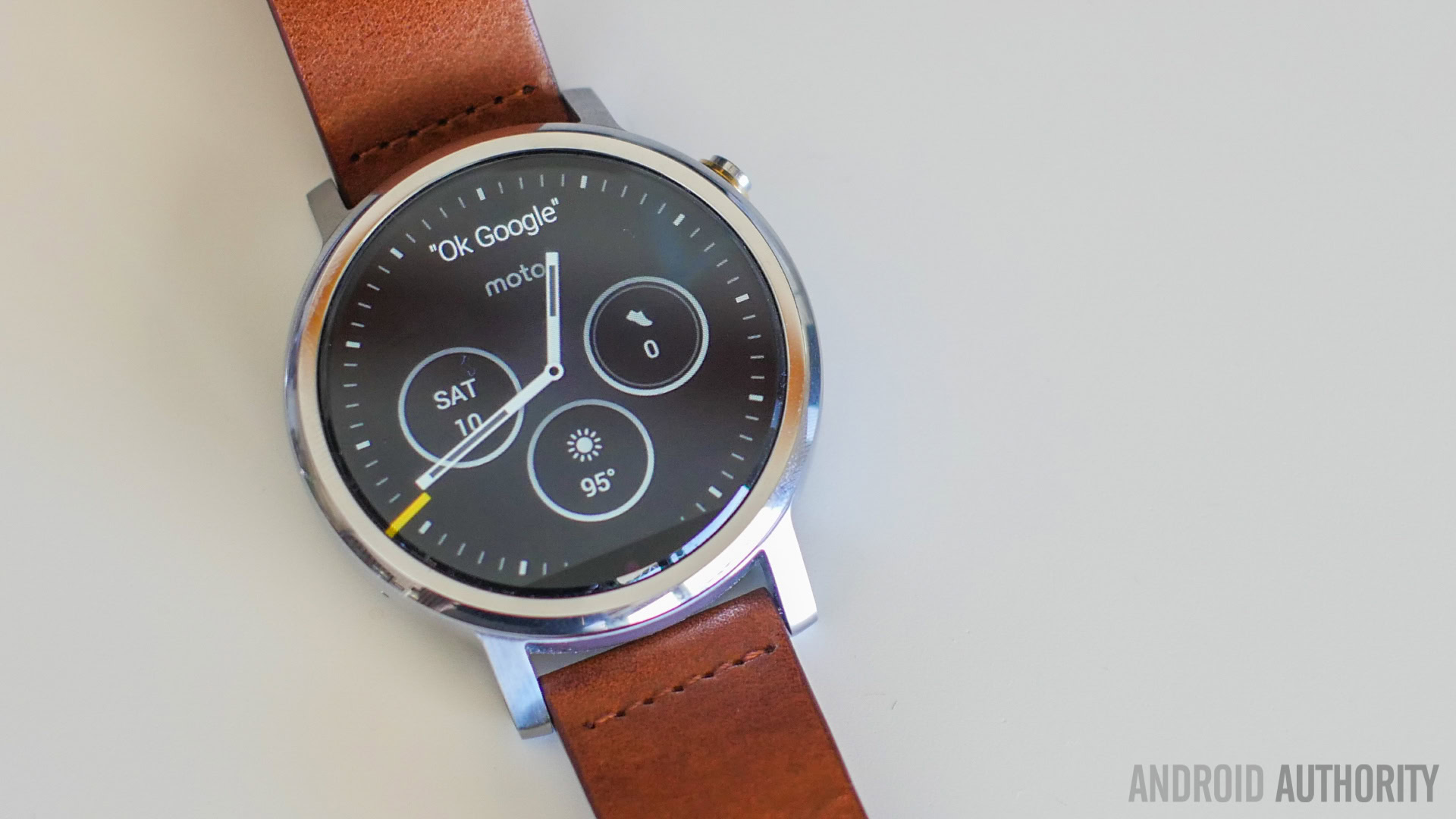
As far as the display itself is concerned, the IPS LCD screen features a 360 x 330 resolution, and is protected by a Corning Gorilla Glass 3 panel. The 46 mm iteration comes with a 1.56-inch display, while the smaller version features a 1.37-inch screen.
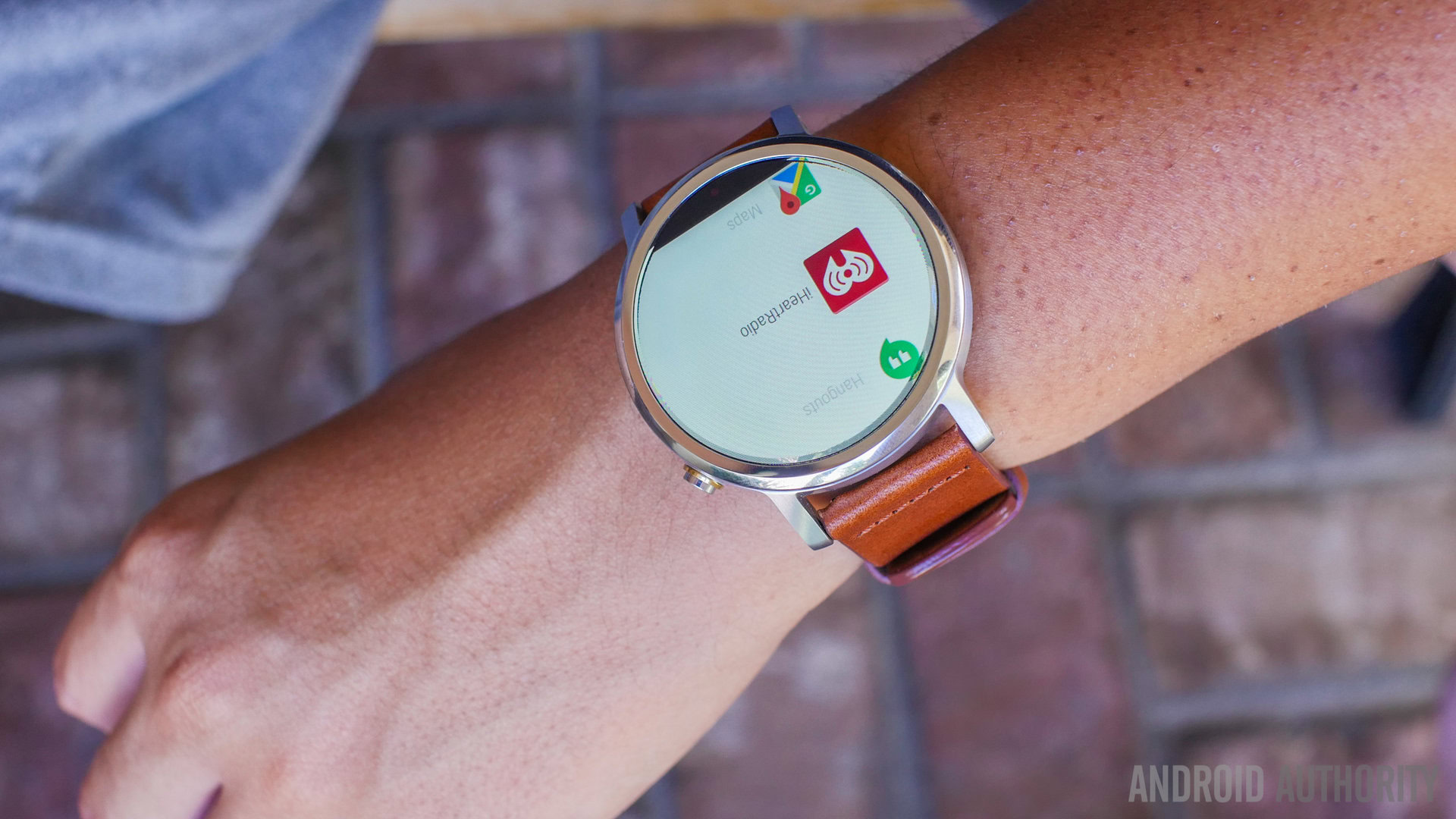
The display performs as well as it should. Daylight viewing is pretty good at the highest brightness settings, and the ambient light sensor means that the user will not have to micromanage the screen. As is the case with any mobile device, the screen can still be a nuisance in dark situations, like in movie theaters, and some input will be required on the user’s part to enable Theater Mode. With it featuring just a slightly higher resolution and resulting pixel density when compared to its predecessor, the display experience isn’t all that different this time around, and for viewing and controlling Android Wear, it continues to get the job done.
Performance
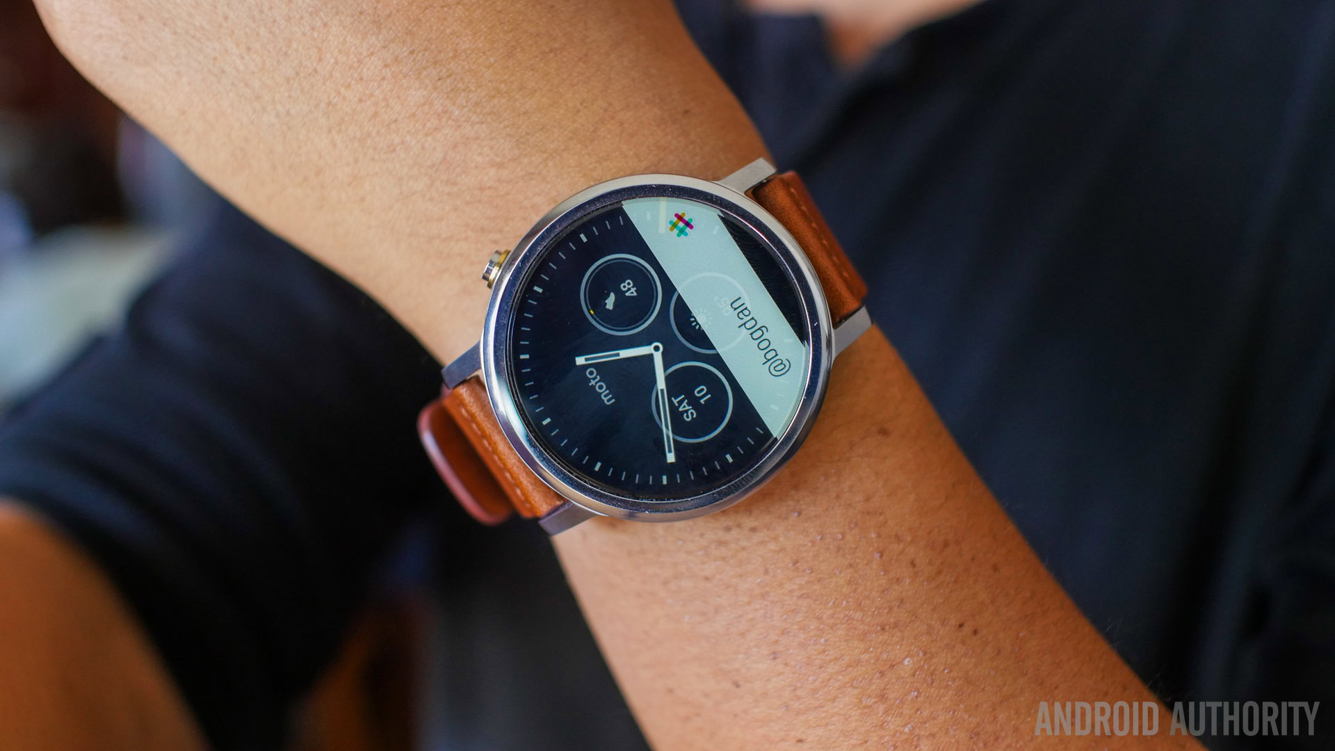
Under the hood is a Qualcomm Snapdragon 400 processor and 512 MB of RAM, and given the fact that this is the de facto processing package for Android Wear, the new Moto 360 won’t let you down as far as performance is concerned. As such, swiping among all of the different notifications and cards were smooth and snappy, and extra input methods are available via companion applications and voice input.
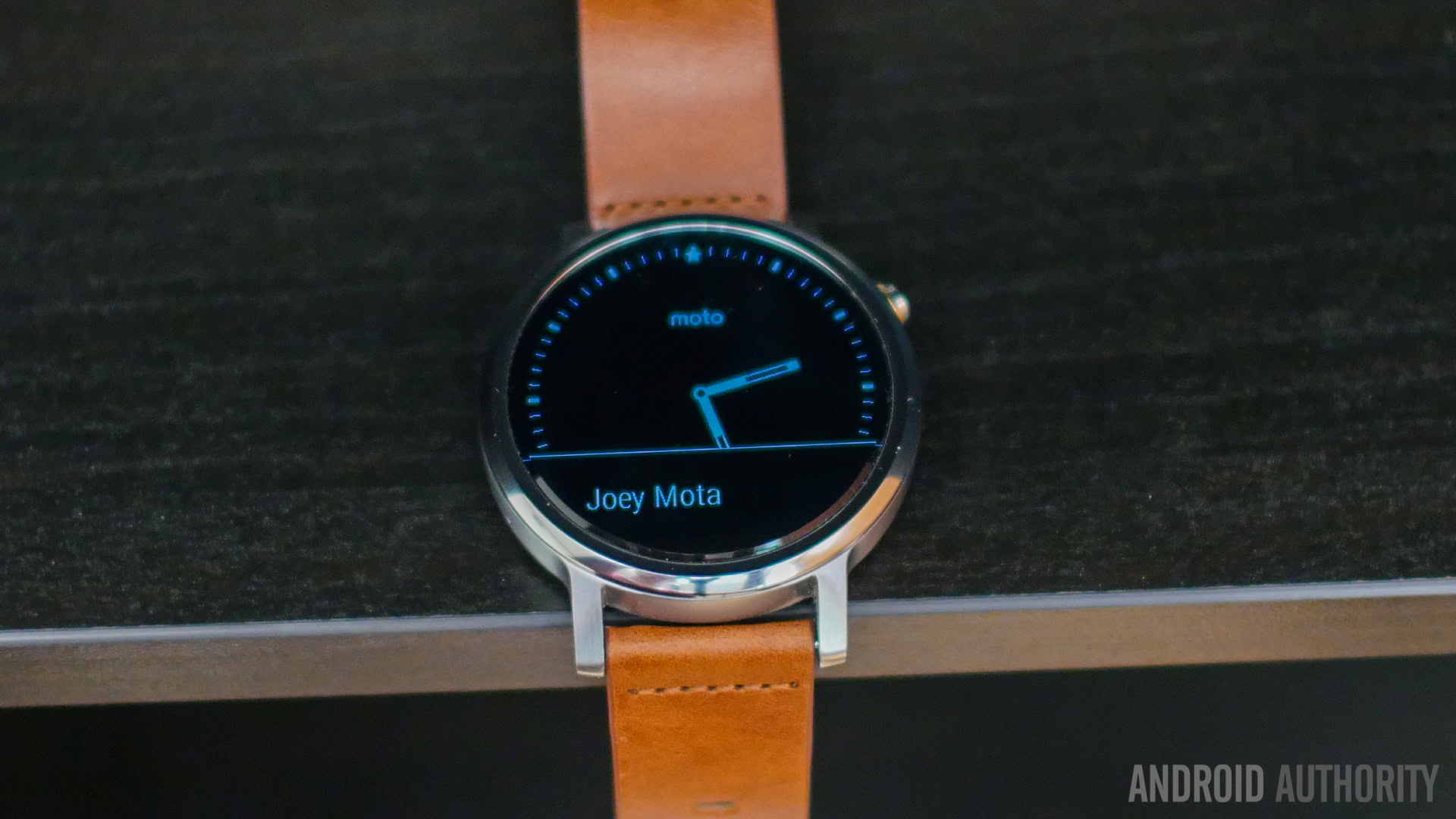
We did have a few issues with getting the watch to recognize our voices with the “OK Google” prompt, which is certainly odd, with the device coming from a company that has been famously good at sound and voice recognition. Granted, these issues are common with other smartwatches when using them in really loud environments, like when driving a car, but we felt that these issues were even more common with the Moto 360 (2nd Gen) than most of its competition. For fitness tracking, Google Fit and Moto Body do try and provide some insight on your step count and lost calories, but these numbers tend to be pretty arbitrary. Then again, with a metallic body and leather or metal strap, this smartwatch might not be an obvious fitness companion anyway.
Hardware
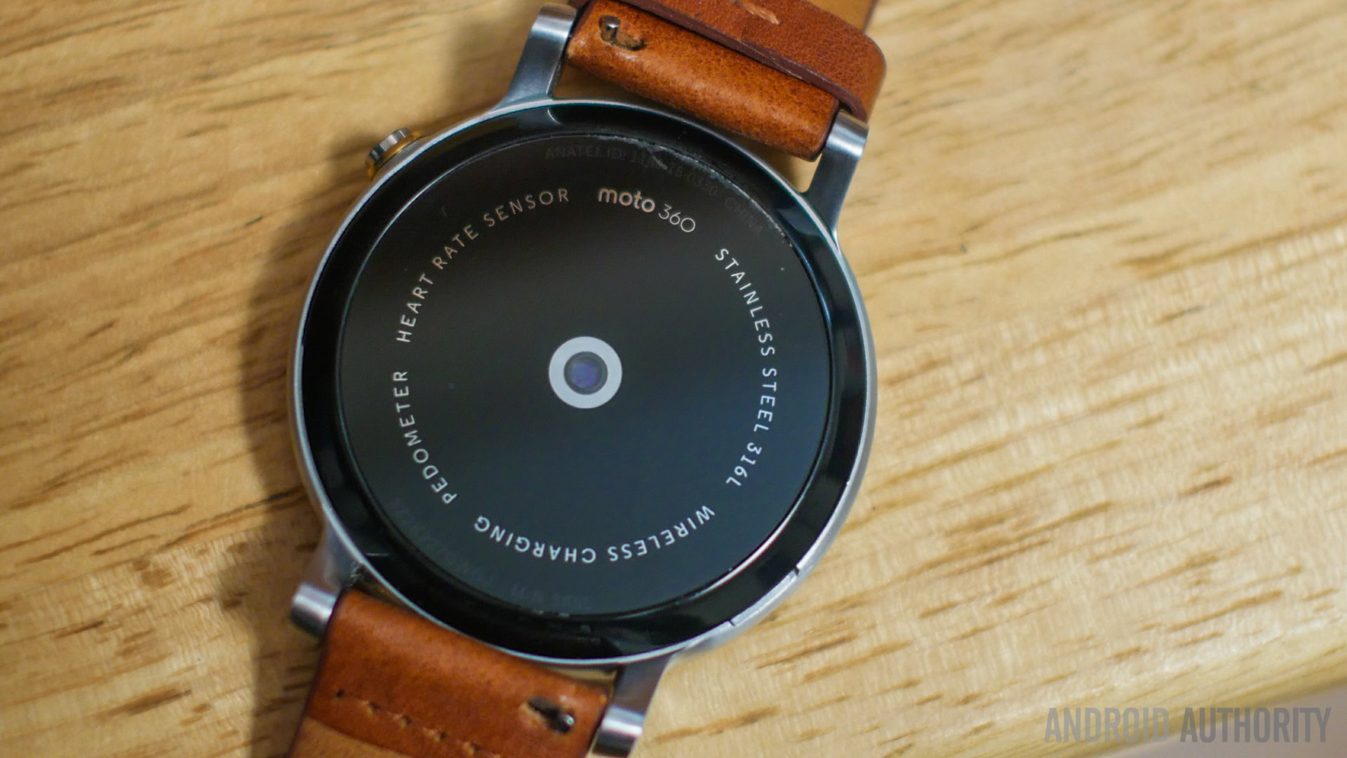
In hardware, we start with the typical heart rate monitor that is available with almost every Android Wear smartwatch out there. In this case, it works well enough for the user that is curious about their current heart rate, and it can be used during workouts to get a little more fitness insight. The Moto 360 (2nd Gen) does come with IP67 certification for resistance against dust and water, but if you decide to go with a leather strap, having one makes this a watch that you will probably be removing before getting into any water-based situations anyway.
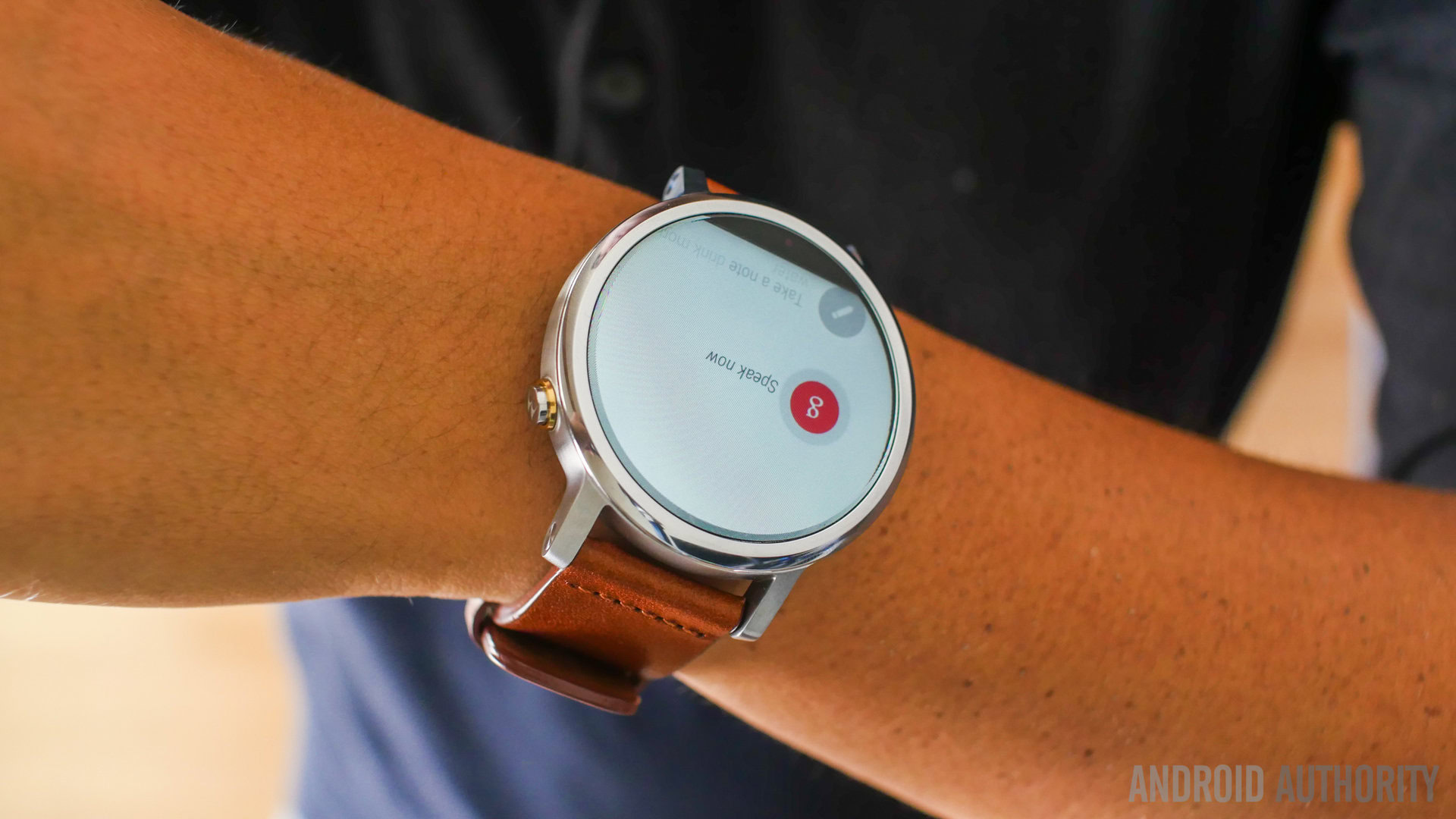
As already mentioned, the performance of the microphone is a little uneven in its performance. It failed to register the voice prompt a noticeable number of times, even when not in a particularly loud environment. It felt like consciously speaking into the microphone hole in the bottom left corner was required, and that little bit of necessary awareness was something that should ideally not be needed.
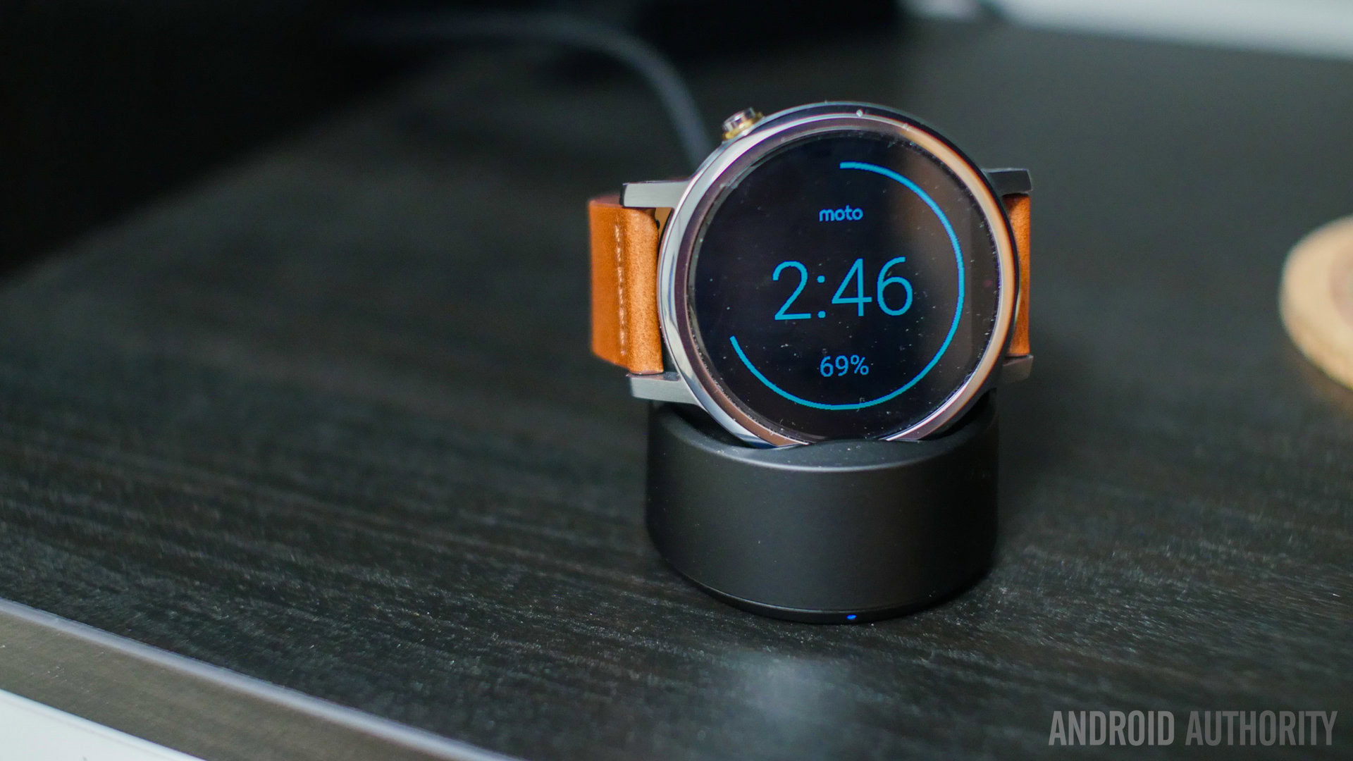
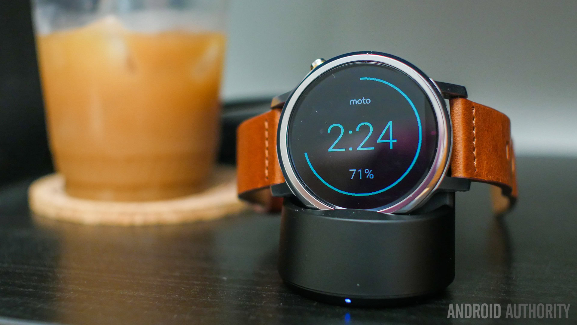
In battery, Motorola brings back their wireless charging dock, that makes the watch a kind of landscape bedside clock while charging, and remains one of the better smartwatch charging implementations out there. The battery gets a small bump to 400 mAh, and the battery life available with the Moto 360 (2nd Gen) is pretty standard. About a full day of use is possible, but it generally won’t go much beyond that. With charging times of around an hour and a half to get to 100 percent, placing the watch on the charger at opportune moments can keep it going easily throughout the day however.
Software
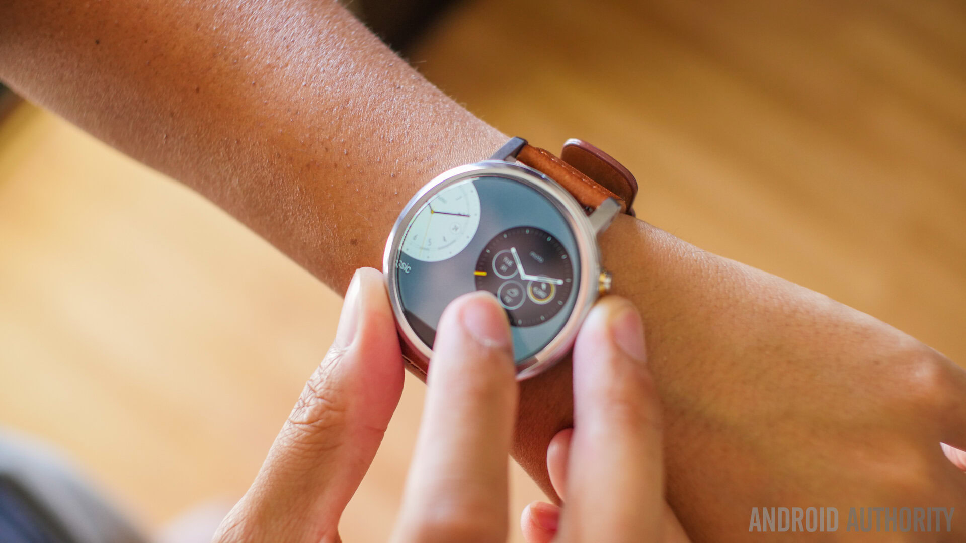
Finally, on the software side of things is Android Wear, which hasn’t changed a whole lot since the original Moto 360. Aside from being a notification machine, with the cards and Google Now suggestions, functionality stays pretty standard across the board. You are essentially just swiping all over the place, and occasionally using your voice to trigger a few functions.
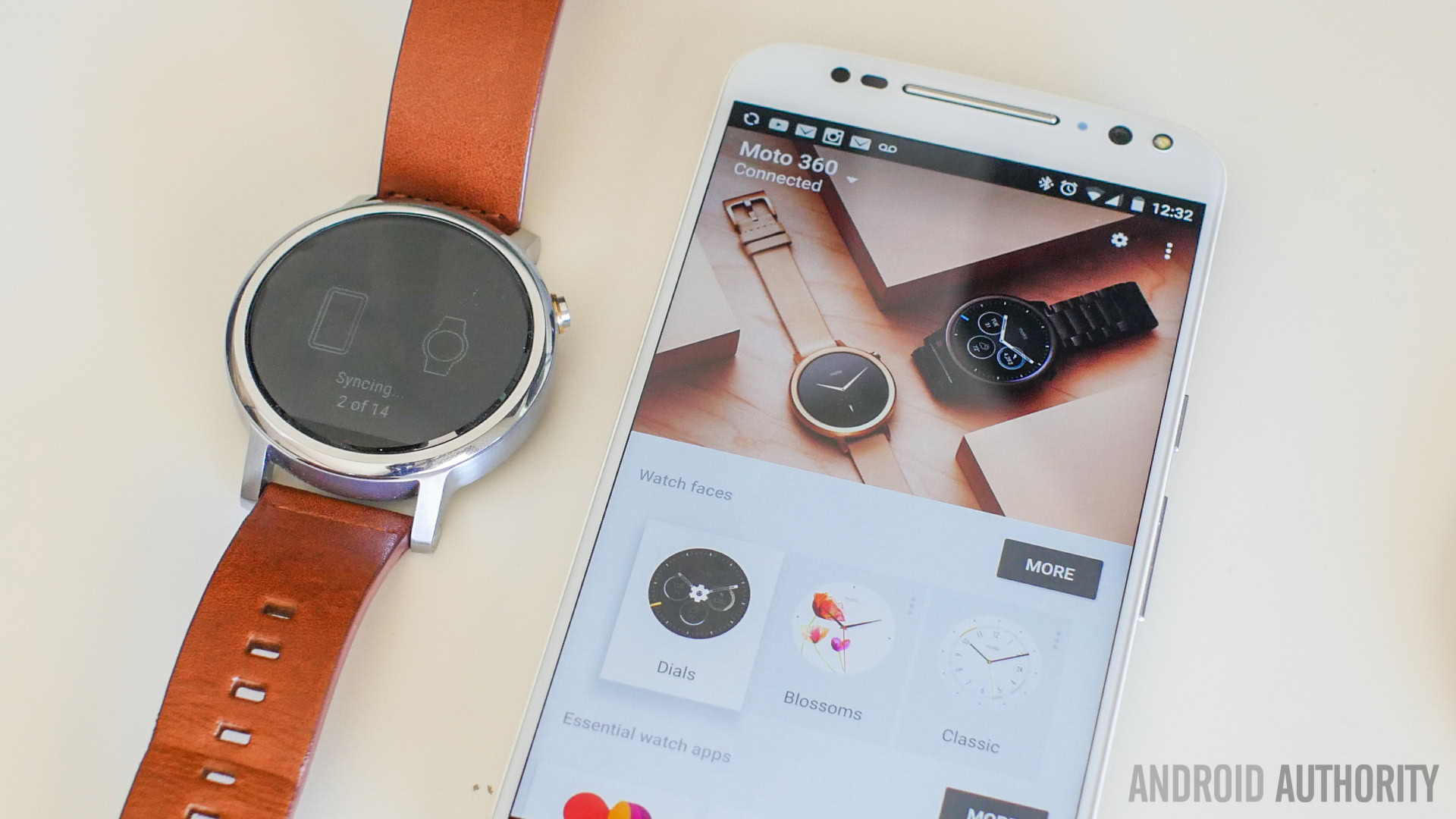
Companion applications can be used when applicable, but as nice as some of them are, it is a small fraction of the overall Android Wear experience. The ability to respond to messages via voice input is always nice to have, but you do have to be wary of outside noise and that might make things difficult. Motorola adds in a number of functions through the companion smartphone app, and also includes customizable watchfaces, but going through the Google Play Store to find even better ways of customizing the experience is certainly the recommended way to go here.
Gallery
Pricing and final thoughts
The price of the base model of the Moto 360 (2nd Gen) is higher that it was with its predecessor, at $299, not including additions like the patterned bezel for $20, the gold body for $30, and metal bands for $50. While the hike in the price point is a bit of a bummer, changes in the overall design of the smartwatch, and the addition of the Moto Maker experience, keep the watch from feeling like a forced acceptance, because you are responsible for how it turns out.
So, there you have it, for this in-depth look at the Moto 360 (2nd Gen)! Overall, the latest smartwatch offering from Motorola is a worthy update to the original, that benefits from the company’s customization system. Its big size may be a concern for some, but a slightly smaller iteration is available for those who want it, and all said and done, this kind of size has become pretty commonplace with smartwatches. Android Wear continues to be as standard as ever, and even with Motorola trying to add some extras, the shell of the device itself feels more important than what it is ultimately presenting. Thankfully, you get more control over that than with most other devices out there, and we think that is the main selling point of the Moto 360 (2nd Gen).