Affiliate links on Android Authority may earn us a commission. Learn more.
7 Years of Samsung Galaxy - from rags to riches
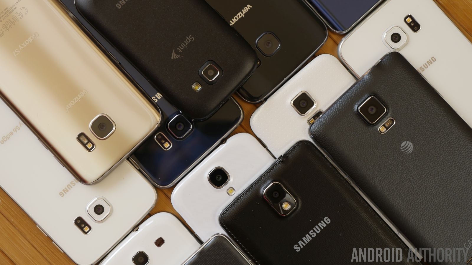
Samsung, they’re the current market leader in the smartphone world. Even as we speak, its latest devices in the Galaxy S7 and Galaxy S7 edge continue to reign supreme – setting the bar extremely high for everyone else. This year’s hit makers are monumental when it comes to designs because they reintroduce water-resistance and memory expansion, which was something that were missed with the S6 line the previous year.
Speaking of designs, Samsung has come a long way from the current design DNA they’ve instilled in its devices. For a good long while there, Samsung wasn’t even regarded as an after-thought when it came to outstanding phone designs. They weren’t. Well, that’s partly attributed to the reputation they established early on in Android’s beginnings, but we can safely say that they’ve evolved tremendously since then.
- Galaxy S7 Review
- Galaxy S7 Edge Review
- LG G5 vs Galaxy S7 vs HTC10
- Camera Shootout: Galaxy S7 vs HTC10 vs vs LG G5 vs Nexus 6P vs iPhone 6S Plus & others
A couple weeks ago, we went down memory lane to reminisce about HTC’s long history with its Android designs, so we thought it’d be a good idea as well to tackle what Samsung has done. So without further ado, here’s a history of Samsung’s Android designs.

2009: The genesis
If we’re to walk down memory lane regarding Samsung’s Android devices, we have to go back to the year 2009, the spring of that year to be exact. In the fall of 2008, Google’s new and competing mobile platform in Android took off with the release of the HTC-made T-Mobile G1 (aka the HTCDream), but Samsung had to wait several months before they unveiled its first Android – the Samsung GT-I7500.
Also known simply as the Samsung Galaxy (no “S” with this one), it heavily borrowed design characteristics from its touchscreen feature phones. It was an all-plastic design with several physical buttons slapped beneath its display, and it really didn’t try to differentiate itself at all from what it currently had in its lineup at the time.
Even later on in the fall of 2009, we saw a similar design with the first Android smartphone to hit the US market commercially – the Samsung Behold II. That phone was particularly more intriguing for the “cube” interface it offered with its Android experience, but apart from that, it wasn’t anywhere as memorable looking as HTC’s first Android.
They did, however, change things up with the introduction of the Samsung Moment, but it only differentiated itself by being slapped with a physical keyboard – a landscape one at that, which some folks regarded as a response to the T-Mobile G1.
During its first year in Android land, Samsung didn’t have anything worth bragging about. You can say that they were rather dull and uninspiring when it comes to designs, but nonetheless, everyone had to start somewhere. For Samsung, though, they just followed the theme from its touchscreen feature and Windows Mobile phones.
2010: Ushering in the Galaxy S
After having some yawn inducing designs for its first crop of Android phones, Samsung went back to the drawing board for 2010. And it’s a good thing they did because by then, Motorola was beginning to rise in the ranks with its original “DROID” release back in the fall of 2009. Samsung didn’t have anything meaningful to compete against it until the spring of 2010, when it announced its revamped flagship line in the first ever Samsung Galaxy S, the GT-I9000 for those of you tracking models.
Visually, the Galaxy S was a totally transformed smartphone from what Sammy pushed out in 2009. Adopting a thinner chassis, one that’s still made out of plastic, the phone was undeniably better looking that its previous efforts, but still lacked the sturdier feel of Moto’s flagship. Many people compared its design to the iPhone (not surprising at all, right?), seeing that it too featured a large touchscreen with a physical home button slapped right beneath it.
While the GT-I9000 was a better-rounded affair for Samsung, especially on the specs side, we eventually saw US-variants of the phone sporting totally different designs. AT&T’s Samsung Captivate was unique looking for its carbon fiber patterned rear cover, Sprint’s ambiguously named Epic 4G featured a slide-out landscape QWERTY keyboard, while T-Mobile and Verizon were pretty faithful respectively with the Vibrant and Fascinate.
These designs were all fresh at the time, far more inviting than its efforts the previous year, but it also told us who was playing the strings behind the scenes. Samsung offered its take on the Galaxy S with the GT-I9000, however, it soon became obvious that they weren’t in total control of how its phones were designed for the US market.
Later in the year, we were greeted with an array of QWERTY sliders – the Samsung Acclaim, Intercept, and Transform. During that time, physical keyboards were all the rage, so it shouldn’t surprise anyone that Samsung capitalized on that. Unfortunately, though, their designs were just more of the same, closer to the line of being viewed as feature phone-esque.
And then came the Samsung Continuum, a phone that’s remembered by its then-different, secondary “ticker” display. Visibly a variant of the Galaxy S from earlier in the year, the overall design of the Continuum didn’t stray too far from the same plastic construction Samsung was putting out time-after-time. Indeed, the ticker display is widely considered as the precursor to today’s edge panel in Sammy’s Galaxy edge devices, but back then, it was seen more as a novelty.
Ending the year, Samsung was granted the permission to build the second ever branded Nexus smartphone – the Google Nexus S. Being given this prestigious opportunity, you’d think that Samsung would’ve treated the phone to an original design, but that didn’t turn out like that. Rather, it was yet another Galaxy S look-a-like with its glossy, all-plastic construction. Yeah, it didn’t live up to the Nexus One’s design, but it’s noteworthy mainly for the curved glass that covered the display.
2011: Establishing an identity
Staying on track, Samsung’s next flagship in the Galaxy S II arrived in early 2011, only to bring along one of this skinniest chassis at the time (8.49 mm). Besides that, it pretty much stayed true to the all-plastic design DNA that Samsung has been exhausting – albeit, the S II was a bit more rectangular looking and wider than its predecessor.
[related_videos title=”Galaxy S3 – S5 in video:” align=”left” type=”custom” videos=”399028,365526,231958,231340,230580,350568″]While Samsung kept of churning out the same plastic designs into other phones in its lineup throughout 2011, we should note that they did manage to experiment. In particular, the Samsung Galaxy Pro B7510 slapped the Android experience into a portrait QWERTY form factor. They didn’t stop with the keyboards either, evident by how Samsung replaced Sharp in making the Sidekick 4G – another Sidekick looking phone that brought along the Android experience. However, they shook things up with the design because rather than going with the unmistakable swivel motion of the keyboard, Sammy opted to employ a simple slide-up mechanism.
One of the more aggressively styled Android phones from Sammy came with the Verizon exclusive in the Droid Charge. It certainly separated itself from the rectangular look of the Galaxy S II from earlier in the year, by featuring a more angular body that produced a subtle point towards the bottom edge of the phone.
Samsung continued to experiment with other designs, even towards the latter portion of 2011, bringing to market the eco-friendly Samsung Replenish. Being eco-friendly and all with its highly recyclable materials, it also packed a portrait style QWERTY keyboard. Its design wasn’t outstanding, nor was the keyboard either, but it just goes to show that Samsung was willing to try things differently.

And boy did they do that with the Samsung DoubleTime! This one was actually a peculiar looking Android phone, as it featured a clamshell design with two touchscreens and a physical landscape keyboard. Still going with the same old plastic chassis, the design intended to favor a younger audience – so yeah, it wasn’t cutting edge or slick looking, but charming enough to entice those youngsters.
Something big shook things up around the middle of 2011. Big is an understatement when you think about how the original Samsung Galaxy Note became one of the first commercially successful “phablets.” The phone introduced a totally new segment in the smartphone landscape, dubbed the phablet, as it bridged a smartphone and compact tablet into one singular smartphone.
[related_videos title=”Galaxy S6 family in video:” align=”right” type=”custom” videos=”637995,634294,624818,623586,597711,595809″]Obviously, the most notable thing about the original Note was the fact that it was ginormous, putting all others to shame in terms of sheer size. Quite frankly, it was a super-sized looking version of the Galaxy S II from earlier in the year, sharing the same design DNA almost to the teeth. However, it also managed to reintroduce and popularize the stylus with its pressure sensitive S Pen.
Hard to believe it, especially given the subdued tone of the Nexus S from the previous year, Samsung was actually given a second opportunity to design the next Nexus. Impressively enough, they delivered the goods with the Samsung Galaxy Nexus, a phone that combined killer specs and a brand new, invigorating design. For starters, it didn’t share a whole lot of the design characteristics of the Galaxy S II, opting instead to have a cleaner finish by not having any sort of capacitive/physical buttons on its façade.
The most important design attribute with the Galaxy Nexus was the so-called Hyper Skin finish found on the back of the phone. It definitely gave the phone a significantly grippier feel in the hand, as opposed to the glossy and slippery feels of its previous efforts. At its core, however, the phone was still comprised mainly out of plastic, but the overall design was a step forward.
Ending the year, the Samsung Galaxy Xcover was one of the company’s first Android powered smartphone to offer a ruggedized construction. Aesthetically, it wasn’t attempting to be just as skinny as its Galaxy S brethren. This one chose to follow a more ruggedized construction with its design by offering an IP67 certification for protection against shock and submersion.
2012: Reaching stardom level
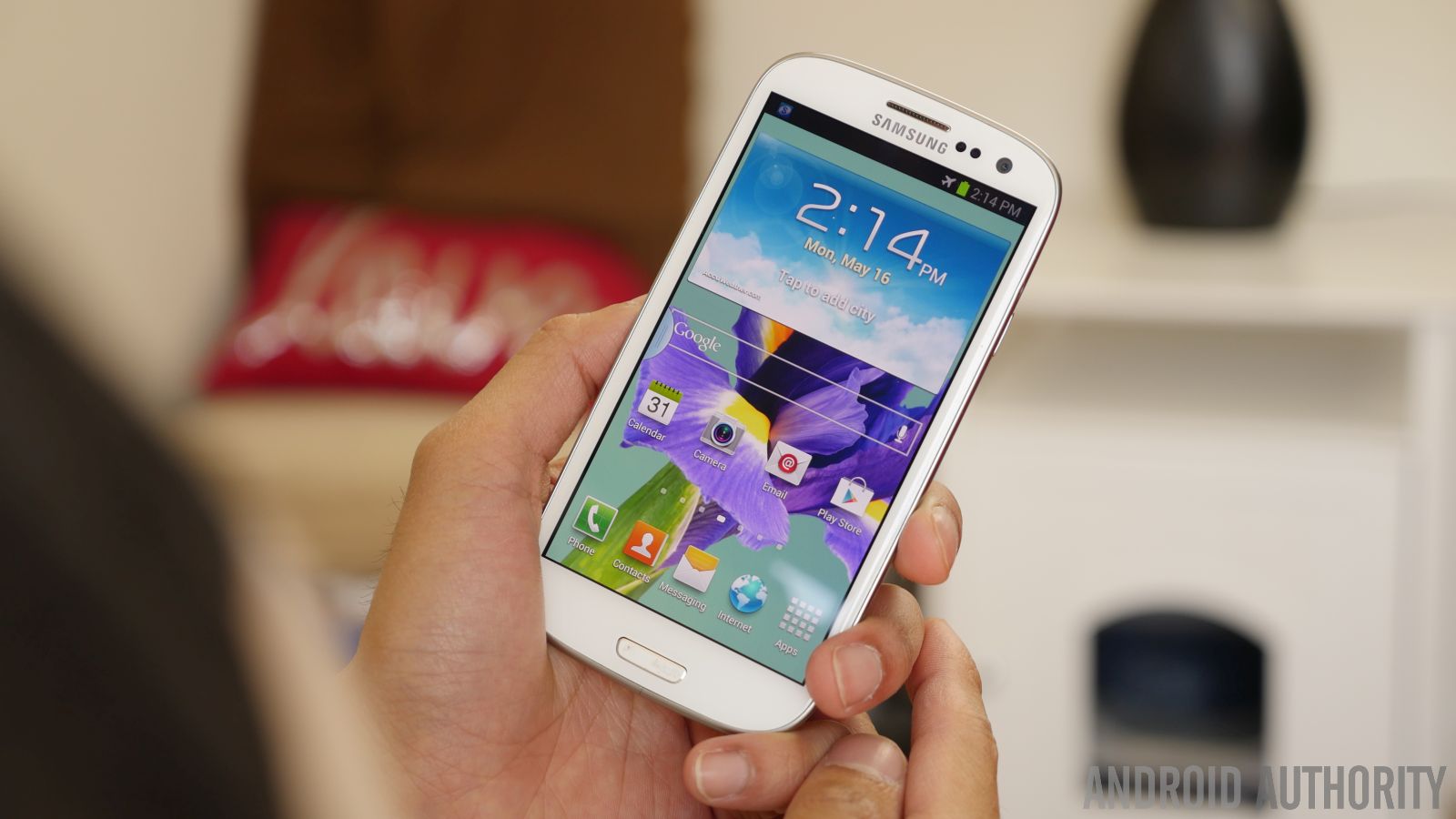
When 2012 arrived, we soon began to see Samsung rising up the charts, becoming a bigger force in the mobile landscape. Things definitely got better for the South Korean company with the arrival of its latest flagship, the Samsung Galaxy S III. For this third-generation iteration, the company forged a new design that brought on several tweaks to differentiate itself from its predecessor. And unlike the past two flagships, Samsung stuck with one consistent design – whereas carrier versions of the previous flagships saw different designs.
[related_videos title=”Galaxy S7 in video:” align=”left” type=”custom” videos=”692556,690300,690754,690098,679646,679576,676937″]The rounded corners of the Galaxy S III gave it a friendlier look, one that was noted by Samsung to be inspired by nature. That thought extended to the chassis, which shows its inspiration with its pebble-esque shape. Despite the inspiration from nature, the Galaxy S III’s foundation was still polycarbonate plastic, which didn’t scream premium in comparison to the stuff Motorola and HTCwere emphasizing in its competing devices. In trying to make the plastic construction fancy (or premium if you want to look it that way), they coined the term “hyperglaze” for the extensive glossy appearance of the plastic finish.
At this point, this is also the time when we started to see Samsung taking on a steady routine with its device portfolio rollout. After a successful launch with the Galaxy S III in the spring, they decided to save its new Galaxy Note successor for the fall. The Samsung Galaxy Note II, much like its predecessor, was most notable for its sheer size – one that was bigger than most phones, but only a smidgen larger than the original Note.
Considering that it featured a larger 5.5-inch screen, it was nice to see that Samsung kept the Note II’s size manageable. Besides that, there wasn’t much to its design, which so happened to follow in similar premise to the Galaxy S III. That meant coming along with a narrower home button, slightly rounded edges, and good old polycarbonate for its chassis.
2013: Sticking to the same formula
So, 2012 didn’t pan out to be much of a year for notable designs from Samsung. You’d think they would step things up by now, right? Well, that’s hardly the case mainly because they started getting into a groove that seemed impossible to break out of.
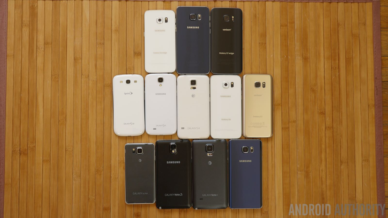
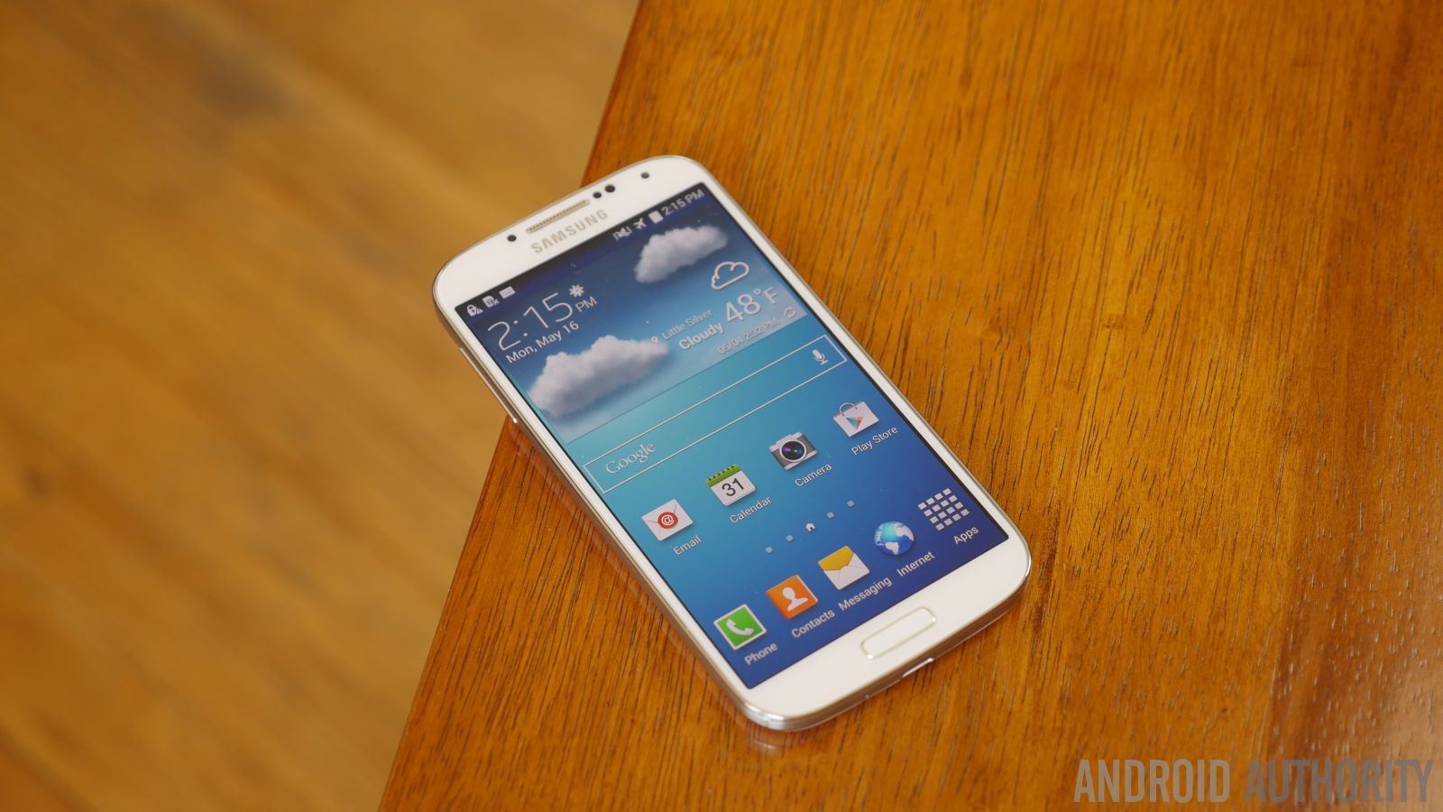
That was evident enough when the Samsung Galaxy S4 came roaring onto the scene in 2013, cementing Samsung’s status as the elite smartphone maker in the world. From a design aspect, there really wasn’t much to be flattered about by this flagship, especially when you look at what HTCreleased then with the One (M7). Most people in fact would have a tough time telling apart the S4 from the S III, but it’s most remarkable for the amount of features they were able to cram into the phone.
In addition to the various sensors they introduced, like the ones used to work in conjunction with its various Air View gestures, the S4 popularized the IR blaster once again – enabling it to double as a handy universal remote. Moreover, it had other sensors that allowed it to track eye movement for vertical scrolling within the web browser. At the core of it all, though, the phone’s design was a bit underwhelming, as it kept to the format of being plastic-based.
Not long after the Galaxy S4, the company released its ruggedized sibling in the Galaxy S4 Active. This became the start of yet another new line for Samsung, as they opted not to pursue the Xcover any further. Its main distinction, of course, was the fact that it featured a more ruggedized design to meet the IP67 certification standard. It wasn’t slick looking or anything like that, but its beefier size and tougher housing meant it could withstand more punishment than the fragile S4.
Going beyond the Note, Samsung chose to go after an even larger form factor with the Samsung Galaxy Mega. Now, if the Note was deemed too big for you, then the Galaxy Mega was clearly not something you would’ve gone after. While the phone itself was obnoxiously large by being endowed with a massive 6.3-inch display, its design once again mainly borrowed from the Galaxy S4.
Another interesting design from the Korean company came with the Samsung Galaxy S4 Zoom. This was regarded as a phone-camera hybrid because of the camera stuffed into its body. Yet again, the S4 Zoom employs the same typical, by now boring design DNA that Samsung has tirelessly used. This one, however, was rather chunky in thickness for a Samsung-made Android, but it was necessary to accommodate the 16-megapixel 1/2.33” BSI-CMOS sensor with 10x optical zoom.
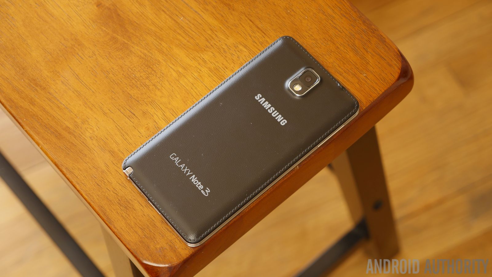
Following on its traditional release period, the third-generation Note, the Galaxy Note 3, came to fruition in the fall of 2013. Always pushing the boundary with “phablets,” the Note 3 turned out to feature a larger screen than its predecessor – a 5.7-inch 1080p Super AMOLED display. However, this is where things get interesting because of Sammy’s decision to give it a sophisticated look. The outline of the phone might’ve followed after the Galaxy S4, but turning it around revealed a stitching pattern that outlined the edges of the faux leather rear cover.
It’s subtle, but nevertheless one that’s different from the norm for Samsung. Foundationally, it’s still a mostly plastic constructed smartphone, but the addition of this stitching, along with being complemented by a faux-metal trim bezel, definitely gave the Note 3 that business-esque look and feel.
2014: The Awakening
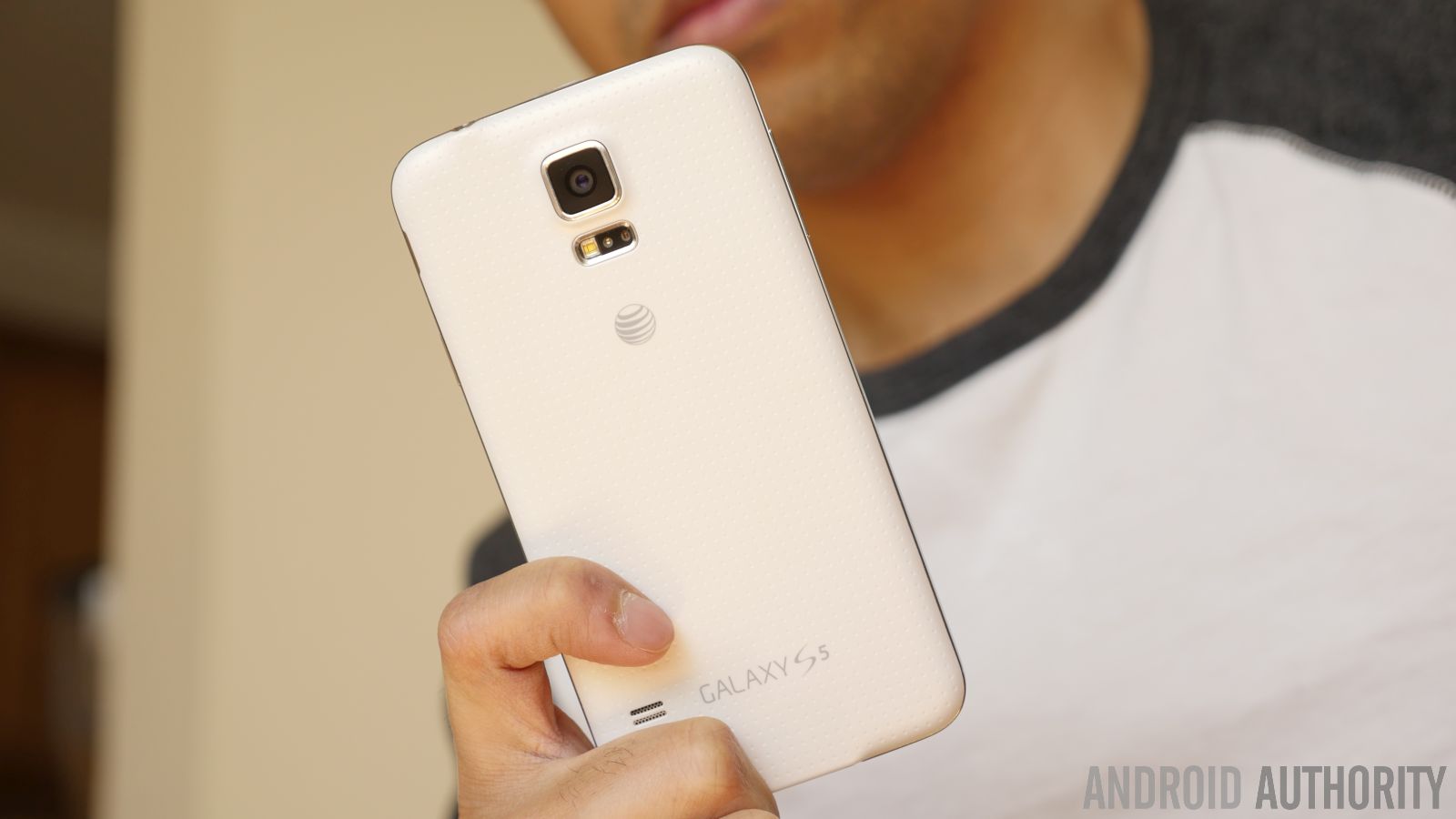
Another major design change came with the announcement of the Samsung Galaxy S5. Going with the same familiar appearance for the most part, the biggest addition to the design was a water-resistant construction – an IP67 certification specifically. Even though it’s still constructed primarily plastic, which was the only way for them to add that water-resistant construction at the time, it wasn’t as slippery as previous Galaxy S smartphone because of the dimpled pattern design of its rear cover.
Even more impressive, the Galaxy S5 was just a monster of a high-end phone packed with an exorbitant set of features. No doubt, the water-resistant construction is commendable on its own, but when you consider that it also housed an IR blaster, heart rate sensor, and fingerprint sensor, it seemingly put other competing smartphones to shame. Despite the variety of goodies in tow with its package, the design was still nothing to gloat about that much.
Over the course of 2014, Samsung was on a stampede by continuing to roll out successive smartphones in its portfolio. The Samsung Galaxy K Zoom with its camera-centric capabilities, the Samsung Galaxy S5 Active/Sport and its more ruggedized design, and Galaxy S5 mini were all variations of Samsung’s flagship.
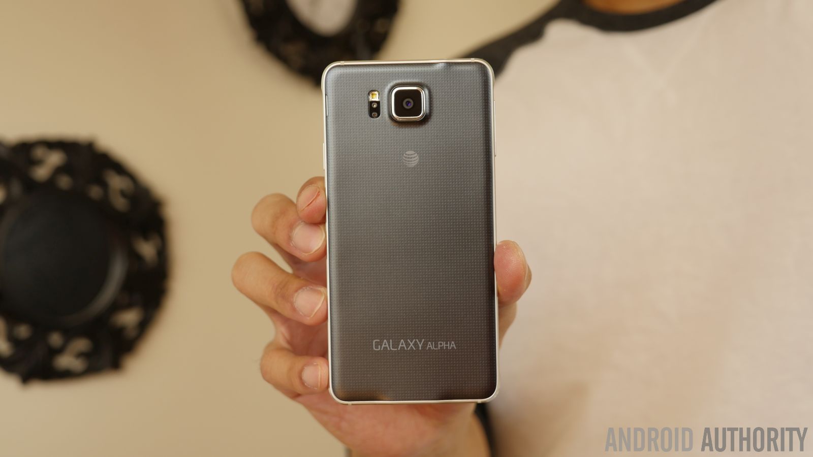
And then came the smartphone that totally changed everything for Samsung; the Galaxy Alpha. This compact sized phone is a hallmark device in the company’s history, shedding the all-plastic construction that Samsung had tirelessly exhausted since the beginning. With the Galaxy Alpha, the phone radiated with an indulging glow like no other before it in Sammy’s stable.
It clearly was a dramatic design change, one that felt like a premium smartphone for a change. Although, it wasn’t without its own set of compromises – such as the lack of a water-resistant construction and IR blaster. For some, the tradeoffs were tangible by placing more emphasis on its different design language. At the time, it was without question the best designed phone out of Samsung’s camp.
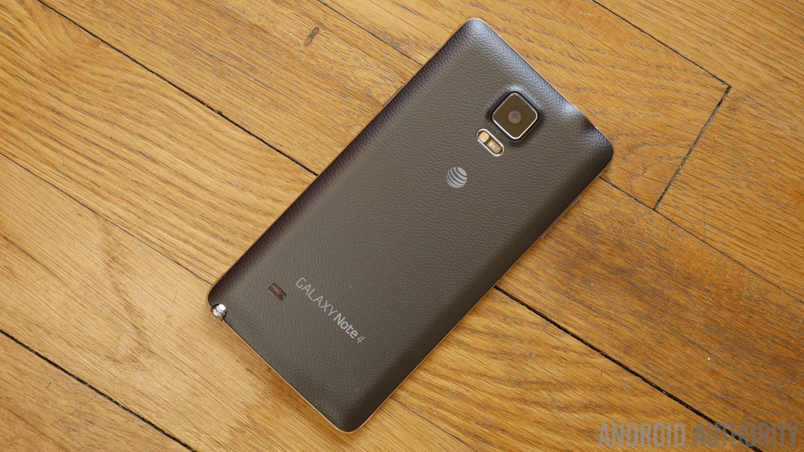
Following up after the alluring Galaxy Alpha, Samsung made sure to keep to the new theme by giving the Samsung Galaxy Note 4 the same treatment. To be fair, though, the Note 3 did offer a degree of sophistication, but the Note 4 upped that with the introduction of a real, shiny metal trim bezel. Complementing that, the Note 4 continued with the faux leather casing on the rear.
And if that wasn’t enough, Samsung also introduced the Galaxy Note Edge alongside the regular Note 4. As its name implies, its main distinction is the curved edge screen along its right edge, which definitely gave it a unique look. Most of the features were no different with the Note Edge, but it definitely was greeted to a slew of edge related functions that came with the interface – such as being able to display notification, apps shortcut, and much more.
2015: Going for premium
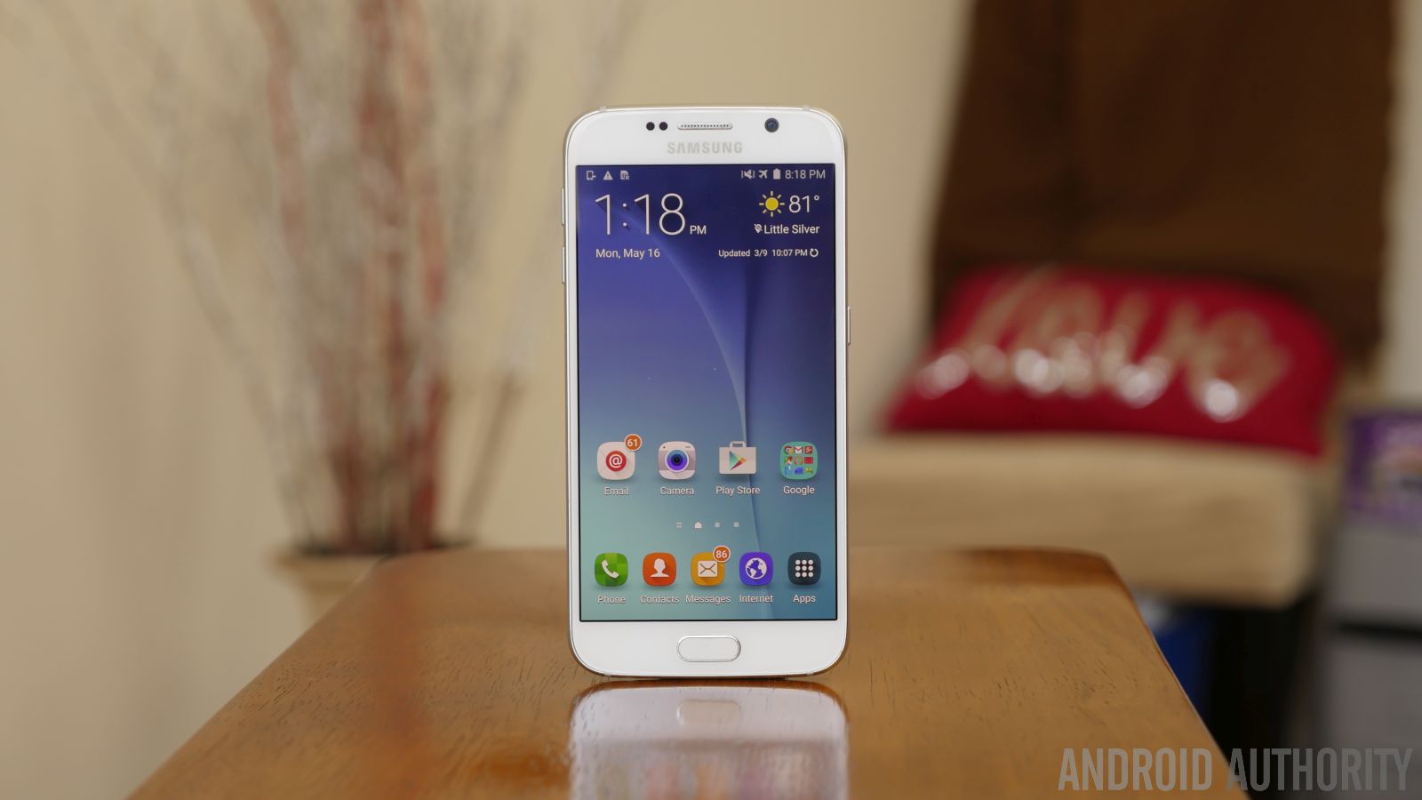
Finally, Samsung went back to the drawing board with its sixth-generation flagship in the Galaxy S series. For the Galaxy S6 series, which broke down to the standard S6 variety and the new Galaxy S6 edge, they decided to ditch plastic entirely – opting instead to go with glass and metal. You could say that the S6 line looked alien, given that it didn’t look like anything previously put out by the company.
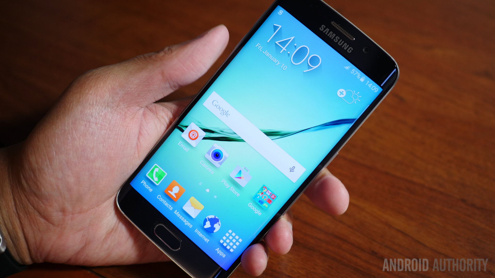
Between the two smartphones, the S6 edge received praised for how it looked slicker with its dual-curved edges. Holding either phone in the hand, most people familiar with the flagship line were thrown off by the new metal and glass construction. Frankly, the phones screamed premium everywhere, but they did have their own compromises. For one, the water-resistant construction was omitted, as well as expandable storage.
Some folks were a bit disappointed by this, especially considering Sony had been making water-resistant phones with expandable storage for some time, but regardless, the outcome was still largely positive for Samsung.
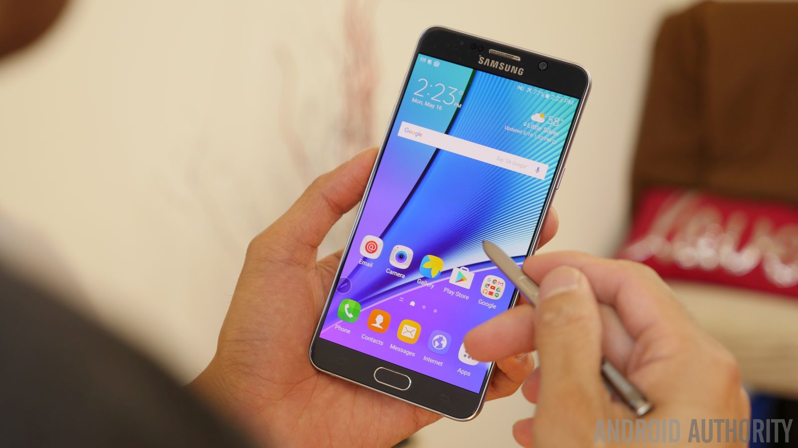
Once fall came around, the Samsung Galaxy Note 5 and Galaxy S6 edge+ both made their appearances to the public. Goliath in structure due to their phablet attachment, these two larger than life phones systematically employed Samsung’s new design language. They really weren’t all that different from the standard S6 line, apart for their massive sizes, but the Note 5 specifically featured rounded edges along the back that made it feel much more ergonomic in the hand.
2016: Listening and tweaking
All of this leads us to where we’re at now! The Samsung Galaxy S7 and Galaxy S7 edge have both launched, bringing along the same, but slightly tweaked premium design language that’s now Samsung’s DNA. Always the one to please folks, Samsung listened to some of the criticism that came with the S6 line’s revamped design the previous year, by bringing back water-resistance and expandable storage. The phones are absolutely gorgeous, but they’re made better by their strong overall performances and rich features.
What do you think of Samsung’s Android design history and what does the future hold for the Galaxy family? Is metal and glass around for the foreseeable future and if not, what do you think Samsung could do to tweak its line further? Let us know your views in the comments below!