Affiliate links on Android Authority may earn us a commission. Learn more.
App review: LinkedIn gets major overhaul

What’s the first thing that comes to mind when I say “social network for professionals”? Most people will instantly think of LinkedIn, but it has been a while since their app hasn’t looked very… professional.
In fact, the mobile app has looked quite outdated and unintuitive compared to modern efforts from other networks for a while now. But LinkedIn plans to close the year with a flourish by remodeling its application from the ground up. The team has been hard at work and the new design has just rolled out globally.
The real question is: did they succeed at creating a well-designed, modern app that harnesses the power of LinkedIn’s 396 million members? Continue reading to find out.
Design and UI
This will obviously be where the main changes rest. It is a redesign, after all. But the nature of today’s changes make this more than a simple change in looks. We will start by talking about the aesthetics, though.
There are obvious differences between the new and old versions of the LinkedIn app. You will notice that the new application is much more colorful, dynamic and light. LinkedIn got rid of the dull black and darker blue hues, introducing a color palette that offers a much more colorful and modern feeling.
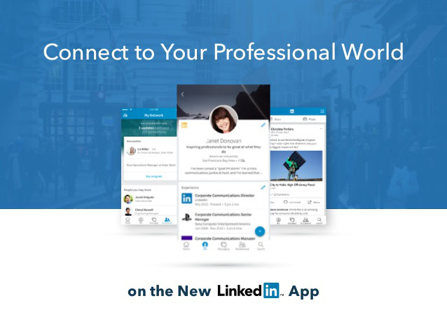
I would almost go as far as saying it has a touch of youthfulness, but in a very subtle, elegant way. The colors still look professional, playing with brighter blue and white tones that are very easy on the eye. And yes, the black colors are gone, something that makes the app look much less heavy.
Do you remember those old, ugly buttons that seem to be from 2013? Well, they were from that year, and those are gone too. The app has adopted an icon design that is simplified and is more in line with Google’s Material Design guidelines. They are flatter and much more minimalist. And what’s best is that they are prevalent throughout the app, not lost in a labyrinth of content.
Everything now seems to be within a couple taps away, something that will definitely make dealing with your professional contacts simpler than ever. We can mostly thank this to the sections LinkedIn has decided to put in what we will call the tab bar (the row on of icons on top).
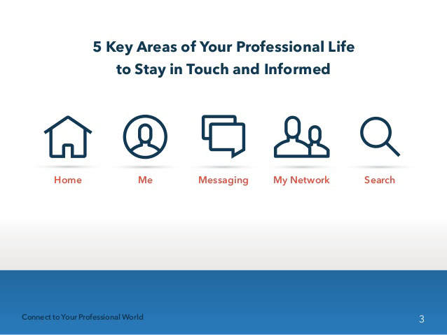
The 5 “core areas”
These tabs keep all your content, information and options within a touch or two away. It’s also a great way for LinkedIn to successfully organize the app by sections, which include 5 “core areas”: Feed, Me, My Network, Messaging and Search.
Pretty simple, right? Let’s go through them and tell you a bit about them, as well as what new features they bring to the table.
Your Feed
This is where all your public social activity is going on. In here you will find all of your contact’s posts, as well as any content relevant to your interests and professional field. What’s new here is that LinkedIn now gives you a certain control over what you want to see in your feed. Over time, you can select what you like and don’t like here, something which will allow LinkedIn to more intelligently choose the posts displayed. In addition, a couple buttons for sharing posts and photos have been included.
Me
This is pretty much where you go to polish your profile and deal with all things related to your personal activity. From here you can edit your profile, look at your account settings, see who has been viewing you, see recent comments and more.
Messaging
Emails can get clogged and cluttered. At least that is what LinkedIn believes. This messaging section offers a much more casual and simple way to communicate with your professional contacts. It works as expected, and even includes a floating action button to begin new threads. Simple and clean!
My Network
This is where a lot of the magic happens. The My Network section keeps you updated on things that go beyond posts. Did someone get a promotion? Did they celebrate a birthday? Maybe you have a meeting with one of your contacts. LinkedIn will remind you through here. The network will even recommend people you may know.
Search
LinkedIn is very proud of its new Search section, and for good reason. It’s said to be 300% faster and much smarter. It benefits by finding results as you type, so you don’t even need to press enter (or finish the search query) before what you are looking for shows up before your eyes.
LinkedIn Apps
There is also a LinkedIn Apps section that offers shortcuts to other apps from the company. These include Job Search, Pulse, SlideShare, Lynda and Lookup.
Conclusion
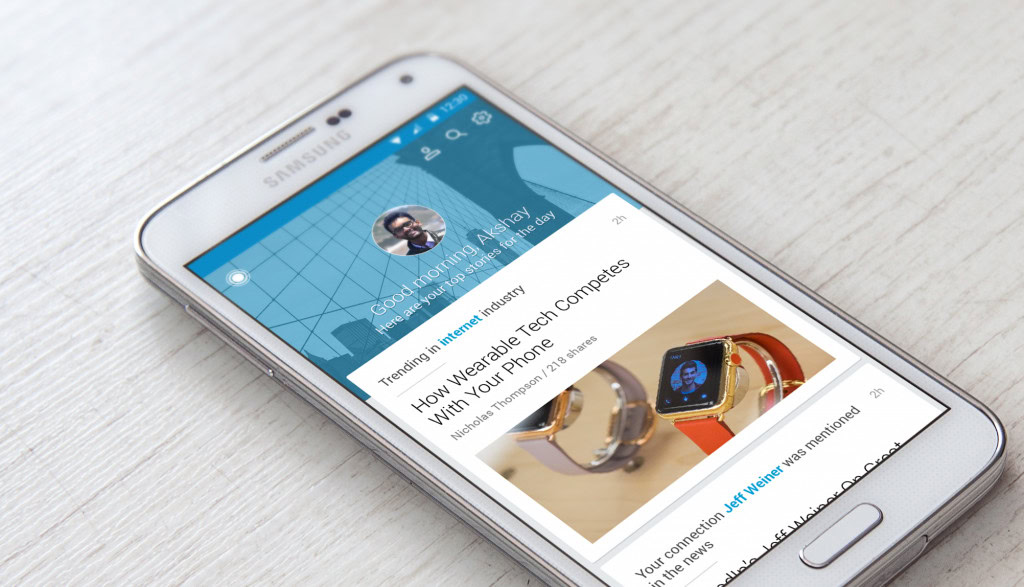
Though some say this app looks much like Facebook‘s, I have to say LinkedIn probably did a slightly better job. It helps that this social network is much simpler, but I do believe the application redesign is also a success.
The main thing to assess is whether the app is intuitive or not. Is everything where you would expect it to be? How much did you have to think about finding where something is located? I found that I pretty much already knew how to use this app. Everything is in plain view, bright and colorful.

The app even integrates swiping from side to side, as well as sliding content away from the screen, giving it a much needed dynamic touch the previous app iteration lacked. So yes, the app is very intuitive, and it also helps that it’s pretty good-looking.
Is it perfect? Nothing is. I will complain about that Settings button, which I do believe should have been more consistent throughout the app. In fact, it should have gotten its own icon in the top row, instead of being hidden in the Me section. Otherwise, I do believe LinkedIn took the right steps to provide a pleasant experience and take its networks where it needs to go. This update is big, and I am loving it.
Check out other great app-related coverage at AA:
But check it out for yourself and hit the comments to let us know what you think! Do you agree with me, or are you less excited about the redesigned app?