Affiliate links on Android Authority may earn us a commission. Learn more.
Google+ gets a Material refresh animation and updated Community page view in new update

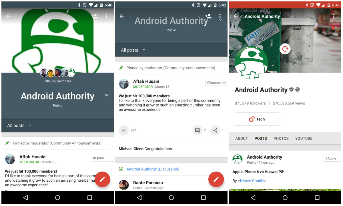
A new update to the Google+ Android app is rolling out now, bringing a few user interface tweaks to our favorite social networking app. For folks who are members of a Google+ Community, you’ll quickly notice that the page layout is much different. Instead of showing a small white banner with the Community title on the top of the screen, you’ll now see a much larger Community title, complete with a big banner image and a sleek gray/blue color. While these UI changes are nice, the big banner images displayed on the top are very pixelated in this update.
Side note: Want to join the Android Authority Google+ Community? Head here!
The last change we’re seeing in this update is the addition of a Material Design refresh animation. When Google updated the app with its Material Design guidelines a few months ago, pulling to refresh a page would result in a colorful loading bar scrolling across the top of the screen. Thankfully Google is now adopting its own guidelines and has done away with the loading bar. The Material refresh animation can be found in the third screenshot attached above.
The update to version 5.3 is rolling out now in the Play Store, so check out the link below if you haven’t updated yet. If you’d rather sideload the APK, you can do so by following this link.
