Affiliate links on Android Authority may earn us a commission. Learn more.
WhatsApp could give some more love to its Stories feature

- WhatsApp could be working on improving its Stories landing page with larger previews.
- The Updates tab could house a horizontally scrolling list of Stories, providing a preview of the first unseen story from a user.
- This change could arrive in a future version of WhatsApp.
WhatsApp continues to be the premier instant messenger choice for many users worldwide. While it works very well as an IM app, the service has ambitions that go beyond just pure texting needs. Most IM apps these days want to build a community on their platform, and they adopt features like stories and channels to get texters more engaged and spend more time on the app. WhatsApp could be revisiting how it presents its Stories feature to users, making it easier for them to learn more from just a glance.
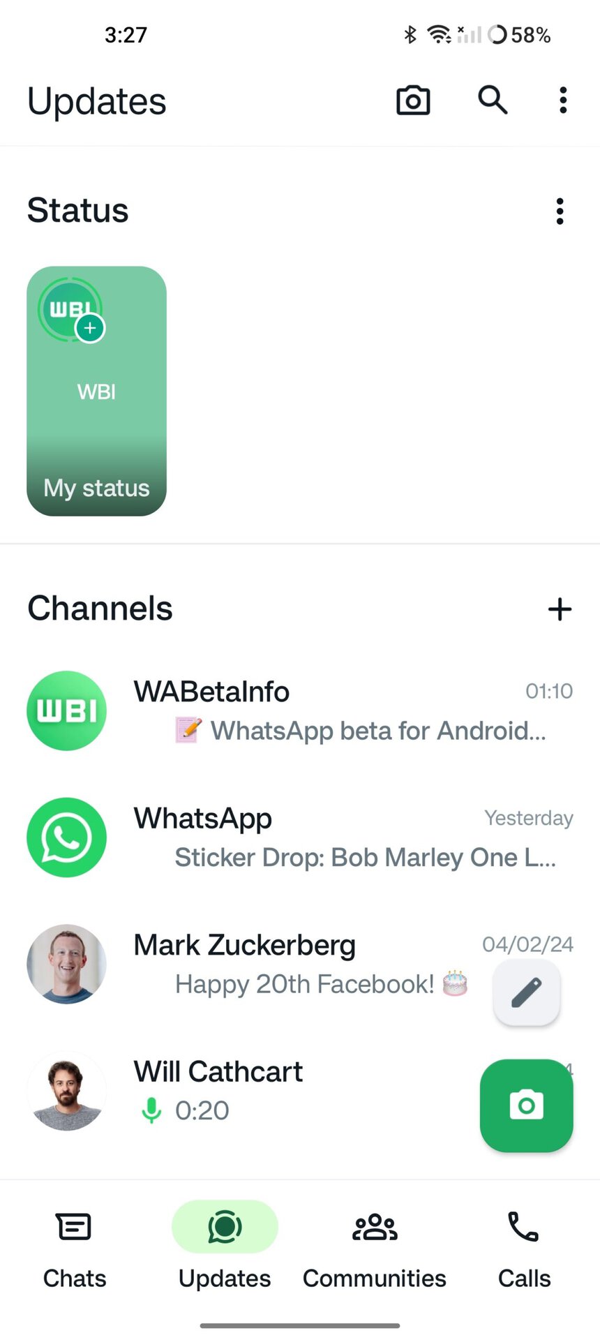
As per a report from WABetaInfo, WhatsApp could be looking at refreshing the status update page. A future update could present a redesigned interface for the status update tray. While the tray would sit at the top of the updates tab, it could get large preview windows that make it easier to skim through the first story from each person without clicking open any of them.
On Android, WhatsApp currently has a top bar with dedicated tabs for Communities, Chats, Updates, and Calls. Within the Updates tab, Android users who do not follow Channels currently have a vertically scrolling list for all stories, with more screen space given to names than to the story preview. If you follow Channels, you get an Instagram-esque circle indicator for stories in a horizontal scrolling list but no real previews.
The redesign would bring the tabs to the bottom and give stories a horizontally scrolling list with large previews, where the focus is more on the content than on the person’s name. It would be a better experience than what is presented right now.
This new preview window for stories is not live yet and could likely appear in a future version of the app. Do you like these new larger previews? Let us know in the comments below!
