Affiliate links on Android Authority may earn us a commission. Learn more.
Galaxy S8 Plus vs Galaxy S7 Edge: How big is the generation gap?
Samsung really needed a flawless launch today, and so far, it delivered. From our time with the new Galaxy S8 and Galaxy S8 Plus, Samsung did a great job preserving key aspects of the Galaxy S experience, while taking the series into new directions with the switch to on-screen keys, a new screen format, and Bixby.
The Galaxy S8 and S8 Plus are two very polished and sleek devices, but most of us only upgrade our phones once every two years. This raises the question: Are the Galaxy S8 and S8 Plus worthy updates compared to their predecessors? And how big of a difference a year makes?
We attempt to answer these questions in our Galaxy S8 Plus vs Galaxy S7 Edge first look.
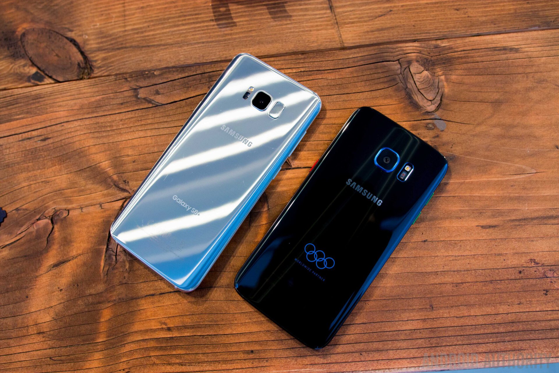
Edge is the new flat: The “Edge” moniker is gone because both versions of the Galaxy S8 have curved edge screens this time around. That said, the Galaxy S8 Plus would more or less be the direct successor to the S7 Edge, which was the larger phone out of last year’s duo.
At a high level, the Galaxy S8 Plus looks like an evolutionary upgrade. At the same time, it’s another step in Samsung’s quest for a bezel-less future that we’ve all been dreaming about. The bezels on the Galaxy S8 Plus are dramatically thinner than on the S7 Edge. The slim bezels are not just eye candy, they also make way for a massive 6.2-inch screen, compared to the still very generous 5.5 inches of the S7 Edge.
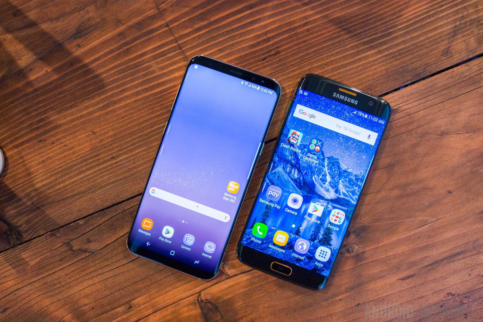
The shrunken-down bezels allow the screen to truly be the center of attention and it looks absolutely stunning. Fans of minimalist designs will appreciate that there’s no more Samsung logo on the front, and, because the bottom bezel has been minimalized, Samsung’s long-time signature home button and capacitive keys have been swapped out for on-screen soft-keys.
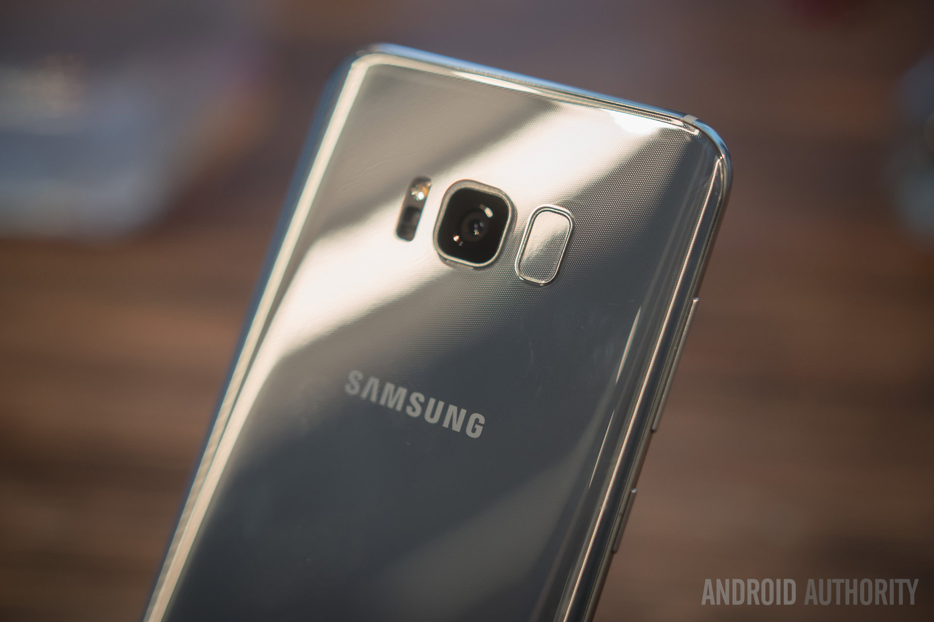
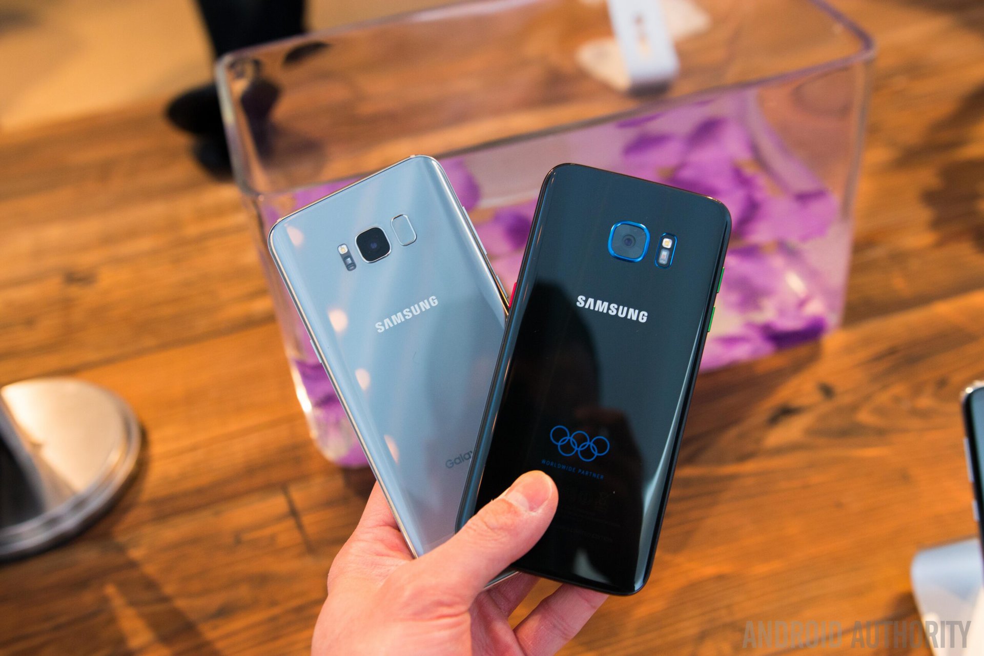
With the home button gone, the fingerprint sensor has been moved to the back. In a very controversial design decision, instead of sitting squarely below the camera where we normally see rear-facing fingerprint sensors, the scanner on the S8 Plus sits awkwardly to the side of the camera. At the moment, that doesn’t feel very user-friendly and it’s definitely going to take some to get used to. That’s especially true for the Galaxy S8 Plus, though you might have an easier time adapting to the sensor placement on the smaller Galaxy S8.
Luckily there are some alternatives to stretching your index finger to find the fingerprint sensor on the back. In fact, you don’t need to touch your S8 Plus at all to unlock it, thanks to the inclusion of iris scanning and facial recognition. The former is an improved version of the feature that first debuted on the Galaxy Note 7, while the latter is expected to add another layer of precision and convenience to what’s already a very secure authentication method.
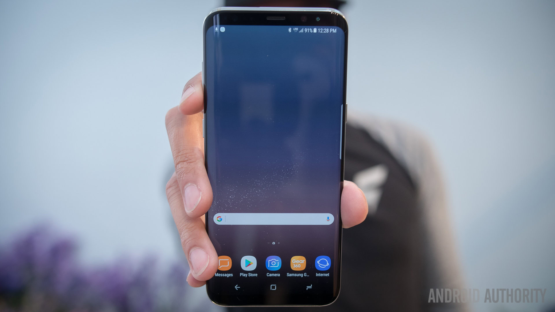
The Galaxy S8 Plus’ design picks up right where the S7 Edge left off. You still have a metal frame with front and rear glass panels, and while the S7 Edge is a very sleek device that stood up to the test of time, the Galaxy S8 Plus refines the design even further with a more rounded and curvier body. It’s incredible how smooth and comfortable the S8 Plus feels in the hand – it certainly doesn’t feel as big in the hand as you initially might think for a phone with a 6.2-inch screen.
Which takes us to another big change that is visible at first glance at the Galaxy S8 Plus. While both the S8 Plus and the S7 Edge feature AMOLED displays, as you would expect at this point from Samsung, the Galaxy S8 Plus features an 18.5:9 aspect ratio that makes the screen narrower and taller than the norm. Along with the narrow side bezels, this screen format – also seen on the LG G6 – is why the 6.2-inch S8 Plus feels more manageable in one hand than you’d expect.
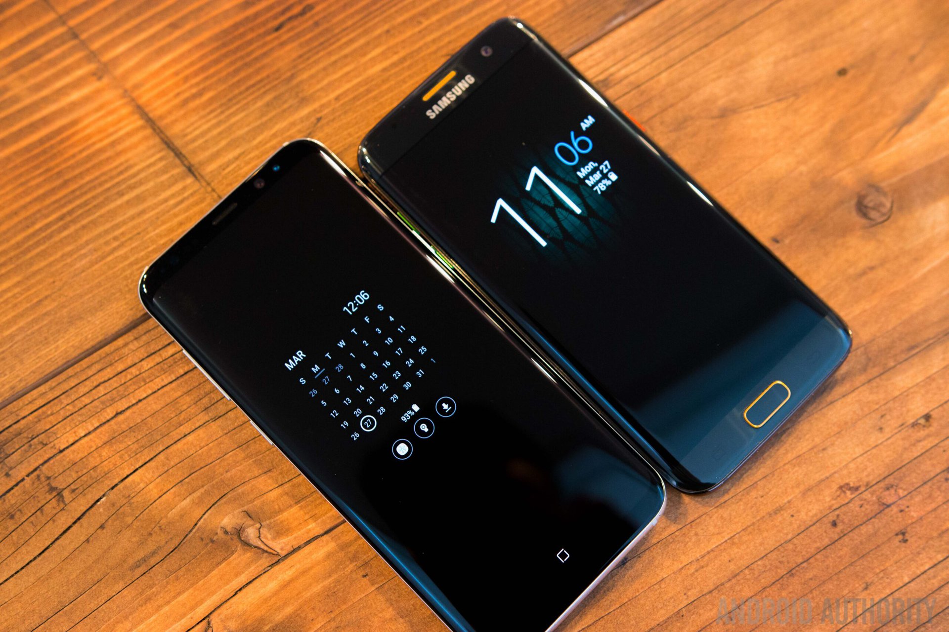
The extra tall format also means there are more pixels on the long side of the display, but it’s still considered a QuadHD screen – QuadHD+ to be precise.
From a hardware perspective, the camera on the Galaxy S8 Plus is largely the same as the one on the S7 Edge. The sensor is the same 12 MP resolution as before, with a f/1.7 aperture and that crazy fast Dual Pixel autofocus we’ve loved on the Galaxy S7 and Galaxy S7 Edge. However, Samsung says improvements have been made to the camera software – the S8 Plus actually takes three pictures every time the shutter button is pressed, with two of the frames being used to enhance the quality of the third and final frame. Another improvement is the autofocus capability of the front camera, which features an 8 MP sensor.
The Galaxy S8 Plus swaps out the microUSB port of the S7 Edge for an USB Type-C port, while other features remained intact. That includes the IP68 dust and water resistance, the multi-standard wireless charging, expandable storage, and a headphone jack. Fortunately, the rumors that said Samsung would pull an Apple and remove the 3.5 mm jack didn’t pan out.
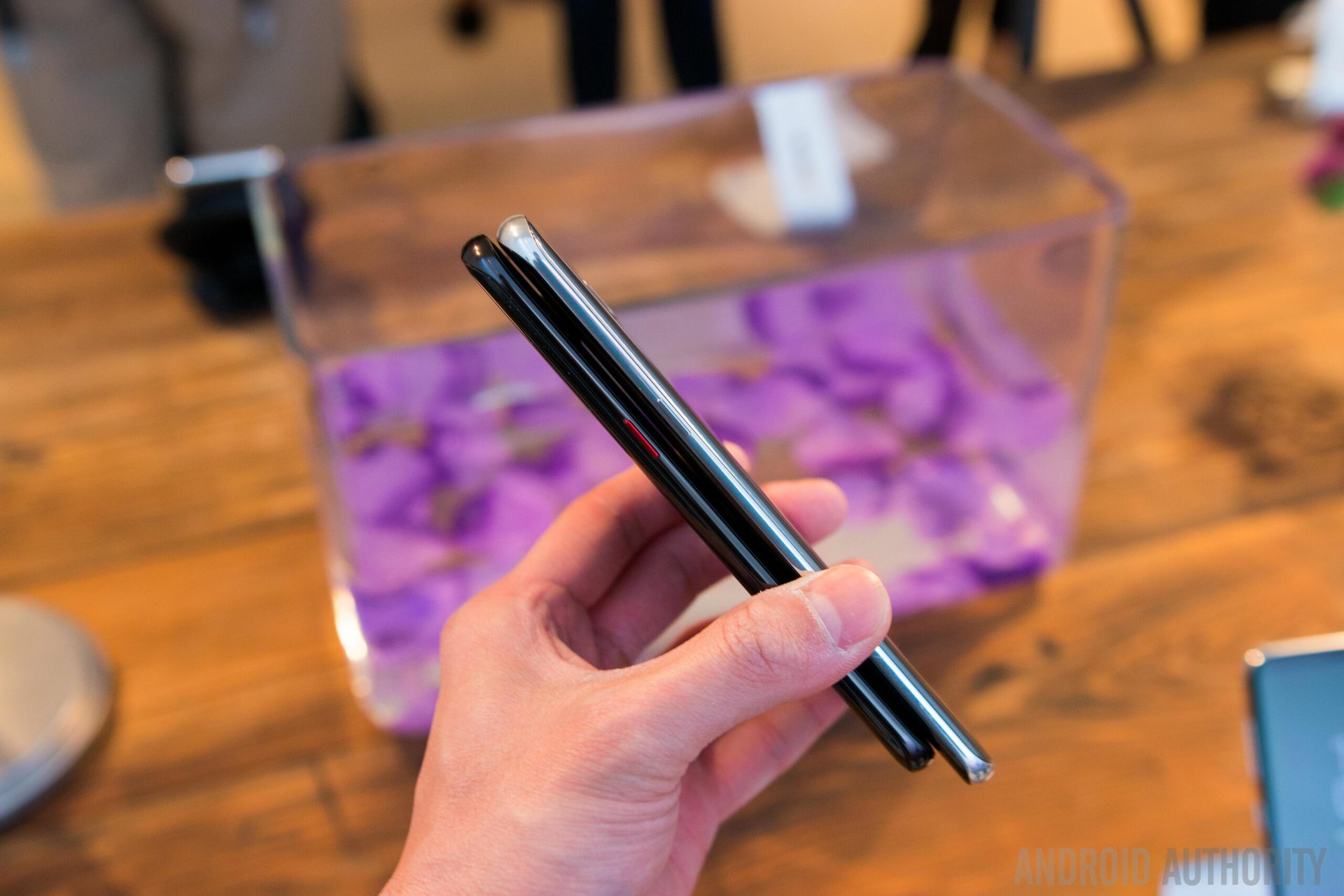
Not everything is an upgrade over the Galaxy S7 Edge. Although the Galaxy S8 Plus got bigger, the battery on the other hand got smaller, even if only slightly. It’s now a 3,500 mAh battery, instead of the 3,600 mAh unit found in the S7 Edge. We doubt the missing 100 mAh capacity makes a big difference, and Samsung might have mitigated it through optimizations in software and hardware. After the Note 7 debacle, Samsung’s most likely playing it safe this year and we can’t say we blame them.
The Galaxy S8 Plus runs Android 7.0 Nougat out of the box, with what looks like a vastly improved user experience that’s much cleaner and easier on the eyes than the old TouchWiz skin of the S7 Edge.
Part of a larger trend in the mobile industry, the standout software feature of the S8 Plus is the AI assistant called Bixby. The phone also comes with Google Assistant on board, but like many of Samsung’s previous apps or features, Bixby looks like an attempt to compete with and replace the Google alternative.
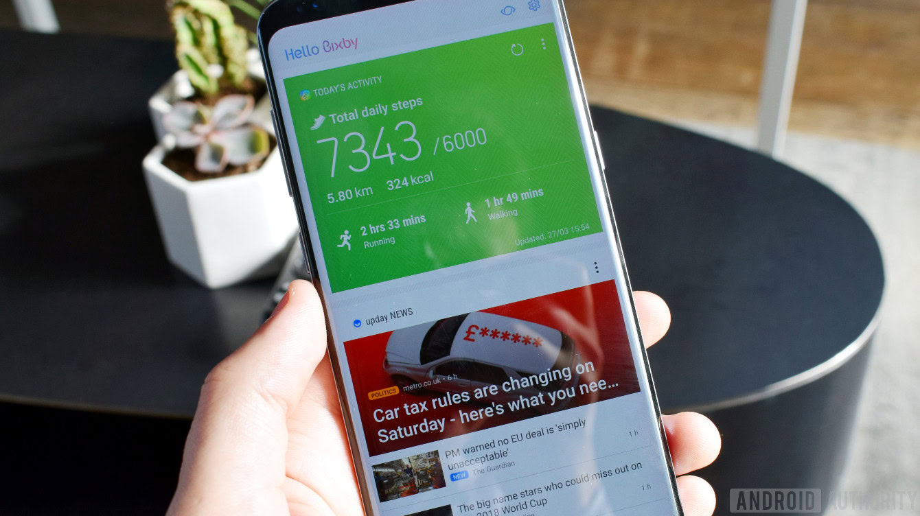
Because it’s Samsung’s own AI, Bixby is heavily integrated into the software and core functions of the Galaxy S8 Plus, aiming to change the way you interact with your device. There’s even a dedicated hardware key on the side for quick access, which we can only assume is designed to encourage you to use Bixby.
As far as specs go, the Galaxy S7 Edge has the Snapdragon 820 and four gigs of RAM, but with the S8 Plus being the newer device, it’s obviously going to take the lead. Inside it, there’s an octa-core processor, also with four gigs of RAM. The processor is the world’s first 10 nm chipset according to Samsung. The specifics are still vague, but if history is any indication, it’ll be a choice between the Snapdragon 835 in the United States and Exynos 8895 for the rest of the world.
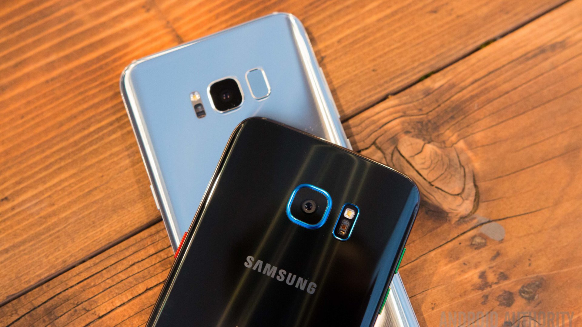
Time to wrap up our Galaxy S8 Plus vs Galaxy S7 Edge comparison. Even though the Galaxy S8 Plus is an evolutionary update, the changes are rather significant and the phone is shaping up to be a beast. But should you pull out your wallet and buy a Galaxy S8 Plus to replace a Galaxy S7 Edge? That depends on how much you appreciate changes like a more compact build, a smoother design, and once it rolls out to all units, Bixby. If you prefer the classic physical home button, or if you just don’t need the latest bells and whistles, the S7 Edge is far from outdated.
Thank you for being part of our community. Read our Comment Policy before posting.