Affiliate links on Android Authority may earn us a commission. Learn more.
One UI 8.5 is largely a hit, but a survey reveals many of you aren't happy with this one key aspect

Samsung’s One UI has always proudly sported its own personality. It’s obviously Android, but it has also long looked and felt distinctly “Samsung,” even as other Android skins borrowed ideas from all over the place. With the One UI 8.5 beta now in the wild, though, that identity is starting to feel like it’s up for debate.
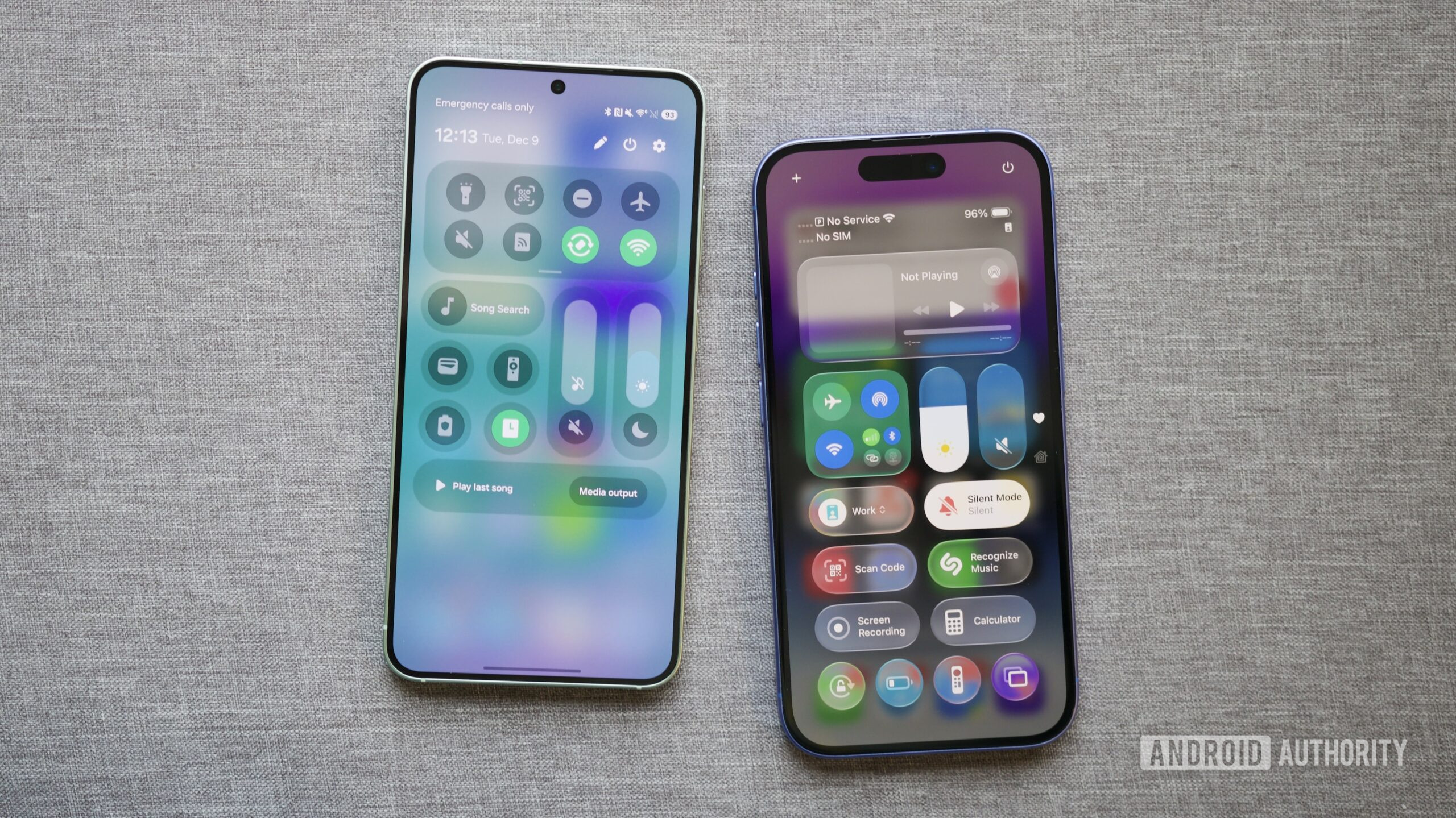
In a recent opinion piece, my colleague Joe Maring said One UI 8.5 might be the update where Samsung finally went a step too far. He highlighted changes like the new Quick Settings layout and refreshed Samsung apps, which can be tweaked to look a lot like iOS 26’s Control Center and navigation bars. The update adds useful customization and isn’t short on polish, but Joe’s bigger point was questioning the point at which refinement starts to feel more like imitation. That question is what led us to ask our readers how they feel about One UI 8.5’s iOS-like changes.
You told us your views via both a poll in Joe’s article and the comments section. Let’s take a look at the results.
What do you think of One UI 8.5’s iOS-like changes?
The results lean more towards the negative than the positive overall. Just over 42% of respondents said they can’t stand the iOS-like changes and don’t want their Android phone to look like an iPhone. On top of that, another 9% said the changes aren’t their favorite, even if they only see them as a minor annoyance. Taken together, that means just over half of the respondents aren’t particularly happy with the new direction, seemingly agreeing with Joe’s concerns.
Still, the response isn’t universally hostile. Around 28% of readers said they think the changes look great, showing there’s a sizeable group that’s on board with Samsung’s approach. Meanwhile, about 20% said they don’t care either way, suggesting that for a lot of people, the visual shift simply isn’t a deciding factor in how they feel about One UI 8.5.
Don’t want to miss the best from Android Authority?
- Set us as a favorite source in Google Discover to never miss our latest exclusive reports, expert analysis, and much more.
- You can also set us as a preferred source in Google Search by clicking the button below.
The comments under Joe’s article were just as divided as the poll results. A vocal group agreed with the core criticism, saying they chose Samsung and Android precisely because they don’t look or behave like iOS. For those readers, the iOS-like elements feel unnecessary at best and actively off-putting at worst, with some even suggesting they’ll lean more heavily on third-party launchers or consider other brands if the trend continues.
At the same time, plenty of commenters pushed back hard on the premise. Some argued that the similarities are exaggerated, pointing out that basic apps like the Phone, Clock, and Calculator can only be redesigned in so many ways, while others noted that Apple has borrowed heavily from Android over the years as well. A recurring theme among defenders was customization: as long as One UI remains flexible and functional, they don’t see visual overlap as a real problem, and a few even welcomed the changes as making it easier for people to switch between platforms.
It’s worth noting that this poll was purely focused on the visual approach Samsung has taken with One UI 8.5 beta. In another article about the update’s functionality, we asked you to share your thoughts on how you were enjoying the beta more broadly. Here’s the outcome of that poll.
What do you think of One UI 8.5 beta so far?
On the whole, readers seem far more positive about One UI 8.5 as an update than they are about its design direction. Nearly half of respondents said they love the beta and think it looks like a great update, making it the single most popular response by a comfortable margin. Another 20% said it’s good but still has room for improvement, suggesting a generally favorable first impression for the majority of you. Only around 14% seem disgruntled about the update in some way.
The contrast of these two polls is quite telling. While many of you clearly dislike Samsung leaning toward elements of Apple’s design language, that frustration doesn’t necessarily translate into a negative view of One UI 8.5 overall. The results suggest that many of you can appreciate the update’s features and customization, while still feeling nonplussed about how Samsung is choosing to evolve its visual identity.
Thank you for being part of our community. Read our Comment Policy before posting.

