Affiliate links on Android Authority may earn us a commission. Learn more.
An updated Material Design look for Pocket Casts revealed by Google

- A partner studies post on the Material Design website revealed a sneak peak of a Material redesign for the podcast app Pocket Casts.
- The new version features several changes to the UI, including the use of color and motion.
- Pocket Casts developer Chris Martin has confirmed that this is an indicator of what is to come in future Android updates.
After the recent news about Pocket Casts’ acquisition, many fans were worried that new owners would mess with the design of the most popular podcast app on Android. The Pocket Casts CEO was quick to reassure users that nothing major was going to change, but news of a redesign came from an unusual source: a new Material partner studies post from the official Material Design website.

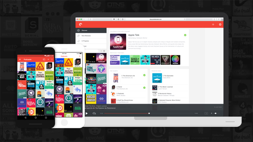
Long time fans of Pocket Casts (there are a lot of us here at Android Authority) might remember that the app was already redesigned using Material Design way back in 2015. Things have changed since then, so this redesign is more to bring Pocket Casts up to speed with more recent design trends.
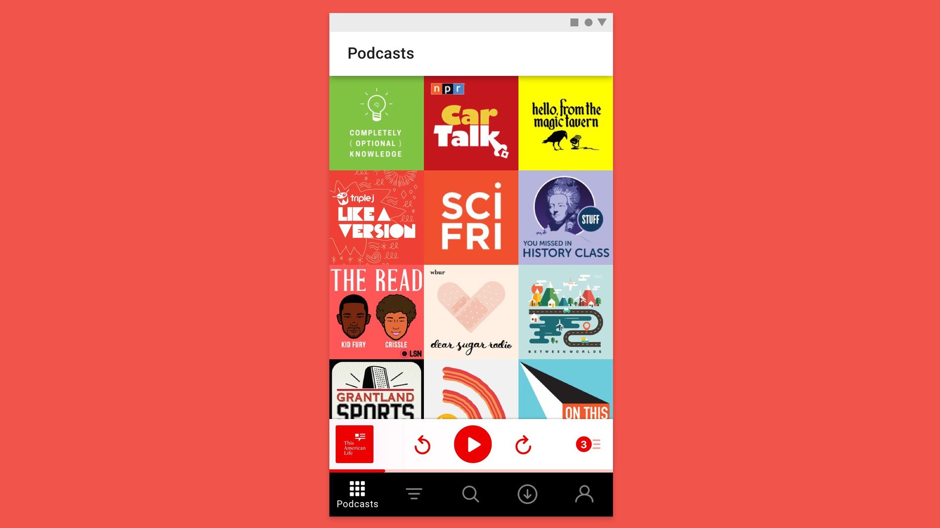
Specifically, the redesign focuses on color and motion. Pocket Casts already pulls colors from the current podcast for UI elements, but now they are reserved for interactive elements over a clean, white background. You can compare the current layout with the proposed redesign below.
Other color gradients taken from the currently playing podcast are also used for other parts of the app, but not the main screen. According to the post, this gives the app “a flexible but understated aesthetic.” The borders between podcasts have also been removed, as they have been in the current iOS version.
The post only includes a static image, so the new motion changes are yet to be seen. The current design is pretty light in this regard, and uses simple transitions like circle reveals to navigate screens in the app. Using “choreography” the redesign would hide and reveal UI elements as they are needed.
There are also several new controls incorporated into the navigation bar at the bottom of the screen rather than the top. As phones grow larger and larger, expect to see more apps moving vital controls within thumb’s reach in the future.
One issue is the giant white bar at the top of the screen, which doesn’t appear to be used for anything. Perhaps that element is one that’s hidden when interacting with the app, but with just a single image, that’s not yet clear.
Pocket Casts developer Chris Martin confirmed on Twitter that this redesign is more than just a case study. Treat this as a sneak preview of what is to come for the next update to the Android version of the app.
What do you think of the new update? Is it an improvement or a step backwards? Let us know in the comments!
Thank you for being part of our community. Read our Comment Policy before posting.