Affiliate links on Android Authority may earn us a commission. Learn more.
Pimp my app: six simple steps to give your app a makeover
To be successful as an app developer, it’s necessary to wear a lot of different hats. You can’t just rely purely on your coding skills; equally important is the need to market your app to ensure that people can discover it, to think about monetization and to have a great idea to start with. And on top of all those things, you also need to make sure your app looks the part as well and has a modern, eye-catching UI that will be intuitive for your users to find their way around.
If you’re someone who considers themselves a coder first... you can ‘hack’ some good looks into your UI
What if you’re someone who considers themselves a coder first? Or a marketer or ‘ideas person’? You might not have the foggiest idea where to start when it comes to design but you’ll still be expected to give it a shot. Speaking as someone who recently thought bright turquoise was a good color for a task bar… I hear ya’!
Fortunately though, you can apply a ‘systems’ style of thinking to design if you don’t have a natural ‘artistic touch’. If you follow some simple rules and acknowledge the underlying algorithms that make certain designs appealing, you can ‘hack’ some good looks into your UI.
And that’s exactly what we’re going to be doing now. Think of this like Pimp My Ride, or one of those makeover programs. We’ll be taking an ‘ugly’ app and applying a few techniques and changes to reveal its ‘inner beauty’.
So if looks are what’s holding your app back, you can follow along – let the transformation begin!
Introducing our ugly app
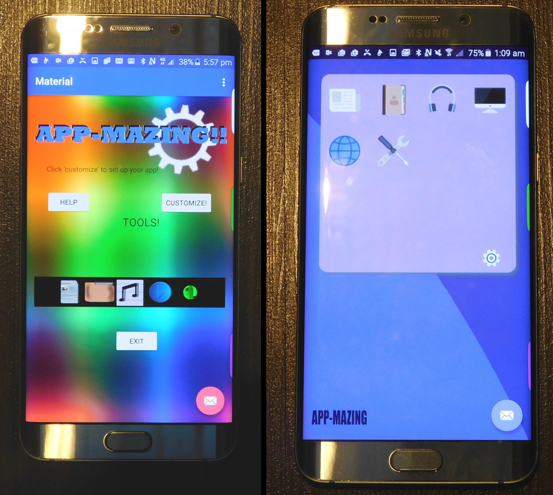
It wouldn’t be a makeover without a before and after picture! So let’s take a look at the ‘before’. This is App-Mazing:
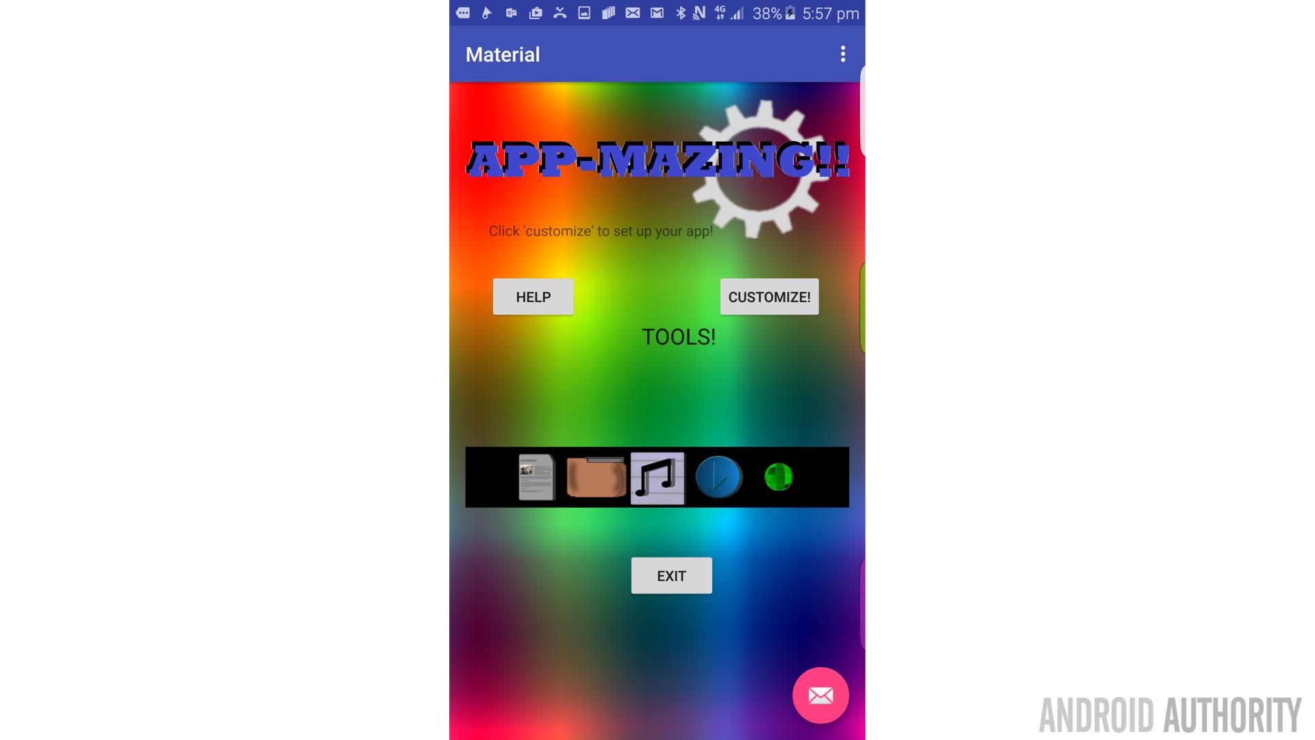
This is definitely a misnomer right now and we’ve certainly got our work cut out for us here. If we were playing ‘snog, marry, avoid’ this would most likely end up in the latter camp. Hopefully no one would actually create an app this unappealing to begin with; this is almost Geocities levels of wrong. But you’d be surprised at what is out there.
As you’ll see though, no app is beyond fixing. With just a few simple steps, we can take this from eye-sore to phwoar!
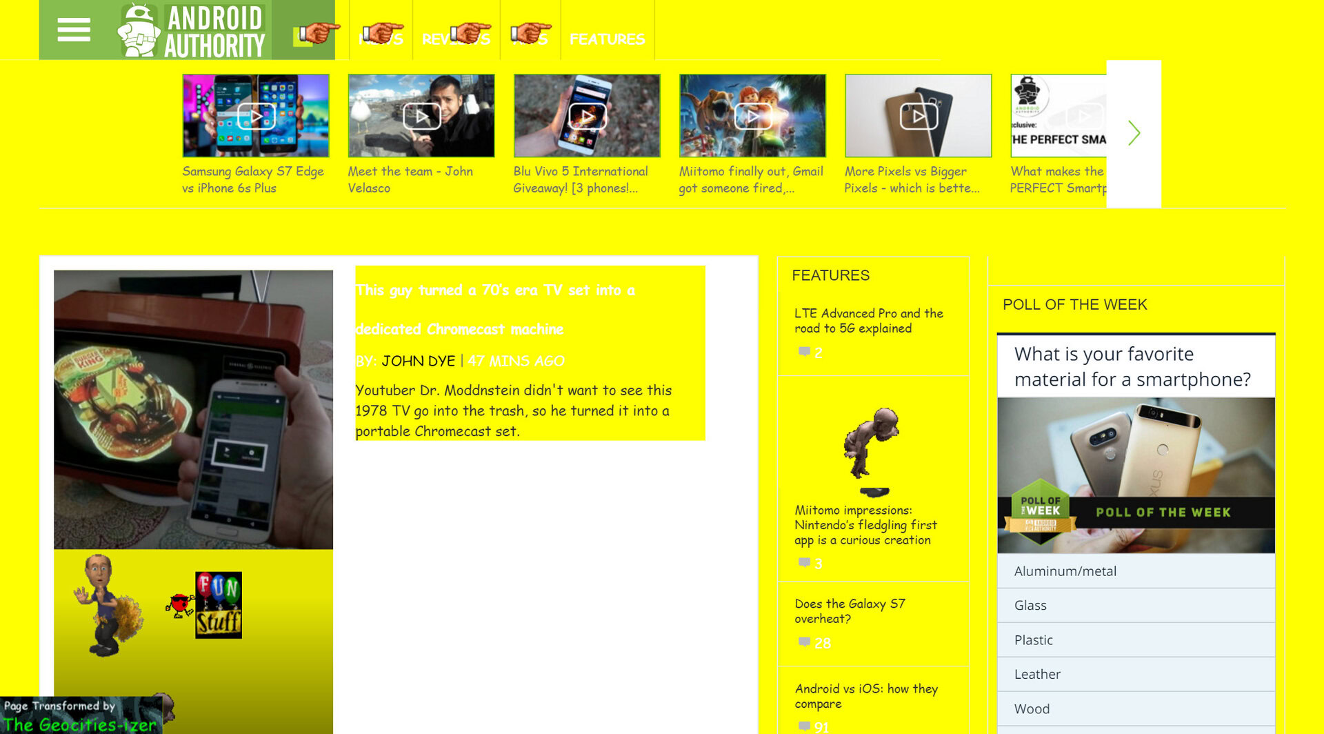
Speaking of ‘Geocities wrong’, this is what Android Authority would look like back in those early days of the web according to Geocitieizer:
Cut the excess
One simple rule that you should always keep in mind when designing an app is “communicate, don’t decorate”. What this essentially means is that the best designs say more with less. In fact nothing should be included in your UI just ‘to look good’ – everything should serve some purpose or be removed. That doesn’t just apply to individual elements on your page either; but also to things like animations and borders.
If an element doesn’t serve some communicative purpose, then all it is doing is distracting from the most important controls and creating clutter. This in turn makes the page a lot ‘busier’ which makes it harder to know where to look. Responsive design is a lot harder to implement smoothly as you start adding more clutter and you’re just introducing more barriers between your users and seeing the results they want from your app.
Before you start ‘adding’ things to try and improve your UI, think instead about what you could remove. Could one button serve two functions? Do you really need your logo in that top corner? Busy backgrounds are an absolute no-no as well. You’ll be surprised how much better things look when you’re a little more ruthless. And if your app suffers, then you can always put it back!
In the screenshot below, I’ve removed the random cog, some of the text and the garish background. I’ve also simplified the Word Art-style logo and removed the ‘exit’ button (seeing as the back button should provide that function). It already looks a lot better. Not good… but better!
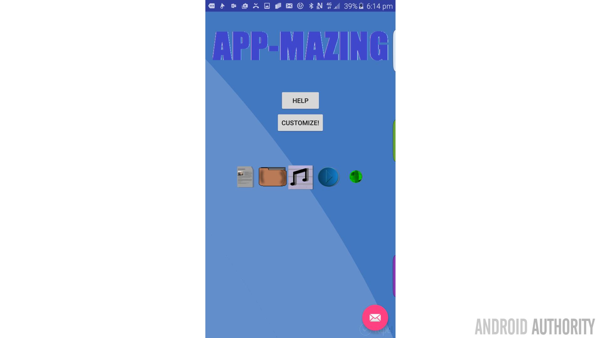
While your own UI might not look as busy as App-Mazing, you might well be able to remove a few borders or unnecessary buttons to make things nicer in your own design.
Get crispy
It sounds like a complete no-brainer but a lot of apps on the store are still using images that look awfully low-res. This is simply a symptom of ever increasing screen resolutions – but it’s important to keep updating your images too. If we switch our image out for a much crisper one, then things improve immediately:
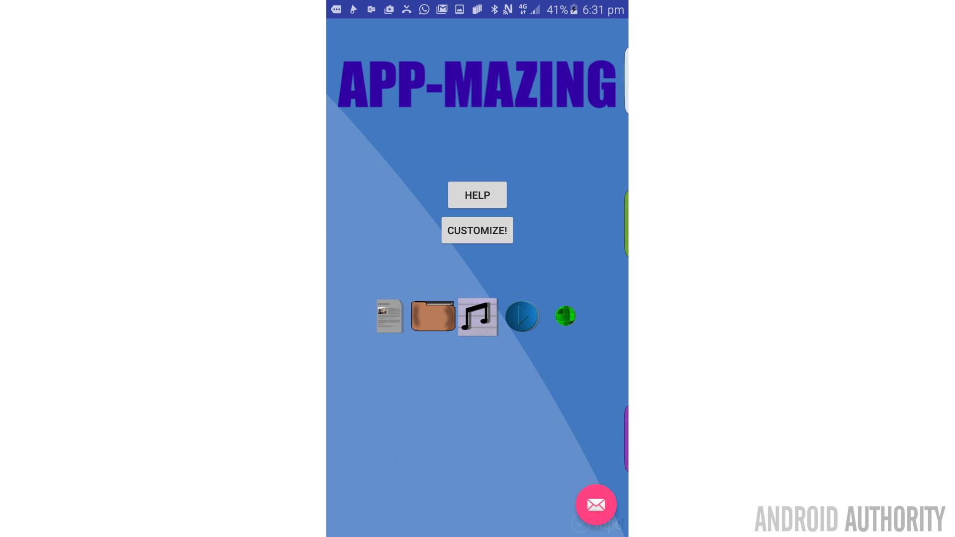
This ultimately just comes down to using the right tools. The first logo was honestly the best I could do with MSPaint + Gimp. The new one I made in Adobe Illustrator.
Think about flow
There’s another very practical reason that you should keep things minimal with your app design which is to ensure that you are able to intentionally guide the user’s eye and create a sense of flow in your app.
Before, App-Mazing was so cluttered that you wouldn’t know where to click or what to do. Now things are a bit clearer but there is still no rhyme or reason to the layout. We need to change that so that the most important actions grab attention first.
To this end, think about the subtle unconscious cues telling your users where to look. For starters, most of us tend to absorb a UI from top to bottom and left to right. So anything you place on the left-hand side of your UI will normally take precedence, as will anything that you place at the top of the screen.
Think about the subtle unconscious cues telling your users where to look
At the same time though, we also tend to look at the boldest (or highest contrast) element first. This might be the biggest image on the screen, or button with the brightest color. The center of your page also generally assumes special importance.
So what if you place your largest element on the right hand side of the screen? This can actually create disharmony and confuse the user. The position is telling them to look at this last but the size is telling them to look at it first. That’s exactly what we want to avoid.
Ask yourself what the most important elements of your app are and make sure they’re the first and the biggest. This video is a very good introduction to the topic:
For App-Mazing, that row of icons should probably take priority. I have no idea what this imaginary app does but I imagine it’s some kind of ‘app curation’ tool. Seeing as that’s what our app is all about, it’s more important than the ‘customize’ action and it’s what the user is likely to use most often. It’s also more important than having a massive narcissistic logo along the top! This is an app, not a magazine.
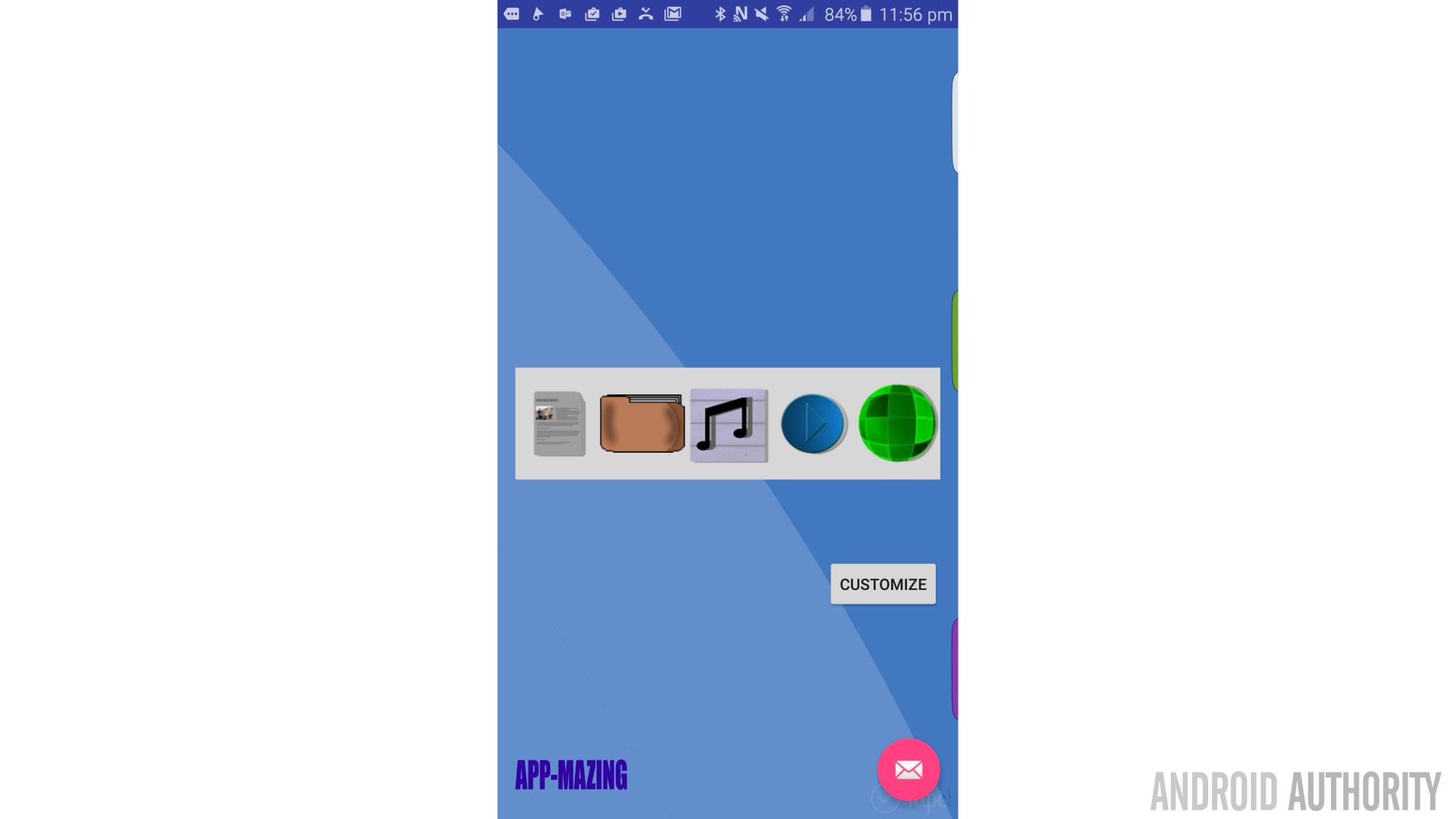
So the logo has been shrunken and demoted to the bottom left corner. It’s far less ostentatious and a lot classier that way. Meanwhile, we’ve moved the icons to the middle and brought back the highlighting around them to create more contrast and draw more attention. The ‘customize’ button has been moved to the right so that it will assume less importance than the icons and be seen second.
If you’re savvy, you may be wondering why Google elected to put the FAB (floating action button) in the bottom right. They say this is for actions you want to encourage, so why put it in the last place that the user would look? Actually, this makes a lot of sense too. In internet marketing speak this point on the page is what’s called the ‘terminal point’ and is where you would place your ‘call to action’ (CTA) such as ‘Buy Now!’ or ‘Subscribe!’. As it’s the last place someone looks, this is a good spot to place an action that might take the user away from the page. It’s still relatively small too and its placement means it doesn’t interfere with the flow of the UI generally.
Achieving balance
Just as important as flow and leading the eye is balance. This essentially means ensuring that your elements are evenly spaced out so as to create a comforting equilibrium across the page.
One of the reasons that the logo looks good down there on the left is that it is balancing out the placement of the FAB in the bottom right. It’s not quite symmetrical as these two elements are different shapes and sizes but it displays balance. Again, Shawn Barry explains this concept in a lot more detail if you’re interested to learn more:
We currently still have an unattractive looking imbalance vertically though; there’s a lot of empty space up the top and too much going on at the bottom and on the right. So what can we do to fix this?
My solution is to make that app window a lot bigger and to arrange the icons almost like an app drawer, spilling over onto a second line (I used a tableLayout). I’m then splitting the ‘customize’ option into two icons that can fit in the drawer to control and customize the layout. By putting the little cog in the bottom right, this then balances out the other icons that are clustered in the top left. And to give it a bit more of a Google feel, I’ve also designed the drawer to appear more like a ‘card’ with rounded edges and a bit of shadow.
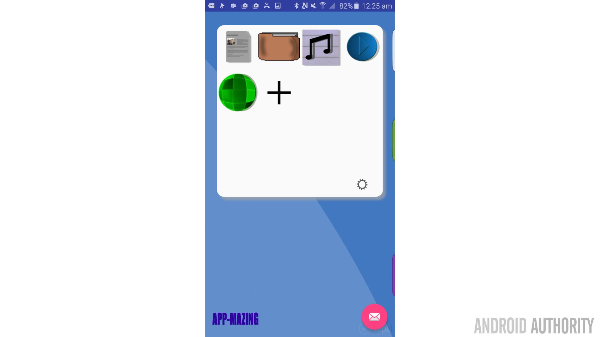
That app tray is now definitely the biggest and brightest thing on the page so you’re definitely going to look at it first. It also manages to be right in your line of sightwhether you start off by looking at the top left of the page or the middle. Everything all leads to the same starting point!
Use flat icons
Perhaps giving your UI a complete material design overhaul represents too much work at this point. But something you can do very easily to get a look somewhat closer to Google’s vision is to swap out any 3D icons for flat icons.
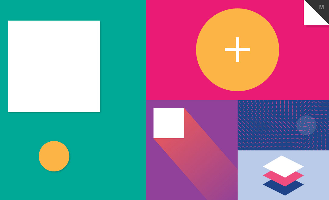
Flat icons essentially do away with the skeuomorphic approach of using three dimensional pictures of things like phones and calendars and instead puts those images through a trouser press. Shadows are gone, as are lighting effects and any attempt to convey depth. What we’re left with is a flat pictographic representation of the item. The logic is that as the screen is flat, we can’t have truly 3D images… so why try? Using flat icons means treating the screen of a phone just like a piece of paper, which makes it look more natural and appealing.
Here is a great post on flat icons and why they’re significant. Google even provides a ton of material design icons that you can go ahead and use completely for free here. I’m actually going to use these though instead.
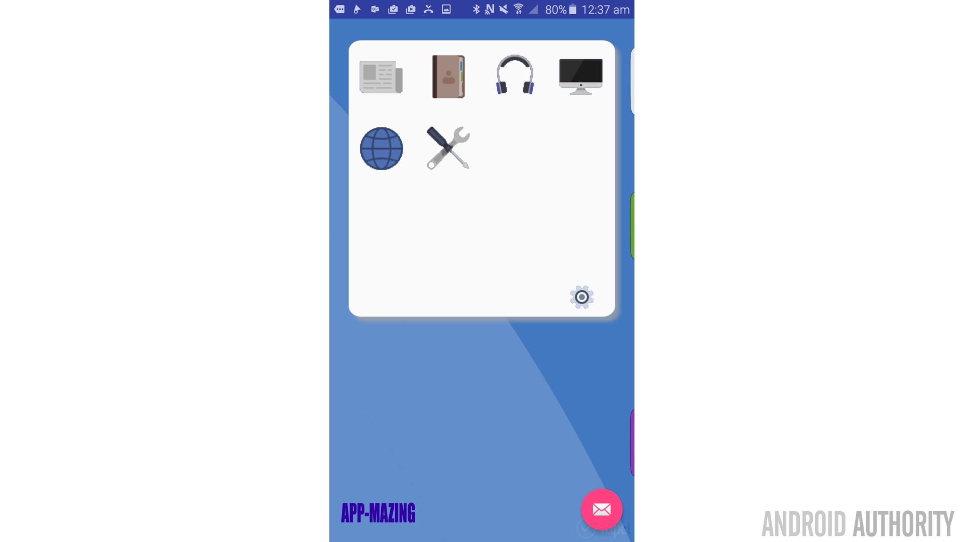
Switching out these icons results in an immediate and marked improvement once again. They’re a bit pixelated as I didn’t have the AI file but that almost adds to the charm…
Apply some color theory and you’re done!
A lot of the time, the mistakes we make with design stem from the simple fact that we don’t give them enough thought.
If you created the color scheme for your app by just picking the colors you ‘liked the looks of’, then you might be guilty of this. Because actually, there are psychological and even evolutionary reasons that we find certain color combinations appealing and others off-putting.
At this point you might not think there’s anything wrong with the color choices in App-Mazing. But trust me: once we apply some proper color theory, things will look a lot better.
Here, I once again turned to a favorite tool of mine: Paletton. I’ve chosen a range of different complementary colors in different shades and then made sure to use them throughout the app both in the xml files and the images themselves.
What we have now is this:
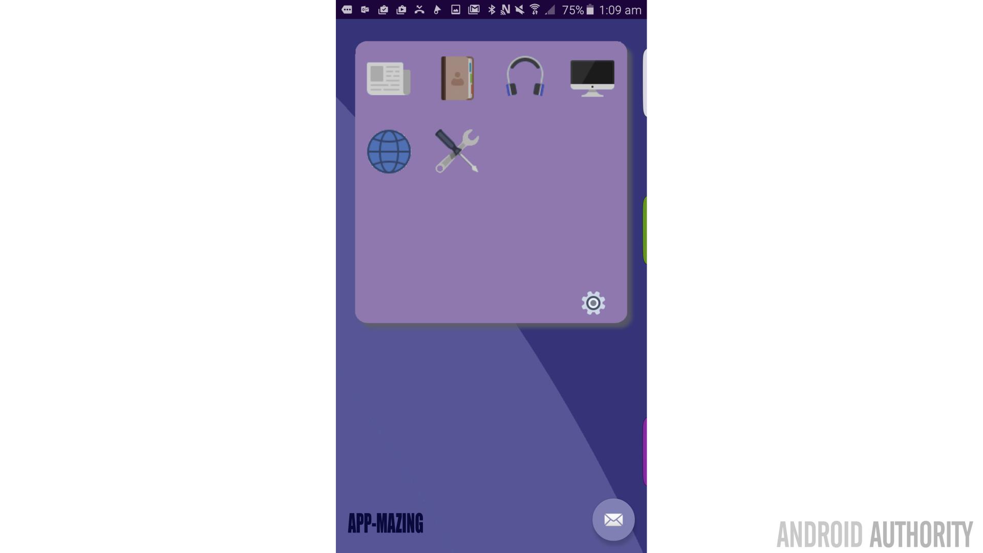
So look, I’ll be the first to admit that this isn’t going to be winning America’s Next Top App any time soon. This is still far from perfect. But it’s definitely a massive improvement over the UI we had to start with and it served its purpose as an illustrative tool.
Because although the two designs look worlds apart, we actually only made a few relatively simple and repeatable changes to get here. To summarize, we…
- Removed everything we didn’t need and tried to convey more information with less
- Used crisp images
- Made sure that we directed the users’ eyes by arranging our elements so that the most important elements would be seen first
- Enforced a sense of balance on the page by spreading things out roughly evenly
- Used flat icons
- Applied a proper color palette
If you have an old app that needs an overhaul, then try taking these same steps and you might be surprised what a difference it can make!
