Affiliate links on Android Authority may earn us a commission. Learn more.
Four easy design tips to give your app that material design look
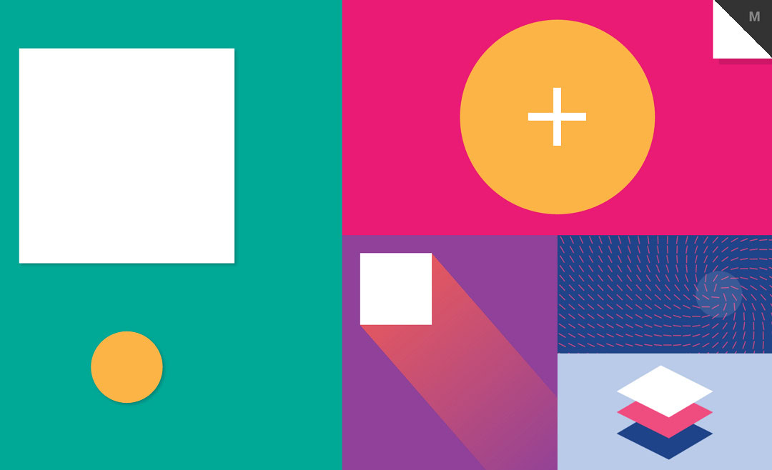
Material design has been around for a while now and is showing no signs of losing its popularity with more and more apps putting the design language to good use. So if you want to give an existing app a little more spit and polish and maybe help it grab some attention in the Play Store, adding some material design-ness is a pretty good way to do it.
Fortunately, this also happens to be pretty easy to do for the most part. Even if you don’t give your UI a complete overhaul, there are some popular design elements used commonly in material design that are easy enough to implement. Those include things like floating action buttons, cards and more.
Let’s take a look at some of the things you can do to give your app a quick shot of material design goodness.

Colored action bar
Google wants you to use material design as often as possible in order to encourage a consistent look and feel across Android apps. This is good news for you, as it means they’ve made it all as easy as possible.
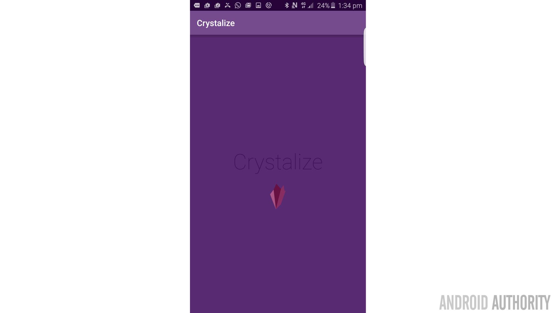
If you want to give your app a material color scheme, complete with a colored action bar, then all you need to do is to edit the ‘Styles.xml’ file within your app to use a theme that will define the action bar.
For instance, you could use the following code for ‘Styles.xml’:
<resources>

    <!-- Base application theme. -->
    <style name="AppTheme" parent="Base.Theme.AppCompat.Light.DarkActionBar">
        <!-- Customize your theme here. -->
        <item name="colorPrimary">@color/colorPrimary</item>
        <item name="colorPrimaryDark">@color/colorPrimaryDark</item>
        <item name="colorAccent">@color/colorAccent</item>
    </style>

</resources>
The AndroidManifest.xml should meanwhile say:
android:theme="@style/AppTheme"Here, you’re telling Android that you want your app to have a theme that uses a dark action bar and then you’re defining what that dark color is going to look like. Note that @color/colorPrimary etc. are referencing color values that you would have set in your ‘colors.xml’. Our action bar will automatically inherit the colorPrimaryDark color. If you want to be wacky though and set your action bar as something completely different, you can use android:statusBarColor to do that.
You also need to tweak a couple of other things though. Specifically, you need to make sure that your minimum SDK level is 21, seeing as the material theme isn’t supported in older versions of Android. This will most likely be defined by Gradle (the build tool that compresses all your files into an APK). You can find and change this value by going to: ‘Gradle Scripts > build.gradle (Module: app)’ and then changing the minSdkVersion accordingly. It’s may be set to ’16’ by default.
Alternatively, if that doesn’t do the trick you may need to edit your ‘AndroidManifest.xml’ by adding these two lines:
<uses-sdk
    android:minSdkVersion="21"
    android:targetSdkVersion="23" />
Alternatively, if you need to target Android versions before Lollipop then you should use the v7 appcompat library. This library adds support for the Action Bar (and other material design elements) to Android 2.1 (API level 7) and higher. Google has some useful documentation on downloading the support library package and adding the libraries to your development environment.
We used a colored action bar in our ‘Crystalize‘ app for a previous tutorial:
Ease in and out animations
One principle of material design is that everything should behave as if it had its own heft, weight and momentum. While material design uses flat icons that indicate a move away from skueomorphism; the movements and interactions are actually meant to more closely mimic the way you’d interact with a card, a piece of paper or a switch. This way, subtle cues like shadows and movements can telegraph the way you’re meant to interact with the interface.
And this grounded approach extends to the animations themselves too. Newer interfaces may have used animations that would move at a constant speed from point A to B. But there’s actually nothing in the ‘real world’ that moves like that. Observe your own movements, or the movements of any vehicle, and you should note that they have a short acceleration and deceleration period at the start and end respectively. This is what is known as ‘ease in’ and ‘ease out’ and it looks much more natural and appealing.
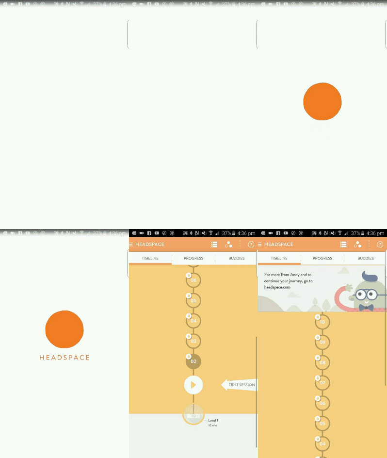
But anyway, you can apply this effect pretty easily to your own animations.
To do it, you simply need to use the interpolator. So a ‘regular’ translation animation might look like this:
TranslateAnimation animation = new TranslateAnimation(0,0,2000,0);
animation.setDuration(1000);
view.startAnimation(animation)
But you’re just going to add one extra line like so before you start your animation:
animation.setInterpolator(getApplicationContext(), android.R.anim.accelerate_decelerate_interpolator);There are more you can play around with too like bounce and overshoot. These can add some real character to your apps and make it feel almost as though each widget has its own personality. Just be careful not to get carried away so that everything is moving on screen and vying for your attention. The maxim to keep in mind when designing an app or website is: ‘communicate, don’t decorate’. This means that everything you use should serve some purpose and convey something to the user. In the case of an anticipate and overshoot animation, this might tell you that a view can be pulled back and released as though it were elastic. Or perhaps it just means that your view is kerrazy!
Custom typeface
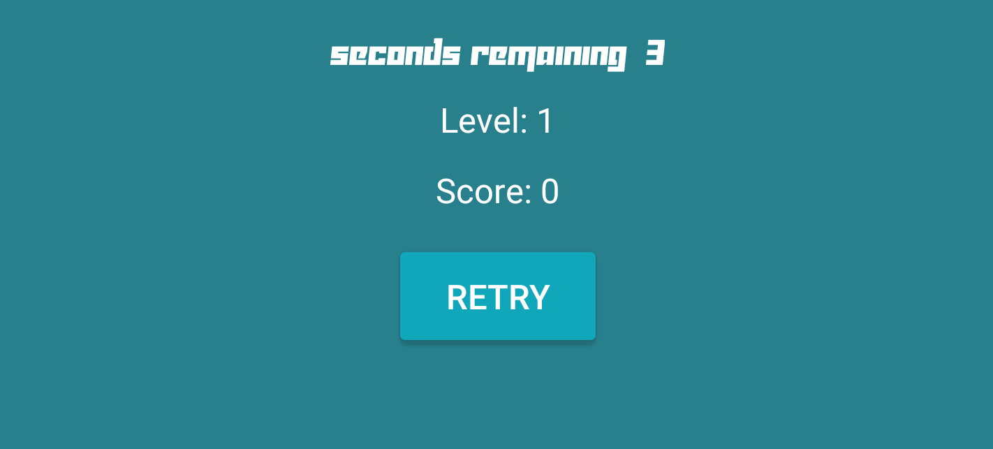
One thing that Android doesn’t make as easy as it could is adding new fonts. But if you really want to create that material look, this is worth learning seeing as a lot of material design is very typographic. With so many awesome typefaces available through sites like Font Squirrel, this is a quick way to spruce up your app and give it a unique look.
You can see an app I’m working on currently that uses a custom font. This is exactly the kind of flamboyant font you should probably stay away from, FYI:
So how did I do it? To be honest it’s not that hard really; it’s just that you need to do it programmatically rather than through the XML (there are ways around this but they are more trouble than they’re worth!). First, you’ll need to create a new directory and sub-directory in your project: assets and fonts.
Now you need to go and grab yourself a .ttf file from somewhere and drop it into that new fonts folder. Then add this to the Java file for the activity you want to use the font:
Typeface typeFace=Typeface.createFromAsset(getAssets(),"fonts/custom.ttf");
view.setTypeface(typeFace);
And don’t forget to import Typefaces!
So it’s really not that hard. Just note that you’ll need to do this for each view and each typeface separately.
Again, be careful not to overdo your fonts though. Adding a couple of typefaces looks good but if you get carried away it will just end up looking busy and cluttered. Choose your fonts carefully too: material design is very minimal by nature, so you should echo this with a nice, clean and sans-serif font using consistent stroke widths. A good example of this is actually Google’s own current logo:

Floating action button
Another common feature of material design is the ‘floating action button’. As the name rather suggests, this is an action button that… floats. It will be ubiquitous throughout the majority of your app’s UI and its job is to provide quick access to your most commonly used actions.
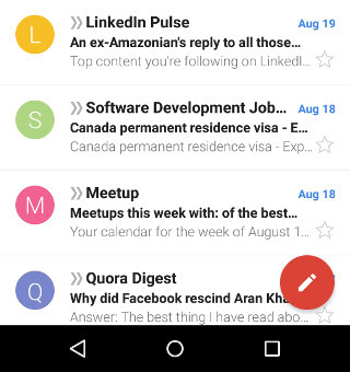
If you create a new project and select ‘Blank Activity’, then your app will automatically have this ‘FAB’ in place. Otherwise though, you can add it yourself by using Google’s Design Support Library. To implement this, you need to make sure that you’ve downloaded the latest version of the Android Support Library through your SDK Manager.
You then need to add a dependency to Gradle. You’ll find this by going to ‘Gradle Scripts > build.gradle (Module: app)’. Now add:
compile 'com.android.support:design:23.2.1'To where it says ‘Dependencies’. With this in place, you can now use the ‘Coordinator Layout’ and FAB, like so:
<android.support.design.widget.CoordinatorLayout
    xmlns:android="http://schemas.android.com/apk/res/android"
    android:layout_width="match_parent"
android:layout_height="match_parent"><android.support.design.widget.FloatingActionButton
android:id="@+id/fab"
android:layout_width="wrap_content"
android:layout_height="wrap_content"
android:layout_gravity="end|bottom"
android:layout_margin="16dp"
android:src="@drawable/ic_done" />
</android.support.design.widget.CoordinatorLayout>What should you use this button for? Google says that it should be reserved for the most important actions in your app. This is the interaction that you most want to encourage; so in the case of Google+ for instance, that means posting new content. You could also place a ‘share’ button here.
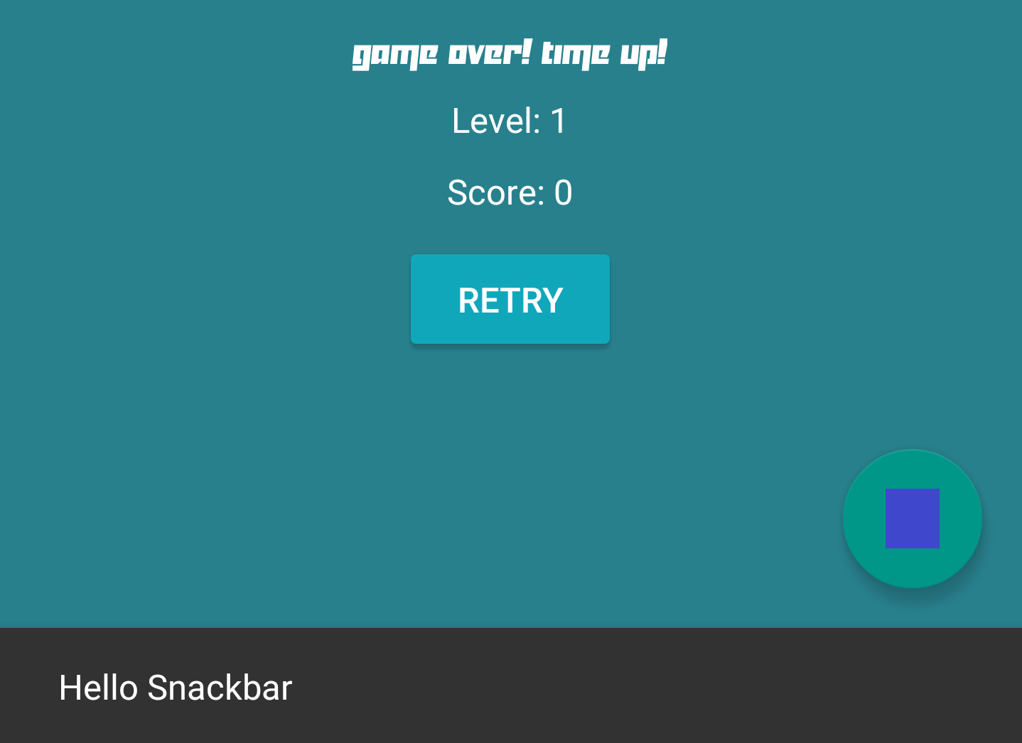
Or how about using it to show a snackbar? A snackbar is another element that comes packaged with the Design Support Library and is a great alternative to toast messages. You can use it like so:
public void onFABClick(View view){
        Snackbar.make(view, "Why hello there", Snackbar.LENGTH_LONG).show();
}
Here’s a great guide to using the Design Support Library that goes over some of the other features in an easy-to-follow manner.
I added a floating action button and snackbar to the bottom of a game I’m working on just so you could check it out…
Closing notes
And with just these four changes, you can give your app that material design gloss without rewriting the rule book. The essential design and navigation of your app hasn’t changed but with less than an hour’s work you now have crisp fonts, smooth animations, a colored action bar and floating action button.
It doesn’t sound like much but with just these few tweaks you can improve those all-important first impressions and you’d be surprised what that can do for your downloads!