Affiliate links on Android Authority may earn us a commission. Learn more.
Google Now Launcher search box may get ugly home button

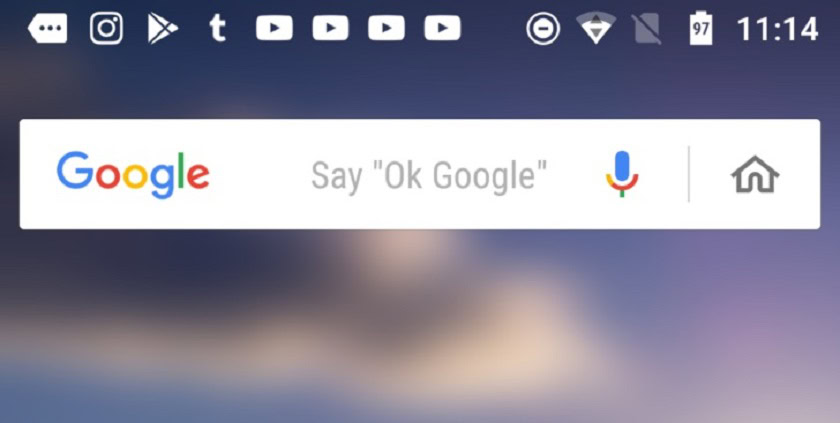
The Google Now Launcher’s search box may be getting a new home button. Google appears to be testing the feature (as pointed out by Android Police), as it has popped up for some users, but it seems neither impressive nor particularly useful.
The button is placed at the right of the already-busy search bar and tapping it takes you to the Google Feed. This can also be achieved by swiping to the left from the home screen, so it feels like a solution to a problem that doesn’t exist.
That swipe gesture can be switched off, so I guess it kind of makes sense for people who don’t like having the feed as their left-most home screen, but it’s pretty uninteresting all the same.

Though it’s nice to know that Google is still pursuing *some kind* of updates to the launcher (it was expected to have been abandoned by now), it’s a shame that the team isn’t trialling something more worthwhile.
If you’ve encountered it, let us know what your thoughts on the button in the comments, and if you want to check out the current best Android launchers, hit the link.