Affiliate links on Android Authority may earn us a commission. Learn more.
You told us: You definitely think Google Maps is too cluttered

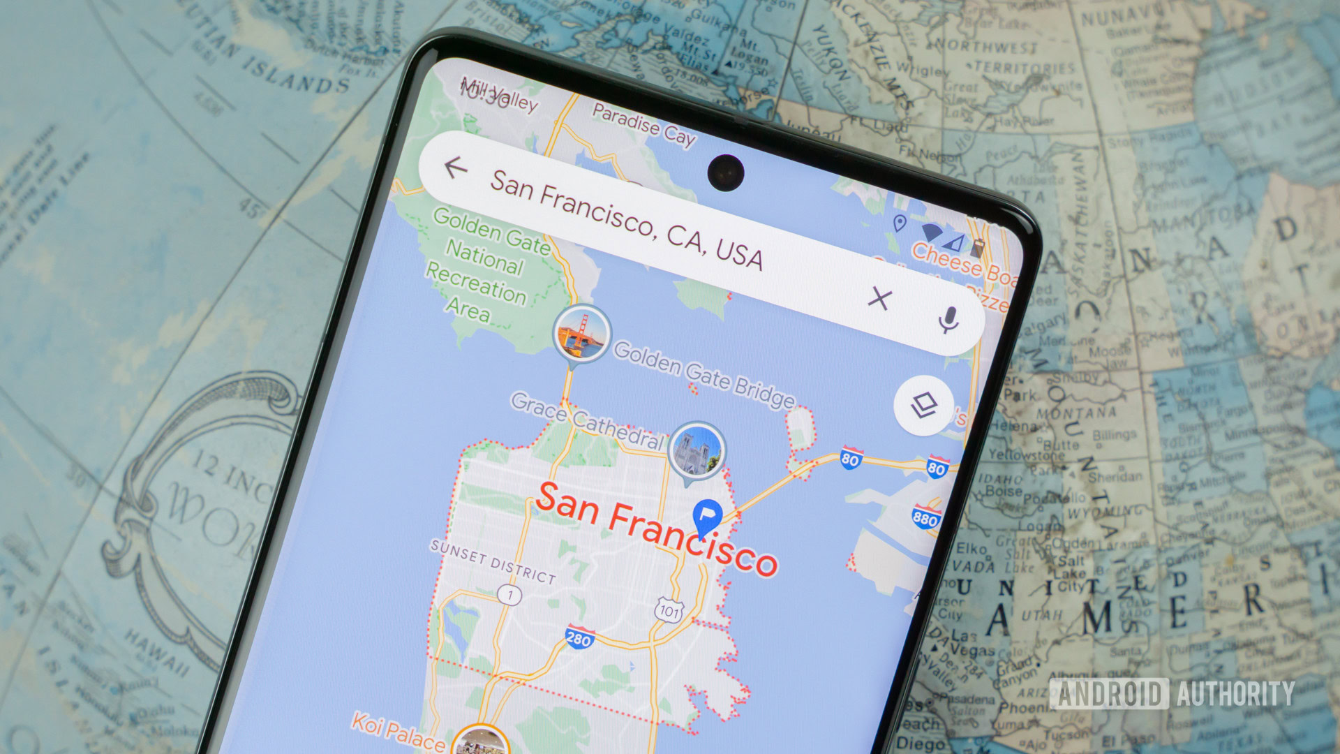
Google Maps has been the go-to mobile mapping solution for years now, and it’s absolutely loaded with features. However, a former Google Maps designer has criticized what she feels is a cluttered user interface and colder colors.
Elizabeth Laraki felt that the Google Maps UI contained too many elements that were overlaid on the map view. Do you share this opinion, though? We posed this question to you and here’s what you said.
Is Google Maps too cluttered? Should Google simplify the UI?
Results
This poll drew almost 1,900 votes, and it turns out that a massive 71.55% of respondents think the Google Maps UI could do with fewer elements. We can understand this stance, especially when comparing the current Google Maps user interface to Laraki’s proposed UI.
Meanwhile, 17.71% of surveyed readers say they’re fine with the current UI and simply want the old color scheme to return. It’s not a day-and-night difference, but Google nevertheless switched to colder colors in the Maps app.
Finally, just 10.74% of polled readers felt that the Google Maps UI was fine the way it was. We can see why people would vote this way as some of the elements proposed for removal seem very useful (e.g. restaurants, the weather, etc).
Comments
- Wibbly: I actually find the new colors more practical when driving. I had previously sometimes struggled to discern the planned route at a glance, especially when the display was in dark mode.
- nxtiak: I HATE the Explore tab. It’s the most useless Google Maps feature and so annoying it takes up so much space and requires me to keep closing it.
- Bojan Tomic: Former employee bashing on their former company? Groundbreaking.
- Rudy™: Thanks, Google, for making Maps harder to read in Android Auto. All the mid-tone elements blend together and are illegible to many of us who don’t have perfect vision. Figure these elements are designed by someone in front of some uber-expensive monitor inches away from their faces, and they see nothing wrong. And as usual, Google is fixing something that wasn’t even broken.
- Anna Del Rama: Agree with the sentiment. However, the proposed solution isn’t good either. For example, some controls—like layers and my location—in the bottom bar are not navigational elements like the others. That would create a set of confusing (sometimes annoying) mixed signals.
- JP: Like the new design. Want the overlays.
Thank you for being part of our community. Read our Comment Policy before posting.