Affiliate links on Android Authority may earn us a commission. Learn more.
Google is giving Chrome's three-dot menu a much-needed brain
Nov 4, 2026 — 4:07 AM ET


- Chrome’s redesigned three-dot menu now features a functional search box for finding browser actions, bookmarks, and recent history.
- Google is also experimenting with a scrollbar, pinned search field and footer, and cleaner, block-style menu sections.
- The redesign remains exclusive to Canary, with no confirmed stable release date.
Chrome‘s three-dot menu has always been a bit of a treasure hunt. You know the setting you’re looking for is buried somewhere in there, but finding it can mean scrolling through a maze of options or remembering which submenu Google decided to hide it under. Now, Google is working on a shortcut that could make all that digging unnecessary. And the latest Chrome Canary build shows it’s finally coming together.
The latest development comes courtesy of Leopeva64 on X, who shared a demonstration of the now-functional search box in Chrome’s redesigned three-dot menu. Previously little more than a decorative placeholder, the search field can now pull up matching browser commands, bookmarks, and recently visited websites as you type.
That’s a surprisingly useful upgrade for something tucked inside a menu. Instead of navigating through several layers to find a particular setting or digging through your bookmarks, you could simply search for what you need without leaving the menu.
Better still, the results are organized into categories, making it easier to distinguish browser actions from saved pages and browsing history.
This isn’t Google’s first attempt at making the menu less of an obstacle course, either. The broader redesign replaces the traditional New tab, New window, and New incognito window entries with prominent buttons and groups other controls into cleaner, block-style sections.
More recently, Google has been experimenting with how users navigate the increasingly crowded menu. The familiar scroll arrows at the top and bottom have disappeared, replaced by a conventional scrollbar. Meanwhile, the search box remains pinned at the top, and the footer containing Settings, Help, and Exit stays anchored at the bottom, even as the rest of the menu scrolls.
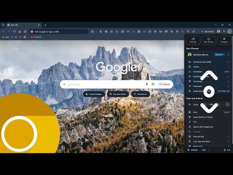
Together, these changes could turn Chrome’s three-dot menu from a place you rummage through into one you actually enjoy using.
There’s still a catch: Everything described here remains part of Chrome Canary’s experimental redesign, with no confirmed timeline for a stable release. Google could also refine or abandon individual elements before they reach everyone.
Still, the latest progress suggests this makeover is becoming more than a fresh coat of paint. The menu is finally learning to help you find things, not just hide them.
Conversation
Read what readers said or add your take.