Affiliate links on Android Authority may earn us a commission. Learn more.
Google Calendar for web gets a beautiful design overhaul

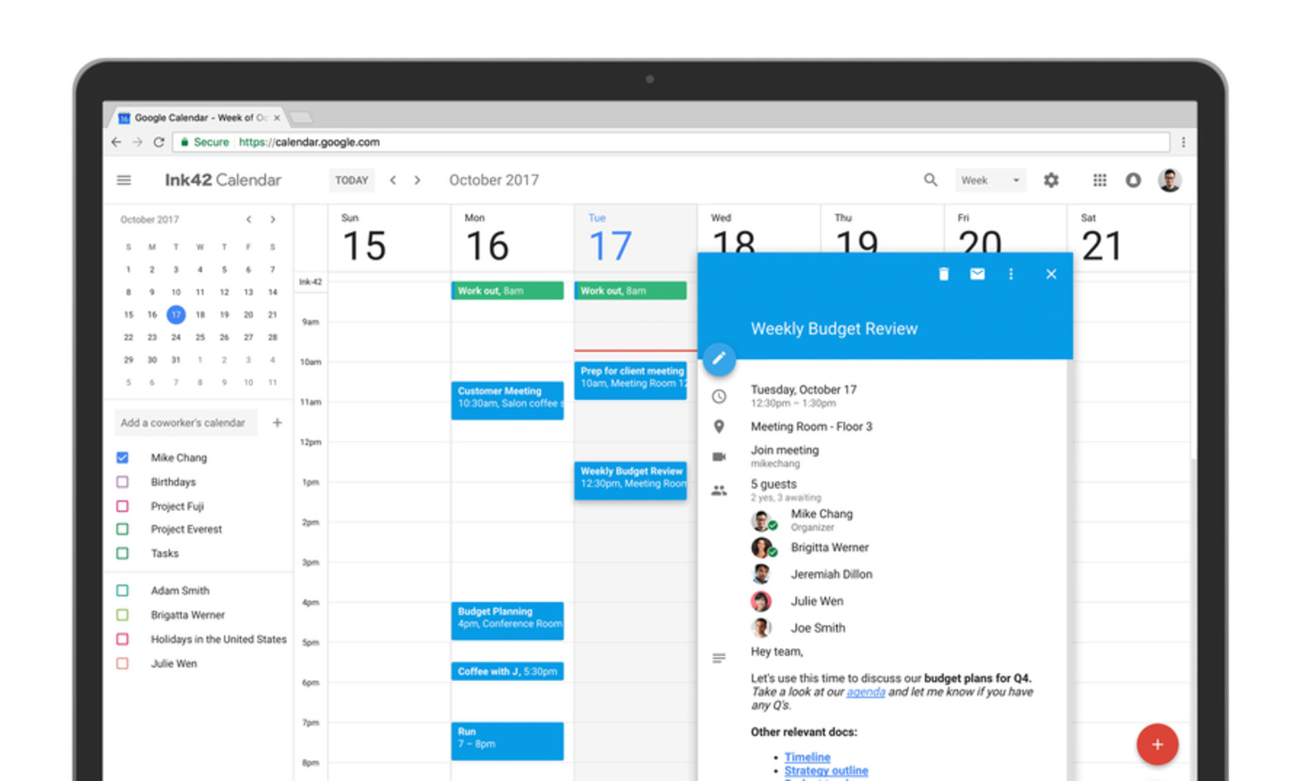
Google Calendar for web is finally getting the long-awaited Material Design update along with a handful of new features.

After first introducing Material Design all the way back in 2014, Google promptly updated its mobile apps and services to reflect the company’s new design language. The trend spilled over to Google’s web-based apps over the course of year or two, but sadly, Calendar for web seemed forgotten and abandoned. Until now, that is. After months of rumors claiming that Google might be testing a brand-new UI for its web-based calendar app, the search giant has taken to its blog to officially announce that indeed, Material Design is coming to Google Calendar for web, and it’s bringing with it quite a few features that could help enterprises with managing meetings.
Material Design is coming to Google Calendar for web, and it’s bringing with it quite a few features that could help enterprises with managing meetings.
As you can see above, the new design is highly reminiscent of the Google Calendar app for Android. The revamped layout as well as its Material Design-inspired colors are a huge improvement. The update is rolling out gradually, but if you’re eager to try it out now, you can click this link provided by Corbin Davenport at Android Police. This will take you to your Calendar page where you should see a “Use new Calendar” button in between Agenda and More buttons in the top right corner. Click that, and voila, you have a brand-new calendar on your screen!
If you use the web version of Google Calendar for business, you will be glad to know that Google has added a handful of new features to help you maximize efficiency in organizing and preparing for meetings:
See conference room details when booking a room. G Suite admins can now enter detailed information about their organization’s meeting rooms—so employees know where a conference room is located, how large it is, and whether it has audio/video equipment or is wheelchair accessible. Employees can simply hover over the room name in Calendar when they want to book a space, and a hovercard will pop up with details about the conference location and resources.
Add rich formatting and hyperlinks to your Calendar invites. Link to relevant spreadsheets, documents or presentations in your Calendar invite and open them directly from the new “Event Detail” view. This can help you create more detailed agendas and ensure all materials are in one place before your meeting starts.
Manage multiple calendars side by side in “Day” view. Now you can view and manage calendars in separate columns. This makes it easier for employees who manage multiple calendars, like administrative assistants, to schedule meetings on behalf of their teams. Click “Day” view and select the calendars you want to compare.
For the full list of new changes, you can visit here.
Do you see the new update on your web calendar yet? Thoughts on the new design? Let us know by leaving a comment below!
Thank you for being part of our community. Read our Comment Policy before posting.